
Highlight
Swift Charts adds the SectorMark pie chart type, chartXSelection selection API, and chartScrollableAxes scrolling—turning data visualization from static display into interactive exploration.
Core Content
Richard uses a pancake food truck’s sales data throughout the session. The scenario is well chosen—six flavor sales proportions naturally suit pie charts, 365 days of daily sales need scrollable browsing, and city comparison data shows the value of selection interaction.
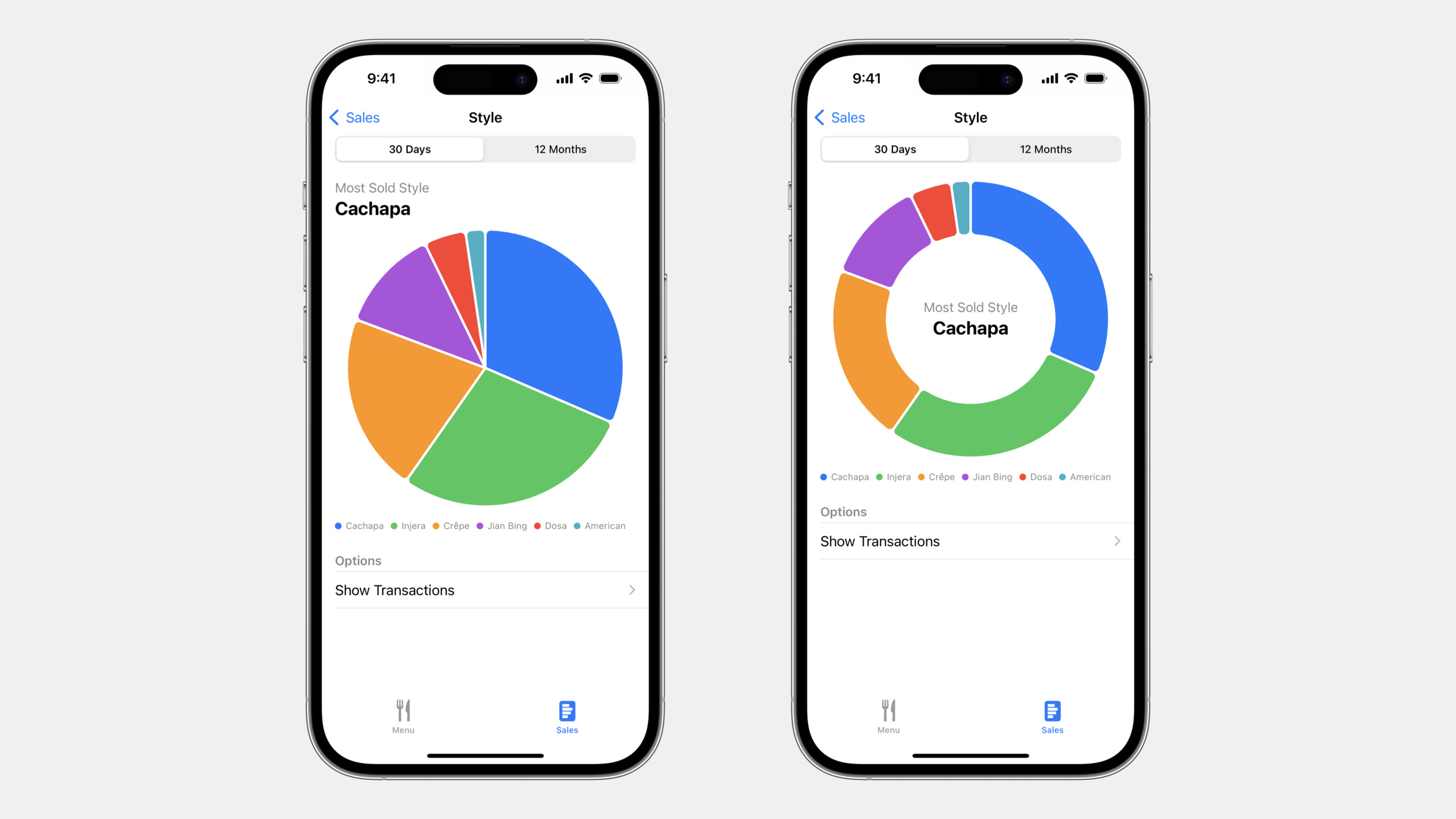
(01:13) The core of pie charts is the new SectorMark. It lives in a polar coordinate system; sector angles are proportional to data values. Converting from a bar chart takes only two changes: swap BarMark for SectorMark and replace the x parameter with angle.
(02:35) angularInset controls spacing between sectors; cornerRadius rounds sector corners. Set innerRadius to a radius ratio (e.g. 0.618) for a donut chart. Use chartBackground to place summary info in the donut hole.
(04:24) Selection interaction is this year’s focus. The chartXSelection(value:) modifier handles all gesture recognition and binds the selected value to a state variable—no custom gesture detection needed. After selection, use RuleMark for a vertical indicator line and annotation for a detail popover.
(07:07) Beyond single-value selection, range selection is supported—chartXSelection(range:) lets users pick an interval. Default gestures differ by platform: two-finger tap on iOS, drag on macOS. You can also fully customize gestures and use ChartProxy to convert touch positions to data values.
(07:31) Pie chart selection uses chartAngleSelection(value:)—selected sectors highlight automatically while others dim. Control unselected sector opacity with the opacity modifier.
(07:54) Scrollable charts solve “too many data points to fit on screen.” chartScrollableAxes(.horizontal) enables horizontal scrolling; chartXVisibleDomain(length:) sets the visible window size (time interval in seconds). chartScrollPosition(x:) binds the current scroll position so you can show summary data for the current window.
(08:50) Scroll alignment uses chartScrollTargetBehavior with value-based snapping. The demo aligns scroll stops to the first hour of each day; with large swipes, majorAlignment further requires landing on the first day of each month. Browsing monthly sales data always stops at month start.
Detailed Content
From bar chart to pie chart
// Original bar chart
Chart(data, id: \.name) { element in
    BarMark(
        x: .value("Sales", element.sales),
        stacking: .normalized
    )
    .foregroundStyle(by: .value("Name", element.name))
}

// Convert to pie chart — only change Mark type and parameter name
Chart(data, id: \.name) { element in
    SectorMark(
        angle: .value("Sales", element.sales)
    )
    .foregroundStyle(by: .value("Name", element.name))
}
Key points:
- Angle values normalize automatically to a full circle—no manual percentage calculation
foregroundStyle(by:)assigns colors to categories automatically
Polished donut chart
Chart(data, id: \.name) { element in
    SectorMark(
        angle: .value("Sales", element.sales),
        innerRadius: .ratio(0.618),
        angularInset: 1.5
    )
    .cornerRadius(5)
    .foregroundStyle(by: .value("Name", element.name))
}
.chartBackground { chartProxy in
    GeometryReader { geometry in
        let frame = geometry[chartProxy.plotAreaFrame]
        VStack {
            Text("Most Sold Style")
                .font(.callout)
                .foregroundStyle(.secondary)
            Text(mostSold)
                .font(.title2.bold())
        }
        .position(x: frame.midX, y: frame.midY)
    }
}
Key points:
innerRadius: .ratio(0.618)uses the golden ratio for donut thicknessangularInset: 1.5insets each sector by 1.5pt; actual gap is 3ptchartBackgroundplaces content at the chart plot center; useGeometryReaderto compute center position
Line chart with selection indicator
struct LocationDetailsChart: View {
    @Binding var rawSelectedDate: Date?

    var selectedDate: Date? {
        guard let rawSelectedDate else { return nil }
        return data.first?.sales.first(where: {
            let endOfDay = endOfDay(for: $0.day)
            return ($0.day ... endOfDay).contains(rawSelectedDate)
        })?.day
    }

    var body: some View {
        Chart {
            ForEach(data) { series in
                ForEach(series.sales, id: \.day) { element in
                    LineMark(
                        x: .value("Day", element.day, unit: .day),
                        y: .value("Sales", element.sales)
                    )
                }
                .foregroundStyle(by: .value("City", series.city))
                .symbol(by: .value("City", series.city))
                .interpolationMethod(.catmullRom)
            }

            if let selectedDate {
                RuleMark(
                    x: .value("Selected", selectedDate, unit: .day)
                )
                .foregroundStyle(Color.gray.opacity(0.3))
                .offset(yStart: -10)
                .zIndex(-1)
                .annotation(
                    position: .top, spacing: 0,
                    overflowResolution: .init(
                        x: .fit(to: .chart),
                        y: .disabled
                    )
                ) {
                    ValuePopover(date: selectedDate)
                }
            }
        }
        .chartXSelection(value: $rawSelectedDate)
    }
}
Key points:
chartXSelectionreturns raw coordinate values—use a computed property to snap to the nearest data pointRuleMarkwithzIndex(-1)draws the indicator below the lineoverflowResolutioncontrols annotation behavior at chart bounds: X constrained to chart, Y may overflow- Selection defaults to hover on macOS and tap on iOS
Scrollable daily sales chart
Chart {
    ForEach(SalesData.last365Days, id: \.day) {
        BarMark(
            x: .value("Day", $0.day, unit: .day),
            y: .value("Sales", $0.sales)
        )
    }
    .foregroundStyle(.blue)
}
.chartScrollableAxes(.horizontal)
.chartXVisibleDomain(length: 3600 * 24 * 30)
.chartScrollPosition(x: $scrollPosition)
.chartScrollTargetBehavior(
    .valueAligned(
        matching: DateComponents(hour: 0),
        majorAlignment: .matching(DateComponents(day: 1))
    )
)
Key points:
chartXVisibleDomain(length:)takes seconds; 30 days = 3600 * 24 * 30chartScrollPositionbinds current position for window summary statsvalueAlignedsnaps scroll stops to a time unit;majorAlignmentcontrols page-turn granularity- Scrolling builds on SwiftUI ScrollView enhancements; axis labels scroll with content
Pie chart selection interaction
Chart(data, id: \.name) { element in
    SectorMark(
        angle: .value("Sales", element.sales),
        innerRadius: .ratio(0.618),
        angularInset: 1.5
    )
    .cornerRadius(5)
    .foregroundStyle(by: .value("Name", element.name))
    .opacity(element.name == selectedName ? 1.0 : 0.3)
}
.chartAngleSelection(value: $selectedAngle)
Key points:
chartAngleSelectionis designed for polar charts- Use the
opacitymodifier for selected highlight and unselected dimming selectedAngleshould map to data values—typically via a computed property
Core Takeaways
-
Add a weekly activity ring pie chart variant to a fitness app: Apple Watch activity rings are essentially donut charts. Use SectorMark for a similar effect with total calories or duration in the center; tap a sector for exercise-type details.
-
Build an explorable expense tracking app: Show monthly spending by category as a pie chart; tap a category to expand a time-trend line chart below. Use chartXSelection on the line chart to pick a date and show that day’s transactions.
-
Use scrollable charts for long time ranges: Stock, weather, and health apps often have hundreds of days of data. Use chartScrollableAxes with chartXVisibleDomain to show the last 30 days; users swipe to browse history. Scroll target behavior aligns stops to month start or Monday.
Related Sessions
- Beyond scroll views — underlying SwiftUI scroll view improvements that scrollable charts build on
- What’s new in SwiftUI — overall SwiftUI updates including animation and data flow improvements
- Animate with springs — spring animation system for chart interaction transitions
Comments
GitHub Issues · utterances