
Highlight
Apple added AccessibilityNotification announcement priorities, Toggle trait, Zoom Action, Direct Touch, and UIKit property auto-sync to SwiftUI and UIKit—making VoiceOver interaction more precise, preventing announcements from interrupting each other, and reducing manual accessibility state maintenance.
Core Content
The problem: custom controls are opaque to VoiceOver users
Imagine a photo editing app with a filter toggle button. Sighted users see the button background shift from light green to dark green and instantly know whether the filter is on. VoiceOver users only hear “button”—they have no idea the button has an on/off state.
Previously, developers wrote accessibility hints manually: “Double-tap to toggle filter state.” But that has problems: every developer writes different copy; users hear different descriptions in different apps. Worse, the system does not know it is a toggle—VoiceOver will not automatically report the current state.
Apple’s solution: six accessibility enhancements
WWDC 2023 brings six key improvements covering button state declaration, announcement control, gesture interaction, visual accessibility, and property auto-sync.
Detailed Content
1. Toggle Trait: automatic button state announcements
The isToggle trait solves accessibility description for custom toggle buttons. Add this line and VoiceOver automatically says “toggle button, on” or “off”—no manual hint needed.
SwiftUI (01:54):
import SwiftUI

struct FilterButton: View {
    @State var filter: Bool = false

    var body: some View {
        Button(action: { filter.toggle() }) {
            Text("Filter")
        }
        .background(filter ? darkGreen : lightGreen)
        .accessibilityAddTraits(.isToggle)
    }
}
Key points:
.accessibilityAddTraits(.isToggle)tells the system this button is a toggle- VoiceOver automatically reads the current Bool state; no manual
accessibilityValue - System provides “double-tap to toggle setting” hint consistently across all apps
UIKit (02:31):
import UIKit

class ViewController: UIViewController {
    override func viewDidLoad() {
        super.viewDidLoad()

        let filterButton = UIButton(type: .custom)

        setupButtonView()

        filterButton.accessibilityTraits = [.toggleButton]

        view.addSubview(filterButton)
    }
}
Key points:
- UIKit uses
.toggleButtonasaccessibilityTraits - Same effect as SwiftUI’s
.isToggle - No need to set
accessibilityHintstring
2. AccessibilityNotification: cross-platform unified notification API
Previously, SwiftUI sent accessibility announcements through UIKit’s UIAccessibility.post(notification:argument:). SwiftUI had no native notification API. WWDC 2023 introduces AccessibilityNotification—a Swift-native cross-platform solution.
Sending announcements (03:43):
import SwiftUI

struct ContentView: View {
    var body: some View {
        NavigationView {
            PhotoFilterView
                .toolbar {
                    Button(action: {
                        AccessibilityNotification.Announcement("Loading Photos View")
                            .post()
                    }) {
                        Text("Photos")
                    }
                }
        }
    }
}
Key points:
AccessibilityNotification.Announcement("message")creates an announcement.post()sends it; VoiceOver speaks the text- Works in SwiftUI, UIKit, and AppKit
- Four notification types: Announcement, LayoutChanged, ScreenChanged, PageScrolled
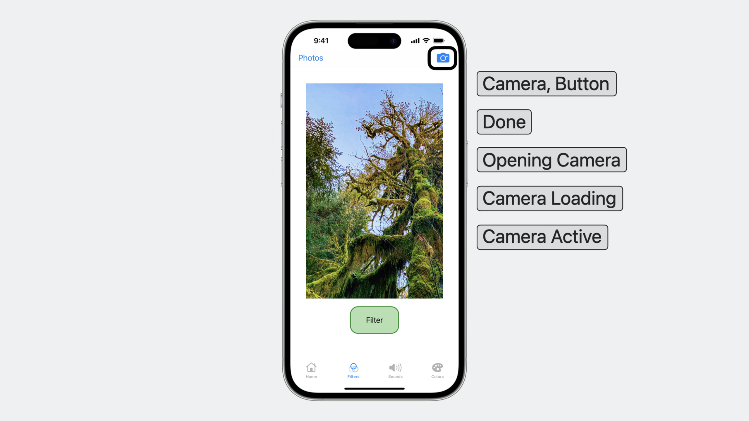
Announcement priority (05:13):
The most important improvement this update. Previously, multiple simultaneous announcements interrupted or stacked, producing confusing speech. Announcements now support three priority levels:
import SwiftUI

struct ZoomingImageView: View {

    var defaultPriorityAnnouncement = AttributedString("Opening Camera")

    var lowPriorityAnnouncement: AttributedString {
        var lowPriorityString = AttributedString("Camera Loading")
        lowPriorityString.accessibilitySpeechAnnouncementPriority = .low
        return lowPriorityString
    }

    var highPriorityAnnouncement: AttributedString {
        var highPriorityString = AttributedString("Camera Active")
        highPriorityString.accessibilitySpeechAnnouncementPriority = .high
        return highPriorityString
    }

    // ...
}
Key points:
- Priority set via
AttributedString’saccessibilitySpeechAnnouncementPriority - Three levels:
.high(interrupts current speech immediately, cannot be interrupted),.default(normal queue),.low(after all default announcements) - When posting multiple announcements,
.highensures critical information arrives first
Practical usage (05:46):
import SwiftUI

struct CameraButton: View {

    // ...

    var body: some View {
        Button(action: {
            // Open Camera Code
            AccessibilityNotification.Announcement(defaultPriorityAnnouncement).post()
            // Camera Loading Code
            AccessibilityNotification.Announcement(lowPriorityAnnouncement).post()
            // Camera Loaded Code
            AccessibilityNotification.Announcement(highPriorityAnnouncement).post()
        }) {
            Image("Camera")
           }
        }
    }
}
Key points:
- Opening camera posts three announcements; priority ensures “Camera Active” is heard first
.lowpriority “Camera Loading” does not interrupt other important information.defaultannouncements queue in normal order
UIKit equivalent (06:15):
class ViewController: UIViewController {
    let defaultAnnouncement = NSAttributedString(string: "Opening Camera", attributes:
        [NSAttributedString.Key.UIAccessibilitySpeechAttributeAnnouncementPriority:
        UIAccessibilityPriority.default]
    )

    let lowPriorityAnnouncement = NSAttributedString(string: "Camera Loading", attributes:
        [NSAttributedString.Key.UIAccessibilitySpeechAttributeAnnouncementPriority:
        UIAccessibilityPriority.low]
    )

    let highPriorityAnnouncement = NSAttributedString(string: "Camera Active", attributes:
        [NSAttributedString.Key.UIAccessibilitySpeechAttributeAnnouncementPriority:
        UIAccessibilityPriority.high]
    )

    // ...
}
Key points:
- UIKit uses
NSAttributedString’sUIAccessibilitySpeechAttributeAnnouncementPriority - Constants:
UIAccessibilityPriority.high,.default,.low
3. Zoom Action: VoiceOver users can zoom images too
Pinch-to-zoom in image viewers is unavailable to VoiceOver users—VoiceOver gestures intercept touch events. New accessibilityZoomAction lets VoiceOver users zoom through accessibility gestures.
SwiftUI (06:56):
struct ZoomingImageView: View {
    @State private var zoomValue = 1.0
    @State var imageName: String?

    var body: some View {
        Image(imageName ?? "")
            .scaleEffect(zoomValue)
            .accessibilityZoomAction { action in
                let zoomQuantity = "\(Int(zoomValue)) x zoom"
                switch action.direction {
                case .zoomIn:
                    zoomValue += 1.0
                    AccessibilityNotification.Announcement(zoomQuantity).post()
                case .zoomOut:
                    zoomValue -= 1.0
                    AccessibilityNotification.Announcement(zoomQuantity).post()
                }
            }
    }
}
Key points:
.accessibilityZoomActiontakes a closure; closure parameter providesaction.directionaction.directionhas.zoomInand.zoomOut- After zooming, announce current magnification with
AccessibilityNotification.Announcement
import UIKit

class ZoomingImageView: UIScrollView {
    override func accessibilityZoomIn(at point: CGPoint) -> Bool {
        zoomScale += 1.0

        let zoomQuantity = "\(Int(zoomScale)) x zoom"
        UIAccessibility.post(notification: .announcement, argument: zoomQuantity)
        return true
    }

    override func accessibilityZoomOut(at point: CGPoint) -> Bool {
        zoomScale -= 1.0

        let zoomQuantity = "\(Int(zoomScale)) x zoom"
        UIAccessibility.post(notification: .announcement, argument: zoomQuantity)
        return true
    }
}
Key points:
- UIKit overrides
UIScrollView’saccessibilityZoomIn(at:)andaccessibilityZoomOut(at:) - Set view
accessibilityTraitsto[.image, .supportsZoom]first - Return
trueto indicate zoom was handled
4. Direct Touch: let VoiceOver gestures pass through to the app
Sometimes VoiceOver speech interferes with operation—a piano keyboard app where users need rapid key presses; VoiceOver reading each key becomes noise.
Direct Touch lets you designate a view region where user gestures pass directly to the app, bypassing VoiceOver interception.
SwiftUI (10:10):
import SwiftUI

struct KeyboardKeyView: View {
    var soundFile: String
    var body: some View {
        Rectangle()
            .fill(.white)
            .frame(width: 35, height: 80)
            .onTapGesture(count: 1) {
                playSound(sound: soundFile, type: "mp3")
            }
            .accessibilityDirectTouch(options: .silentOnTouch)
    }
}
Key points:
.accessibilityDirectTouch(options: .silentOnTouch)enables direct touch without speech on touch- VoiceOver still reads the element in explore mode to help users locate it
- Once direct touch is activated, all subsequent gestures go to the app until the user exits the region
UIKit (10:46):
import UIKit

class ViewController: UIViewController {
    let waveformButton = UIButton(type: .custom)

    override func viewDidLoad() {
        super.viewDidLoad()

        waveformButton.accessibilityTraits = .allowsDirectInteraction
        waveformButton.accessibilityDirectTouchOptions = .silentOnTouch
        waveformButton.addTarget(self, action: #selector(playTone), for: .touchUpInside)

        view.addSubview(waveformButton)
    }
}
Key points:
- UIKit sets
accessibilityTraits = .allowsDirectInteractionfor direct interaction accessibilityDirectTouchOptions = .silentOnTouchoptionally disables speech feedback on touch
5. Visual accessibility enhancements
Content Shape customization (12:21):
VoiceOver focus borders default to rectangles, but circular elements with rectangular borders confuse users. New .contentShape API supports custom shapes for accessibility focus:
import SwiftUI

struct ImageView: View {
    var body: some View {
        Image("circle-red")
            .resizable()
            .frame(width: 200, height: 200)
            .accessibilityLabel("Red")
            .contentShape(.accessibility, Circle())
    }
}
Key points:
.contentShape(.accessibility, Circle())makes VoiceOver focus highlight circular- First parameter
.accessibilitymeans this shape is for accessibility only, not hit testing - Supports any SwiftUI Shape type
6. UIKit property auto-sync: goodbye manual updates
In UIKit, when UI state changes (e.g. filter toggle), developers had to remember to update accessibilityValue. Miss once and VoiceOver users hear wrong state.
WWDC 2023 introduces block-based property setters so accessibility values automatically derive from UI state:
import UIKit

class ViewController: UIViewController {
    var isFiltered = false

    override func viewDidLoad() {
        super.viewDidLoad()
        // Set up views
        zoomView.accessibilityValueBlock = { [weak self] in
            guard let self else { return nil }
            return isFiltered ? "Filtered" : "Not Filtered"
        }
    }
}
Key points:
accessibilityValueBlocktakes a closure called whenever VoiceOver needs the value- Closure uses
[weak self]to avoid retain cycles - When
isFilteredchanges, VoiceOver gets the latest value on next read - No manual
accessibilityValueat every state change
Core Takeaways
1. Refactor all custom toggle buttons
Audit all custom toggle buttons in your app—any UIButton or SwiftUI Button with toggle behavior. Add .isToggle trait (SwiftUI) or .toggleButton (UIKit). Instantly improves VoiceOver experience with one line of code.
2. Add prioritized announcements for critical operations
Find state changes users must know immediately—payment success, file upload complete, navigation arrival. Replace silent state updates with .high priority AccessibilityNotification.Announcement. Use .low priority for progress info like “loading more” to avoid interrupting important messages.
3. Add accessibility zoom to image viewers
If your app has image browsing or map viewing, add accessibilityZoomAction. VoiceOver users zoom via rotor gestures without physical pinch. Announce magnification after zooming.
4. Identify Direct Touch scenarios
Find elements needing rapid sequential interaction—keyboards, drawing pads, game controllers, music pads. Enable Direct Touch for these regions to minimize VoiceOver interaction latency. Ensure the region has a clear accessibilityLabel so users know what it is in explore mode.
5. Migrate UIKit accessibility properties to block mode
Search for all manual accessibilityValue and accessibilityHint settings. Migrate to accessibilityValueBlock and similar block-based properties. Eliminates state sync bugs—one of the most common accessibility issues.
Related Sessions
- Explore media formats for the web — accessibility improvements overview from WWDC23 Keynote
- Design considerations for vision and motion — how visual and motion design affects accessibility
- Extend Speech Synthesis with personal and custom voices — speech synthesis in accessibility scenarios
- Meet Assistive Access — Assistive Access mode for cognitive disability users
- Explore enhancements to RoomPlan — RoomPlan accessibility enhancements
Comments
GitHub Issues · utterances