
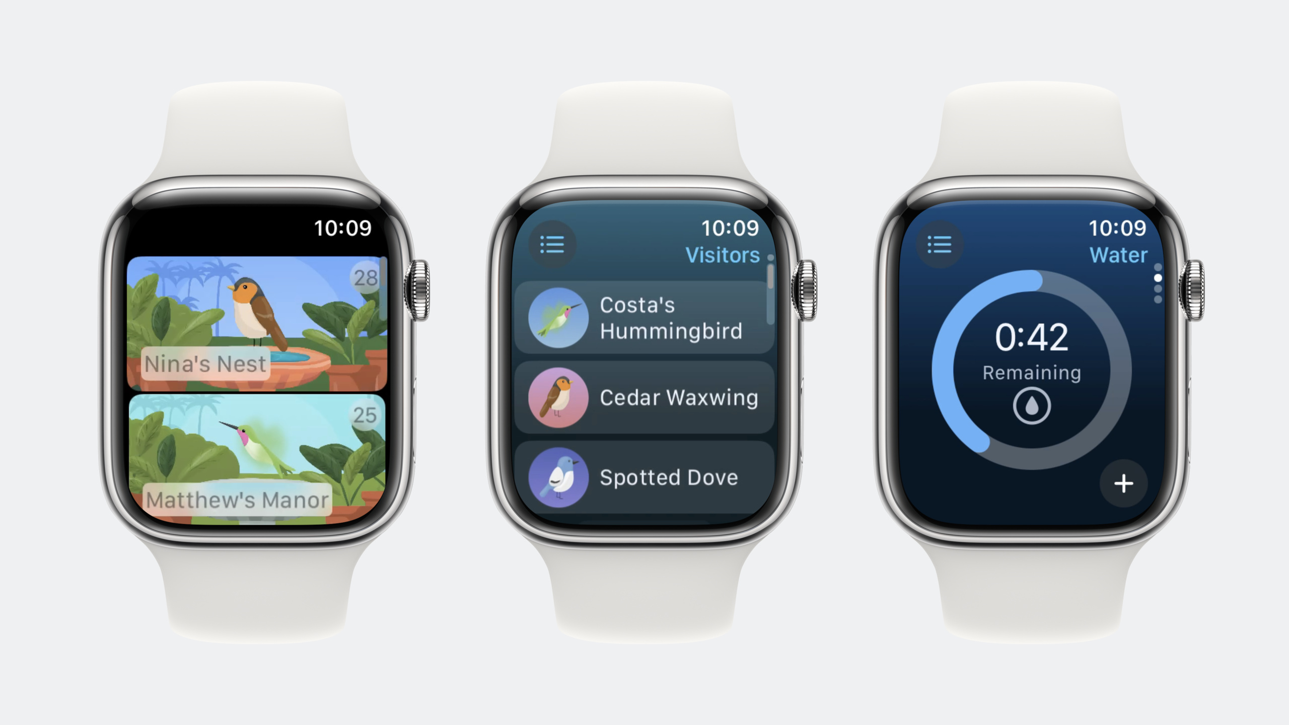
Highlight
In watchOS 10, Apple redesigned Apple Watch app navigation with vertical TabView and NavigationSplitView, making Digital Crown scrolling the primary interaction while improving glanceability through
.containerBackground()and the new material system.
Core Content
Previously on Apple Watch, switching views meant swiping on screen—awkward with a raised wrist and often needing your other hand. Side navigation on watchOS also required precise taps, and the crown was mainly for zooming maps and scrolling lists.
watchOS 10 makes the Digital Crown a core navigation tool. A single-handed crown turn switches views, even with your wrist raised. The Apple Watch team rethought interaction: if the crown is built for fast one-handed control, why not make it the main way to navigate?
To implement this navigation, developers need two SwiftUI components: NavigationSplitView and TabView. NavigationSplitView handles the sidebar list and detail relationship; TabView with .verticalPage style stacks views where crown scrolling works.
Apple also introduced the .containerBackground() modifier so each tab looks visually distinct—users can tell at a glance which page they are on. Combined with the new material system (Material.ultraThin), important information can stand out without blocking background content, improving glanceability.
Detailed Content
NavigationSplitView sidebar navigation
watchOS 10 upgrades sidebar navigation from NavigationStack to NavigationSplitView (04:02):
NavigationSplitView {
    List(backyardsData.backyards, selection: $selectedBackyard) { backyard in
        BackyardCell(backyard: backyard)
    }
    .listStyle(.carousel)
} detail: {
    if let selectedBackyard {
        BackyardView(backyard: selectedBackyard)
    } else {
        BackyardUnavailableView()
    }
}
Key points:
NavigationSplitViewhas two parts: sidebar list and detailselection: $selectedBackyardbinds the currently selected item.listStyle(.carousel)makes list items scroll horizontally—a better gesture on Apple Watch- The detail view shows different content depending on selection
- After upgrading the SDK, apps open directly into the detail view (what users care about most); users return to the list via the Source List button
Vertical TabView and crown scrolling
The new vertical TabView lets the Digital Crown switch main views directly (06:18):
TabView {
    TodayView()
        .navigationTitle("Today")
    HabitatGaugeView(level: $waterLevel, habitatType: .water, tintColor: .blue)
        .navigationTitle("Water")
    HabitatGaugeView(level: $foodLevel, habitatType: .food, tintColor: .green)
        .navigationTitle("Food")
    List {
        VisitorView()
            .navigationTitle("Visitors")
    }
}
.tabViewStyle(.verticalPage)
Key points:
.tabViewStyle(.verticalPage)is key—it stacks tabs vertically and switches them as the crown scrolls- Each tab can be any SwiftUI view, including Gauge, List, or custom views
navigationTitle()sets each tab’s title in the top status area- Put scrollable tabs (like List) last to avoid conflicting with crown paging
Bottom toolbar
watchOS 10 adds .bottomBar toolbar placement, putting action buttons in an easier-to-tap area (08:37):
.toolbar {
    ToolbarItemGroup(placement: .bottomBar) {
        Spacer()
        Button {
            level = Int(min(100, Double(level) + 5))
        } label: {
            Label("Add", systemImage: "plus")
        }
    }
}
Key points:
.bottomBarplaces the toolbar at the bottom for more stable one-handed useSpacer()pushes the button to the right- Buttons can modify state directly, such as increasing water or food level
.bottomBarkeeps button position consistent across screen sizes
Dynamic color calculation and backgrounds
Dynamically changing colors based on state strengthens visual feedback (09:48):
func backgroundColor(_ level: Int, for type: HabitatType) -> Color {
    let color: Color = type == .food ? .green : .blue
    return level < 40 ? .red : color
}

var waterColor: Color {
    backgroundColor(waterLevel, for: .water)
}

var foodColor: Color {
    backgroundColor(foodLevel, for: .food)
}
Key points:
backgroundColor()returns the appropriate color for level and type- Below level 40, it returns red to signal refill needed
- Computed properties
waterColorandfoodColorreact to state changes automatically - Pass these colors into
.containerBackground()for dynamic backgrounds
.containerBackground() for visual distinction
To make each tab recognizable at a glance, watchOS 10 introduces .containerBackground() (10:10):
TabView {
    TodayView()
        .navigationTitle("Today")
        .containerBackground(Color.accentColor.gradient, for: .tabView)
    HabitatGaugeView(level: $waterLevel, habitatType: .water, tintColor: waterColor)
        .navigationTitle("Water")
        .containerBackground(waterColor.gradient, for: .tabView)
    HabitatGaugeView(level: $foodLevel, habitatType: .food, tintColor: foodColor)
        .navigationTitle("Food")
        .containerBackground(foodColor.gradient, for: .tabView)
    List {
        VisitorView()
            .navigationTitle("Visitors")
            .containerBackground(Color.accentColor.gradient, for: .tabView)
    }
}
.tabViewStyle(.verticalPage)
.environmentObject(backyard)
.navigationTitle(backyard.displayName)
Key points:
.containerBackground()sets the tab background—solid color, gradient, or any SwiftUI ShapeStyle- The first parameter is the background style;
for: .tabViewscopes it to the tab - Different tabs use different colors so users know where they are at a glance
.gradientsmooths color transitions to match Apple Watch design language- Color helps users build spatial awareness in navigation, not just decoration
New material system
watchOS 10 offers finer-grained material control (11:38):
.foregroundStyle(.secondary)
.background(Material.ultraThin, in: RoundedRectangle(cornerRadius: 7))
Key points:
.foregroundStyle(.secondary)lightens text for secondary informationMaterial.ultraThinis the lightest material with the highest background transparencyin: RoundedRectangle(cornerRadius: 7)limits where the material applies- Materials automatically blur content behind them for foreground readability
Layering materials highlights important information without blocking the background (12:15):
.overlay(alignment: .topTrailing) {
    Text("\(backyard.visitorScore)")
        .frame(width: 25, height: 25)
        .foregroundStyle(.secondary)
        .background(.ultraThinMaterial, in: .circle)
        .padding(.top, 5)
}
Key points:
.overlay()adds a layer on top of the existing view.ultraThinMaterialis semi-transparent—background visible but blurred.circlecreates a circular background suited for numbers or icons.padding(.top)adjusts position to avoid edge clipping
Forcing light mode ensures text readability on dark backgrounds (12:20):
.environment(\.colorScheme, .light)Key points:
.environment(\.colorScheme, .light)forces the current view to use light mode- Light text on dark backgrounds is clearer in this case
- This setting affects only the current view and its children
Core Takeaways
- Make the Digital Crown your primary navigation
- What to do: Refactor your Apple Watch app to use vertical TabView instead of horizontal swipe navigation.
- Why it’s worth doing: Crown scrolling is one-handed and works with a raised wrist—more ergonomic than on-screen swiping. watchOS 10 makes this the default; users will expect all apps to support it.
- How to start: Change existing TabView to
.tabViewStyle(.verticalPage)and ensure each tab’snavigationTitleis clear. Put scrollable tabs last.
- Use color to improve glanceability
- What to do: Set a unique background color per tab or view, driven by state.
- Why it’s worth doing: The Apple Watch screen is small—users only glance. Color is the fastest cue, faster than text. When data is abnormal (e.g., low water), a red background is more noticeable than a number.
- How to start: Use
.containerBackground()per tab with colors that change via computed properties from data state. Upgrade the SDK first for the new look, then optimize manually.
- Highlight important information with material overlays
- What to do: Layer semi-transparent material backgrounds on key data.
- Why it’s worth doing: Drawing directly on content blocks information; materials blur the background while keeping the foreground readable. Great for scores, status indicators, and data you need to see instantly.
- How to start: Use
.background(.ultraThinMaterial, in: .circle)on numbers or status indicators and position with.overlay().
- Put high-frequency actions in the bottom toolbar
- What to do: Move your most-used actions to Toolbar
.bottomBar. - Why it’s worth doing: The lower part of the Apple Watch screen is easier to tap;
.bottomBarkeeps position consistent across sizes so users do not relearn. - How to start: Audit existing button placement and move frequent actions to
ToolbarItemGroup(placement: .bottomBar).
- Optimize navigation with NavigationSplitView
- What to do: Replace
NavigationStackwithNavigationSplitView. - Why it’s worth doing: Apps launch into the detail view, reducing navigation steps. Content users care about most comes first; return to the list via the Source List button.
- How to start: Use
Listwithselectionbinding instead of the old navigation list; put detail content in thedetailclosure.
Related Sessions
- What’s new in watchOS 10 — Overview of all watchOS 10 features, including Smart Stack, new watch faces, and health capabilities
- Build widgets for Apple Watch — Build Smart Stack widgets for Apple Watch to improve glanceability
- SwiftUI for Apple Watch — Latest SwiftUI features and best practices on Apple Watch
- Design for spatial computing — Design fundamentals for spatial computing, aligned with watchOS glanceability principles
Comments
GitHub Issues · utterances