
Highlight
iOS 17 turns widgets from read-only displays into interactive controls: developers can trigger AppIntents directly on widgets through Button and Toggle, and use new animation APIs to create smooth content transitions when timeline entries change.
Core Content
Widgets before: look but don’t touch
When WidgetKit introduced widgets in iOS 14, their role was simple: display information. Tapping a widget only opened the app—the widget itself did not respond to any gestures. If you wanted users to complete an action on the widget—such as checking off a todo or logging a cup of coffee—you had to bring them into the app.
For developers, this meant widgets were just display windows, not functional entry points. Every action followed the flow of “tap widget → open app → act → return.”
What changed in iOS 17: widgets support interaction
iOS 17 added two key capabilities to WidgetKit:
- Interactive controls: Widgets can include Button and Toggle. Tapping them runs an AppIntent directly without opening the app.
- Animated transitions: When timeline entries change, you can customize animations and content transitions instead of an abrupt swap.
Together, these turn widgets from an “information board” into a “mini app control panel.”
The mechanism behind it all: AppIntents
The core of widget interactivity is the AppIntents framework. Button and Toggle initializers accept an AppIntent object; when the user taps, the system runs that intent’s perform() method. After perform() returns, WidgetKit automatically refreshes the widget UI.
This design means widgets do not manage their own state—they trigger your app’s business logic and then display the latest result.
Detailed Content
Custom widget backgrounds: containerBackground
iOS 17 provides the new containerBackground modifier specifically for widget backgrounds (03:54):
.containerBackground(for: .widget) {
    Color.cosmicLatte
}
Key points:
containerBackground(for: .widget)is a new WidgetKit modifier that replaces the oldbackgroundapproach- The system adjusts how the background renders based on widget placement (Home Screen, Lock Screen, StandBy)
- In StandBy mode, the system adds appropriate corner radius and margins to the background
Preview widget animations: #Preview macro
Xcode 15’s new #Preview macro lets you preview widget timeline animations directly (04:22):
#Preview(as: WidgetFamily.systemSmall) {
    CaffeineTrackerWidget()
} timeline: {
    CaffeineLogEntry.log1
    CaffeineLogEntry.log2
    CaffeineLogEntry.log3
    CaffeineLogEntry.log4
}
Key points:
#Preview(as:)specifies the widget size, supportingsystemSmall,systemMedium,systemLarge, and more- The
timeline:closure returns multiple timeline entries; the preview automatically cycles through them - Transitions play your defined animations and effects without testing on a device
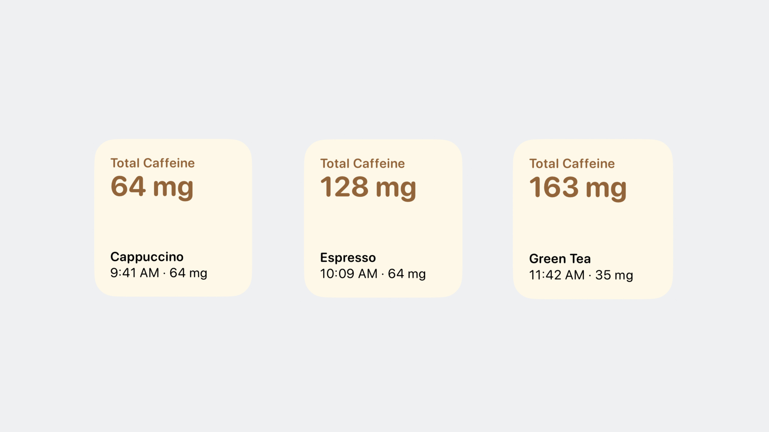
Smooth transitions for changing values: contentTransition
Numeric changes in widgets can use .contentTransition(.numericText(value:)) for smooth scrolling number effects (05:41):
struct TotalCaffeineView: View {
    let totalCaffeine: Measurement<UnitMass>

    var body: some View {
        VStack(alignment: .leading) {
            Text("Total Caffeine")
                .font(.caption)

            Text(totalCaffeine.formatted())
                .font(.title)
                .minimumScaleFactor(0.8)
                .contentTransition(.numericText(value: totalCaffeine.value))
        }
        .foregroundColor(.espresso)
        .bold()
        .frame(maxWidth: .infinity, alignment: .leading)
    }
}
Key points:
.contentTransition(.numericText(value:))takes a Double value; when it changes, the text animates with a number-scrolling transitiontotalCaffeine.valuecomes from theMeasurement<UnitMass>value property- This transition applies only to numeric text and is more informative than a default fade
- Great for counts, amounts, measurements, and similar values
Push transitions between entries: transition and animation
When one timeline entry switches to another, use .transition and .animation to control the effect (06:21):
struct LastDrinkView: View {
    let log: CaffeineLog

    var body: some View {
        VStack(alignment: .leading) {
            Text(log.drink.name)
                .bold()
            Text("\(log.date, format: Self.dateFormatStyle) · \(caffeineAmount)")
        }
        .font(.caption)
        .id(log)
        .transition(.push(from: .bottom))
        .animation(.smooth(duration: 1.8), value: log)
    }

    var caffeineAmount: String {
        log.drink.caffeine.formatted()
    }

    static var dateFormatStyle = Date.FormatStyle(
        date: .omitted, time: .shortened)
}
Key points:
.id(log)tells SwiftUI that whenlogchanges, this is a different view and should trigger a transition.transition(.push(from: .bottom))defines the transition: the old entry pushes up while the new one enters from the bottom.animation(.smooth(duration: 1.8), value: log)sets the curve and duration, triggering only whenlogchangesduration: 1.8gives a longer animation that feels more natural on a widget
Manually reload widget timelines
After data changes in your app, notify WidgetKit to refresh the widget (09:18):
WidgetCenter.shared.reloadTimelines(ofKind: "LocationForecast")Key points:
WidgetCenter.shared.reloadTimelines(ofKind:)refreshes widgets of the specified kind- Call this after your app modifies data the widget depends on
- Suitable after changing data in an AppIntent’s
perform()method, though Button/Toggle AppIntents trigger refresh automatically
Interactive controls with AppIntent: Button
This is the core mechanism for widget interactivity. First, define an AppIntent (13:06):
import AppIntents

struct LogDrinkIntent: AppIntent {
    static var title: LocalizedStringResource = "Log a drink"
    static var description = IntentDescription("Log a drink and its caffeine amount.")

    @Parameter(title: "Drink", optionsProvider: DrinksOptionsProvider())
    var drink: Drink

    init() {}

    init(drink: Drink) {
        self.drink = drink
    }

    func perform() async throws -> some IntentResult {
        await DrinksLogStore.shared.log(drink: drink)
        return .result()
    }
}
Key points:
- The
AppIntentprotocol comes from theAppIntentsframework; you needimport AppIntents static var titleanddescriptionare used for Siri and Shortcuts- Properties marked with
@Parameteraccept values from outside;optionsProvidersupplies the list of options perform()is where business logic runs;DrinksLogStore.shared.log(drink:)is a custom data store method- After
perform()returns.result(), WidgetKit automatically reloads the widget
Then bind the intent to a Button in the widget view (15:10):
struct LogDrinkView: View {
    var body: some View {
        Button(intent: LogDrinkIntent(drink: .espresso)) {
            Label("Espresso", systemImage: "plus")
                .font(.caption)
        }
        .tint(.espresso)
    }
}
Key points:
Button(intent:label:)is a new iOS 17 initializer- Tapping the button runs
LogDrinkIntent’sperform()without opening the app - Use
.tint()to set the button color - A single widget can have multiple buttons, each bound to a different intent
Reducing perceived latency: invalidatableContent
After the user taps a button and triggers an AppIntent, there is a gap between data updating and the widget refresh. .invalidatableContent() lets the widget mark content as about to change first (16:28):
struct TotalCaffeineView: View {
    let totalCaffeine: Measurement<UnitMass>

    var body: some View {
        VStack(alignment: .leading) {
            Text("Total Caffeine")
                .font(.caption)

            Text(totalCaffeine.formatted())
                .font(.title)
                .minimumScaleFactor(0.8)
                .contentTransition(.numericText(value: totalCaffeine.value))
                .invalidatableContent()
        }
        .foregroundColor(.espresso)
        .bold()
        .frame(maxWidth: .infinity, alignment: .leading)
    }
}
Key points:
.invalidatableContent()marks that this view’s content will change before new data arrives- While the AppIntent runs, marked views show a transitional state instead of freezing
- Works best combined with
.contentTransition(.numericText(value:)) - Ideal when you need to give users immediate feedback
Core Takeaways
-
Build a coffee/water logging widget: Put a few drink buttons (espresso, latte, water) on the widget; tapping logs to HealthKit or local storage, with total intake shown via number-scrolling animation. Why it’s worth doing: this session’s demo is a caffeine tracker using Button + AppIntent + contentTransition together. How to start: define a Drink type and
LogDrinkIntent, create drink buttons withButton(intent:), and callWidgetCenter.shared.reloadTimelinesinperform(). -
Build a Pomodoro widget: Show the current task and remaining time; use Toggle to start/pause the timer, with
.contentTransition(.numericText(value:))for countdown animation. Why it’s worth doing: Toggle is the second interactive control widgets support, and countdown is a natural fit for numeric transitions. How to start: create aTimerIntent, bind timer state withToggle(isOn:intent:label:), and start/pause a background timer inperform(). -
Build a habit check-in widget: List today’s habits, each with a Button to mark complete; completed items exit with
.transition(.push(from: .bottom)). Why it’s worth doing: habit tracking is a high-frequency widget use case, and animated transitions make check-ins feel smoother. How to start: create aMarkHabitIntentper habit, list habits with ForEach, and pair each with a Button. -
Build a quick-payment widget: Place common amount buttons (breakfast ¥15, coffee ¥25, lunch ¥40); tapping logs to your expense app, with monthly total shown via number animation. Why it’s worth doing: the biggest friction in expense tracking is opening the app to enter amounts—a widget button reduces it to one tap. How to start: create
RecordExpenseIntent, accept amount and category via@Parameter, and write to a local database inperform(). -
Build a smart home control widget: Use Toggle for lights and Button for scene modes; match button colors to device state with
.tint(). Why it’s worth doing: home control is a classic widget interaction scenario—users can switch devices without opening the app. How to start: create aToggleDeviceIntentper device, execute at the HomeKit or MQTT layer, and use.invalidatableContent()to handle command latency.
Related Sessions
- Bring widgets to new places — Widgets expand to the Lock Screen, StandBy, and Mac desktop in iOS 17; learn how to adapt to different environments
- Meet SwiftUI for spatial computing — How SwiftUI works in spatial computing, sharing the same AppIntents foundation as widget interactivity
- Explore enhancements to App Intents — Latest AppIntents enhancements, the engine behind widget interactivity
- Design dynamic Live Activities — Live Activities support the same Button and Toggle interactions, including on the Dynamic Island
- What’s new in AppKit — Interactive widget support on macOS; desktop widgets can use Button and Toggle too
Comments
GitHub Issues · utterances