
Highlight
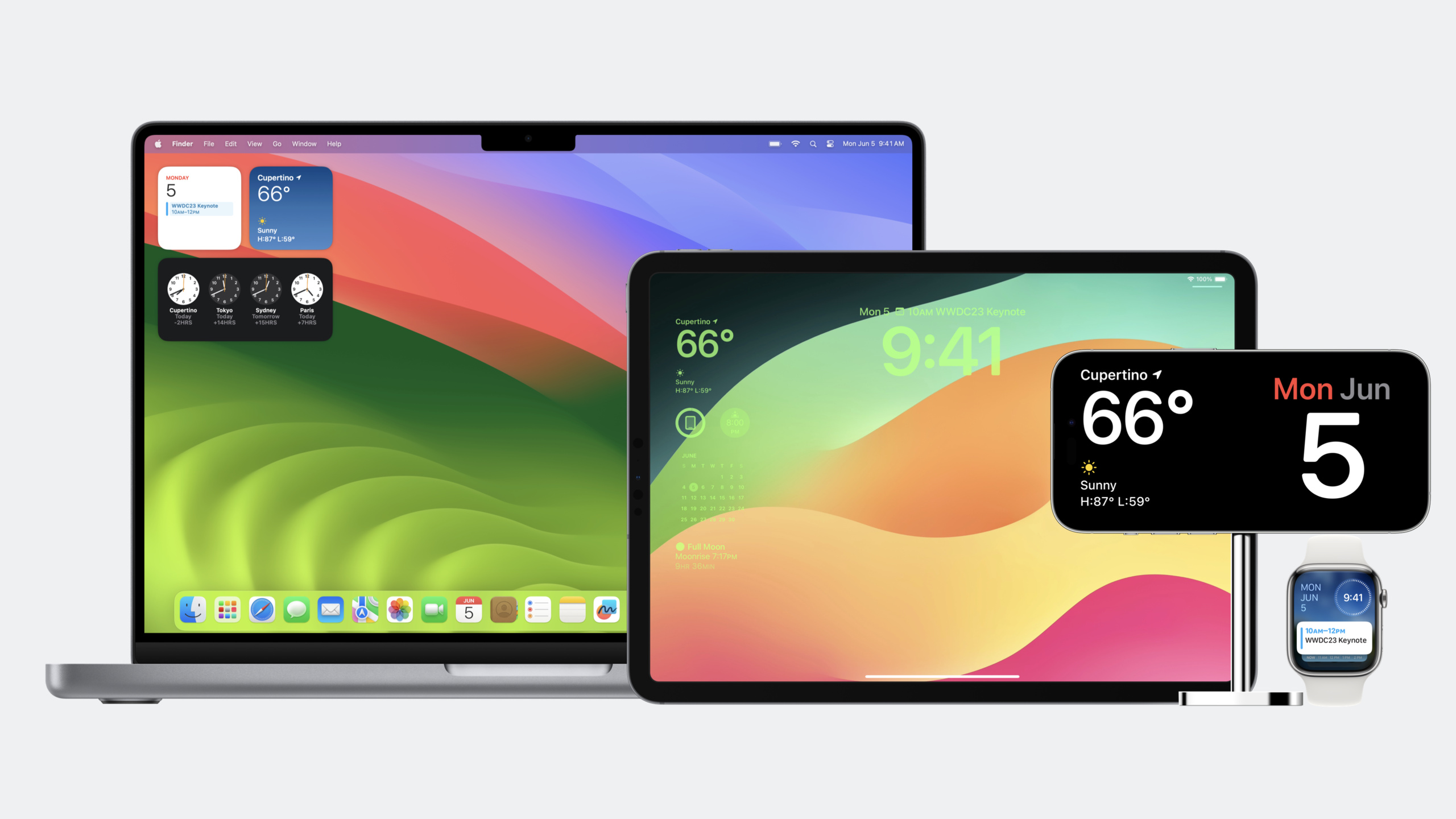
iOS 17 and macOS Sonoma introduced new widget surfaces—StandBy, desktop widgets, and the iPad Lock Screen. WidgetKit added APIs such as
containerBackground,contentMargins,widgetAccentable, andcontainerBackgroundRemovableso widgets can automatically adapt background, margins, and rendering style to each environment.
Core Content
The problem: widgets used to have only one home
When WidgetKit launched in iOS 14, widgets had a single placement: the Home Screen. Developers only had to think about one background style, one set of margin rules, and one color rendering approach.
That has changed. iOS 17 brought StandBy mode—when an iPhone charges in landscape, widgets appear on a full-screen dark interface. macOS Sonoma lets widgets sit directly on the desktop. The iPad Lock Screen now supports widgets too.
Each new surface expects a different look. In StandBy, the system intelligently tints widgets. Desktop widgets may need to drop their background to blend with the wallpaper. Home Screen widgets should keep their vivid backgrounds. One codebase for every environment became the new challenge.
Apple’s approach: environment-aware widget APIs
WidgetKit gained three core capabilities:
- Container background (
containerBackground): tells the widget what its background should look like; the system adjusts based on placement. - Content margin control (
contentMarginsDisabled): when edge-to-edge rendering is needed (for example in StandBy), developers control padding themselves. - Accent rendering (
widgetAccentable): in dark smart-tint modes like StandBy, marks which text and elements the system should tint.
There is also containerBackgroundRemovable, which lets the system remove a desktop widget’s background so it can appear transparent against the wallpaper.
The shared idea: developers declare intent, and the system decides how to render for the current environment.
Detailed Content
Disable default margins (02:08)
In iOS 17, widgets get system-added content margins by default. For widgets that need full layout control—such as those that fill the widget with a solid color or gradient—those default margins leave awkward gaps.
contentMarginsDisabled() turns off the default margins; you then control padding with the widgetContentMargins environment value:
struct SafeAreasWidgetView: View {
    @Environment(\.widgetContentMargins) var margins

    var body: some View {
        ZStack {
            Color.blue
            Group {
                Color.lightBlue
                Text("Hello, world!")
            }
                .padding(margins)
        }
    }
}

struct SafeAreasWidget: Widget {
    var body: some WidgetConfiguration {
        StaticConfiguration(...) {_ in
            SafeAreasWidgetView()
        }
        .contentMarginsDisabled()
    }
}
Key points:
- Call
contentMarginsDisabled()onWidgetConfigurationto disable system margins. @Environment(\.widgetContentMargins)reads the margin values the system would have applied, so you can add padding where you want it.- This pattern suits full-bleed background widgets—the inner content gets manual padding while the outer background fills the widget.
Container background: one codebase for every surface (03:19)
containerBackground(for:alignment:content:) is the most important new WidgetKit API in iOS 17 / macOS Sonoma. It replaces setting backgrounds directly on the view.
struct EmojiRangerWidgetEntryView: View {
    var entry: Provider.Entry

    @Environment(\.widgetFamily) var family

    var body: some View {
        switch family {
        case .systemSmall:
            ZStack {
                AvatarView(entry.hero)
                    .widgetURL(entry.hero.url)
                    .foregroundColor(.white)
            }
            .containerBackground(for: .widget) {
                Color.gameBackground
            }
        }
        // additional cases
    }
}
Key points:
containerBackground(for: .widget)tells the system “this content is the widget’s background.” Rendering adapts to where the widget appears.- In StandBy, that background may be removed or softened; on the desktop, users can choose to drop the background so the widget blends with the wallpaper.
- A normal background (such as
Color.bluein aZStack) withoutfor: .widgetis not adjusted by the system’s smart rendering. @Environment(\.widgetFamily)distinguishes small, medium, large, and accessory sizes so one widget entry can branch layouts.
Accent color: automatic tinting in StandBy (03:48)
In StandBy, the system smart-tints widgets—turning colorful content into monochrome or duotone styles suited to a dark environment. Not every element should be tinted. widgetAccentable() marks text that should receive system tinting:
var body: some View {
    switch family {
    case .accessoryRectangular:
        HStack(alignment: .center, spacing: 0) {
            VStack(alignment: .leading) {
                Text(entry.hero.name)
                    .font(.headline)
                    .widgetAccentable()
                Text("Level \(entry.hero.level)")
                Text(entry.hero.fullHealthDate, style: .timer)
            }.frame(maxWidth: .infinity, alignment: .leading)
            Avatar(hero: entry.hero, includeBackground: false)
        }
        .containerBackground(for: .widget) {
            Color.gameBackground
        }
    // additional cases
}
Key points:
widgetAccentable()marks text so the system prioritizes it when applying StandBy tinting.- Unmarked text stays subdued under tinting, creating visual hierarchy.
accessoryRectangularis the compact rectangular size used on the Lock Screen and in StandBy.- This modifier only applies when the system performs smart tinting; regular Home Screen widgets are unaffected.
Removable background: blending into the macOS desktop (04:22)
macOS Sonoma lets users place widgets on the desktop. They can choose to remove the widget background so it feels like part of the desktop. For photo widgets, removing the background lets the photo appear to float on the wallpaper.
struct PhotoWidget: Widget {
    public var body: some WidgetConfiguration {
        StaticConfiguration(...) { entry in
            PhotoWidgetView(entry: entry)
        }
        .containerBackgroundRemovable(false)
    }
}
Key points:
containerBackgroundRemovable(false)declares that this widget’s background must not be removed. Photo widgets usually setfalsebecause the photo is the content—removing the background removes the widget.- When set to
true(the default), users on the macOS desktop can remove the widget background. - This API only has a visible effect on macOS Sonoma, but you can write the code on every platform—the system handles platform differences.
Core Takeaways
Here are a few directions you can act on with these APIs:
-
Build a StandBy clock widget: use
widgetAccentable()so time digits stay prominent under StandBy tinting while decorative elements fade. UsecontainerBackground(for: .widget)for a dark background so the widget feels native in StandBy’s dark environment. Entry point:StaticConfiguration+accessoryRectangularlayout. -
Upgrade existing widgets for the desktop: if your app already has Home Screen widgets, two lines of code can improve macOS Sonoma desktop behavior: move all background colors into
.containerBackground(for: .widget)and add.widgetAccentable()to key text. No platform checks required. -
Build a photo widget for the desktop: use
containerBackgroundRemovable(false)to prevent the system from stripping the photo widget’s background. When users drag the widget to the desktop, the photo blends seamlessly with the wallpaper. Pair withPhotoPickerso users choose which album to display. -
Build an edge-to-edge weather widget: use
contentMarginsDisabled()+widgetContentMarginsto control margins manually and achieve a gradient that fills the entire widget. Good for immersive weather—a sky gradient from edge to edge. -
Add accessory family support to existing widgets: if your widget only supports
systemSmall/Medium/Large, addaccessoryRectangularandaccessoryCircularcases to appear on the iPhone Lock Screen and in StandBy. Reuse the data model; change only the layout.
Related Sessions
- What’s new in SwiftUI — the latest SwiftUI updates, including new widget modifiers and layout APIs
- Explore enhancements to App Intents — App Intents bring interactivity to widgets; learn about the latest enhancements
- Build programmatic UI with Xcode Previews — preview widgets at different sizes and in different environments with Xcode Previews
- Design for spatial computing — design consistent interfaces across platforms and display environments, including widget adaptation
Comments
GitHub Issues · utterances