
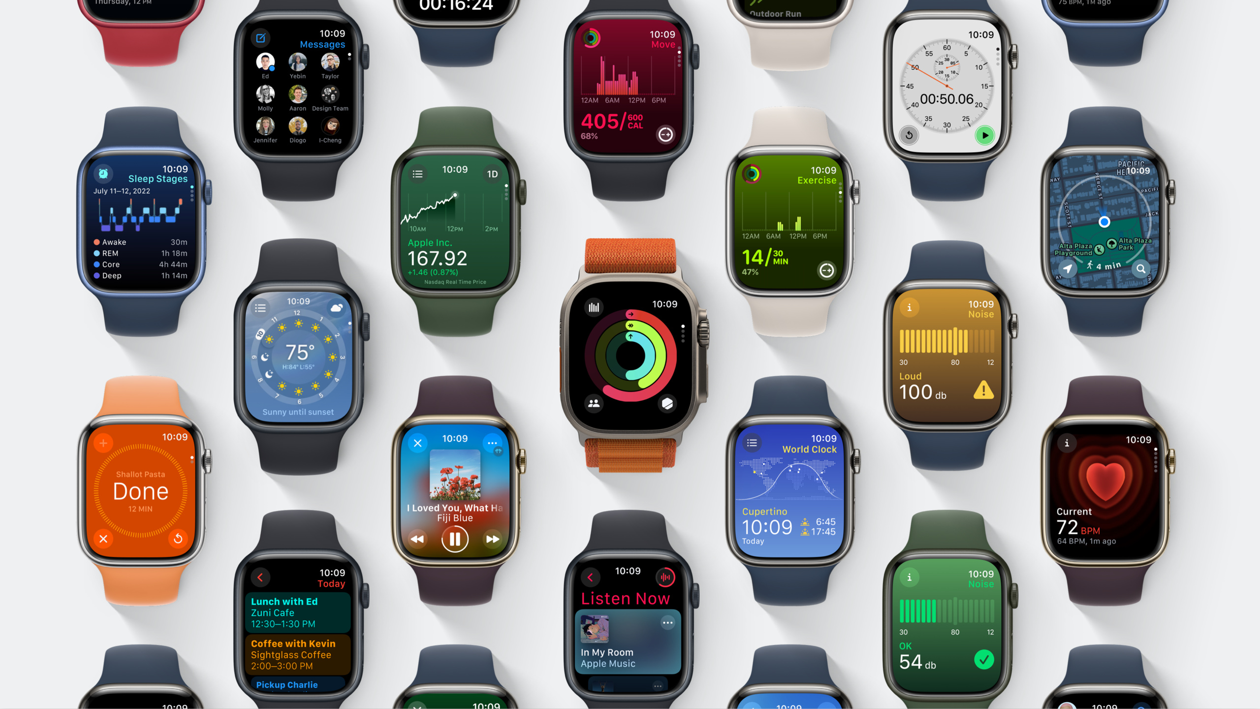
Highlight
watchOS 10 redesigns the Apple Watch user interface from the ground up: three foundational layouts—Dial, Infographic, and List—replace horizontal paging with vertical paging, simplify deep navigation with source lists, and use translucent materials and semantic backgrounds to make every screen easier to scan.
Core Content
Why apps on a small screen are hard to use
From the Apple Watch launch in 2014 through 2023, hardware evolved several generations—larger, brighter displays, Always-On, cellular, and more sensors. App design patterns did not keep pace.
Three pain points persisted.
First, navigation was inconsistent. Some apps used horizontal paging (swipe left/right), some used hierarchical push/pop, and some mixed both. Gestures users learned in system apps stopped working in third-party apps.
Second, layout was ad hoc. Every app chose its own button placement, label sizes, and content boundaries. Side by side, apps looked visually unrelated.
Third, information density was hard to control. Too much text on a small screen is unreadable; too little wastes space. There were no system rules for “how much belongs on one screen.”
watchOS 10’s design system overhaul
watchOS 10 rebuilt the design system. The core idea: define layout rules from the physical shape of the display, not from each app’s individual taste.
Apple defined three foundational layouts (01:40):
- Dial: for a single key value—a timer, a stopwatch. Information sits in the center with space around it.
- Infographic: for complex data with context—Activity rings, weather details. A large area for the main content, supplementary info at the top or bottom.
- List: for multiple items of the same type—mail, contacts, settings.
These layouts adapt automatically to every Apple Watch size watchOS 10 supports. Designers do not calculate pixels; the system controls control size, placement, and spacing.
Navigation is unified too. The Digital Crown drives core navigation—rotate to move between vertical pages, scroll lists, or inspect data. Side button single-click opens Control Center; double-click opens Wallet. The Home Screen scrolls vertically; rotate the Digital Crown to browse downward.
Materials and backgrounds carry information
watchOS 10 introduces a new Materials system. Different layers use semi-transparent effects at different opacities to build visual hierarchy (05:03).
Content can now scroll under the status bar; the status bar stays readable through a translucent material. That frees space that used to sit empty. Elements using semantic system colors automatically adjust contrast against the background material.
Backgrounds are not just decoration. World Clock backgrounds show daylight for the current time zone; Weather backgrounds reflect conditions; Stocks backgrounds use color for up/down trends. In Activity, each infographic page background matches its ring color—Move red, Exercise green, Stand blue (04:28).
Detailed Content
Vertical paging: page changes driven by the Digital Crown
Vertical paging is watchOS 10’s core navigation innovation (02:49).
Older watchOS apps often used horizontal paging (swipe left/right). Two problems: fingers on a small screen cause accidental touches, and swipe gestures cover content.
Vertical paging uses Digital Crown rotation to change pages. In Activity, rotating the Crown moves from the Activity Rings overview to Move detail, Exercise detail, then Stand detail. Page indicators align with the Digital Crown and stay visible on any background.
import SwiftUI

struct ActivityView: View {
    @State private var selection: ActivityTab = .overview

    enum ActivityTab: Hashable {
        case overview
        case moveDetail
        case exerciseDetail
        case standDetail
    }

    var body: some View {
        TabView(selection: $selection) {
            RingOverviewView()
                .tag(ActivityTab.overview)

            MoveDetailView()
                .tag(ActivityTab.moveDetail)

            ExerciseDetailView()
                .tag(ActivityTab.exerciseDetail)

            StandDetailView()
                .tag(ActivityTab.standDetail)
        }
        .tabViewStyle(.verticalPage)
    }
}
Key points:
TabViewwith.tabViewStyle(.verticalPage)enables vertical paging- Users rotate the Digital Crown to switch pages—no finger swiping required
- Each page’s content should fit within one screen height, which forces a clear purpose per page
- Page indicators automatically align with the Digital Crown; the system handles adaptation
Three principles when implementing vertical paging.
Principle 1: limit each page to one screen height. That constraint forces you to decide what each page is for, which makes scanning easier. If content truly needs more, put a scroll view after a fixed-height page. Messages does this: a fixed first page for pinned conversations, then a scrolling list of regular threads.
Principle 2: shared elements across pages should animate, not duplicate. If Activity rings appear on both overview and detail pages, use scale, position, and density changes—not a new instance on each page. This “object constancy” gives users a visual anchor so they know they are viewing different layers of the same thing.
Principle 3: prefer vertical paging over horizontal paging. The Digital Crown rotates vertically; vertical paging feels more natural.
Source list navigation: two levels instead of many
The source list is another new navigation pattern for “multiple entities sharing the same kind of information” (03:36).
Take World Clock. Users care about local time in several cities. Source list design: open the app directly to the selected city’s detail; a source list button in the top-left opens the city list; pick another city and return to detail.
Compare to traditional hierarchy: “list → tap → detail → back → list.” Source list: “detail (default) → tap button → switch city → new detail.” Users spend most of their time on detail; switching cities stays lightweight.
import SwiftUI

struct WorldClockView: View {
    @State private var cities: [City] = [
        City(name: "San Francisco", timeZone: "PST"),
        City(name: "New York", timeZone: "EST"),
        City(name: "London", timeZone: "GMT"),
    ]
    @State private var selectedCity: City?

    var body: some View {
        NavigationSplitView {
            List(cities, selection: $selectedCity) { city in
                CityRow(city: city)
            }
        } detail: {
            if let city = selectedCity {
                CityDetailView(city: city)
            } else {
                ContentUnavailableView("Select a City", systemImage: "globe")
            }
        }
    }
}
Key points:
NavigationSplitViewis a new watchOS 10 container that provides source list navigation automatically- The sidebar is the entity list; the detail area shows the selected entity
- The system handles navigation animations and back behavior
- No manual navigation stack management
Traditional hierarchical navigation still exists in watchOS 10, but Apple recommends it only when content cannot be expressed with a source list or vertical paging. Settings and Mail are good fits—their structure is naturally multi-level. watchOS 10 adds new transition animations for hierarchical navigation so users know which level they are entering.
Background content: color that communicates
In watchOS 10, background content communicates information—it is not pure decoration (04:28).
import SwiftUI

struct ActivityDetailView: View {
    var type: ActivityType

    var body: some View {
        ZStack {
            // Background color matches Activity type so users sense where they are
            type.backgroundColor
                .ignoresSafeArea()

            VStack(spacing: 12) {
                Text(type.title)
                    .font(.title3)
                    .foregroundStyle(.primary)

                Text("\(type.progress, format: .percent)")
                    .font(.system(size: 48, weight: .bold))
                    .foregroundStyle(.primary)
            }
        }
    }
}

enum ActivityType {
    case move, exercise, stand

    var backgroundColor: Color {
        switch self {
        case .move: return .red.opacity(0.15)
        case .exercise: return .green.opacity(0.15)
        case .stand: return .blue.opacity(0.15)
        }
    }

    var title: String {
        switch self {
        case .move: return "Move"
        case .exercise: return "Exercise"
        case .stand: return "Stand"
        }
    }

    var progress: Double {
        switch self {
        case .move: return 0.75
        case .exercise: return 0.5
        case .stand: return 0.83
        }
    }
}
Key points:
- Background color is not just aesthetic—Move/Exercise/Stand each use a distinct color so users know which page they are on at a glance
opacity(0.15)keeps the background light enough that foreground text stays readable- Foreground text uses
.primarysemantic color; the system adjusts contrast automatically - Backgrounds can use color, gradients, or animation, but they must convey extra information
Materials: reclaim space at the top of the screen
watchOS 10’s material system uses semi-transparent effects to separate layers (05:03).
Content below the status bar can now extend to the very top of the screen; the status bar stays readable through a translucent overlay.
import SwiftUI

struct WeatherDetailView: View {
    var body: some View {
        NavigationStack {
            ScrollView {
                VStack(alignment: .leading, spacing: 16) {
                    // Content starts at the top—no need to avoid the status bar
                    CurrentConditionsView(temperature: 72, condition: "Sunny")
                    HourlyForecastView()
                    TenDayForecastView()
                }
            }
            .toolbarBackground(.ultraThinMaterial, for: .navigationBar)
            .navigationTitle("San Francisco")
        }
    }
}
Key points:
.toolbarBackground(.ultraThinMaterial, for: .navigationBar)gives the navigation bar a translucent material- While scrolling, content passes beneath the semi-transparent area, maximizing usable space
- Status bar text stays readable; the system adjusts color automatically
- No manual padding reserved for the status bar
Digital Crown as a data inspection tool
When you are not navigating a list or switching pages, the Digital Crown can inspect data (03:36).
World Clock is a good example. On the detail page you see the selected city’s time; rotating the Crown adjusts time forward and back—useful for “if I call my London colleague at 8 PM, what time is it there?”
import SwiftUI

struct WorldClockDetailView: View {
    @State private var timeOffset: TimeInterval = 0

    var body: some View {
        VStack {
            Text(adjustedTime, style: .time)
                .font(.system(size: 56, weight: .medium))
                .focusable()
                .digitalCrownRotation(
                    $timeOffset,
                    from: -12 * 3600,
                    through: 12 * 3600,
                    by: 300,
                    sensitivity: .low,
                    isContinuous: true
                )

            Text("Current: \(Date.now, style: .time)")
                .font(.caption)
                .foregroundStyle(.secondary)
        }
    }

    var adjustedTime: Date {
        Date.now.addingTimeInterval(timeOffset)
    }
}
Key points:
.digitalCrownRotationbinds Digital Crown rotation to aTimeIntervalvaluefrom:through:defines the offset range (-12 to +12 hours)by: 300sets the step to 5 minutessensitivity: .lowreduces sensitivity for fine adjustmentisContinuous: trueallows the value to wrap at the boundaries
Core Takeaways
-
Redesign your app’s information architecture with vertical paging: if your app uses horizontal paging or deep multi-level navigation, switch to vertical paging. Put one core piece of information on each page; users rotate the Digital Crown to move between them. Why it’s worth doing: vertical paging is watchOS 10’s native navigation mode—all system apps use it. Users do not need to learn new gestures. How to start: replace horizontal swipes with
TabView+.tabViewStyle(.verticalPage)and keep each page within one screen height. -
Introduce semantic backgrounds for each functional area: change background color based on content context—a weather app by conditions, a fitness app by activity type. Why it’s worth doing: system apps already use semantic backgrounds; users expect it. Color gives instant visual cues and reduces time to recognize state. How to start: in SwiftUI, place a background layer in a
ZStackand switch color or gradient by data state; keep opacity around 0.1–0.2. -
Replace deep navigation with source lists: if your app manages multiple entities of the same kind (accounts, devices, projects), use source list navigation. Open directly to the default entity’s detail; put a switch button in the top-left. Why it’s worth doing: one fewer navigation level. Users spend most of their time on detail and switch entities occasionally. How to start: use
NavigationSplitViewwith the entity list in the sidebar and detail content on the right. -
Use materials to maximize content space: use space previously reserved for the status bar and let content extend to the top of the screen. Why it’s worth doing: every pixel on Apple Watch counts; materials reclaim space that used to go unused. How to start: use
.toolbarBackground(.ultraThinMaterial, for: .navigationBar)with aScrollView. -
Connect pages with object-constancy animation: when the same data element appears on multiple vertical pages, transition with scale and position—do not instantiate two copies. Why it’s worth doing: it gives users a visual anchor so they know they are viewing different layers of the same thing. How to start: in SwiftUI, use
matchedGeometryEffectfor shared elements across pages.
Related Sessions
- Bring widgets to life — watchOS 10’s Smart Stack and widget system, tightly integrated with the new design language
- Build custom workouts with WorkoutKit — WorkoutKit is a new watchOS 10 framework for presenting workout data with the new layouts
- What’s new in SwiftUI — watchOS 10’s design system is implemented in SwiftUI, with new APIs including
NavigationSplitView,.verticalPage, and.digitalCrownRotation - Update your app for watchOS 10 — a practical guide to migrating existing watchOS apps to the new design language
Comments
GitHub Issues · utterances