
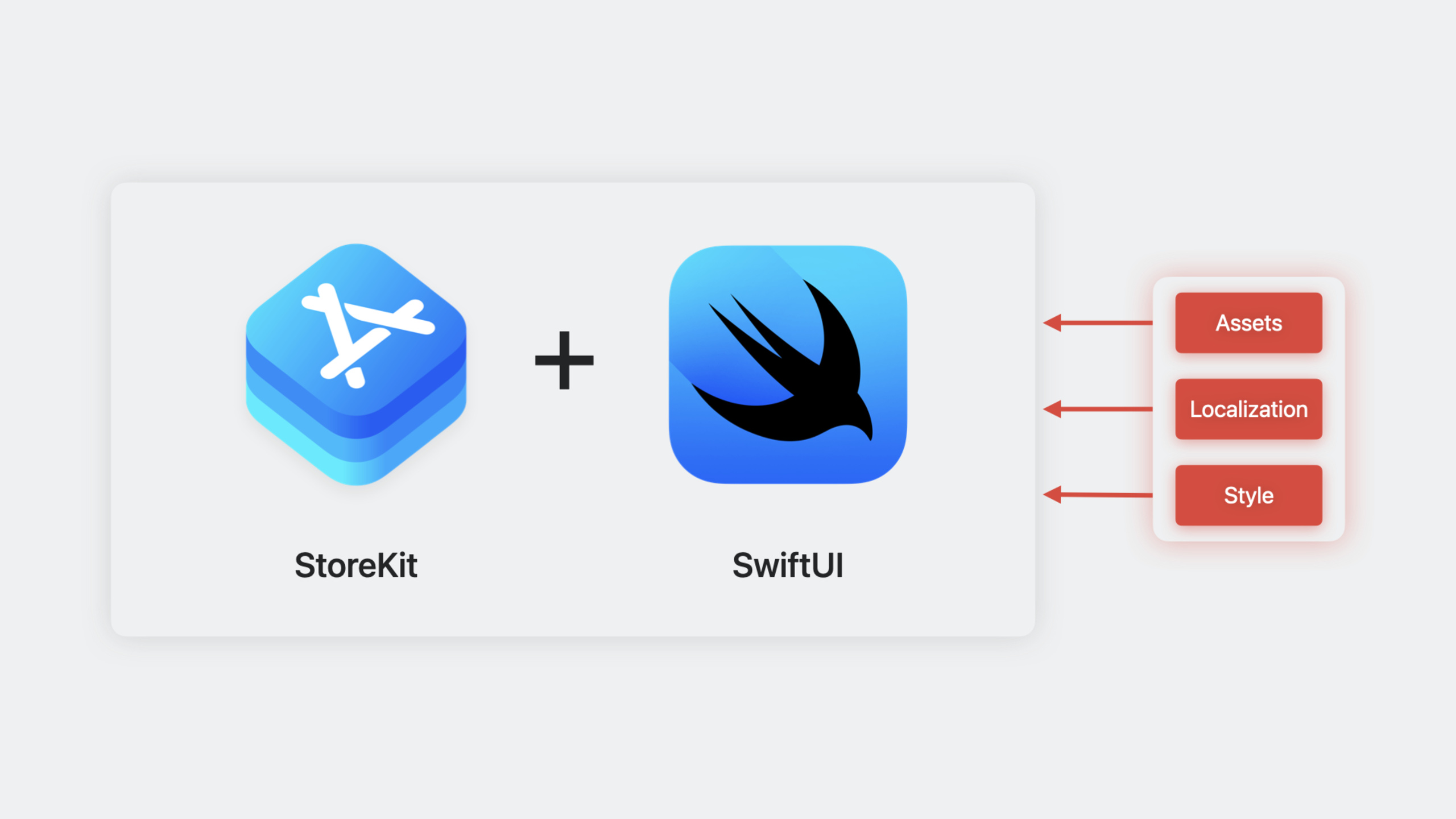
Highlight
Apple introduced a set of SwiftUI-native views in StoreKit (
StoreView,ProductView,SubscriptionStoreView) that let developers display and sell in-app purchases and subscriptions in their apps with just a few lines of code, with Xcode Previews support for real-time preview without manually configuring screenshots in App Store Connect.
Core Content
Before iOS 17, building an in-app purchase store page in your app required significant work: loading product lists, monitoring purchase status, handling transaction callbacks, and writing your own UI layout. Supporting subscriptions meant additional logic for free trials, discount offers, upgrades, downgrades, and more. A complete store page could easily run to hundreds of lines of code, and every debug session required a real device.
StoreKit in iOS 17 provides three SwiftUI view groups that encapsulate product loading, display, and purchase flows. Developers only need to provide product IDs—the views automatically fetch metadata (name, price, description) from the App Store and render the complete UI.
The three view groups are:
- StoreView — A collection view for displaying one-time purchase products (non-consumables, consumables)
- ProductView — A view for displaying a single product with customizable layout
- SubscriptionStoreView — A view for displaying subscription product groups, automatically handling free trials, discounts, upgrades, and related display logic
Let’s look at how to use each of these three view groups.
Detailed Content
StoreView: Build a product shelf in a few lines of code
StoreView is the simplest entry point. Give it a set of product IDs and it automatically fetches metadata and renders with the default style.
(03:35) Start with the basics. Create a BirdFoodShop view:
import SwiftUI
import StoreKit

struct BirdFoodShop: View {
    @Query var birdFood: [BirdFood]

    var body: some View {
        StoreView(ids: birdFood.productIDs)
    }
}
Key points:
import StoreKitbrings in the StoreKit framework to use these new viewsStoreView(ids:)accepts a set of product IDs ([String]) and automatically fetches corresponding product metadata from App Store Connect- You don’t need to manually call
SKProductRequestor manage loading/error states @Queryis SwiftData’s property wrapper, used here to fetch the product ID list from the bird food data model
(04:51) If the default product icons aren’t distinctive enough, pass a closure to customize the decorative icon for each product:
StoreView(ids: birdFood.productIDs) { product in
    BirdFoodProductIcon(productID: product.id)
}
StoreView uses the .compact style by default. You can also specify the style explicitly:
StoreView(ids: birdFood.productIDs) { product in
    BirdFoodProductIcon(productID: product.id)
}
.productViewStyle(.compact)
ProductView: Custom layout and styling
When you want to design your own store layout, ProductView is the more flexible choice. It represents a single product view that you can place in any SwiftUI layout container.
(06:47) Place ProductView in a ScrollView + VStack for manual layout:
ScrollView {
    VStack(spacing: 10) {
        if let (birdFood, product) = birdFood.bestValue {
            ProductView(id: product.id) {
                BirdFoodProductIcon(
                    birdFood: birdFood,
                    quantity: product.quantity
                )
            }
            .padding()
            .background(.background.secondary, in: .rect(cornerRadius: 20))
            .padding()
            .productViewStyle(.large)
        }
    }
    .scrollClipDisabled()

    Text("Other Bird Food")
        .font(.title3.weight(.medium))
        .frame(maxWidth: .infinity, alignment: .leading)

    ForEach(birdFood.premiumBirdFood) { birdFood in
        BirdFoodShopShelf(title: birdFood.name) {
            ForEach(birdFood.orderedProducts) { product in
                ProductView(id: product.id) {
                    BirdFoodProductIcon(
                        birdFood: birdFood,
                        quantity: product.quantity
                    )
                }
            }
        }
    }
}
.contentMargins(.horizontal, 20, for: .scrollContent)
Key points:
ProductView(id:)accepts a single product ID and automatically loads and displays that product- The second parameter is a decorative icon closure, customizable like
StoreView .productViewStyle(.large)specifies the large style, suited for featured product display- Placing
ProductViewinForEach+VStackmanually implementsStoreView’s layout capability .productViewStyle(.compact)is the default style, suited for list display
(21:25) Use a promotional icon to make a product visually stand out:
ProductView(
    id: ids.nutritionPelletBox,
    prefersPromotionalIcon: true
) {
    BoxOfNutritionPelletsIcon()
}
prefersPromotionalIcon: true uses a larger icon size, suited for highlighting a recommended product in a product list.
(21:56) You can also add a border to the icon:
ProductView(id: ids.nutritionPelletBox) {
    BoxOfNutritionPelletsIcon()
        .productIconBorder()
}(20:52) Show a placeholder icon while loading:
ProductView(id: ids.nutritionPelletBox) {
    BoxOfNutritionPelletsIcon()
} placeholderIcon: {
    Circle()
}
placeholderIcon displays while product metadata hasn’t finished loading, avoiding blank UI.
Custom ProductViewStyle
(23:02) The ProductViewStyle protocol lets you fully control the appearance and behavior of product views. Built-in styles are .compact and .large, but you can write your own:
struct SpinnerWhenLoadingStyle: ProductViewStyle {
    func makeBody(configuration: Configuration) -> some View {
        switch configuration.state {
        case .loading:
            ProgressView()
                .progressViewStyle(.circular)
        default:
            ProductView(configuration)
        }
    }
}
Usage:
ProductView(id: ids.nutritionPelletBox) {
    BoxOfNutritionPelletsIcon()
}
.productViewStyle(SpinnerWhenLoadingStyle())
Key points:
- The
ProductViewStyleprotocol has only one method:makeBody(configuration:) configuration.statehas four states:.loading,.failure(let error),.unavailable,.success(let product)- Show a spinner during loading; fall back to the default
ProductView(configuration)in other cases
(23:58) A more complete custom style example with full control over each state:
struct BackyardBirdsStyle: ProductViewStyle {
    func makeBody(configuration: Configuration) -> some View {
        switch configuration.state {
        case .loading:
            ProgressView()
        case .failure(let error):
            Text("Loading failed")
        case .unavailable:
            Text("Unavailable")
        case .success(let product):
            HStack(spacing: 12) {
                configuration.icon
                VStack(alignment: .leading, spacing: 10) {
                    Text(product.displayName)
                    Button(product.displayPrice) {
                        configuration.purchase()
                    }
                    .bold()
                }
            }
            .backyardBirdsProductBackground()
        }
    }
}
Key points:
configuration.iconis the decorative icon closure you passed earlierconfiguration.purchase()triggers the purchase flowproduct.displayNameandproduct.displayPriceare fields from App Store metadata, automatically localized
SubscriptionStoreView: One-tap subscription store generation
SubscriptionStoreView is designed specifically for subscriptions. It automatically handles subscription-specific display needs like free trials, discounts, and multi-tier comparisons.
(09:57) Basic usage:
import SwiftUI
import StoreKit

struct BackyardBirdsPassShop: View {
    @Environment(\.shopIDs.pass) var passGroupID

    var body: some View {
        SubscriptionStoreView(groupID: passGroupID)
    }
}
groupID is the subscription group ID configured in App Store Connect. SubscriptionStoreView automatically loads and displays all subscription tiers in that group.
(10:38) Add marketing content at the top of the subscription page:
SubscriptionStoreView(groupID: passGroupID) {
    PassMarketingContent()
}
The passed closure is the marketing area content—you can place a logo, promotional image, feature descriptions, and more.
(10:57) Set full-height background and styling:
SubscriptionStoreView(groupID: passGroupID) {
    PassMarketingContent()
        .lightMarketingContentStyle()
        .containerBackground(for: .subscriptionStoreFullHeight) {
            SkyBackground()
        }
}
.backgroundStyle(.clear)
.containerBackground(for: .subscriptionStoreFullHeight) sets the background for the entire subscription page, extending from the top marketing area through the subscription options area.
(11:21) Control subscription button label styling:
.subscriptionStoreButtonLabel(.multiline).multiline lets button labels support multiple lines, suited for displaying longer subscription descriptions.
(11:44) Set picker item background material:
.subscriptionStorePickerItemBackground(.thinMaterial)(12:20) Show the redeem code button:
.storeButton(.visible, for: .redeemCode)(31:22) Switch control style to buttons (default is picker style):
.subscriptionStoreControlStyle(.buttons)Button style displays each subscription tier as an independent button rather than a Picker-style single-select list.
(33:44) Customize icons for each subscription tier:
.subscriptionStoreControlIcon { subscription, info in
    Group {
        let status = PassStatus(
            levelOfService: info.groupLevel
        )
        switch status {
        case .premium:
            Image(systemName: "bird")
        case .family:
            Image(systemName: "person.3.sequence")
        default:
            Image(systemName: "wallet.pass")
        }
    }
    .foregroundStyle(.tint)
    .symbolVariant(.fill)
}(35:30) Show only upgrade options (hide current subscription tier):
SubscriptionStoreView(
    groupID: passGroupID,
    visibleRelationships: .upgrade
) {
    PremiumMarketingContent()
        .containerBackground(for: .subscriptionStoreFullHeight) {
            SkyBackground()
        }
}
visibleRelationships: .upgrade shows only subscription options higher than the current tier, suited for users who already subscribe and want to upgrade.
(30:32) Show App Store privacy policy and terms links:
.subscriptionStorePolicyForegroundStyle(.white)
.storeButton(.visible, for: .policies)(29:56) Customize sign-in behavior:
@State var presentingSignInSheet = false

var body: some View {
    SubscriptionStoreView(groupID: passGroupID) {
        PassMarketingContent()
            .containerBackground(for: .subscriptionStoreFullHeight) {
                SkyBackground()
            }
    }
    .subscriptionStoreSignInAction {
        presentingSignInSheet = true
    }
    .sheet(isPresented: $presentingSignInSheet) {
        SignInToBirdAccountView()
    }
}
If users need to sign in to your app account before purchasing (for example, to link subscription status to an existing account), you can intercept the default sign-in flow via .subscriptionStoreSignInAction and present your own sign-in page.
Handling purchase results
(14:10) Listen for purchase completion on the view:
BirdFoodShop()
    .onInAppPurchaseCompletion { (product: Product, result: Result<Product.PurchaseResult, Error>) in
        if case .success(.success(let transaction)) = result {
            await BirdBrain.shared.process(transaction: transaction)
            dismiss()
        }
}(15:43) Listen for purchase start events (suited for showing loading state):
BirdFoodShop()
    .onInAppPurchaseStart { (product: Product) in
        self.isPurchasing = true
    }
Querying subscription status
(16:57) Use subscriptionStatusTask to query the current user’s subscription status:
subscriptionStatusTask(for: passGroupID) { taskState in
    if let statuses = taskState.value {
        passStatus = await BirdBrain.shared.status(for: statuses)
    }
}(19:37) For non-consumables, use currentEntitlementTask to check purchase eligibility:
currentEntitlementTask(for: "com.example.id") { state in
    self.isPurchased = BirdBrain.shared.isPurchased(
        for: state.transaction
    )
}
Handling product loading state
(26:44) When you need finer control over the loading flow, use storeProductsTask:
@State var productsState: Product.CollectionTaskState = .loading

var body: some View {
    ZStack {
        switch productsState {
        case .loading:
            BirdFoodShopLoadingView()
        case .failed(let error):
            ContentUnavailableView(/* ... */)
        case .success(let products, let unavailableIDs):
            if products.isEmpty {
                ContentUnavailableView(/* ... */)
            } else {
                BirdFoodShop(products: products)
            }
        }
    }
    .storeProductsTask(for: productIDs) { state in
        self.productsState = state
    }
}
Key points:
storeProductsTask(for:)loads products asynchronously and updates state via callbackProduct.CollectionTaskStatehas three states:.loading,.failed(let error),.success(let products, let unavailableIDs)- Display different UI based on state: loading, load failure, empty result, or normal content
Core Takeaways
1. Quickly add an in-app purchase store to an existing app
If your app currently displays product pages in a WebView or has no in-app purchase store at all, you can now create a new page, drop in a StoreView or SubscriptionStoreView, pass product IDs, and have a complete native store page. Product metadata, price localization, and purchase buttons are all handled automatically.
Entry API: StoreView(ids:) or SubscriptionStoreView(groupID:)
2. Build a product detail page with a “hero” item
Use ProductView + .productViewStyle(.large) to enlarge and showcase the best-value product at the top, with other products listed below in .compact style. prefersPromotionalIcon: true makes the hero product’s icon more prominent.
Entry API: ProductView(id:prefersPromotionalIcon:content:) + .productViewStyle(.large)
3. Build a subscription tier comparison page
SubscriptionStoreView’s default Picker style already provides tier comparison. But if you want a more custom comparison, switch to button layout with .subscriptionStoreControlStyle(.buttons), then add custom icons and descriptions for each tier. Use visibleRelationships: .upgrade for a dedicated upgrade page.
Entry API: SubscriptionStoreView(groupID:visibleRelationships:content:)
4. Combine with SwiftData for a dynamic product shelf
The example uses @Query var birdFood: [BirdFood] to fetch data from SwiftData, then passes productIDs from the data model to StoreView. You can maintain a local product catalog in your app (categories, sorting, recommendation logic) and hand the corresponding product ID list to StoreKit views for rendering.
Entry API: @Query + StoreView(ids:)
5. Write a custom ProductViewStyle for a branded store
If your app has a distinctive design style, the built-in .compact and .large styles may not be enough. By implementing the ProductViewStyle protocol, you can fully control how each product is displayed—from loading state animations to purchase button styling to the entire card layout.
Entry API: ProductViewStyle protocol, makeBody(configuration:) method
Related Sessions
- What’s new in StoreKit and In-App Purchase — Learn about more StoreKit improvements in later versions
- Explore App Store server APIs for In-App Purchase — Server-side verification and handling of in-app purchase transactions
- What’s new in SwiftUI — Learn about the latest SwiftUI features to use alongside StoreKit views
- What’s new in SwiftData — The example uses SwiftData; learn how to model and manage data
Comments
GitHub Issues · utterances