
Highlight
The San Francisco font family added three new font width variants (Condensed, Compressed, Expanded) at WWDC22, which are combined with the original font weights to form a richer typography level; SF Arabic and SF Arabic Rounded were also launched, extending the SF design language to the Arabic language family.
Core Content
San Francisco font family overview
San Francisco, the system font for Apple platforms, has evolved over the years to form a fully functional font family. Different sub-families are optimized for different scenarios:
- SF Pro / SF Pro Rounded: Main system font for iOS, iPadOS, macOS, tvOS
- SF Compact / SF Compact Rounded: optimized for narrow columns and small font sizes, watchOS default font
- SF Mono: Monospace font, used in coding environments such as Xcode and Swift Playgrounds
Each family provides a complete font weight gradient from Ultralight to Black, as well as automatic adjustment of optical sizes - the system automatically fine-tunes stroke thickness, font cavity opening and font spacing according to the font size. Large font sizes are more elegant, and small font sizes are clearer.
Three new font widths: a new dimension of typesetting control
Before WWDC22, SF Pro only had one font width: Regular. Three new members have now been added:
Condensed: Narrower than Regular, but still maintaining a comfortable reading ratio. Suitable for placing more text in limited space, such as reducing news headlines from five lines to four.
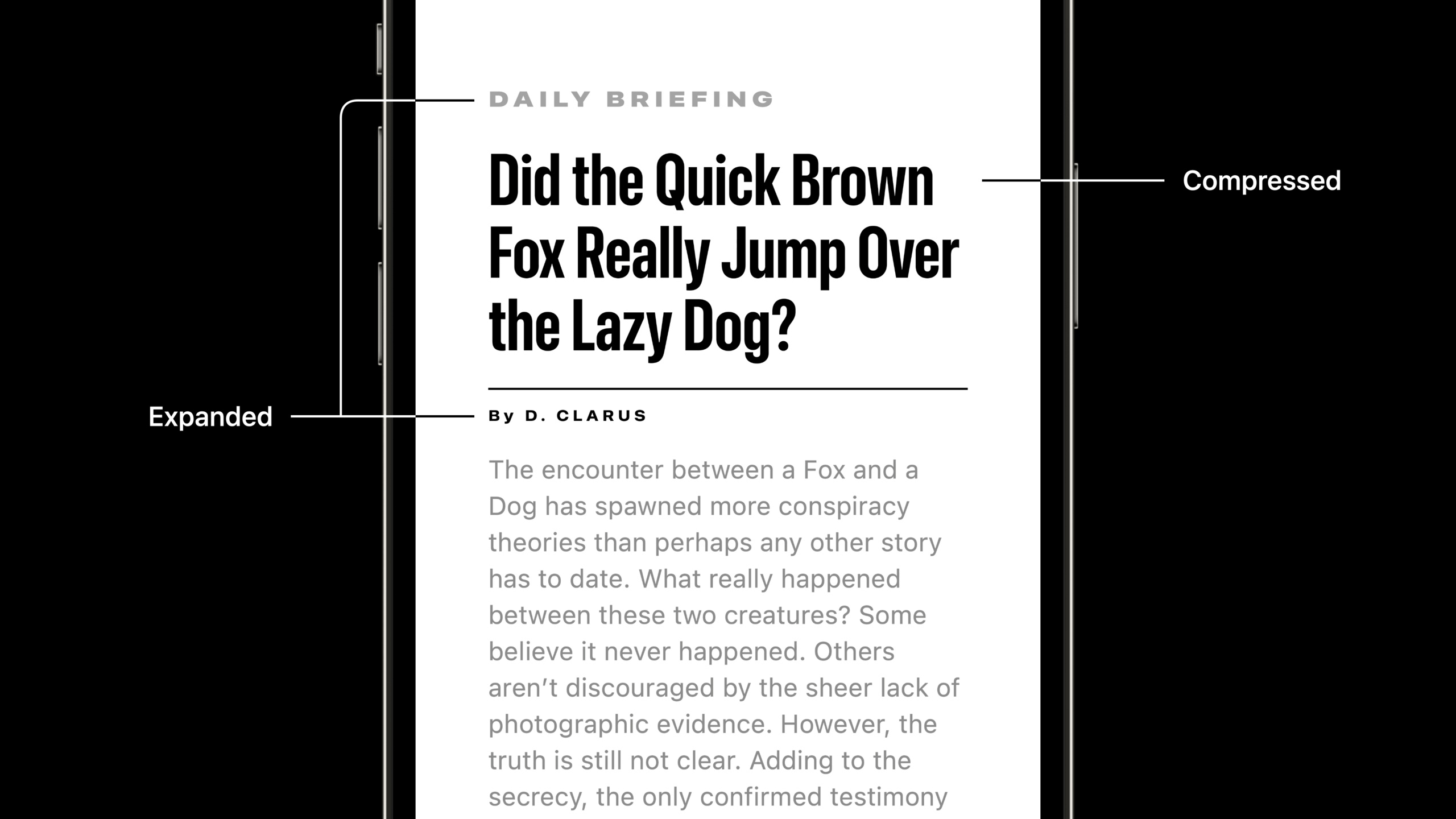
Compressed: The most compact font width in SF currently, and the flat stroke shape makes it very graphic. Suitable for large font titles and short tags, but not suitable for reading long paragraphs.
Expanded: Loose and open stroke proportions are visually impactful. Suitable for display layout, geographical tags on maps, or as a title to contrast with the main text.
These widths and weights combine to form a “style map”: the center area (Regular width with medium weight) is the most neutral and versatile; the edge area (extreme weight and width combinations) is more expressive and suitable for attracting attention.
Practical application cases
Photos’ Memories title: Use Compressed and Expanded to create a strong contrast. Large font sizes and different font widths make the text itself a visual element and jump out from the UI background.
News headlines: A long headline can be shortened from five lines to four lines using Condensed, and even to three lines using Compressed. The space saved is for pictures and abstracts, and the title itself has more presence. Use Expanded to contrast the subtitle with the main title.
Map labels in Maps: Different geographical features are distinguished by different font widths - mountain labels use Expanded with loose font spacing, road labels use Condensed, and countries and continents use Regular. The layout system of the entire map is both unified and hierarchical.
Arabic fonts: SF Arabic and SF Arabic Rounded
WWDC21 introduces SF Arabic, based on a modern interpretation of the Naskh style, visually harmonious with the San Francisco family. Supports full font weights from Ultralight to Black, as well as optical sizes optimized for Arabic - Text style strokes have high contrast and wide font spacing to ensure readability; Display style geometry is more concise, consistent with the modern feel of SF.
WWDC22 adds SF Arabic Rounded. The rounded corner design enriches the expressiveness of Arabic typography and has been used in apps such as Reminders and Fitness.
Detailed Content
Visual effect of word width contrast
(07:52)
Comparison of the same text, the same font weight, and different font widths:
| Font width | Features | Applicable scenarios |
|---|---|---|
| Expanded | The loosest and most visually impactful | Headline, map label, subtitle |
| Regular | Standard ratio, most common | Body text, most UI text |
| Condensed | Narrow, still readable | Space-constrained titles, long tags |
| Compressed | The most compact, strong graphic sense | Short title, large font display |
Key insight: The vertical proportions of different font widths are exactly the same, and there is no need to adjust font sizes to align when mixed. Only the horizontal proportions change, and the visual scale remains consistent when replacing fonts.
Font pairing strategy
(09:48)
Three ways to establish typography hierarchy:
Same word width, compare word weight:
Text("Main Title")
    .font(.system(size: 48, weight: .black, design: .default))
    .fontWidth(.expanded)

Text("Subtitle")
    .font(.system(size: 24, weight: .light, design: .default))
    .fontWidth(.expanded)
Same font weight, compare font width:
Text("HEADLINE")
    .font(.system(size: 36, weight: .bold, design: .default))
    .fontWidth(.compressed)

Text("Caption text")
    .font(.system(size: 14, weight: .bold, design: .default))
    .fontWidth(.expanded)
Mixed weights and widths:
Text("EXTREME")
    .font(.system(size: 48, weight: .black, design: .default))
    .fontWidth(.compressed)

Text("contrast")
    .font(.system(size: 48, weight: .ultraLight, design: .default))
    .fontWidth(.expanded)
Using new font widths in SwiftUI
import SwiftUI

struct ContentView: View {
    var body: some View {
        VStack(spacing: 20) {
            Text("Compressed Title")
                .font(.system(size: 32, weight: .bold))
                .fontWidth(.compressed)

            Text("Regular Body Text")
                .font(.body)
                .fontWidth(.standard)

            Text("Expanded Label")
                .font(.system(size: 16, weight: .medium))
                .fontWidth(.expanded)
        }
    }
}
Key points:
.fontWidth()It is a new modifier in iOS 16/macOS 13- Optional values:
.compressed、.condensed、.standard、.expanded- and.font()To use together, set the font size and weight first, then adjust the font width. - The system will automatically select the corresponding optical size
Used in UIKit
import UIKit

let label = UILabel()
let descriptor = UIFontDescriptor.preferredFontDescriptor(withTextStyle: .headline)
    .withDesign(.default)
    .withSymbolicTraits(.traitExpanded)

if let expandedDescriptor = descriptor {
    label.font = UIFont(descriptor: expandedDescriptor, size: 0)
}
Key points:
withSymbolicTraits(.traitCompressed)、.traitCondensed、.traitExpandedControl word width -withDesign(.default)Make sure to use SF Pro- Passing 0 for font size means using the default font size in the descriptor
Arabic font support
// The system automatically selects SF Arabic based on the current locale
Text("مرحبا بالعالم")
    .font(.largeTitle)

// Explicitly specify the design variant
Text("Hello")
    .font(.system(size: 24, design: .rounded))
Key points:
- SF Arabic and SF Arabic Rounded are system fonts and do not require additional installation
- When the device language is set to Arabic, the system automatically calls SF Arabic
- Optical size, font weight, rounded corner variants are consistent with the Latin version of the design language
Core Takeaways
1. Design a hierarchical title system for reading apps
- What to do: Use different font widths to create title hierarchies in news, blogs, and reading apps, instead of relying solely on font size distinctions
- Why it’s worth doing: Condensed makes long titles more compact, Expanded makes subtitles more breathable, and text levels within the same page are richer.
- How to start: Use
.fontWidth(.compressed)Make a first-level title,.fontWidth(.standard)Make a secondary title,.fontWidth(.expanded)Make tags and metadata
2. Build data-intensive dashboards
- What to do: Use Compressed font width to display large numbers in limited space in stock, weather, fitness data panels
- Why it’s worth doing: Compressed takes up the least horizontal space at the same font size, allowing you to put larger numbers in small cards to improve readability.
- How to start: Key indicator numbers are used
.fontWidth(.compressed)+.weight(.bold), the unit and decimal part are contrasted with Regular font width.
3. Design a global app that is consistent in multiple languages
- What: Optimize the app interface for the Arabic market, leveraging SF Arabic’s optical size and weight system
- Why it’s worth it: SF Arabic and SF Pro are visually coordinated, and there will be no separation of font styles when mixed. Complete font weight support makes the typesetting hierarchy equally clear in the Arabic interface.
- How to get started: Make sure to use system fonts (
.font(.body)etc.) instead of hardcoding font names, check RTL adaptation and font weight consistency when testing Arabic layouts
4. Make expressive onboarding and empty status pages
- What to do: Use extreme font width combinations to create visual memory points in the app’s onboarding page and empty status page
- Why it’s worth doing: The contrast between Compressed + Black and Expanded + Light is so impactful that the text itself becomes an illustration element
- How to start: For headlines
.fontWidth(.compressed).fontWeight(.black), for auxiliary text.fontWidth(.expanded).fontWeight(.light), creating a strong contrast with the large font size
Related Sessions
- The details of UI typography — An in-depth understanding of the optical size, variable fonts and dynamic typography mechanisms of SF fonts
- Design for Arabic — Interface design principles and best practices for Arabic users
- Adopt Variable Color in SF Symbols — Integration and application of SF Symbols variable color and typesetting system
Comments
GitHub Issues · utterances