
Highlight
iOS 16 and iPadOS 16 bring Mac-level capabilities to the SwiftUI toolbar: overflow menu automatic folding, secondary action placement, user-customizable toolbars, ControlGroup grouping, editable navigation titles and document associations, making the toolbar of iPad applications no longer just an enlarged version of the iPhone.
Core Content
From manual Menu to automatic Overflow
(02:05)
Many developers are accustomed to using a “More” menu to store toolbar buttons on the iPhone. On the iPad’s large screen, this wastes available space.
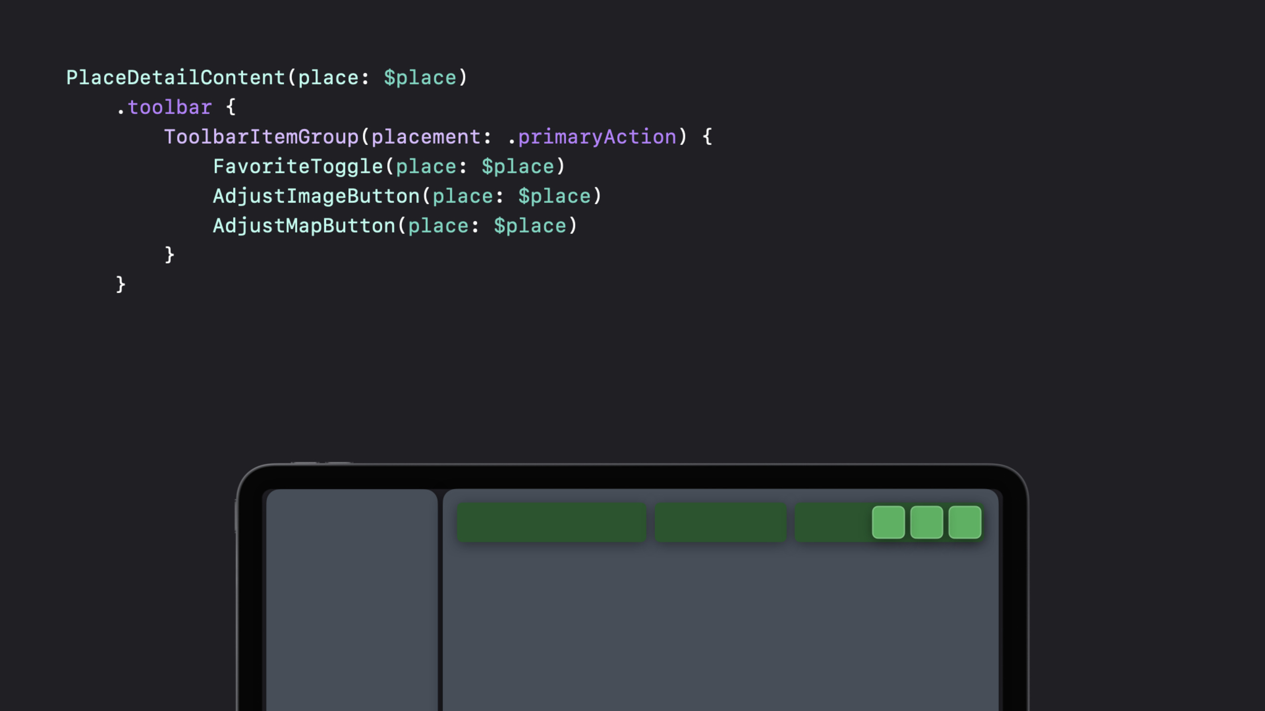
The solution for iOS 16 is the overflow menu: the system will automatically put the buttons that cannot be placed into the menu, without you having to manually write the Menu.
BundleToolbarItemChange toToolbarItemGroup, remove the manually wrapped Menu, and use the button directly as the content of the group:
PlaceDetailContent(place: $place)
    .toolbar {
        ToolbarItemGroup(placement: .primaryAction) {
            FavoriteToggle(place: $place)
            AdjustImageButton(place: $place)
            AdjustMapButton(place: $place)
        }
    }
Key Points:
-ToolbarItemGroupA separate toolbar item is created for each subview
- On iPad and Mac, the system will automatically move items that cannot fit into the overflow menu
- No need to manually maintain Menu expansion logic
Secondary Action and ToolbarRole
(04:05)
The navigation bar has three areas: leading (left), center (middle), and trailing (right). Leading and trailing are used for controls, and center is used for navigation titles.
New in iOS 16.secondaryActionplacement. This type of operation is not used very frequently, but it deserves to be shown on its own. By default they are not displayed directly on the toolbar, but instead go into the overflow menu.
usetoolbarRole(.editor)Change layout behavior:
PlaceDetailContent(place: $place)
    .toolbar {
        ToolbarItemGroup(placement: .secondaryAction) {
            FavoriteToggle(place: $place)
            AdjustImageButton(place: $place)
            AdjustMapButton(place: $place)
        }
    }
    .toolbarRole(.editor)
Key Points:
-.editorThe role tells the navigation bar “This page is for editing content”
- The navigation bar will move the title from center to leading, freeing up the center area for secondary actions
- On compact size class (such as iPhone portrait screen), the title remains in the center
User-definable toolbar
(05:37)
macOS has long supported toolbar customization, and iPadOS 16 also introduces this capability.
Three conditions are required to enable customization:
PlaceDetailContent(place: $place)
    .toolbar(id: "place") {
        ToolbarItem(id: "favorite", placement: .secondaryAction) {
            FavoriteToggle(place: $place)
        }
        ToolbarItem(id: "image", placement: .secondaryAction) {
            AdjustImageButton(place: $place)
        }
        ToolbarItem(id: "map", placement: .secondaryAction) {
            AdjustMapButton(place: $place)
        }
    }
    .toolbarRole(.editor)
Key Points:
- each
ToolbarItemThere must be a uniqueid, and remain consistent across launches -toolbarThe modifier itself also requires aid- onlyToolbarItemSupport customization,ToolbarItemGroupNot supported - On iPad, only secondary actions support customization, but primary actions do not.
Buttons hidden by default
(06:59)
Some actions are useful to certain groups of users, but should not be shown by default. useshowsByDefault: falseLet these buttons initially stay in the custom panel:
ToolbarItem(id: "share", placement: .secondaryAction, showsByDefault: false) {
    ShareLink(item: place)
}
Users can drag such buttons from the customization panel onto the toolbar.
ControlGroup grouping
(07:45)
Related buttons are availableControlGroupGroup together, add or remove as a whole:
ToolbarItem(id: "image", placement: .secondaryAction) {
    ControlGroup {
        AdjustImageButton(place: $place)
        AdjustMapButton(place: $place)
    } label: {
        Label("Edits", systemImage: "wand.and.stars")
    }
}
Key Points:
- Provide
labelFinally, the entire group collapses into a menu when there is insufficient space - No
labelWhen the space is insufficient, the buttons will enter the overflow menu one by one. - Users can add or remove the entire ControlGroup as a unit
Detailed Content
Complete toolbar configuration example
PlaceDetailContent(place: $place)
    .toolbar(id: "place") {
        ToolbarItem(id: "new", placement: .primaryAction) {
            NewButton()
        }
        ToolbarItem(id: "favorite", placement: .secondaryAction) {
            FavoriteToggle(place: $place)
        }
        ToolbarItem(id: "image", placement: .secondaryAction) {
            ControlGroup {
                AdjustImageButton(place: $place)
                AdjustMapButton(place: $place)
            } label: {
                Label("Edits", systemImage: "wand.and.stars")
            }
        }
        ToolbarItem(id: "share", placement: .secondaryAction, showsByDefault: false) {
            ShareLink(item: place)
        }
    }
    .toolbarRole(.editor)
Key Points:
-id: "new"useprimaryAction, fixed in the trailing area and cannot be customized
-id: "favorite"andid: "image"usesecondaryAction, displayed in the center area by default, can be customized
-id: "share"useshowsByDefault: false, initially hidden in the custom panel
- All ids must be unique and consistent across launches because SwiftUI uses ids to persist the user’s custom configuration
Navigation title menu
(10:44)
Navigation headers now support menus, similar to the macOS File menu:
PlaceDetailContent(place: $place)
    .navigationTitle(place.name) {
        MyPrintButton()
    }
A menu indicator will appear to the right of the title, and when clicked, a menu containing the actions you provide will pop up.
Editable navigation title
(11:07)
Passing in Binding tells the system that this title supports editing:
PlaceDetailContent(place: $place)
    .navigationTitle($place.name) {
        MyPrintButton()
        RenameButton()
    }
Key Points:
-$place.namePass in Binding, the system knows that the title is editable
-RenameButton()Trigger the rename process
- After clicking the RenameButton, the title becomes an editable text box
Associated documents
(11:37)
Associating the document to a view, the title menu will display the document preview header:
PlaceDetailContent(place: $place)
    .navigationTitle($place.name) {
        MyPrintButton()
        RenameButton()
    }
    .navigationDocument(place.url)
Key Points:
- The title menu will display a document preview and supports drag and drop
- When providing a URL, the proxy icon in the window toolbar is also automatically configured on macOS
- Parameters can be
TransferableType, you can also directly pass the URL
Core Takeaways
1. Add a customizable toolbar to the note app
- What: Let the user decide which formatting buttons appear on the toolbar
- Why is it worth doing: Different users have very different usage habits. Some people often use bold fonts, while others often use code blocks. Customizing the toolbar allows everyone to have their own workflow.
- How to start: Use
toolbar(id:)+ToolbarItem(id:placement:)Assign a unique id to each button, and assign rarely used buttons toshowsByDefault: false
2. Add ControlGroup toolbar to image editing app
- What to do: Group operations such as rotation, cropping, and filtering by function
- Why it’s worth doing: Related operations are visually grouped into a group, making it easier for users to find. When there is insufficient space, the entire group is collapsed into a menu.
- How to start: Use
ControlGroupPackage related buttons and add them to grouplabelMake it collapse into a menu when it runs out of space
3. Add document title menu to file management app
- What to do: Click the navigation title to pop up the file operation menu (rename, move, share)
- Why it’s worth doing: The title is where the user’s eyes naturally stay. Placing commonly used file operations here is more intuitive than hiding it in the toolbar.
- How to start: Use
.navigationTitle($document.name) { ... }Add a menu to the title and pass in Binding to support renaming
4. Optimize the toolbar layout for iPad reading apps
- What to do: Use
toolbarRole(.editor)Let the secondary action occupy the center area - Why it’s worth doing: The iPad screen is wide enough. Placing bookmarks, directories, font settings and other buttons in the center is easier to access than stuffing them all into the overflow menu.
- How to start: Mark reading-related operations as
.secondaryAction, plus.toolbarRole(.editor), the system will automatically move the title to the left to make space
Related Sessions
- SwiftUI on iPad: Organize your interface — iPad interface organization and list, table, column view
- What’s new in SwiftUI — Overview of SwiftUI’s annual new features
- Meet Transferable — SwiftUI data transfer protocol, the basis of ShareLink
Comments
GitHub Issues · utterances