
Highlight
Apple launched the Swift Charts framework at WWDC22 and also released a set of chart design principles to help developers use charts to convey data more clearly and attractively in their applications.
Core Content
When to use charts
(01:53)
You may have a lot of data to display in your app, but making all the data into charts will only make users lose track. The core function of charts is to guide attention and allow users to quickly grasp the most important information.
Three scenarios where charts are suitable:
- Display historical or forecast values: Time series data can visually display changing trends using charts.
- Show the relationship between the part and the whole: status information such as progress, completion, remaining amount, etc.
- Compare different items or categories: Let users see the difference at a glance
Apple uses a pancake truck app as an example. This app originally only had two tabs: order entry and transaction records. The transaction record is just a list, and the food truck owner needs to extract the information from it himself. With charts, you can turn this list into actionable insights: recent sales, which flavors are most popular, which locations do the best business each day.
How to describe a chart
(03:29)
Charts cannot have just one title. The title only labels the diagram elements and conveys no information.
Change the title to a self-contained description:
- Basic: “1,234 pancakes sold in the last 30 days”
- Advanced version: “Sales increased 12% in the past 30 days, with a total of 1,234 pancakes sold”
The second method helps users judge whether the data is high or low, rising or falling, and is especially useful for unfamiliar data.
Enrich data from multiple perspectives
(05:06)
A chart can add detail on three levels:
- Macro: Summary of the entire data set, such as totals, averages
- Meso: Data subsets, such as weekdays vs weekends, different flavors, different cities
- Micro: individual data points such as last transaction, largest single sale
In the Pancake Truck app, you can add a few rows of clickable summary data below the sales chart. Click on “Daily Sales” and the chart will overlay the average line; click on “Workdays vs Weekends” and the chart will highlight the comparison; click on “Best Sales Day” and the chart will jump to that day.
Chart size and interaction level
(06:42)
Charts are divided into three levels based on size and depth of interaction:
Static small chart: Watch dial complication, Stocks thumbnail, Health trend card. They often serve as portals that lead to larger diagrams when clicked. Small charts don’t require gridlines, labels, or interactivity because users expect to click to see details.
Interactive Medium Chart: Usually the full width of the view, taking up less than the full height. Requires coordinate axes and labels, supports touch to view precise values, and can switch time ranges.
Large Depth Chart: Occupies a large amount of vertical space and supports deep data exploration. Functions should be rolled out progressively, allowing users to choose their own information density.
There is continuity in the transition from a small chart to a full chart: the shape remains unchanged and the numbers shown are retained. Information can be added, but cannot be replaced with something completely different.
Chart design system
(10:01)
When there are multiple charts in an application, a chart design system is formed.
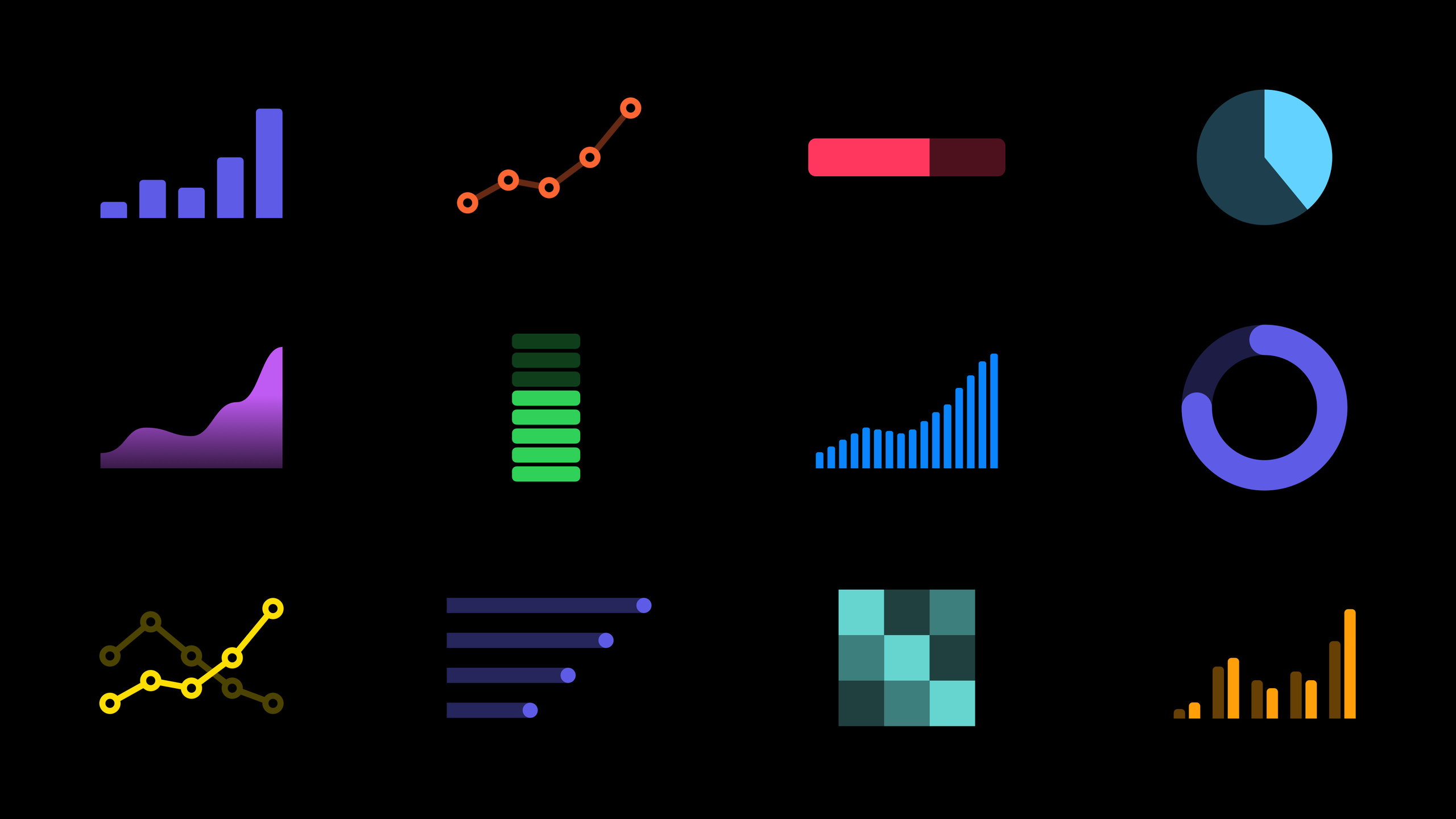
Use familiar chart format. Bar charts and line charts are the forms that most people come into contact with on a daily basis. Scatterplots are relatively rare and require additional guidance. If you want to make a unique chart (such as an activity ring), it should be the core of the application, not an add-on feature.
Differences are meaningful signals. When two charts present different information, differences in design help users notice it. Apple demonstrates the evolution from “Recent Sales” to “Last 12 Months Sales”:
- Change only the description - changes are easily overlooked
- Give the second graph a different color – it’s easier to notice that it’s a different graph
- Change the way the data is presented (from a bar chart to a chart showing monthly sales range) - Coordinate with the description and style changes to ensure users notice that the themes, time ranges and metrics are different
Detailed Content
Swift Charts Framework
(01:22)
The new Swift Charts framework introduced at WWDC22 makes it easy to create charts on Apple devices. Although this session focuses on design principles, the framework itself provides a declarative API and is deeply integrated with SwiftUI.
Best Practices for Chart Descriptions
// Bad practice: only label the element
Text("Sales in the Past 30 Days")

// Good practice: self-contained description
Text("Sales in the past 30 days totaled 1,234 pancakes.")

// Better practice: interpret the data
Text("Sales for the past 30 days are up 12%, totaling 1,234 pancakes.")
Key Points:
- Descriptions should be informative when read independently
- For unfamiliar data, use complete sentences to reduce the cost of understanding
- Add trend interpretation (increase and decrease percentage) to help users judge the meaning of the data
Progressive expansion complexity
// Small static chart as the entry point
SalesChart(data: last7Days)
    .frame(height: 80)
    .onTapGesture {
        // Tap to open the full chart
        showDetailChart = true
    }

// The full chart preserves the same data context
DetailSalesChart(data: last30Days)
    .frame(height: 300)
    // Add interactions: time range switching and exact value inspection
Key Points:
- Small charts and full charts show the same data shape
- Numbers visible in the small chart are still visible in the full chart
- Information can be added, but cannot be replaced with something completely different
Design differentiated charts
When you have multiple charts in your app, create meaningful differences by:
- Color: Charts of different themes use different main colors
- Direction: horizontal histogram vs vertical histogram to distinguish different data types
- Style: solid bars vs range bars indicate different indicator meanings
// Recent sales: vertical bar chart, primary color
BarChart(data: recentSales)
    .foregroundStyle(.blue)

// Popular flavors: horizontal bar chart, emphasized contrast
HorizontalBarChart(data: popularFlavors)
    .foregroundStyle(.green)

// City sales trend: line chart showing change
LineChart(data: citySales)
    .foregroundStyle(.orange)
Core Takeaways
1. Add trend charts to fitness apps
- What to do: Change the user’s training records from a list to a weekly/monthly trend chart
- Why it’s worth doing: Swift Charts reduces the amount of code for this task from hundreds to dozens of lines, and users can intuitively see the progress curve.
- How to start: Use
ChartThe view wraps the training data and selects the appropriate marker type (BarMarkorLineMark)
2. Add consumption analysis to the accounting app
- What to do: Display consumption proportion by category, display consumption trends by time
- Why is it worth doing: The core appeal of user accounting is “where the money is spent”. Charts are much more intuitive than numerical lists.
- How to start: Use
SectorMarkMake a pie chart to display category proportions, useBarMarkMake monthly comparisons
3. Add completion visualization to the habit tracking app
- What to do: Use a donut chart or progress bar to display the habit completion rate for this week/month
- Why it’s worth doing: Progress visualization is an effective positive feedback mechanism in behavioral psychology
- How to start: Use
SectorMarkofinnerRadiusParameters to create a circular progress chart
4. Add temperature trends to the weather app
- What to do: Display the temperature change curve for the next 24 hours, superimposing the probability of precipitation
- Why it’s worth doing: The list of temperature numbers is not as intuitive as the curve. Overlaying information allows one chart to convey more information.
- How to start: Use
LineMarkTo draw a temperature curve, useAreaMarkOverlay precipitation probability area
Related Sessions
- Hello Swift Charts — Getting started with the Swift Charts framework and basic usage
- SwiftUI on iPad: Organize your interface — iPad interface organization and navigation design
- What’s new in SwiftUI — Overview of SwiftUI’s annual new features
Comments
GitHub Issues · utterances