
Highlight
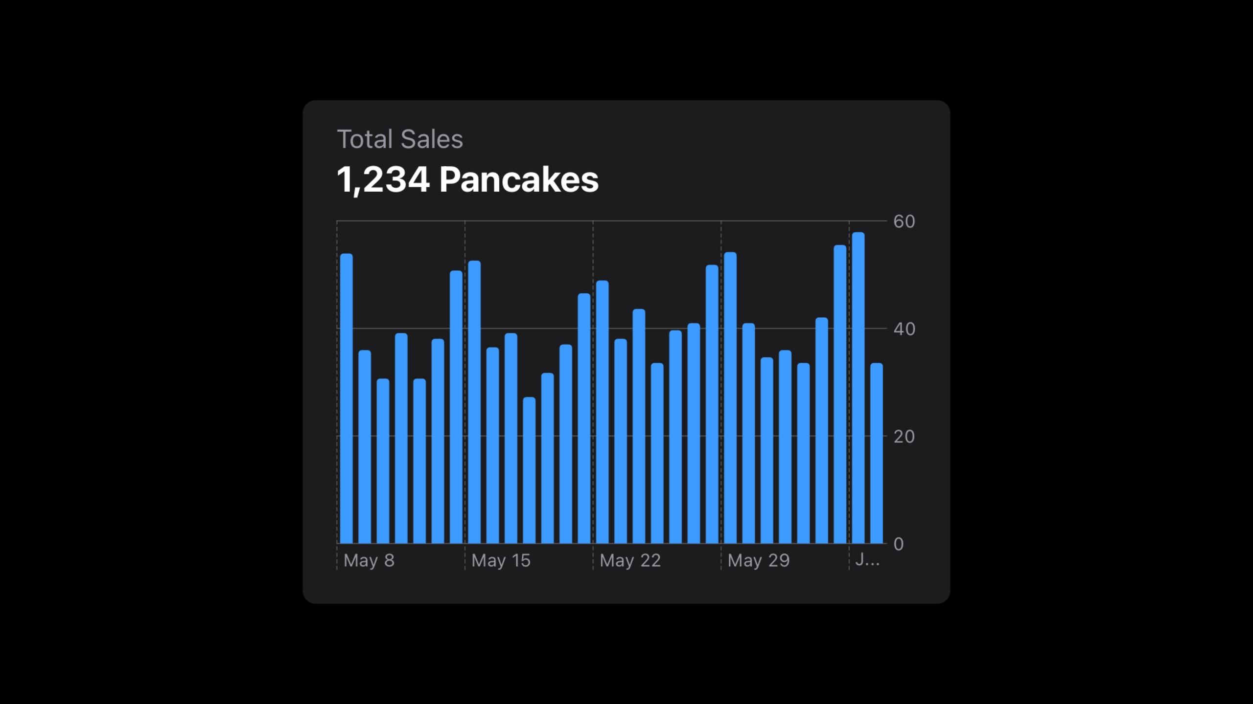
Taking pancake restaurant sales data as an example, the Apple design team explained how to design charts that both focus on information and are accessible to all users from five dimensions: label selection, axis design, description copywriting, interaction methods, and color use.
Core Content
The first step in chart design: clarify the goal
(01:35)
After many developers get the data, their first reaction is to choose a “good-looking” chart type. But effective graphic design should start with the question: What message do you want to convey?
Session uses a pancake truck example throughout. The food truck owner wants to know “how sales have been over the past 30 days” - this simple question can be broken down into multiple insights: trend fluctuations, numerical ranges, sales on a specific day, outliers, comparisons across locations.
Effective charts focus on only a few key pieces of information. In this case, the designer chose three priorities: pattern (trend), range (range), and values (specific values).
Marker selection: starting from real data
(03:13)
Marks are the visual elements of a chart—the columns of a bar chart, the lines of a line chart, and the points of a scatter chart.
The designers first tried scatter plots. Under ideal data, the dot plot looks clear. But after testing it with real data, the dot plot failed to show any discernible trends.
Next try a line chart. Polyline is good at showing the rate of change and the trend is clear. But consider a real-life scenario: a food truck has 5 alternating days off. Polylines connect data points that are far apart, and the connections themselves are more eye-catching than the data.
Finally chose the bar chart. Bar charts are more flexible – the zero value is clearly visible without being distracting, and the visual weight directly corresponds to the total sales volume. If one pillar is twice as high as the other, sales will be twice as high.
The key lesson from this selection process: test designs with real data, not just ideal data.
Axis: Range and Density
(08:25)
The axes provide the frame of reference for the markers. There are two range strategies for the vertical axis:
- Fixed Range: If the battery graph is always 0-100%, you can see at a glance whether it is fully charged, empty or in between
- Dynamic Range: If the step chart does not have a fixed upper limit, dynamic adjustment will make the fluctuations more obvious.
There is no upper limit on pancake sales, so dynamic range is used. But the base is fixed to 0, keeping the column heights comparable.
The density of grid lines needs to be balanced. Too much can be distracting, too little can make it difficult to estimate in-between values. This case selects about 4 horizontal grid lines, using integer multiples of 20, and a 30-day period using 7-day steps.
Description copywriting: Lower the threshold of understanding
(12:14)
The chart is not independent, it is embedded in the application’s interface. The screen title “Total Sales” and the segment controller “30 Days” already provide some context.
But the unit of the vertical axis still needs to be clarified - is it the amount or the number of pancakes? The solution is to state it directly with the chart title: “Pancakes sold”.
A better approach would be to summarize the key takeaway in the headline: “Total Sales: 1,234 Pancakes.” This specific number allows users to immediately grab the most important information.
A similar approach is used for precipitation charts in weather apps: “Light Rain Forecasted — Light rain is expected to start in 9 minutes and last for 36 minutes”.
Interaction design: multiple input methods
(15:37)
Touch interaction requires a sufficiently large touch target. Don’t limit the touch area to the column itself; extend it to the entire height of the chart, including the empty space above the column.
But interaction design can’t just consider touch. Keyboard, Voice Control, Switch Control, and VoiceOver all need equal support. The focus indicator should be large enough to align with the touch target.
When navigating charts with VoiceOver, label design follows several principles:
- Concise, no repetition of axis names
- Use full words, no abbreviations (“June” instead of “Jun”)
- Contextual information comes first (date comes first, value comes last)
- Allow users to quickly locate specific values
Use of color: enhance rather than unique
(19:32)
Color can add personality and also enhance clarity. But color should be used as a supporting means, not the only way to convey key information.
Session shows a line chart comparing sales in two cities. Using only color to distinguish the two lines, color-blind users cannot tell the difference. The correct approach is to add shape markers (circles and squares) first and then use color to enhance the differences.
Things to consider when choosing a color:
- The meaning of colors in different cultures (such as the Chinese stock market rising red and green falling, opposite to the United States)
- Visual weight balance to avoid implying primary and secondary relationships
- Contrast between colors to ensure readability
- Color blindness friendly, check with filter
- Adapt Dark Mode and Increase Contrast settings
Detailed Content
Accessibility support for Swift Charts
(06:08)
Swift Charts automatically generates customizable accessibility labels for markers and has built-in support for Audio Graphs. Audio charts convert data trends into sounds, allowing visually impaired users to “hear” the chart.
VoiceOver can:
- Navigation chart data value (“May 8th. 54 pancakes.”)
- Interactive switching time range (“Selected: one year, two of two.”)
- Play audio graph (“Play audio graph.”)
- Describe the axis (“The x-axis is time. The y-axis is sales.”)
Data summary for audio charts
(14:45)
Audio charts offer a variety of data summaries, including a customizable summary. Axis descriptions are critical for non-visual communication—if audio charts are not available, provide this information through accessible text labels.
Marking strategies for different scenarios
(18:42)
The bicycling route elevation map in the Maps app demonstrates another labeling strategy. The chart does not show a single value, but rather a pattern of elevation gain and loss. There are too many pillars to navigate one by one. The accessibility label is designed to read: “From 3.6 miles to 4.4 miles: Climb 100 feet, descend 5 feet”.
If the chart is a thumbnail preview within a button, you can summarize the entire button with a label: “Weekly activity summary, tap to view details”.
Core Takeaways
-
What to do: Design a step trend chart for a health app
-
Why it’s worth doing: Users need to quickly understand their activity patterns, and good chart design makes the data clear at a glance
-
How to start: Determine the core information (trend vs goal completion), choose a bar chart or a line chart, and add a summary title of “Average X steps this week”
-
What to do: Add expense category visualization to your finance app
-
Why it’s worth it: The combination of color + shape allows color-blind users to differentiate between different spending categories
-
How to get started: Using Swift Charts
SectorMarkorBarMark, assigning each category a unique shape tag, enhanced with color -
What to do: Design precipitation forecast charts for weather applications
-
Why it’s worth doing: The description copywriting mode of the weather application in Session can be directly reused
-
How to start: Add a sentence summary above the chart (“Rain starting in 9 minutes”), use dynamic range on the vertical axis, and use color intensity to indicate precipitation intensity
-
What: Build a charting system for data dashboards
-
Why it’s worth doing: Design decisions for individual diagrams need to be consistent across the entire system
-
How to start: First define the chart design system (color, grid line density, label format) to ensure that all charts follow the same rules
Related Sessions
- Hello Swift Charts — Getting started with Swift Charts
- Swift Charts: Raise the bar — Swift Charts Advanced
- Bring accessibility to charts in your app — Chart accessibility support
Comments
GitHub Issues · utterances