
Highlight
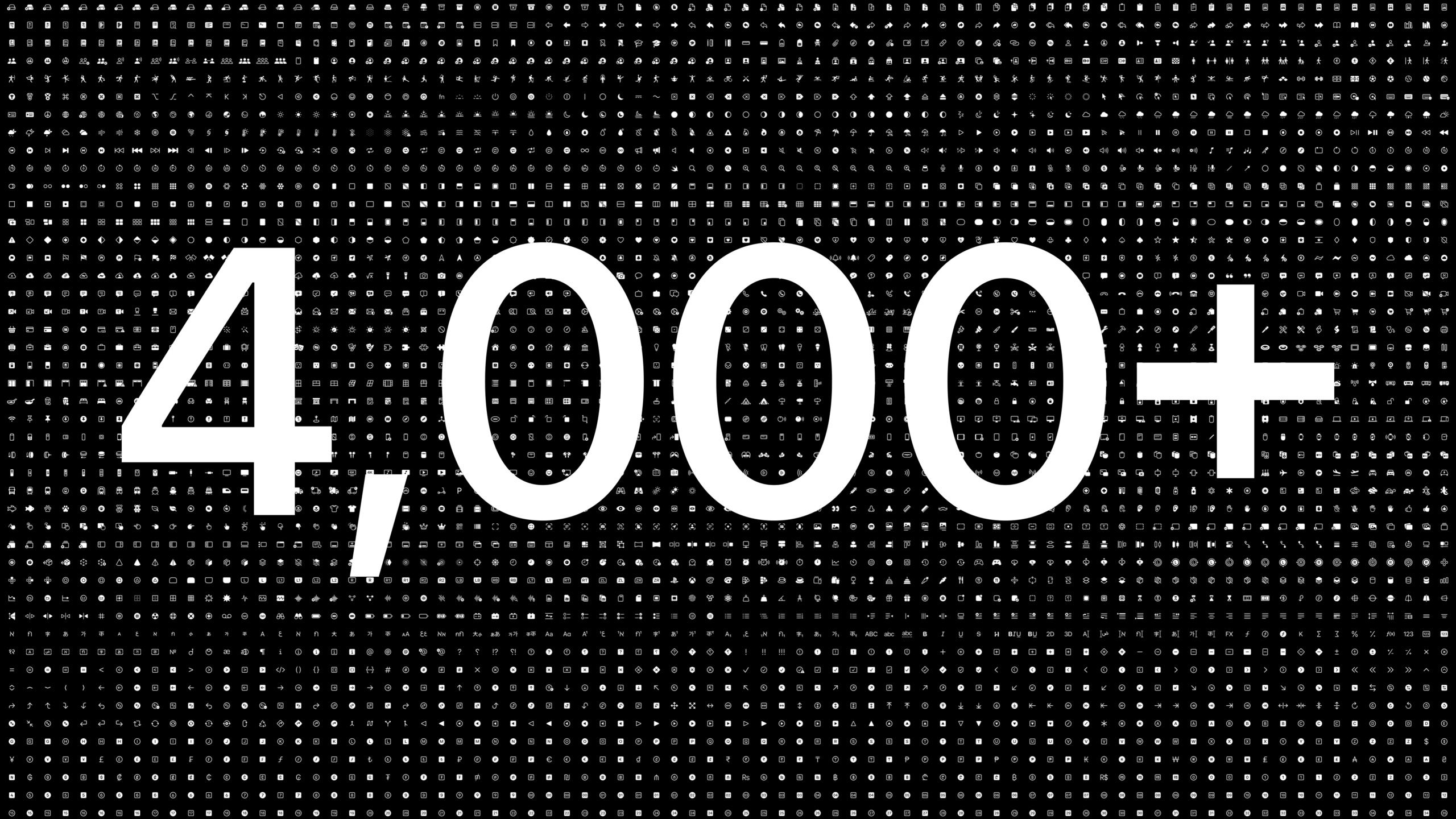
SF Symbols 4 adds 700+ new symbols (more than 4000 in total), introduces the Automatic Rendering mode to automatically select the best rendering method, adds the Variable Color feature to convey intensity changes with layered coloring, and unifies the annotation structure of custom symbols.
Core Content
Symbol library extension
SF Symbols is growing every year. More than 700 new symbols were added in 2022, taking the total to over 4,000.
(02:35)
The new symbols cover multiple areas:
- Home: lights, curtains, windows, doors, switches, sockets
- HEALTH & FITNESS: Fitness people icons
- Currency: more currency symbols
- Localization: Covers different scripts and right-to-left writing systems
SF Symbols App adds five new categories to help navigate: Camera & Photos, Accessibility, Privacy & Security, Home, and Fitness. Developers can also create their own collections.
Review of four rendering modes
SF Symbols has four rendering modes, each providing a different degree of control over color:
(04:02)
- Monochrome: the most neutral, unified color, closest to the essence of typography
- Hierarchical: Monochromatic gradient that highlights important shapes through transparency differences
- Palette: Two or more contrasting colors to make symbol elements stand out
- Multicolor: Use the inherent color of the symbol, such as the real color of the physical world
Automatic Rendering
Previously, Monochrome was used by default when rendering mode was not specified. Each symbol now has a “preferred rendering mode” that is automatically matched when Automatic is selected.
(05:38)
For example:
- The camera filter symbol uses Hierarchical under Automatic to highlight the translucency of the lens
- SharePlay symbols use Hierarchical in Automatic to make the human figure stand out and the sound waves recede into the background
- AirPods Pro symbol uses Hierarchical under Automatic
But Automatic isn’t always the best choice. In small-size low-contrast scenes, Monochrome may be clearer. Rendering mode can still be specified explicitly.
Variable Color
Variable Color is the most important new feature of 2022. It divides a symbol’s vector path into multiple layers, colored sequentially, to convey intensity changes or time sequences.
(07:51)
Key concepts:
- Some paths participate in the sequence, some do not
- Participation paths are organized by layers, with each layer corresponding to a stage
- Control with percentage value: 0% all off, 100% all on
- Based on transparency, works in all rendering modes
Example scenario:
- Signal Strength: The shape of the mobile phone is not involved, and the radio waves are layered according to strength.
- Volume: Speaker shape is not involved, three sound wave layers represent low/medium/high volume
- Room Capacity: Human icons layered to indicate empty/small amount/half full/full
Unified Annotations
The way custom symbols are labeled is simplified in 2022. All rendering modes use a unified layer structure.
(12:09)
Newly introduced concepts:
- Draw: Layer drawing contains the path
- Erase: layer erasure path, affecting the rendering effect of overlapping areas
Developers only need to organize the layer structure once to generate annotations for all rendering modes. With Variable Color, you can also create custom symbols with dynamic states.
Detailed Content
Use Automatic Rendering
import SwiftUI

struct ContentView: View {
    var body: some View {
        VStack {
            // Automatic: the system chooses the best rendering mode for the symbol
            Image(systemName: "camera.filters")
                .symbolRenderingMode(.automatic)
                .font(.system(size: 60))

            // Explicitly specify Hierarchical
            Image(systemName: "camera.filters")
                .symbolRenderingMode(.hierarchical)
                .foregroundStyle(.blue)
                .font(.system(size: 60))

            // Explicitly specify Monochrome (clearer at small sizes)
            Image(systemName: "airpodspro")
                .symbolRenderingMode(.monochrome)
                .foregroundStyle(.primary)
                .font(.system(size: 16))
        }
    }
}
Key points:
.symbolRenderingMode(.automatic)Let the system choose the preferred mode of the symbol- Automatic is the best choice in most cases
- Small size, low contrast scenes may require explicit specification of Monochrome
-
.foregroundStyle()control color
Use Variable Color
import SwiftUI

struct VolumeView: View {
    @State private var volume: Double = 0.5

    var body: some View {
        VStack {
            // Variable Color highlights different parts of the symbol based on the value
            Image(systemName: "speaker.wave.3.fill")
                .symbolRenderingMode(.hierarchical)
                .font(.system(size: 60))
                .foregroundStyle(.blue)

            Slider(value: $volume, in: 0...1)
                .padding()
        }
    }
}
Used in UIKit:
import UIKit

class ViewController: UIViewController {
    let imageView = UIImageView()
    let slider = UISlider()

    override func viewDidLoad() {
        super.viewDidLoad()

        let config = UIImage.SymbolConfiguration(
            paletteColors: [.systemBlue]
        )
        imageView.image = UIImage(
            systemName: "wifi",
            withConfiguration: config
        )

        // Variable Color is controlled through symbol configuration
        let variableConfig = UIImage.SymbolConfiguration(
            variableValue: 0.6
        )
        imageView.image = UIImage(
            systemName: "wifi",
            withConfiguration: variableConfig
        )
    }
}
Key points:
- Variable Color passed
variableValue(0.0 to 1.0) Controls the level of highlighting - 0.0 means that all paths are not highlighted, 1.0 means that all paths are highlighted
- Intermediate values are progressively highlighted in layer order
- Paths that do not participate in the sequence are always displayed in full
- Works in all rendering modes
Create custom symbols that support Variable Color
In the SF Symbols App:
- Import custom SVG symbols
- Logically divide the path into multiple layers
- Create separate layers for paths participating in Variable Color
- Set the Draw/Erase behavior of each layer
- Unify labeling for all rendering modes
Example: a kitchen timer symbol
- Place the outer ring, scale and hands of the timer on different layers
- The pointer layer participates in the Variable Color sequence
- The outer ring and scale are not involved and are always displayed
- Variable Color progressively highlights the pointer layer over time
Key points:
- The layer order of the path determines the sequence order of the Variable Color
- Not all paths need to participate in the sequence
- Draw/Erase controls the overlapping rendering effect between layers
- Annotate once, common to all rendering modes
Code comparison of four rendering modes
import SwiftUI

struct RenderingModesView: View {
    var body: some View {
        HStack(spacing: 30) {
            // Monochrome: unified color
            Image(systemName: "folder.badge.plus")
                .symbolRenderingMode(.monochrome)
                .foregroundStyle(.blue)

            // Hierarchical: layered monochrome gradient
            Image(systemName: "folder.badge.plus")
                .symbolRenderingMode(.hierarchical)
                .foregroundStyle(.blue)

            // Palette: multicolor contrast
            Image(systemName: "folder.badge.plus")
                .symbolRenderingMode(.palette)
                .foregroundStyle(.blue, .green)

            // Multicolor: inherent colors
            Image(systemName: "folder.badge.plus")
                .symbolRenderingMode(.multicolor)
        }
        .font(.system(size: 40))
    }
}
Key points:
.monochromeand.hierarchicalaccept a color -.paletteAccepts two or more colors, applied sequentially to different layers -.multicolorUse the symbol’s built-in color definitions -.automaticAutomatically selects one of the above based on the symbol’s preferred mode
Core Takeaways
Make a smart home control panel
- What: An iOS/iPadOS smart home control center using SF Symbols to represent various devices and states
- Why it’s worth doing: The new Home category includes icons such as lights, curtains, switches, sockets, etc. Variable Color can visually display the brightness/opening degree
- How to start: Use
symbolRenderingMode(.hierarchical)+ Variable Color allows the light bulb symbol to change with brightness and the curtain symbol to change with opening and closing
Make a fitness tracking app
- What it does: An App that records and displays fitness data, using icons to represent different types of exercise
- Why it’s worth doing: The new Fitness human icon can be used directly, and the Variable Color can indicate the completion progress
- How to start: Use fitness humanoid symbols with Variable Color to display training completion, and use Hierarchical rendering to highlight the currently active items
Make a network status monitoring tool
- What: A menu bar tool that displays the quality of your network connection
- Why it’s worth doing: WiFi and signal strength symbols are naturally suitable for Variable Color, which can intuitively reflect the quality of the signal.
- How to start: Use
wifiorcellularbarssymbol, throughvariableValueBind to actual signal strength value
Make a custom icon design tool
- What: A tool that lets designers create custom SF Symbols style icons for specific apps
- Why it’s worth doing: Unified Annotations allow custom symbols to be annotated once and reused in multiple modes, reducing maintenance costs.
- How to get started: Design symbols in the SF Symbols App, labeling Multicolor, Hierarchical, Palette and Monochrome with a unified layer structure
Related Sessions
- Adopt Variable Color in SF Symbols — A practical guide to using Variable Color
- What’s new in SF Symbols — WWDC21 SF Symbols update review
- Meet Transferable — Drag and share data transfer across apps
Comments
GitHub Issues · utterances