
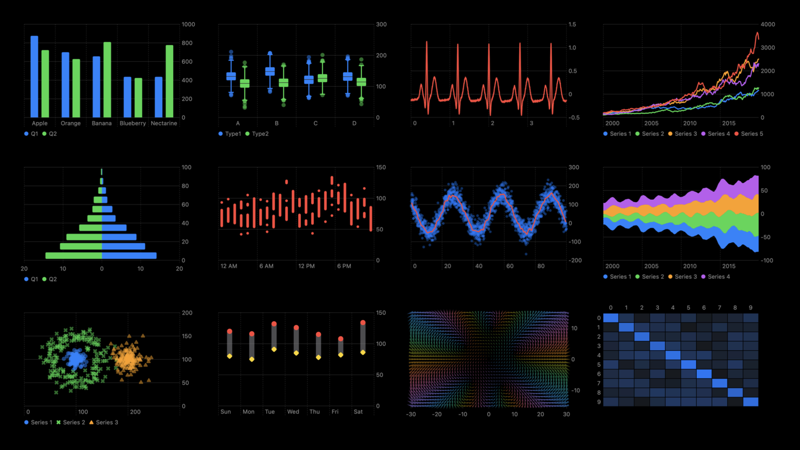
Highlight
Swift Charts provides rich Mark combinations, custom axis styles, plot area backgrounds, and gesture interaction capabilities in addition to basic charts, allowing developers to build a complete data visualization experience from simple to complex.
Core Content
It’s not difficult to add a bar chart or line chart to your app. The Hello Swift Charts session already demonstrates the basic usage. But when you actually launch a data dashboard, you will encounter a bunch of problems: How to combine multiple visual elements in the same picture? How do I get the X-axis labels to be grouped by quarter? How to let users drag and drop to select a data range?
These requirements previously required writing Core Graphics yourself or introducing third-party libraries. Swift Charts provides a set of combination and customization mechanisms based on basic Mark, which greatly reduces the cost of implementing complex charts.
This session starts from scratch, using the same pancake sales data set, and gradually adds complexity - from single Mark to multi-Mark stacking, from default styles to fully customized axes, and then to drag-and-drop interaction. The entire process shows the complete path of Swift Charts from “usable” to “easy to use”.
Detailed Content
Combine multiple Marks to express rich data
(3:48) Horizontal histograms are a classic choice for displaying ranking data. Swap the values of x and y to get a horizontal layout:
Chart(data, id: \.name) {
    BarMark(
        x: .value("Sales", $0.sales),
        y: .value("Name", $0.name)
    )
    .foregroundStyle(.pink)
    .accessibilityLabel($0.name)
    .accessibilityValue("\($0.sales) sold")
}
Key points:
BarMarkThe value is placed in x and the category is placed in y, and it is automatically rendered into a horizontal histogram. -.foregroundStyle(.pink)Set colors uniformly -.accessibilityLabeland.accessibilityValueProvide a custom description for VoiceOver
(5:12) For time series data, useLineMarkreplaceBarMarkJust change a type name:
Chart {
    ForEach(dailySales, id: \.day) {
        BarMark(
            x: .value("Day", $0.day, unit: .day),
            y: .value("Sales", $0.sales)
        )
    }
}
Key points:
unit: .dayTell the framework the time granularity of the data and automatically generate appropriate axis labels- will
BarMarkChange toLineMarkYou can switch the chart type without any changes to the data layer.
(6:16) When comparing multiple cities,LineMarkCooperate.foregroundStyle(by:)Automatically assign colors to different series:
Chart {
    ForEach(seriesData, id: \.city) { series in
        ForEach(series.data, id: \.weekday) {
            LineMark(
                x: .value("Weekday", $0.weekday, unit: .day),
                y: .value("Sales", $0.sales)
            )
        }
        .foregroundStyle(by: .value("City", series.city))
        .symbol(by: .value("City", series.city))
        .interpolationMethod(.catmullRom)
    }
}
Key points:
- Nesting
ForEachProcess multiple series of data: the outer layer traverses the city, and the inner layer traverses the daily data of the city -.foregroundStyle(by:)Group coloring by city, automatically generate legend -.symbol(by:)Use different data point markers for different series -.interpolationMethod(.catmullRom)Smooth connections using Catmull-Rom curves
(7:19) changed toBarMarkWhen comparing grouped histograms, the key difference is.position(by:):
BarMark(
    x: .value("Weekday", $0.weekday, unit: .day),
    y: .value("Sales", $0.sales)
)
.foregroundStyle(by: .value("City", series.city))
.position(by: .value("City", series.city))
Key points:
.position(by:)Let columns at the same x position be displayed side by side by city- No addition
.position(by:)columns will stack on top of each other - from
LineMarkswitch toBarMarkJust change the type name and add.position(by:)
(8:02) Overlaying multiple Marks on the same picture can display the data range and average at the same time:
Chart {
    ForEach(data, id: \.month) {
        AreaMark(
            x: .value("Month", $0.month, unit: .month),
            yStart: .value("Daily Min", $0.dailyMin),
            yEnd: .value("Daily Max", $0.dailyMax)
        )
        .opacity(0.3)
        LineMark(
            x: .value("Month", $0.month, unit: .month),
            y: .value("Daily Average", $0.dailyAverage)
        )
    }
}
Key points:
AreaMarkuseyStartandyEndDefine the regional range and display the monthly minimum to maximum sales range -LineMarkSuperimposed over the area to show the daily average trend -.opacity(0.3)Make the area semi-transparent so that the polylines are clearly visible
(8:46) Another combination:BarMark + RectangleMark:
BarMark(
    x: .value("Month", $0.month, unit: .month),
    yStart: .value("Daily Min", $0.dailyMin),
    yEnd: .value("Daily Max", $0.dailyMax),
    width: .ratio(0.6)
)
.opacity(0.3)
RectangleMark(
    x: .value("Month", $0.month, unit: .month),
    y: .value("Daily Average", $0.dailyAverage),
    width: .ratio(0.6),
    height: 2
)
Key points:
BarMarkofwidth: .ratio(0.6)Control column width to 60% of available space -RectangleMarkActs as an “average horizontal line” here,height: 2make it look like a line- Two Marks share the same data and display information in different dimensions
(9:19)RuleMarkReference lines and annotations can be added to the diagram:
RuleMark(
    y: .value("Average", averageValue)
)
.lineStyle(StrokeStyle(lineWidth: 3))
.annotation(position: .top, alignment: .leading) {
    Text("Average: \(averageValue, format: .number)")
        .font(.headline)
        .foregroundStyle(.blue)
}
Key points:
RuleMarkDraw a horizontal reference line at the specified value on the y-axis -.lineStyle(StrokeStyle(lineWidth: 3))Set line width -.annotation(position: .top, alignment: .leading)Add text annotations on top of guides
Customize axis style
(13:54) Control chart scale and color mapping through chart modifiers:
Chart {
    // ... LineMark definition ...
}
.chartYScale(domain: 0 ... 200)
.chartForegroundStyleScale([
    "San Francisco": .orange,
    "Cupertino": .pink
])
Key points:
.chartYScale(domain:)Manually set the y-axis range to avoid automatic scaling that makes comparison between different charts difficult -.chartForegroundStyleScale([:])Precise control of mapped colors for each series with dictionary
(15:16) Customize X-axis scale and label format:
.chartXAxis {
    AxisMarks(values: .stride(by: .month)) { value in
        AxisGridLine()
        AxisTick()
        AxisValueLabel(
            format: .dateTime.month(.narrow)
        )
    }
}
Key points:
AxisMarks(values: .stride(by: .month))Generate ticks in monthly steps -AxisGridLine()Draw grid lines -AxisTick()Draw tick marks -AxisValueLabel(format:)use.dateTime.month(.narrow)Format labels as abbreviated months (J, A, S, etc.)
(16:17) inAxisMarksMake conditional judgments in closures to implement quarter marking:
.chartXAxis {
    AxisMarks(values: .stride(by: .month)) { value in
        if value.as(Date.self)!.isFirstMonthOfQuarter {
            AxisGridLine().foregroundStyle(.black)
            AxisTick().foregroundStyle(.black)
            AxisValueLabel(
                format: .dateTime.month(.narrow)
            )
        } else {
            AxisGridLine()
        }
    }
}
Key points:
value.as(Date.self)Convert axis values to Date type- By customizing
isFirstMonthOfQuarterExtended to determine whether it is the first month of the quarter - The first month of the quarter displays complete markers (grid lines, tick marks, labels), and other months only display grid lines
- This mode is suitable for any “interval highlighting” needs
(17:00) Customize Y-axis:
.chartYAxis {
    AxisMarks(preset: .extended, position: .leading)
}
Key points:
preset: .extendedExtend axis label range -position: .leadingPut the Y axis on the left
Customize drawing area style
(18:26) Use.chartPlotStyleModify the appearance of the drawing area:
.chartPlotStyle { plotArea in
    plotArea.frame(height: 60 * 6)
            .background(.pink.opacity(0.2))
            .border(.pink, width: 1)
}
Key points:
plotAreaIs a proxy for the drawing area view to which SwiftUI modifier can be applied directly -.frame(height: 60 * 6)Manually set the height, each line of 60pt corresponds to 6 pieces of data- You can set any SwiftUI style such as background color, border, etc.
Drag selection interaction
(20:03) Passed.chartOverlayAdd gesture interaction to implement brushing function:
struct InteractiveBrushingChart: View {
    @State var range: (Date, Date)? = nil

    var body: some View {
        Chart {
            ForEach(data, id: \.day) {
                LineMark(
                    x: .value("Month", $0.day, unit: .day),
                    y: .value("Sales", $0.sales)
                )
                .interpolationMethod(.catmullRom)
                .symbol(Circle().strokeBorder(lineWidth: 2))
            }
            if let (start, end) = range {
                RectangleMark(
                    xStart: .value("Selection Start", start),
                    xEnd: .value("Selection End", end)
                )
                .foregroundStyle(.gray.opacity(0.2))
            }
        }
        .chartOverlay { proxy in
            GeometryReader { nthGeoItem in
                Rectangle().fill(.clear).contentShape(Rectangle())
                    .gesture(DragGesture()
                        .onChanged { value in
                            let xStart = value.startLocation.x - nthGeoItem[proxy.plotAreaFrame].origin.x
                            let xCurrent = value.location.x - nthGeoItem[proxy.plotAreaFrame].origin.x
                            if let dateStart: Date = proxy.value(atX: xStart),
                               let dateCurrent: Date = proxy.value(atX: xCurrent) {
                                range = (dateStart, dateCurrent)
                            }
                        }
                        .onEnded { _ in range = nil }
                    )
            }
        }
    }
}
Key points:
.chartOverlayOverlay SwiftUI views on top of charts to support gesture recognition -proxy.plotAreaFrameGet the coordinate frame of the drawing area for coordinate conversion -proxy.value(atX:)Convert the screen x-coordinate back to a Date value in the chart data field -GeometryReaderUsed to obtain the position of the overlay view in the screen coordinate system -RectangleMarkusexStartandxEndRender highlight of selected area- At the end of the gesture
range = nilClear selection status -.contentShape(Rectangle())Make sure transparent areas also respond to gestures
Core Takeaways
The “Interval Highlight” function of the Data Kanban App
- exploit
AreaMark+LineMarkOverlay the daily fluctuation range and average trend to display, and then passRuleMarkAdd industry baseline - use
.chartOverlay+DragGestureTo implement drag and drop selection of time interval, useRectangleMarkRender selected highlight - from
proxy.value(atX:)After obtaining the selected date range, the statistics card below is linked to display the interval summary data.
Sports Data Visualization
- use
BarMark+.position(by:)Compare the duration of different sports each week, and the horizontal bar chart displays the ranking of sports - use
.chartYScale(domain:)Fixed y-axis range to avoid visual misleading between different weeks - use
.chartXAxisCustomize the scale to only mark the first day of each week
Financial Trend Chart
- use
LineMark+.interpolationMethod(.catmullRom)Draw smooth asset movements - use
AreaMarkofyStart/yEndShow monthly income/expense range - use
.chartForegroundStyleScaleCustomize color scheme for expenses/income - use
RuleMarkMark the budget line and change the annotation color when the budget is exceeded
Weather data comparison
- use
LineMarkCooperate.foregroundStyle(by:)Display temperature curves for multiple cities - use
.symbol(by:)Assign different shaped data point markers to each city - use
.chartPlotStyleAdd a light blue background to the drawing area to enhance the visual perception of “weather”
Leaderboard Animation
- Utilize the data-driven features of SwiftUI to cooperate when data changes
.animation()Achieve smooth transition of ranking changes - use landscape
BarMark+.foregroundStyleGradient display ranking, the higher the ranking, the darker the color - use
.chartPlotStyleSet a fixed height to avoid chart height jumping when the amount of data changes.
Related Sessions
- Hello Swift Charts — say hello to swift charts — a flexible framework that helps you create charts entirely in swiftui that look and feel right at home on all apple platforms
- Design an effective chart — learn how to design focused, approachable, and accessible charts with clear marks, axes, descriptions, interaction, and color
- What’s new in SwiftUI — join us as we share the latest updates and a glimpse into the future of ui framework design including swift charts
Comments
GitHub Issues · utterances