
Highlight
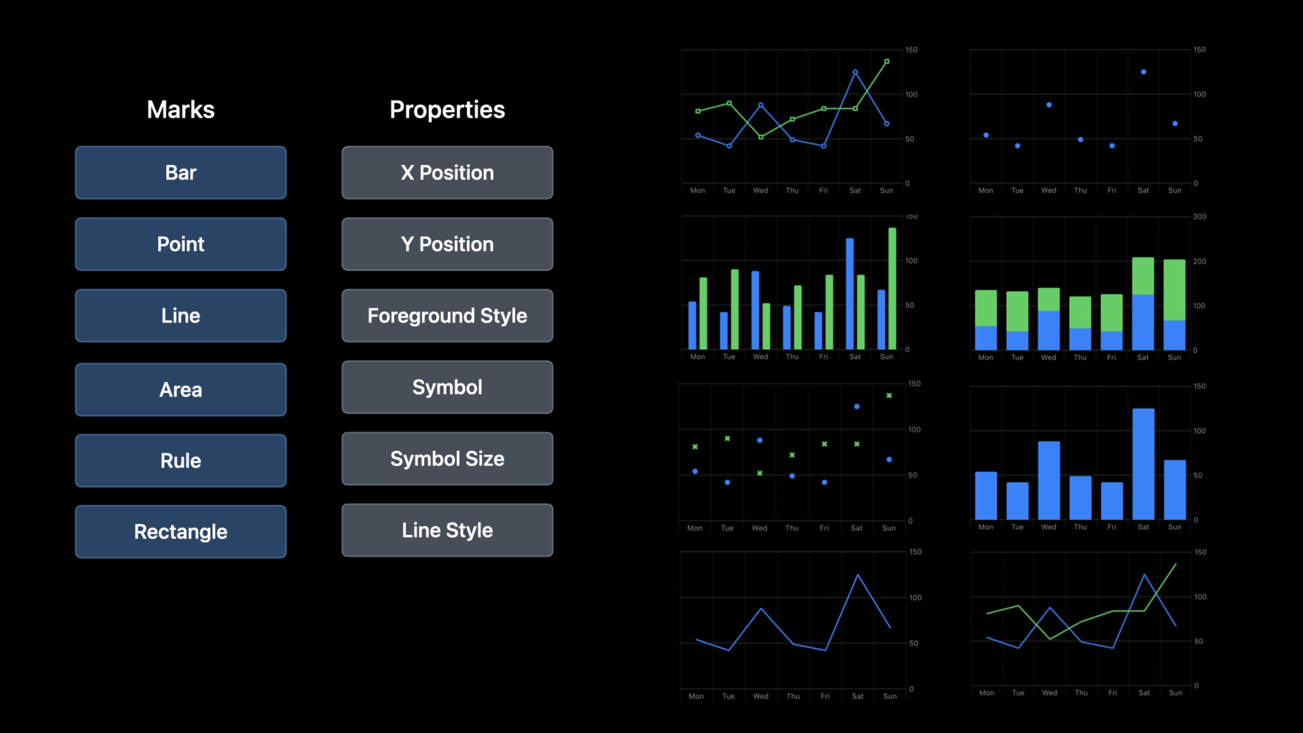
Swift Charts is a declarative chart framework released by Apple at WWDC 2022, completely based on SwiftUI syntax. It unifies all chart types with the concept of Marks—BarMark, LineMark, PointMark, etc.—and you build charts by combining these Marks, just like you combine Views in SwiftUI. Session uses a pancake sales tracking app to demonstrate the construction process of bar charts, multi-series comparison charts, and combination charts from scratch.
Core Content
Swift Charts solves a long-standing problem: to do data visualization on the Apple platform, you must either use a third-party library or draw your own Core Graphics. Both options are heavy.
The new Swift Charts framework brings declarative charting syntax. You just need to describe the data mapping—“x-axis is date, y-axis is sales”—and the framework automatically handles axes, scales, legends, and interactions.
The session demonstrates three typical scenarios using a Pancake Food Truck application. This app records sales data of different pancake varieties in the two cities of Cupertino and San Francisco.
The first scene is a bar chart showing the total sales ranking of each category. The code is very simple:
Chart(panSales) {
    BarMark(
        x: .value("Pancake", $0.type),
        y: .value("Sales", $0.sales)
    )
}Here’s.value()The method is critical - the first parameter is the label description, the second parameter is the actual value. The framework uses this description to generate axis labels and accessible VoiceOver descriptions, rather than just displaying raw values.
The second scenario is a multi-series comparison. A city picker has been added to the application, and SwiftUI Picker is used to switch between Cupertino and San Francisco data. add a line.foregroundStyle(by: .value("City", $0.city))It can be distinguished by city coloring.
The third scenario is a combination chart, which overlays the data of two cities in the same chart. LineMark draws polylines, PointMark marks data points,.foregroundStyle(by:)Automatically assign colors and generate legends.
Detailed Content
BarMark: The basis of histogram
The core idea of Swift Charts is Mark. Each chart type corresponds to a Mark, just like each UI element in SwiftUI corresponds to a View.
BarMarkIt is the most basic Mark, used to create histograms. Initialization requires two dimensions, x and y:
Chart(salesData) { sale in
    BarMark(
        x: .value("Variety", sale.pancakeType),
        y: .value("Sales", sale.count)
    )
}ChartThe constructor accepts a RandomAccessCollection, with each element in the array corresponding to a data point on the chart. If your data followsIdentifiable, can be passed directly into the collection.
Want to make the histogram horizontal? Just swap the values of x and y:
BarMark(
    x: .value("Sales", sale.count),
    y: .value("Variety", sale.pancakeType)
)
The frame automatically adjusts axis label orientation and layout, no need to manually calculate the frame or rotate the view.
Multiple series and dynamic data
When a chart contains multiple data series,.foregroundStyle(by:)is the key modifier:
Chart(salesByCity) { sale in
    BarMark(
        x: .value("Date", sale.date, unit: .day),
        y: .value("Sales", sale.count)
    )
    .foregroundStyle(by: .value("City", sale.city))
}
The framework automatically assigns colors to each city and generates a legend. With SwiftUI.animation()You can make the chart transition smoothly when data is switched:
Chart(filteredSales) { ... }
    .animation(.easeInOut, value: selectedCity)
This code means: whenselectedCityWhen a change causes the data filtering results to change, the chart transitions to the new state with an easeInOut curve animation.
Combination of LineMark and PointMark
Line chart usageLineMark,andBarMarkThe syntax is almost identical:
Chart(salesByDate) { sale in
    LineMark(
        x: .value("Date", sale.date),
        y: .value("Sales", sale.count)
    )
    .foregroundStyle(by: .value("City", sale.city))
}plusPointMarkMarkers can be displayed on each data point of the polyline:
Chart(salesByDate) { sale in
    LineMark(
        x: .value("Date", sale.date),
        y: .value("Sales", sale.count)
    )
    .foregroundStyle(by: .value("City", sale.city))

    PointMark(
        x: .value("Date", sale.date),
        y: .value("Sales", sale.count)
    )
    .foregroundStyle(by: .value("City", sale.city))
}
This combination model is the key to the design of Swift Charts - different Marks can be freely superimposed, and the framework handles coordinate mapping uniformly.
Other chart types
Session ends with a quick look at the other Mark types supported by Swift Charts:
// Area chart
AreaMark(
    x: .value("Date", data.date),
    y: .value("Value", data.value)
)

// Rule line (threshold line)
RuleMark(
    y: .value("Target", targetValue)
)

// Rectangle (heat map)
RectangleMark(
    x: .value("Column", data.col),
    y: .value("Row", data.row)
)
Each Mark’s API follows the same pattern: the x and y dimensions are.value()Describe the mapping relationship, and the data passes throughChartInitializer passed in.
Core Takeaways
- Mark combination mode is the soul of the framework: The chart is not regarded as a fixed template (bar chart/line chart/pie chart), but as a combination of Mark. LineMark + PointMark is a common combination, and AreaMark + LineMark can also be superimposed. This design makes customizing charts natural without having to learn another DSL.
.value()does more than set a value; it provides semantics for accessibility and axis labels: the first argument will be spoken by VoiceOver and referenced by axis labels. Write.value("Sales", count)instead of just passing count; this habit is worth developing from the beginning.- Data-driven animation for almost zero cost: Use
.animation(.easeInOut, value: selectedCity)One line of code can make the transition between chart data smooth. This is a natural extension of SwiftUI’s declarative paradigm in the world of diagrams — you declare data changes and the framework takes care of the animation. - You don’t need to change the data to transpose the chart, just swap x/y: Switching between horizontal histogram and vertical histogram is just
BarMark(x:y:)The order of the two parameters is a problem. The framework automatically handles axis orientation, label positioning, and layout. IdentifiableThe data model makes the code more concise: let the data struct followIdentifiable,ChartYou can directly initialize it with an array,ForEachThere is no need to specify an id either. This is the continuation of SwiftUI data flow best practices in Charts.
Related Sessions
- The SwiftUI cookbook for navigation — get the recipes you need to build a great navigation experience for your app, using the new navigation apis introduced in swiftui.
- What’s new in SwiftUI — an overview of the latest swiftui features announced at wwdc22. we’ll explore swift charts, navigation apis, layout enhancements, and much more.
- Use SwiftUI with UIKit — learn how you can use swiftui and uikit together to build a great experience in your app.
- Design an effective chart — discover how you can create a clear, understandable chart that helps people make decisions.
- Build a productivity app for Apple Watch — learn how you can build a productivity app that is quick and lightweight.
Comments
GitHub Issues · utterances