
Highlight
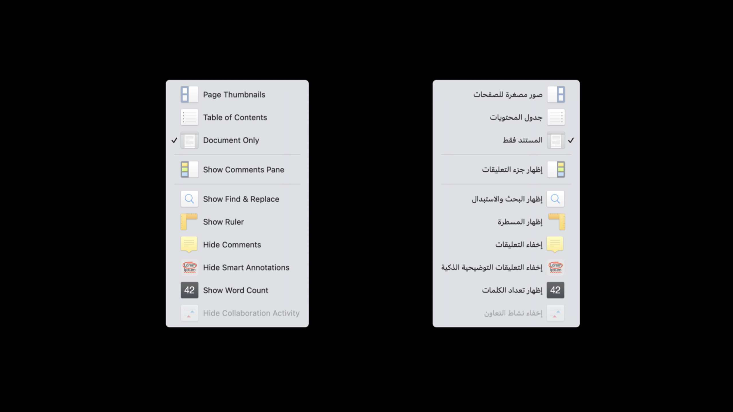
Arabic is one of the top ten most used languages on Apple platforms. RTL (Right-to-Left) languages don’t just invert text direction - it affects the entire UI layout, from toolbars to sidebars, from icons to number displays.
Core Content
You may have localized your app to English, French, Japanese, and Chinese. Next, when it comes to supporting Arabic or Hebrew, the problem becomes different: text is arranged from right to left, and English product names and numbers may be sandwiched in the paragraphs.
(00:22) Rich Gillam opened by noting that Arabic is one of the top ten most used languages on Apple platforms. Apple platforms also provide font and keyboard support for 15 right-to-left languages.
This change in direction is propagated throughout the interface. (02:17) In the Hebrew version of the Numbers help page, the text is aligned to the right, and the positions of tables and pictures are reversed; when placed in the Safari window, the toolbars are also arranged from right to left; when placed in the entire system, the menu bar, Dock, sidebar, and tab bar are all flipped.
The good news is that the system already does most of the work. (03:21) CoreText handles bidirectional text, Apple’s UI framework sets natural writing direction and natural alignment by default, and standard controls automatically flip. Developers have to deal with edge cases: which icons should be mirrored, which controls should maintain absolute orientation, and which numbers should be displayed according to the user’s region and preferences.
Detailed Content
The text is first handed over to the system for processing
(04:21) Bidirectional text often occurs in right-to-left languages. A Hebrew sentence can contain English words such as Pages, Numbers, and Keynote. English is still read from left to right, and the fragment order of the entire paragraph is from right to left.
(05:18) Most text controls do not require manual setting of orientation. CoreText will arrange characters in different directions on the same line, and text controls in UIKit, AppKit, and SwiftUI will use natural writing direction and natural alignment. In Arabic or Hebrew UI, text controls are written from right to left and aligned to the right by default.
The practical meaning of this rule is very simple: keep the system defaults for ordinary text, button titles, and form input boxes. Overriding the default behavior is only considered when expressing absolute directions.
Icons should distinguish between “direction” and “semantics”
(07:50) The RTL behavior of custom images is set in the Xcode imageset editor. Select Fixed when the image does not change with the language; select Mirrors when algorithmic mirroring is possible; select Both when simple mirroring is not possible, and provide images for LTR and RTL respectively.
(09:06) If you use SF Symbols, a lot of localization is already handled by the system. Symbols that need to change with the reading direction will be automatically flipped; symbols such as question marks also have localized versions for Arabic.
(10:17) The arrow depends on the name.arrow.backward.circleIt means “return” and will be flipped in RTL;arrow.left.circleRepresents the absolute left side and will not be flipped in RTL.
Label("Preview", systemImage: "arrowtriangle.forward.fill")
Label("Left", systemImage: "arrow.left")
Label("Right", systemImage: "arrow.right")
Key points:
arrowtriangle.forward.filluseforward, expressing “forward” in the reading direction, will be flipped with RTL. -arrow.leftUse absolute directionleft, always points to the left. -arrow.rightUse absolute directionright, always points to the right.
Use the environment to control the direction of controls in SwiftUI
(12:55) Standard controls automatically flip with the UI orientation. When the button has text and icon, SwiftUI passesLabelStyleControl which side of the text the icon is on, and use environment values to fix the layout direction of a certain view if necessary.
struct ContentView: View {
    var body: some View {
    VStack(alignment: .leading) {
        Button(action: {}) {
            Label("Preview", systemImage: "arrowtriangle.forward.fill")
        }.labelStyle(IconOnRightLabelStyle())

            HStack() {
                Button(action: {}) {
                    Label("Left", systemImage: "arrow.left")
                }.labelStyle(TitleAndIconLabelStyle())

                Button(action: {}) {
                    Label("Right", systemImage: "arrow.right")
                }.labelStyle(IconOnRightLabelStyle())
            }.environment(\.layoutDirection, .leftToRight)
        }.padding()
    }
}
Key points:
VStack(alignment: .leading)Use leading, don’t write the left side. -arrowtriangle.forward.fillUsed for Preview to express progress relative to the reading direction. -TitleAndIconLabelStyle()Place the Left button icon in front of the title in the reading direction. -IconOnRightLabelStyle()It is a custom style so that the Preview and Right icons are behind the title. -.environment(\.layoutDirection, .leftToRight)Only added if contains Left and RightHStackon so the two buttons remain arranged from left to right.- Preview does not inherit this environment override, so it will still be inverted by system rules in the RTL UI.
(14:22) The implementation of custom label style is small. It only needs to put the title and icon in a fixed orderHStack。
struct IconOnRightLabelStyle : LabelStyle {
    func makeBody(configuration: Configuration) -> some View {
        HStack {
            configuration.title
            configuration.icon
        }
    }
}
Key points:
IconOnRightLabelStyleaccomplishLabelStyle。makeBody(configuration:)Receives the title and icon provided by the system. -HStackThe order of subviews determines the display order. -configuration.titlePut it in first, with the title displayed first. -configuration.iconAfter putting it in, the icon will be displayed at the back.
(16:32) AppKit and UIKit have the same concept. Leading, Trailing, Left, and Right are used in Interface Builder; button is used in AppKit code.imagePosition; UIKit is button configurationimagePlacement. Leading and Trailing change with the UI orientation, Left and Right maintain absolute orientation.
Segmented controls and layouts should be flipped according to their usage.
(18:58) Text style buttons Segmented controls such as Bold, Italic, and Underline can be flipped with the UI direction; text alignment buttons represent absolute left, center, and right, and the order should remain unchanged.
struct ContentView: View {
    var body: some View {
        VStack(alignment: .leading) {
            Picker(selection: $textStyle, label: Text("Text Style")) {
                Text("B").tag(TextStyle.bold)
                Text("I").tag(TextStyle.italic)
                Text("U").tag(TextStyle.underline)
                Text("S").tag(TextStyle.strikethrough)
            }.pickerStyle(.segmented)

            Picker(selection: $alignment, label: Text("Alignment")) {
                Image(systemName: "text.alignleft").tag(TextAlignment.left)
                Image(systemName: "text.aligncenter").tag(TextAlignment.center)
                Image(systemName: "text.alignright").tag(TextAlignment.right)
           }.pickerStyle(.segmented)
             .environment(\.layoutDirection, .leftToRight)
        }
    }
}
Key points:
- first
PickerRepresents text style, maintaining default RTL behavior. - the second
PickerIndicates text alignment, and the icon has an absolute direction meaning. -text.alignleft、text.aligncenter、text.alignrightCorresponds to fixed left, center and right. -.environment(\.layoutDirection, .leftToRight)Only works on the alignment control, making it appear left, center, and right in the RTL UI as well.
(19:16) UIKit usessemanticContentAttributeExpress control semantics. defaultUnspecifiedWill flip with the UI direction;SpatialRepresents a spatial direction control, suitable for alignment control; it can also force left-to-right or right-to-left. Use NSControl’s Layout and Mirror settings in AppKit, or set them in codeuserInterfaceLayoutDirection。
Multi-line labels need to be aligned within the text box
(22:38) Single-line labels in the form only need to be aligned with the text object itself, and multi-line labels must be aligned with each line inside the text object. Use SwiftUImultilineTextAlignmentDeal with this problem.
var body: some View {
   Form {
        TextField("Password:", text: $password)
        TextField("Verify:", text: $verifyPassword)
        TextField("Password Hint:\n(Recommended)", text: $passwordHint)
            .multilineTextAlignment(.trailing)
    }.padding()
}
Key points:
FormResponsible for the overall layout of form labels and input boxes.- first two
TextFieldare single-line labels, and the system can directly align their bounding boxes. - third
TextFieldThe tags contain line breaks and each line inside the text needs to be processed. -.multilineTextAlignment(.trailing)Use trailing to align to the caudal side of the reading direction. - In RTL UI, the physical direction of trailing is reversed.
Auto Layout gives priority to leading and trailing
(26:32) Standard views, navigation controllers, page controllers, tables, and collection views all automatically adjust layout and scroll direction according to the UI direction. When handwriting layout, also let the constraints express the “reading direction” and use less fixed left and right.
myView.leadingAnchor.constraint(equalTo: mySuperView.leadingAnchor, constant:16)Key points:
leadingAnchorIndicates the side where reading begins.- In LTR UI, leading is left.
- In RTL UI, leading is the right side.
-
constant:16Margins are maintained and orientation is handled by Auto Layout based on the UI language.
(26:53) If you really want to fix the absolute left and right, you can turn off Respect language direction in the constraints menu of Interface Builder and let leading/trailing become left/right. But Session recommends treating this situation as a rare exception.
Numbers must be generated through localization and formatting
(28:02) Both Arabic and Hindi may use non-Latin digits. Whether or not Arabic-Indic digits are used in Arabic also depends on the country and user preference. Convert the numbers to strings and then concatenate them to fix Latin digits.
myLabel.string = String(localized: "There are \(peopleInChat) people in this chat.",
                        comment: "Label indicating number of chat participants")

Text("There are \(peopleInChat) people in this chat.",
     comment: "Label indicating number of chat participants")
Key points:
String(localized:)Translatable strings are looked up from the app bundle. -\(peopleInChat)The interpolated value will render the numbers according to the user’s locale and preference. -commentExplain the context to the translator.- SwiftUI
TextThe initializer also handles numbers in interpolation correctly.
(30:12) Even if the number is known at compile time, runtime interpolation is recommended so that the same Arabic localization can follow the user’s number preference.
myLabel.string = String(localized: "This application supports \(3) file formats.",
                        comment: "Label showing number of supported file formats
                        (number is always 3)")
Key points:
\(3)Leave fixed numbers to the localized formatting process as well.- Keep only one copy of the Arabic or Hindi translation, no need to copy localization files by digital system.
- The comment clearly states that this number is always 3 to prevent translators from misunderstanding the business meaning.
(31:41) The positions of percent signs, currency symbols and units cannot be spliced by handwriting. The position of the percent sign may be different in Arabic, Hebrew, and Turkish, and Arabic-Indic digits may also use different percent sign characters.
myLabel.stringValue = String(localized: "\(percentComplete.formatted(.percent)) complete")Key points:
percentComplete.formatted(.percent)Let the formatter determine percent sign, number, and symbol placement. -String(localized:)Insert formatted results into localized sentences.- Runtime interpolation adds directional markers to prevent numbers and surrounding RTL text from interfering with each other.
Testing RTL with pseudo-language
(32:21) Testing RTL does not require an Arabic or Hebrew translation to be completed first. In the Options of the Xcode Scheme Editor, set App Language to Right-to-Left Pseudolanguage. The app still displays the development language, but the interface is flipped to RTL.
This step is suitable for inclusion in the regular testing process. It can quickly expose problems such as hard-coded left/right, incorrect mirror icons, incorrect control order, and digital format splicing.
Core Takeaways
1. Perform RTL check on existing forms
- What to do: Run login, payment, data editing and other forms under Right-to-Left Pseudolanguage, check labels, input boxes, multi-line prompts and button sequences.
- Why it’s worth doing: Session clearly states that standard controls will automatically flip, but multi-line labels and absolute orientation controls still require manual judgment.
- How to start: First select the RTL pseudo-language in the Xcode Scheme Editor, then add the multi-line label
.multilineTextAlignment(.trailing), add controls that must have a fixed directionlayoutDirectioncover.
2. Audit all directional SF Symbols
- What to do: List the arrow, play, return, expand, indent and other symbols in the application, and determine whether they express the reading direction or the absolute direction.
- Why it’s worth doing:
forward/backwardWill flip with RTL,left/rightKeep it fixed, choosing the wrong name can lead to incorrect navigation or spatial manipulation meaning. - How to start: Use “Next/Back” instead
forward、backwardSeries, keep “Align Left/Move Right”left、rightseries.
3. Remove number splicing in user-visible strings
- What to do: Search
+splicing,String(format:),handwriting%or a UI string for the currency symbol. - Why it’s worth doing: Arabic, Hindi, and user numeric preferences change numeric characters; the position of the percent sign and currency symbol also changes by language.
- How to start: Migrate user-visible strings to
String(localized:)or SwiftUITextInterpolation, change the percentage tovalue.formatted(.percent)。
4. Complete the direction settings for custom pictures
- What to do: Check the Asset Catalog for custom images with directional meanings and decide whether they are Fixed, Mirrors, or Both.
- Why it’s worth doing: SF Symbols can automatically handle many localized icons, custom images still need to specify the orientation behavior in the imageset editor.
- How to start: Select Mirrors for images that can be simply mirrored; select Both for images that contain text, shadows, or multiple directional elements and provide both LTR/RTL resources.
Related Sessions
- Build global apps: Localization by example — Take the weather application as an example to talk about strings, localized resources, server-side content and formatting.
- Design for Arabic — Talk about Arabic layout, typography, icons and number systems from a design perspective.
- Design for Arabic · صمّم بالعربي — An explanation of the same theme design for Arabic users.
- Meet the expanded San Francisco font family — Introducing the expanded San Francisco font family, including font resources related to Arabic interfaces.
Comments
GitHub Issues · utterances