
Highlight
macOS Ventura adds Stage Manager window collaboration rules, Settings style forms, and
NSComboButton、NSColorWellNew styles, toolbar customization API, SF Symbols 4 mutable symbols, and new sharing and collaboration portals.
Core Content
macOS Ventura changes many daily details of Mac applications.
These details seem scattered: windows, settings pages, buttons, color selections, toolbars, tables, symbols, sharing.Underlying them all is the same problem: Mac apps need to better adapt to system-level workflows.
Stage Manager will collapse inactive windows, leaving the current window in the center.Document windows lend themselves to this behavior.Panels, pop-ups, Settings, and floating tools should not crowd out the current window.AppKit now responds based on window type andcollectionBehaviorHelp Stage Manager determine window roles.
Settings have also changed.The system application has been renamed from System Preferences to System Settings, and the control-intensive settings interface adopts a new form visual style.AppKit will automatically update “Preferences” in the application menu to “Settings”, but the window title, description text and localized strings still need to be checked by the developer themselves.
control level,NSComboButtonPut the main action and drop-down menu into the same control.NSColorWellGet a new look, minimal and expanded styles.NSToolbarAdded finer custom constraints.NSTableViewUse lazy calculations for tables with variable row heights, so large tables load faster for the first time.
Finally, SF Symbols 4 adds over 450 symbols and variable symbols.The sharing panel has also been upgraded to a richer popover and provides preview metadata, standard menu items, and collaboration invitation entry.
Detailed Content
Stage Manager requires the window to declare its role
(01:00) Stage Manager will move the inactive window out of the workspace so that the active window is centered.The speech clearly distinguished two types of windows: the primary window of the document type should enter this exchange model; auxiliary windows such as panel, popover, settings, and modal window should remain on top of the current window.
AppKit already hasNSWindowThe API describes these behaviors.Stage Manager will respect the windowcollectionBehavior.if contains.auxiliary、.moveToActiveSpace、.stationaryor.transient, the window will not crowd out the central active window.
// Conceptual code: the transcript explicitly lists these collectionBehavior options.
let panel: NSWindow = makeInspectorPanel()

panel.collectionBehavior.insert(.auxiliary)
panel.collectionBehavior.insert(.moveToActiveSpace)
Key points:
panelRepresents auxiliary windows such as inspectors and tool panels..auxiliaryTells the system that this window serves the current workflow and has a different role than the main document window..moveToActiveSpaceLet the window follow the current Space to prevent the user from losing context after switching workspaces.- Stage Manager, Space, and full screen will all read the same group
collectionBehaviorinformation.
The practice in this part is straightforward: don’t treat all windows as document windows.Settings, panels, temporary tools, and popups should express their intent using appropriate window types or collection behavior.
Settings style form is suitable for incremental adoption of SwiftUI
(02:42) System Preferences is renamed System Settings in Ventura.AppKit will automatically change “Preferences” in the application menu to “Settings” after building with the new SDK.The speech also reminded that localized text in window titles, description labels, and other controls must be searched and updated by yourself.
(04:23) The new Settings interface uses a control-intensive form style.SwiftUIFormThis visual language can be adopted directly and is suitable for incremental introduction of SwiftUI starting from the independent Settings window.
enum AirDropVisbility: String, CaseIterable, Identifiable {
    case nobody = "No One"
    case contactsOnly = "Contacts Only"
    case everyone = "Everyone"

    var id: String { rawValue }
    var label: String { rawValue }
    var symbolName: String {
        switch self {
        case .nobody: return "person.crop.circle.badge.xmark"
        case .contactsOnly: return "person.2.circle"
        case .everyone: return "person.crop.circle.badge.checkmark"
        }
    }
}

struct ExampleFormView: View {
    @State private var name: String = "Mac Studio"
    @State private var screenSharingEnabled: Bool = true
    @State private var fileSharingEnabled: Bool = false
    @State private var airdropVisibility = AirDropVisbility.contactsOnly

    var body: some View {
        Form {
            TextField("Computer Name", text: $name)
            Toggle("Screen Sharing", isOn: $screenSharingEnabled)
            Toggle("File Sharing", isOn: $fileSharingEnabled)
            Picker("AirDrop", selection: $airdropVisibility) {
                ForEach(AirDropVisbility.allCases) {
                    Label($0.label, systemImage: $0.symbolName)
                        .labelStyle(.titleAndIcon)
                        .tag($0)
                }
            }
        }
        .formStyle(.grouped)
    }
}
Key points:
AirDropVisbilityUse an enumeration to define the options in Settings and provide label and SF Symbol names.@StateSave form state, suitable for editable options in the Settings window.Formput inTextField、ToggleandPicker, making the interface structure consistent with the setting items.Label(..., systemImage:)Add system symbols to Picker options..labelStyle(.titleAndIcon)Display text and icons simultaneously..formStyle(.grouped)Apply the grouped form style from the talk and let visuals, scrolling, and layout be handled by SwiftUI.
If the application already has an AppKit Settings window, you can first make a set of independent settings into SwiftUIForm, and then embed the existing window.The talk calls the Settings window a good entry point into SwiftUI because it’s typically a separate area of an app’s interface.
New controls reduce the number of self-made combined controls
(05:37) AppKit added in VenturaNSComboButton.It combines the main one-click operation and the menu of additional options into the same control.”Move to predicted folder” in Mail is a typical scenario: the default location is reachable with one click, and other folders can still be selected from the menu.
NSComboButtonThere are two styles.The split style has a separate arrow area dedicated to opening the menu.The unified style looks more like a normal button. Click to perform the main action, and long press to display the menu.
// Conceptual code: the transcript only explains the control role and two styles.
let archiveButton = NSComboButton()

archiveButton.menu = archiveMenu
archiveButton.style = .split
archiveButton.target = self
archiveButton.action = #selector(archiveToSuggestedMailbox(_:))
Key points:
NSComboButtonExpress “default action + more options” in one control.menuHost additional destinations, such as moves to other mailboxes or folders..splitCorresponding to the default style in the lecture, the arrow area is only responsible for the menu.targetandactionKeep the one-click main action of a normal button.
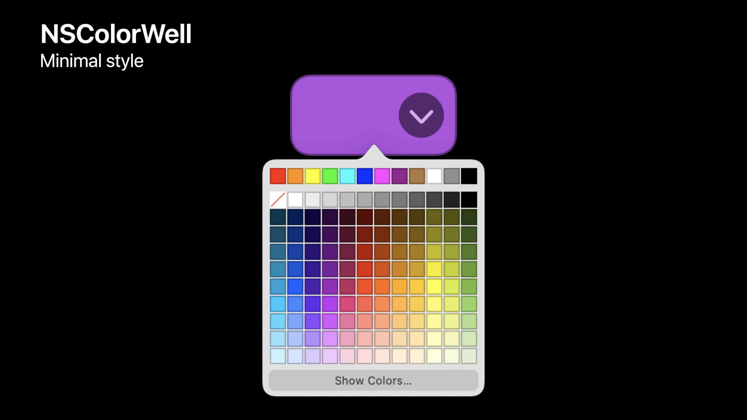
(07:21)NSColorWellThe default appearance updates automatically, no code migration is required.It also adds minimal and expanded styles.The minimal style displays a disclosure arrow on rollover and pops up the quick palette.The expanded style combines quick selection and completeNSColorPanelPut it in the same control.
// Conceptual code: the transcript explicitly lists the three colorWellStyle cases.
let colorWell = NSColorWell()

colorWell.colorWellStyle = .minimal
Key points:
NSColorWellThe default appearance is automatically modernized..minimalIdeal for smaller color entries in toolbars or inspectors..expandedClear entryway, iWork-style: quick selection on the left, full panel on the right.- pulldown target/action can take over the dropdown area, replacing the system palette with a custom popover or menu.
Toolbar customization can write rules
(09:40)NSToolbarThe new API solves two common problems: some items cannot be moved by the user; and some items can only appear in certain areas of the toolbar.
The talk lists two delegate methods.toolbarImmovableItemIdentifiersReturns an item identifier that cannot be moved or deleted.toolbar(_:itemIdentifier:canBeInsertedAt:)You can judge rearrangement, insertion, and removal.
// Conceptual code: method names come from the transcript and show where the rules live.
func toolbarImmovableItemIdentifiers(_ toolbar: NSToolbar) -> Set<NSToolbarItem.Identifier> {
    [filterItemIdentifier]
}

func toolbar(
    _ toolbar: NSToolbar,
    itemIdentifier: NSToolbarItem.Identifier,
    canBeInsertedAt index: Int
) -> Bool {
    allowedSection.contains(index)
}
Key points:
toolbarImmovableItemIdentifiersSuitable for items such as Mail filter buttons that must be parked in a fixed position.- The returned identifier will not be moved or deleted in custom mode.
canBeInsertedAtLet the application determine whether the insertion is legal based on position.allowedSection.contains(index)Express the rule “can only be placed in a certain paragraph”.
(10:56)centeredItemIdentifiersSupports multiple centered items.When the toolbar is customizable, these items can be added or removed, but they can only be rearranged within the centered group.NSToolbarItem.possibleLabelsUsed for variable titles.The width of the toolbar will be calculated based on the longest title to prevent other items from jumping left and right when switching states.
// Conceptual code: property names come from the transcript.
toolbar.centeredItemIdentifiers = [cropIdentifier, adjustIdentifier, filterIdentifier]

muteItem.possibleLabels = ["Mute", "Unmute"]
Key points:
centeredItemIdentifiersPin a group of tools to the center area of the toolbar.- Centered groups can still be rearranged according to user settings.
possibleLabelsTell the toolbar in advance which localized titles will appear for the same item.- The toolbar reserves the width according to the longest title, and the layout remains stable when switching states.
Variable row height tables no longer rush to measure all rows
(13:43)NSTableViewIn the past, all row heights were calculated in advance for scrolling experience.When a variable row height table has a large amount of data, the first load will be slowed down by these calculations.
Ventura changed to lazy calculation.NSTableViewOnly measure rows near the current viewport.Unmeasured rows use running estimated heights derived from measured rows.When scrolling, the table re-requests the true row height and maintains the correct scroll position.
// Conceptual code: the delegate callback still exists, but its timing changed in Ventura.
func tableView(_ tableView: NSTableView, heightOfRow row: Int) -> CGFloat {
    heightCache[row] ?? estimatedHeight(for: row)
}
Key points:
heightOfRowIt’s still where the row height is provided.- Ventura will request row heights as needed and no longer guarantees that all rows will be requested at once on startup.
- The code should not rely on the specific timing of the delegate call.
- Optimization automatically applied to
NSTableViewand SwiftUIList, no need to apply opt in.
SF Symbols 4 adds preferred rendering mode and variable symbols
(15:32) SF Symbols 4 adds over 450 new symbols in Ventura.Symbol rendering modes still include monochrome, hierarchical, palette, and multicolor.The new preferred rendering mode allows symbols to declare their own preferred default rendering mode.AppKit automatically uses this preference at runtime.
(17:28) Variable symbol expresses a quantity as a floating point value between 0 and 1.There are thresholds inside the symbol and the path will change based on the incoming value.The talk gave examples of Wi‑Fi signal strength and volume.
// Conceptual code: the transcript explains that the new initializer adds a value parameter to the existing symbol initializer.
let signalLevel = 0.75
let image = NSImage(
    systemSymbolName: "wifi",
    variableValue: signalLevel,
    accessibilityDescription: "Wi-Fi signal"
)
Key points:
systemSymbolNameSelect SF Symbol.variableValueIs a floating point number from 0 to 1.- symbol If variable thresholds are not defined, this value will be ignored.
- Symbol If thresholds are defined, the path will change numerically.
- Variable symbol can be used with palette, multicolor and other rendering methods.
The sharing portal is upgraded to popover and supports collaboration invitations.
(18:50) Ventura’s sharing experience has been upgraded from the old share menu to a more informative sharing popover.It can display document information and suggested people while retaining the originalNSSharingServicePickerAPI and delegate methods.
If you are sharing a file URL,NSSharingServicePickerIcons, names and file metadata can be automatically populated.If you share a custom type, you can let the item followNSPreviewRepresentableActivityItem, providing the underlying sharing object, title, image provider and icon provider.AppKit also providesNSPreviewRepresentingActivityItemAs a convenience category.
// Conceptual code: API names come from the transcript and show the composition of a custom share item.
let previewItem = NSPreviewRepresentingActivityItem(
    item: itemProvider,
    title: documentTitle,
    image: previewImage,
    icon: documentIcon
)

let picker = NSSharingServicePicker(items: [previewItem])
Key points:
NSPreviewRepresentingActivityItemKeep the sharing audience and preview metadata together.itemProviderIt’s something that really needs to be shared.title、image、iconHeader display for sharing popover.- When the cost of image generation is high, it is recommended for speeches
NSItemProviderDelivery delayed.
(20:44) If the sharing entry comes from the menu,NSSharingServicePickercan createstandardShareMenuItem.After adding it to the main menu or context menu, the user selects the menu item and the standard sharing popover opens.In context menu scenarios, the popover is anchored to the view that generated the menu.
// Conceptual code: property names come from the transcript.
let shareItem = picker.standardShareMenuItem
contextMenu.addItem(shareItem)
Key points:
standardShareMenuItemAvoid manual enumeration of sharing services.- The menu entry still goes into the system standard sharing popover.
- Applications can continue to use picker’s filtering and custom service capabilities.
- Collaborative applications can continue to explore the invitation process of CloudKit, iCloud Drive or their own server access.
Core Takeaways
1. Make a Stage Manager adaptation list
- What to do: Traverse the document window, Settings window, inspector, floating panel and pop-up window in the application, and specify the role for each type of window.
- Why it’s worth doing: Stage Manager will
collectionBehaviorDetermines whether to move existing windows out of the central area. - How to start: Check if the secondary window should be used
.auxiliary、.moveToActiveSpace、.stationaryor.transient。
2. Migrate a page of Settings to SwiftUIForm
- What to do: Select a set of independent settings, using SwiftUI
FormRewrite and apply.formStyle(.grouped)。 - Why it’s worth it: Settings windows usually have clear borders and are suitable for incremental introduction of SwiftUI in AppKit applications.
- How to start: Start with only
TextField、Toggle、Pickerpage, retaining the original AppKit window container.
3. UseNSComboButtonReplace a two-button or segmented control
- What to do: Merge the “Default Action + More Goals” controls into one
NSComboButton。 - Why it’s worth doing: The speech clearly mentioned that segmented controls were used to spell out this kind of interaction in the past, but now there are dedicated controls.
- How to start: Find the adjacent main button and drop-down button in the toolbar, put the main action in button action, and put additional selections in menu.
4. Add custom rules to the toolbar
- What: Limit where key toolbar items can be moved, deleted, and inserted.
- Why it’s worth doing: Ventura’s
NSToolbarThe delegate has added immovable items and insertion position judgment. - How to start: Implementation
toolbarImmovableItemIdentifiers, then usecanBeInsertedAtRestrict items to only appear in a specific area.
5. Complete preview metadata for the sharing object
- What: Let custom shared content display a title, preview, and icon in the sharing popover.
- Why it’s worth doing: Ventura’s sharing popover will display more document information and support suggested people and collaboration portals.
- How to get started: Use with custom sharing objects
NSPreviewRepresentableActivityItemorNSPreviewRepresentingActivityItem, menu entry is usedstandardShareMenuItem。
Related Sessions
- Adopt Variable Color in SF Symbols — Continue to talk about the variable color of SF Symbols 4, suitable for reading after the SF Symbols update of this session.
- Adopt desktop-class editing interactions — Talk about desktop-class editing interactions, related to AppKit controls, menus, and keyboard workflows.
- Bring multiple windows to your SwiftUI app — Talk about SwiftUI multiple windows, related to Stage Manager and Mac window collaboration scenarios.
- Build a desktop-class iPad app — Talk about iPad desktop-class capabilities, adjacent to cross-platform Settings, toolbars, and window thinking in Ventura.
Comments
GitHub Issues · utterances