
Highlight
Session is organized around three themes: Lists and Tables, Selection Models, and Column Views.
Core Content
The most common problem when moving an iPhone list to iPad is that it is empty. The screen has become larger, but the information density has not changed. Users still only see one column of content and have to click in and out.
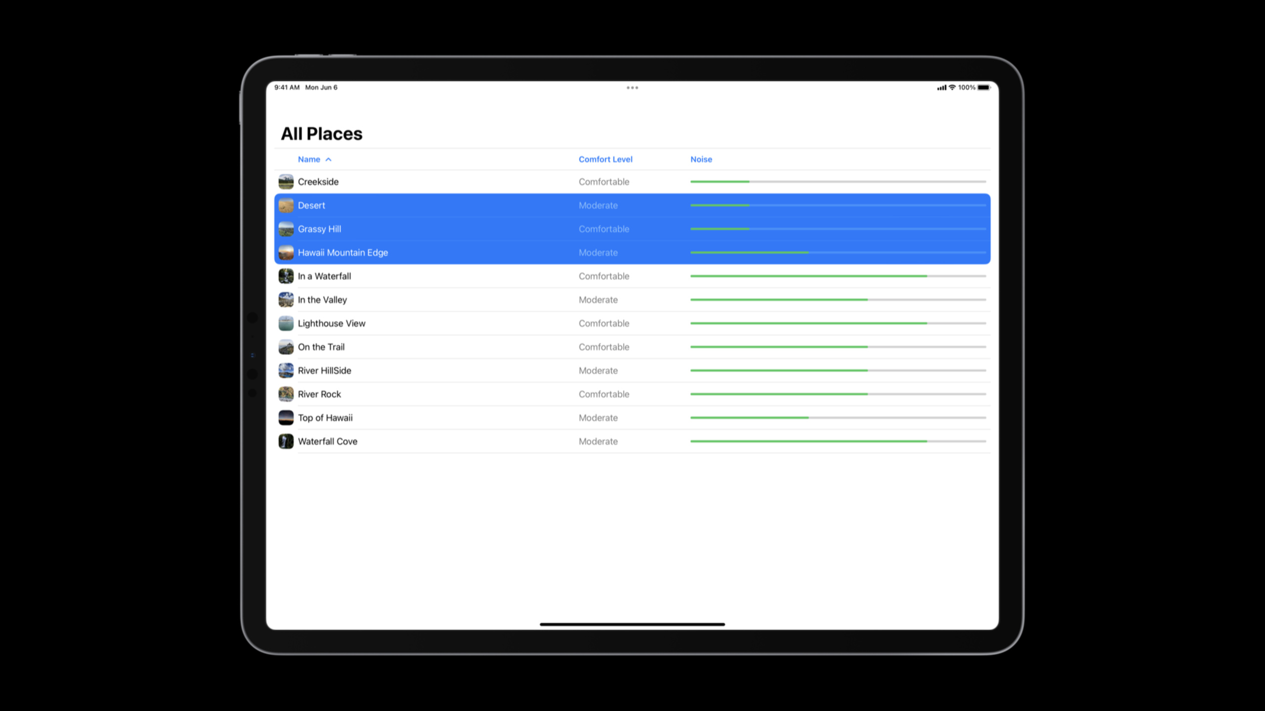
This session uses a “quiet reading place” app as an example. The original interface was justList, a waste of space on your iPad. iPadOS 16 brings SwiftUI’s multi-column table (Table) to iPad, and the same API is also available for macOS. The list can be changed into a table, and the name, comfort level, and noise level are put into columns respectively, and the user can sort them directly.
The form is only the first step. Productivity apps also need selection, batch operations, and context menus. SwiftUI’s selection model uses tags and selection state, and Table will automatically use the identifier of the row value as the selection tag. iPadOS 16 also adds lightweight multi-selection: after connecting the keyboard, users can use Shift and Command to expand the selection without entering editing mode.
Finally there is structure. Many iPad apps still use pop-up windows and layer-by-layer jumps to host the main process. SwiftUI enhanced in iPadOS 16 and macOS VenturaNavigationSplitView, supports two columns, three columns and different split view styles. It allows sidebar, content, and detail to be automatically adjusted in horizontal screen, vertical screen, Slide Over, and compact size class, reducing the use of modal interfaces.
Detailed Content
Migrate from List to Table
(03:10) The example starts with a normal list. It can display data, but only using a single column.
struct PlacesList: View {
    @Binding var modelData: ModelData

    var body: some View {
        List(modelData.places) { place in
            PlaceCell(place)
        }
    }
}
Key points:
@Binding var modelData: The list directly uses the external incoming data source. -List(modelData.places): eachPlaceGenerate a row. -PlaceCell(place): The original cell view can continue to be reused.
(03:18) Table is constructed differently. What it receives is the column builder. The first column can still be reusedPlaceCell, the following columns useTableColumnShow other fields.
struct PlacesTable: View {
    @Binding var modelData: ModelData
    @State private var sortOrder = [KeyPathComparator(\Place.name)]

    var body: some View {
        Table(modelData.places, sortOrder: $sortOrder) {
            TableColumn("Name", value: \.name) { place in
                PlaceCell(place)
            }
            TableColumn("Comfort Level", value: \.comfortDescription).width(200)
            TableColumn("Noise", value: \.noiseLevel) { place in
                NoiseLevelView(level: place.noiseLevel)
            }
        }
        .onChange(of: sortOrder) {
            modelData.sort(using: $0)
        }
    }
}
Key points:
@State private var sortOrder: Save the current sorting comparator, initially sorted by name. -Table(modelData.places, sortOrder: $sortOrder): Bind data and sorting status to the table. -TableColumn("Name", value: \.name): Column name is used for header, key path is used for sorting. -PlaceCell(place): The first column retains the complete information needed for a compact layout. -TableColumn("Comfort Level", value: \.comfortDescription).width(200): String columns can omit the view builder and set a fixed width. -TableColumn("Noise", value: \.noiseLevel): Non-plain text content still uses view builder. -.onChange(of: sortOrder): Table will not rearrange the data for you, the data source sorting must be performed by yourself.
There are two iPad-specific limitations here. First, Table under compact size class only displays the first column, so the first column must be able to independently express the row content. Second, the Table on the iPad does not scroll horizontally, and the number of columns must be controlled, otherwise the information will be crowded together.
Selection model: tag and selection state
(06:22) SwiftUI’s selection model consists of two parts: the tag of each row, and the state that holds the selected item. When making multiple selections, state is usually aSet, which stores the tag of the selected row.
(07:45) tag and identity are close, but not the same.ForEachTags are automatically derived from explicit identity. Table will use the identifier of the row value as the selection tag. When setting tag manually, usetagmodifier, the value must beHashable, the tag types in the same selectable container must be consistent.
(10:25) To add multiple selections to Table, you only need to add selection state and pass binding to Table.
struct PlacesTable: View {
    @EnvironmentObject var modelData: ModelData
    @State private var sortOrder = [KeyPathComparator(\Place.name)]
    @State private var selection: Set<Place.ID> = []

    var body: some View {
        Table(modelData.places, selection: $selection, sortOrder: $sortOrder) {
            // columns
        }
    }
}
Key points:
@EnvironmentObject var modelData:Table reads the shared model from the environment. -@State private var sortOrder: Sorting status is still retained. -@State private var selection: Set<Place.ID>: Used in multi-select stateSetSave multiple row identifiers. -selection: $selection: Table reads and writes the current selection through binding. -Set<Place.ID>: The type must match the Table row identifier. -// columns: Column definition can follow the previous TableColumn writing method.
(09:06) iPadOS 16 adds lightweight multi-selection. After connecting the keyboard, users can use Shift and Command to multi-select without entering edit mode. Touch scenes still require edit mode, and the system automatically supports two-finger pan to enter multi-selection gestures.
Use toolbar to expose selection operations
(10:56) The selection itself has no value, only batch actions have value. Example: Add the “Add selected location to guide” button to the toolbar and keep itEditButtonAllows users without a keyboard to enter edit mode.
Table(modelData.places, selection: $selection, sortOrder: $sortOrder) {
    ...
}
.toolbar {
    ToolbarItemGroup(placement: .navigationBarTrailing) {
        if !selection.isEmpty {
            AddToGuideButton(selection)
        }
    }

    ToolbarItemGroup(placement: .navigationBarLeading) {
        EditButton()
    }
}
Key points:
selection: $selection: The display logic of toolbar depends on the same selection state. -if !selection.isEmpty: When no items are selected, the batch operation button will not be displayed. -AddToGuideButton(selection):The action receives the currently selected set of identifiers. -EditButton(): When there is no keyboard, users still have a clear entrance to enter and exit edit mode.
This design takes care of both types of iPad usage. Keyboard and trackpad users can directly multi-select; pure touch users can still complete the same operation through edit mode.
###Multiple selection context menu
(11:41) SwiftUI adds multi-select context menus in iOS 16, iPadOS 16, and macOS Ventura. The menu closure receives an array of selected identifiers. If the collection is empty, it means that the user opens the menu in a blank area; if the collection has only one element, it means a single-line menu; if there are multiple elements in the collection, it means a multi-select menu.
// Item context menus

Table(modelData.places, selection: $selection, sortOrder: $sortOrder) {
    ...
}
.contextMenu(forSelectionType: Place.ID.self) { items in
    if items.isEmpty {
        // Empty area
        AddPlaceButton()
    } else {
        if items.count == 1 {
            // Single item
            FavoriteButton(isSet: $modelData.places[items.first!].isFavorite)
        }

        // Single and multiple items
        AddToGuideButton(items)
    }
}
Key points:
contextMenu(forSelectionType: Place.ID.self): The selection type must be consistent with the selection type of Table. -{ items in ... }: The closure gets the set of identifiers to be used in this menu. -if items.isEmpty: The blank area menu is suitable for global actions such as “Add a new location”. -if items.count == 1: The single-item menu can contain actions such as favorite that only apply to a single object. -AddToGuideButton(items): Both single selection and multi-selection can reuse batch actions.
If the empty collection branch does not generate any views, SwiftUI will not display the menu in the empty area. This allows the white space menu to be opened on demand.
Use NavigationSplitView to create an iPad structure
(13:52) The iPad’s large screen is suitable for displaying more levels at the same time. SwiftUI has improved split view support in iPadOS 16 and macOS Ventura, addingNavigationSplitView, supports two and three columns.
In a two-column layout, the leading column is called sidebar and the trailing column is called detail. Horizontal screen displays side by side by default. When the screen is in portrait orientation, the sidebar is retracted and the details remain visible.prominentDetailWill be more inclined to detail,balancedThe weights of the two columns will be balanced.
The three-column layout adds a content column. Content and detail are displayed by default in landscape mode, and the sidebar can be switched. In the vertical screen, detail is displayed first, and then content and sidebar are expanded in sequence through buttons. session recommends using automatic style first for three-column layout, because it will adapt according to the available space.
(16:55) The smallest two-column split view code is as follows.
// Navigation Split View example

struct ContentView: View {
    var body: some View {
        NavigationSplitView {
            SidebarView()
        } detail: {
            Text("Select a place")
        }
    }
}
Key points:
NavigationSplitView: Declare a SwiftUI split view. -SidebarView(): The first closure is the sidebar column. -detail:: The second closure is the detail column. -Text("Select a place"): When no content is displayed from the sidebar, fill the detail with a placeholder view.
(17:24) After entering Slide Over or compact size class, columns will automatically collapse into stacks. In this way, the same structure can cover iPad landscape, portrait and narrow windows.
Core Takeaways
-
What to do: Change the database, task database, and location database from single-column lists to Tables. Why it’s worth doing: iPadOS 16’s SwiftUI Table supports multiple columns, sorting, and sections, which can increase information density. How to start: First keep the original cell as the first column, and then use
TableColumnAdd a sortable field andonChange(of: sortOrder)Rearrange data sources in . -
What to do: Add lightweight multi-selection to batch sorting scenarios. Why it’s worth doing: Keyboard users can directly use Shift and Command to multi-select, and touch users can complete the same process through edit mode. How to start: Add to Table
@State private var selection: Set<Model.ID>,Bundle$selectionpass toTable, and then in toolbar according toselection.isEmptyShow batch button. -
What to do: Design context menus for blank areas, single items, and multiple items. Why it’s worth doing: multi-select context menus can bring actions closer to the user’s current selection, reducing the number of times they have to move back and forth to the toolbar. How to get started: Use
contextMenu(forSelectionType:), in the closure according toitems.isEmptyanditems.countSelect menu content. -
What to do: Change the main process from pop-up window to sidebar + detail. Why it’s worth doing:
NavigationSplitViewMore information can be displayed in the horizontal screen, and automatically collapsed in the vertical screen and Slide Over. There is no need to write a separate structure for each size. How to start: Build two columns firstNavigationSplitView, put the collection entry into the sidebar, and put the current content and empty state into detail.
Related Sessions
- The SwiftUI cookbook for navigation — An in-depth explanation of the state restoration, deep linking and programmatic navigation mentioned in this session.
- SwiftUI on iPad: Add toolbars, titles, and more — The second part of this session continues to improve the SwiftUI toolbar and title experience on iPad.
- Build a desktop-class iPad app — Talking about desktop-class iPad App from the perspective of UIKit, it is complementary to the SwiftUI route of this field.
- Adopt desktop-class editing interactions — Extended discussion of desktop-class interactions such as editing, selection, and menus.
Comments
GitHub Issues · utterances