
Highlight
This session revolves around four new tools for SwiftUI layout capabilities. First is a brand new Grid container, which fills the gap of non-lazy loading two-dimensional layout. Previously we only had LazyHGrid/LazyVGrid, which sacrificed two-way automatic size calculation for scrolling performance; the new Grid loads all subviews at once and can automatically calculate row height and column width, which is especially suitable for scenes with fixed content such as rankings and settings panels.
Core Content
SwiftUI already hasHStack、VStackand lazy grids. They can solve most interface arrangement problems.
The problem arises in more specific scenarios.
The ranking list of the voting app requires three columns: name, progress bar, and number of votes. The name column only needs to accommodate the longest name, the vote column only needs to accommodate the largest number, and the progress bar takes away the remaining space. The content of this interface is fixed and does not require scrolling. In order to only load visible content, lazy grid cannot automatically measure rows and columns at the same time.
SwiftUI 2022 fills this gap.GridLoad all subviews at once, so row height and column width can be calculated simultaneously.LayoutThe protocol lets you write your own containers and participate directly in SwiftUI’s measurement and placement process.ViewThatFitsSelect the first available version from multiple candidate views.AnyLayoutPreserve view identity when switching between different layouts and make animations continuous.
The example of this speech is very complete: for ranking listGrid, use a fixed-width custom stack for the voting button, and use it for large font sizes.ViewThatFitsCut it into vertical rows, use radial layout for the top avatar, and then useAnyLayoutSwitch back in case of three-way drawHStack。
Detailed Content
Grid: Static 2D content is automatically measured by SwiftUI
(04:28) The ranking list is a typical two-dimensional layout. Each row is a pet, and each column displays the name, voting percentage, and number of votes.
struct Leaderboard: View {
    var pets: [Pet]
    var totalVotes: Int

    var body: some View {
        Grid(alignment: .leading) {
            ForEach(pets) { pet in
                GridRow {
                    Text(pet.type)
                    ProgressView(
                        value: Double(pet.votes),
                        total: Double(totalVotes))
                    Text("\(pet.votes)")
                        .gridColumnAlignment(.trailing)
                }

                Divider()
            }
        }
        .padding()
    }
}
Key points:
Grid(alignment: .leading)Sets the default alignment for the entire grid. -ForEach(pets)Use data to generate multiple rows of content,PetImplemented in the exampleIdentifiable。GridRowThe three views in each go into three columns. -ProgressViewIt is a flexible view and will get the remaining space outside the text column. -Text("\(pet.votes)")Show the number of votes. -.gridColumnAlignment(.trailing)Affects only the column where the votes are located, aligning the numbers to the right. -Divider()put onGridRowWhen outside, it spans the entire width of the grid.
GridIt fits here because the leaderboard is not a long list. It can measure all cells and automatically obtain the required dimensions for each column and row.
Layout: Write custom containers into the layout engine
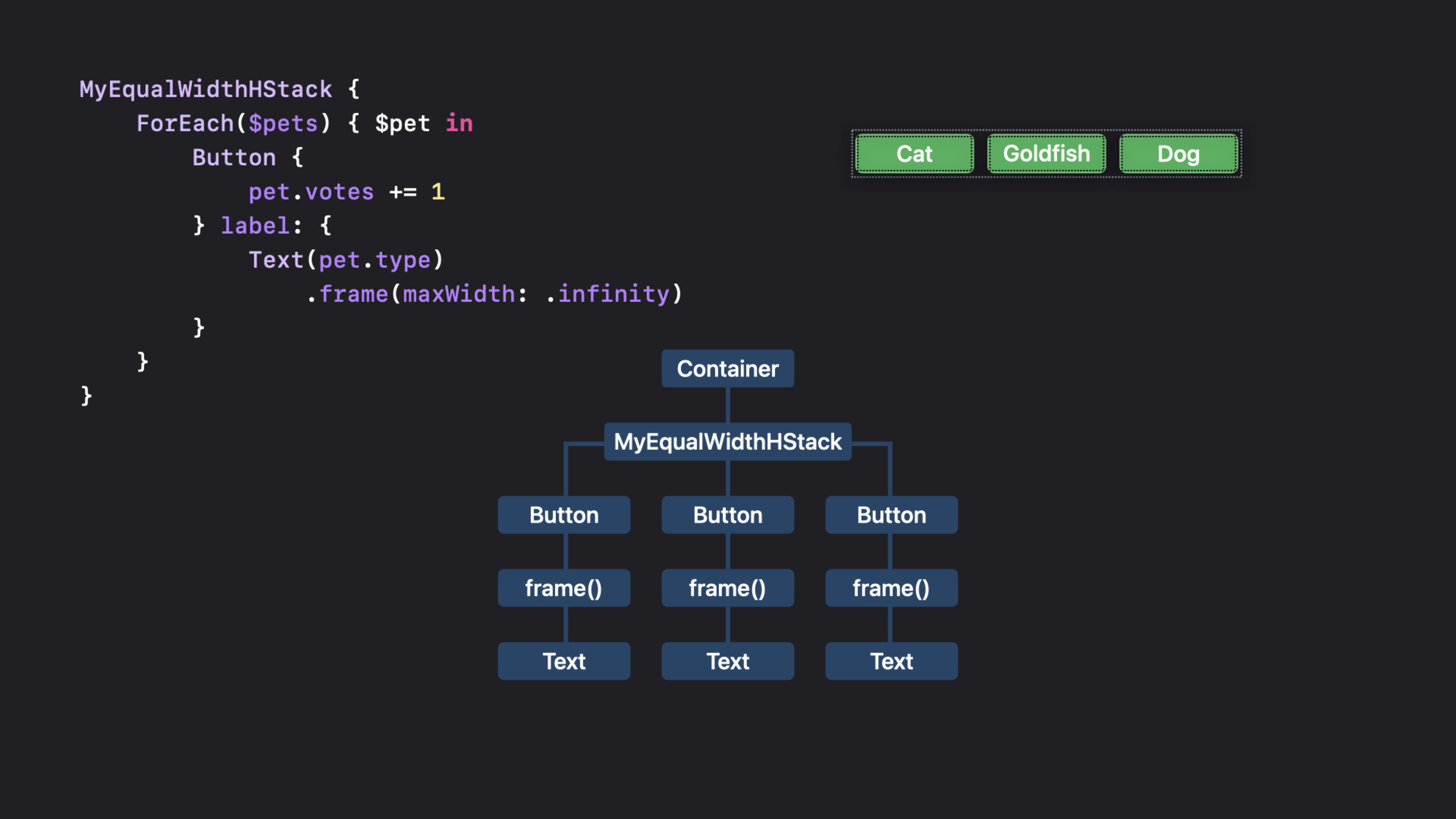
(10:53) There is another requirement for the voting buttons: each button has the same width, but the width is only equal to the ideal width of the widest text.HStackThis will cause the buttons to be arranged according to the width of their own text; adding a flexible frame to the text will cause the buttons to fill the container.
LayoutIt is this middle ground that the agreement addresses.
struct MyEqualWidthHStack: Layout {
    func sizeThatFits(
        proposal: ProposedViewSize,
        subviews: Subviews,
        cache: inout Void
    ) -> CGSize {
        // Return a size.
    }

    func placeSubviews(
        in bounds: CGRect,
        proposal: ProposedViewSize,
        subviews: Subviews,
        cache: inout Void
    ) {
        // Place child views.
    }
}
Key points:
MyEqualWidthHStackDeclare yourself as a SwiftUI layout container. -sizeThatFitsResponsible for answering how big the container wants to be. -proposalIt is the size suggestion given by the parent container to this layout. -subviewsIs a set of proxies used to make size suggestions to subviews and read the results. -cacheIntermediate calculations can be shared between two methods; this is not used for this simple example. -placeSubviewsResponsible for putting subviews intobounds。boundsThe origin cannot be assumed to be(0, 0), use when placingbounds.minX、bounds.midYSuch attributes.
(13:44) Monowidth layout first measures the ideal size of each button, and then finds the maximum width and maximum height.
private func maxSize(subviews: Subviews) -> CGSize {
    let subviewSizes = subviews.map { $0.sizeThatFits(.unspecified) }
    let maxSize: CGSize = subviewSizes.reduce(.zero) { currentMax, subviewSize in
        CGSize(
            width: max(currentMax.width, subviewSize.width),
            height: max(currentMax.height, subviewSize.height))
    }

    return maxSize
}
Key points:
subviews.mapIterate through all subview delegates. -$0.sizeThatFits(.unspecified)Ask the subview for the ideal size. -reduce(.zero)Accumulate maximum values starting from zero size. -max(currentMax.width, subviewSize.width)Find the widest button. -max(currentMax.height, subviewSize.height)Find the top button.- returned
maxSizeWill be used for both measuring the container and placing subviews.
(15:40) Do not write the spacing as a fixed value casually. SwiftUI’s subview proxy can provide system recommended spacing.
private func spacing(subviews: Subviews) -> [CGFloat] {
    subviews.indices.map { index in
        guard index < subviews.count - 1 else { return 0 }
        return subviews[index].spacing.distance(
            to: subviews[index + 1].spacing,
            along: .horizontal)
    }
}
Key points:
subviews.indices.mapGenerates a spacing for each subview to the next. -guard index < subviews.count - 1 else { return 0 }Leave no extra space behind the last view. -subviews[index].spacingRead the spacing preference of the current view. -distance(to:along:)Also consider the preference of two adjacent views on the common edge. -.horizontalIndicates calculating the horizontal spacing.
(16:33) With the maximum subview size and spacing,sizeThatFitswill return the container size.
func sizeThatFits(
    proposal: ProposedViewSize,
    subviews: Subviews,
    cache: inout Void
) -> CGSize {
    // Return a size.
    guard !subviews.isEmpty else { return .zero }

    let maxSize = maxSize(subviews: subviews)
    let spacing = spacing(subviews: subviews)
    let totalSpacing = spacing.reduce(0) { $0 + $1 }

    return CGSize(
        width: maxSize.width * CGFloat(subviews.count) + totalSpacing,
        height: maxSize.height)
}
Key points:
- Empty layout is returned directly
.zero。 maxSize(subviews:)Get the width and height shared by all buttons. -spacing(subviews:)Get the system recommended spacing between adjacent buttons. -spacing.reduce(0) { $0 + $1 }Find the total distance.- The width is equal to the maximum button width multiplied by the number of buttons, plus the spacing.
- The height is equal to the height of the tallest button.
(16:51)placeSubviewsUsing the same dimensions, place each button at its own center point.
func placeSubviews(
    in bounds: CGRect,
    proposal: ProposedViewSize,
    subviews: Subviews,
    cache: inout Void
) {
    // Place child views.
    guard !subviews.isEmpty else { return }

    let maxSize = maxSize(subviews: subviews)
    let spacing = spacing(subviews: subviews)

    let placementProposal = ProposedViewSize(width: maxSize.width, height: maxSize.height)
    var x = bounds.minX + maxSize.width / 2

    for index in subviews.indices {
        subviews[index].place(
            at: CGPoint(x: x, y: bounds.midY),
            anchor: .center,
            proposal: placementProposal)
        x += maxSize.width + spacing[index]
    }
}
Key points:
- Empty layout does not require any subviews to be placed.
-
placementProposalGive each button the same width and height recommendations. -bounds.minX + maxSize.width / 2Get the x-coordinate of the center point of the first button. -bounds.midYCenter the button vertically. -subviews[index].placePlace the subview at the specified point. -anchor: .centerexpressatPoints to the center of the subview. - After each cycle,
xAdvances one button width and current spacing.
(18:07) Using a custom layout is the same as using the built-in stack.
MyEqualWidthHStack {
    ForEach($pets) { $pet in
        Button {
            pet.votes += 1
        } label: {
            Text(pet.type)
                .frame(maxWidth: .infinity)
        }
        .buttonStyle(.bordered)
    }
}
Key points:
MyEqualWidthHStackWrap a set of voting buttons. -ForEach($pets)Traverse the binding array, so the button can be modified directlypet.votes。pet.votes += 1It’s a voting action. -Text(pet.type)Display candidate names. -.frame(maxWidth: .infinity)Allows the text view to expand to the width given by layout. -.buttonStyle(.bordered)Use the system bordered button style.
Here also explains why it is not recommendedGeometryReaderReverse button width.GeometryReaderWhat is measured is its container, and then the information is passed to the subview; if it is used to pass the measurement results back to the upper frame, it may bypass the layout engine and cause repeated measurement and rearrangement.
ViewThatFits: Prepare alternate layout for Dynamic Type
(21:08) Large font sizes will make the horizontal buttons unable to fit. At this time, the example does not includeMyEqualWidthHStackto write more complexly, but giveViewThatFitsTwo candidate layouts.
struct StackedButtons: View {
    @Binding var pets: [Pet]

    var body: some View {
        ViewThatFits {
            MyEqualWidthHStack {
                Buttons(pets: $pets)
            }
            MyEqualWidthVStack {
                Buttons(pets: $pets)
            }
        }
    }
}
Key points:
StackedButtonstake over@Binding var pets, the hold button can modify the voting data. -ViewThatFitsInternal candidate views are checked sequentially.- The first candidate is a horizontal monowidth layout.
- The second candidate is vertical monowidth layout.
- When the horizontal version cannot fit, SwiftUI selects the vertical version.
-
Buttons(pets: $pets)Extract the button content into a subview to avoid duplicating button code in two candidate layouts.
This is suitable for handling Dynamic Type, narrow and split screens. You provide several clear layout versions and let SwiftUI choose from the currently available space.
LayoutValueKey: Let the subview give layout data to the container
(22:52) The top avatar uses radial layout. The basic version places each avatar on the circle according to the number of subviews.
func placeSubviews(
    in bounds: CGRect,
    proposal: ProposedViewSize,
    subviews: Subviews,
    cache: inout Void
) {
    let radius = min(bounds.size.width, bounds.size.height) / 3.0
    let angle = Angle.degrees(360.0 / Double(subviews.count)).radians
    let offset = 0 // This depends on rank...

    for (index, subview) in subviews.enumerated() {
        var point = CGPoint(x: 0, y: -radius)
            .applying(CGAffineTransform(
                rotationAngle: angle * Double(index) + offset))

        point.x += bounds.midX
        point.y += bounds.midY

        subview.place(at: point, anchor: .center, proposal: .unspecified)
    }
}
Key points:
radiusTake one-third of the smaller value of the width and height of the layout area. -angleDivide 360 degrees evenly according to the number of subviews.- Initial point
CGPoint(x: 0, y: -radius)Located directly above the center of the circle. -CGAffineTransform(rotationAngle:)Rotate this point based on the index. -point.x += bounds.midXandpoint.y += bounds.midYMove local coordinates to the center of the layout. -subview.placePlace the avatar on the calculated circumference point.
(23:42) To allow the circular layout to rotate by rank, the layout needs to know the rank of each avatar.LayoutValueKeyIt’s the communication channel here.
private struct Rank: LayoutValueKey {
    static let defaultValue: Int = 1
}

extension View {
    func rank(_ value: Int) -> some View {
        layoutValue(key: Rank.self, value: value)
    }
}
Key points:
RankobeyLayoutValueKey。defaultValueProvides a default value for views that have no rank set. -defaultValueIt is also determined that the type of this layout value isInt。extension ViewAdd a more readable one.rank(_:)modifier. -layoutValue(key:value:)Store the rank in the view for the layout’s subview agent to read.
(24:21) After reading rank, the layout can calculate the overall rotation offset based on ranking.
func placeSubviews(
    in bounds: CGRect,
    proposal: ProposedViewSize,
    subviews: Subviews,
    cache: inout Void
) {
    let radius = min(bounds.size.width, bounds.size.height) / 3.0
    let angle = Angle.degrees(360.0 / Double(subviews.count)).radians

    let ranks = subviews.map { subview in
        subview[Rank.self]
    }
    let offset = getOffset(ranks)

    for (index, subview) in subviews.enumerated() {
        var point = CGPoint(x: 0, y: -radius)
            .applying(CGAffineTransform(
                rotationAngle: angle * Double(index) + offset))
        point.x += bounds.midX
        point.y += bounds.midY
        subview.place(at: point, anchor: .center, proposal: .unspecified)
    }
}
Key points:
subviews.mapTraverse subview delegates. -subview[Rank.self]Read the rank on each subview. -getOffset(ranks)Calculate the rotation angle based on the ranked array; the presentation did not expand on the internal logic of this function.- The placement loop is the same as the base version, just the rotation angle is added
offset. - This way the layout container does not need to access the business model and only reads the layout values explicitly provided by each subview.
AnyLayout: Preserve view identity when switching layouts
(25:18) In a three-way tie, the circular layout cannot align the three avatars in a line through rotation. For exampleAnyLayoutin radial layout andHStackLayoutswitch between.
struct Profile: View {
    var pets: [Pet]
    var isThreeWayTie: Bool

    var body: some View {
        let layout = isThreeWayTie ? AnyLayout(HStackLayout()) : AnyLayout(MyRadialLayout())

        Podium() // Creates the background that shows ranks.
            .overlay(alignment: .top) {
                layout {
                    ForEach(pets) { pet in
                        Avatar(pet: pet)
                            .rank(rank(pet))
                    }
                }
                .animation(.default, value: pets)
            }
    }
}
Key points:
isThreeWayTieDecide which layout you want to use currently. -AnyLayout(HStackLayout())Wrap the built-in horizontal layout into the same type. -AnyLayout(MyRadialLayout())Also wrap custom radial layout into the same type. -let layout = ...Keep the structure of the subsequent view hierarchy consistent. -layout { ... }to the same groupAvatarApply different layouts. -.rank(rank(pet))Continue to pass the ranking to the radial layout. -.animation(.default, value: pets)Create a smooth transition when voting data changes.
The focus is on view identity. What SwiftUI sees is the same set of avatars changing layout, rather than a set of old avatars disappearing and a new set of avatars appearing. The animation can therefore be continuous.
Core Takeaways
-
What to do: Make a two-dimensional table of automatic measurements for the settings page. Why it’s worth doing:
GridThe label column and value column can be automatically widened according to the content, and flexible views such as switches and progress bars can use the remaining space. How to start: UseGrid(alignment:)andGridRowRewrite the fixed content table and add columns that need to be right aligned.gridColumnAlignment(.trailing)。 -
What to do: Make a set of tool buttons into controls with equal width but not covering the window. Why it’s worth doing:
LayoutYou can first measure the ideal size of all buttons and then use the widest button as the uniform width. How to start: Implement aLayouttype, insizeThatFitsChinese use.unspecifiedMeasure the subview, inplaceSubviewsChinese useProposedViewSize(width:height:)Place the subview. -
What: Provides automatic switching of button arrangements for large font sizes and narrow windows. Why it’s worth doing:
ViewThatFitsYou can try the horizontal layout first, and switch to the vertical layout when it can’t fit. There is no need to stuff all the judgment into a custom layout. How to start: Take a cut of duplicate button contentButtonssubview, and then put the horizontal and vertical layouts into itViewThatFits。 -
What to do: Make an avatar, badge or ranking display that rotates based on business status. Why it’s worth doing:
LayoutValueKeyAllow each subview to provide layout data such as rank, weight, and priority to layout. How to start: Define aLayoutValueKey,GiveViewAdd convenience modifiers inplaceSubviewsChinese usesubview[Key.self]Read. -
What to do: Make a continuous layout animation between compact mode, expanded mode and flat mode. Why it’s worth doing:
AnyLayoutThe subview identity is retained when switching layout types, which is suitable for state-driven interface rearrangement. How to start: Package the candidate layout intoAnyLayout, use the samelayout { ForEach(...) }Carrying content, and then adding the driver status.animation。
Related Sessions
- What’s new in SwiftUI — Overview of new capabilities in SwiftUI 2022, including layout capabilities used in this scene.
- The SwiftUI cookbook for navigation — Continue to use SwiftUI’s declarative API to organize the app navigation structure.
- SwiftUI on iPad: Organize your interface — Talk about SwiftUI organization method for larger screen and multi-column interface on iPad.
- The craft of SwiftUI API design: Progressive disclosure — Understand how SwiftUI puts together simple entrances and advanced capabilities from an API design perspective.
Comments
GitHub Issues · utterances