
Highlight
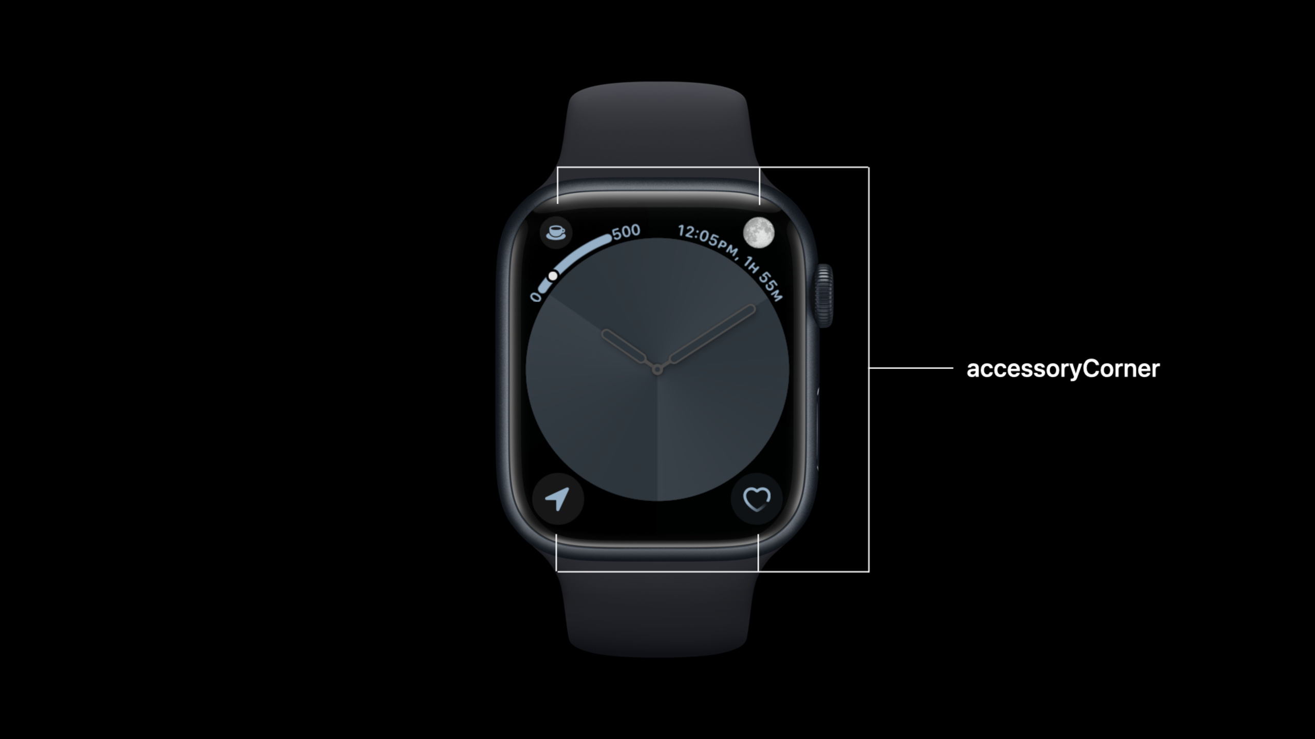
watchOS 9 brings WidgetKit to the Complications of the watch, sharing the same API base as the iOS 16 lock screen widget. But watches have several unique requirements: the position of the corner of the dial (accessoryCorner) needs to display both circular content and arc-shaped auxiliary labels; circular Complication has extra bezel space to display text on some dials (such as Infograph dials).
Core Content
The difficulty in doing Complication for Apple Watch is not only the data. The space on the dial is very small, and the same content will appear in the corners, bezel, circular slots, and Extra Large dial. The old ClockKit also required developers to deal with many templates and families, making migration costly.
The change in watchOS 9 is to connect the watch face Complication to WidgetKit. Developers continue to write SwiftUI views, timelines, and configurations. The system is responsible for placing content in different watch face locations and allowing old ClockKit Complication to automatically upgrade to the new WidgetKit version.
This session only talks about the unique parts of watchOS. There are three key points:accessoryCornerarc auxiliary content,accessoryCircularadditional tabs on the Infograph watch face, andCLKComplicationWidgetMigratormigration mapping.
Coffee Tracker examples appear throughout. It records coffee, tea and soda intake for the day and tracks caffeine in the body. This example works for Complication: the user can take a look at the dial and know the current caffeine level.
Detailed Content
accessoryCorner: circular main body plus arc auxiliary content
(03:06)accessoryCornerIt is the WidgetKit family added to watch face corners in watchOS 9. Its circular main body is rendered according to ordinary SwiftUI, and the auxiliary content is drawn by the dial. Let’s look at the body-only version first.
struct CornerView: View {
    let value: Double

    var body: some View {

        ZStack {
            AccessoryWidgetBackground()
            Image(systemName: "cup.and.saucer.fill")
                .font(.title.bold())
                .widgetAccentable()
        }

    }
}
Key points:
CornerViewis a SwiftUI view, and the input value isvalue, which will be used later for Gauge. -ZStackStack the background and icon together to form the rounded body of the corner Complication. -AccessoryWidgetBackground()Provides system-recognized accessory context. -Image(systemName:)Use SF Symbol to display the coffee cup icon. -.widgetAccentable()Let icons participate in WidgetKit’s accent color rendering.
(03:27) To add arced content, watchOS 9 provideswidgetLabel. existaccessoryCornerHere, label can beText、GaugeorProgressView. The watch face will take out the label content and draw it as a curve label or progress in the corner.
struct CornerView: View {
    let value: Double

    var body: some View {

        ZStack {
            AccessoryWidgetBackground()
            Image(systemName: "cup.and.saucer.fill")
                .font(.title.bold())
                .widgetAccentable()
        }
        .widgetLabel {
            Gauge(value: value,
              in: 0...500) {
                Text("MG")
            } currentValueLabel: {
                Text("\(Int(value))")
            } minimumValueLabel: {
                Text("0")
            } maximumValueLabel: {
                Text("500")
            }
        }


    }
}
Key points:
.widgetLabelInstead of drawing the content into the main body of the circle, give the auxiliary content to the dial. -Gauge(value:in:)Map caffeine values to0...500range. -Text("MG")Is the Gauge unit tag. -currentValueLabelDisplays the current integer value. -minimumValueLabelandmaximumValueLabelProvides the range endpoint for the watch face.- When the label appears, the circular body will automatically shrink to leave space for the arc content.
accessoryCircular: Use showsWidgetLabel to adapt the positions with and without bezels
(04:24)accessoryCircularGauge can also be displayed. There is no additional bezel text for ordinary circular slots, and the core information needs to be placed in the main body.
struct CircularView: View {
    let value: Double

    var body: some View {

        Gauge(value: value,
              in: 0...500) {
            Text("MG")
        } currentValueLabel: {
            Text("\(Int(value))")
        }
        .gaugeStyle(.circular)

    }
}
Key points:
CircularViewuse the samevalueRepresents caffeine value. -GaugeStill using0...500range. -currentValueLabelPut the current value into Gauge. -.gaugeStyle(.circular)Render Gauge into a circular style suitable for Complication.
(04:34) The circular Complication of the Infograph dial has extra bezel space. You can put longer text herewidgetLabel。
struct CircularView: View {
    let value: Double

    var body: some View {
        let mg = value.inMG()

        Gauge(value: value,
              in: 0...500) {
            Text("MG")
        } currentValueLabel: {
            Text("\(Int(value))")
        }
        .gaugeStyle(.circular)
        .widgetLabel {
            Text("\(mg, formatter: mgFormatter) Caffeine")
        }

    }

    var mgFormatter: Formatter {
        let formatter = MeasurementFormatter()
        formatter.unitOptions = [.providedUnit]
        return formatter
    }
}

extension Double {
    func inMG() -> Measurement<UnitMass> {
        Measurement<UnitMass>(value: self, unit: .milligrams)
    }
}
Key points:
let mg = value.inMG()wrap the numbers intoMeasurement<UnitMass>.- The body still displays the current value with a circular Gauge.
-
.widgetLabelAdd to"Caffeine"Text, used for the bezel position of the Infograph. -MeasurementFormatterPreserve the incoming units to prevent the system from changing to other mass units. -inMG()clearlyDoubleConvert to milligrams.
(05:12) The problem is that the sameaccessoryCircularwill appear in different dial locations. Some show the widget label, and some don’t. watchOS 9 providesshowsWidgetLabelAn environment value that lets the view choose content density based on its current location.
struct CircularView: View {
    let value: Double
    @Environment(\.showsWidgetLabel) var showsWidgetLabel

    var body: some View {
        let mg = value.inMG()
        if showsWidgetLabel {
            ZStack {
                AccessoryWidgetBackground()
                Image(systemName: "cup.and.saucer.fill")
                    .font(.title.bold())
                    .widgetAccentable()
            }
            .widgetLabel {
                Text("\(mg, formatter: mgFormatter) Caffeine")
            }
        }
        else {
            Gauge(value: value,
                  in: 0...500) {
                Text("MG")
            } currentValueLabel: {
                Text("\(Int(value))")
            }
            .gaugeStyle(.circular)
        }

    }

    var mgFormatter: Formatter {
        let formatter = MeasurementFormatter()
        formatter.unitOptions = [.providedUnit]
        return formatter
    }
}

extension Double {
    func inMG() -> Measurement<UnitMass> {
        Measurement<UnitMass>(value: self, unit: .milligrams)
    }
}
Key points:
@Environment(\.showsWidgetLabel)Read whether the widget label will be displayed at the current location. -showsWidgetLabel == trueAt this time, only the coffee cup icon is placed in the main body, and the numerical text is placed in the label. -showsWidgetLabel == false, the body switches to a circular gauge to prevent users from losing caffeine information.- Both branches come from the same view and do not need to be split into two widgets.
-
mgFormatterandinMG()Ensure that label copy continues to use milligram units.
(05:47) Extra Large dial also usesaccessoryCircular. The system will automatically enlarge the circular content. Apple’s advice is clear: don’t cram more information into the canvas just because it gets larger, and keep the content hierarchy consistent with a regular circular Complication.
Migrate from ClockKit to WidgetKit
(06:45) Migration is a two-step process. The first step is to rewrite the old ClockKit template into WidgetKit’s SwiftUI view. watchOS 9 converges the old 12 ClockKit families into 4 WidgetKit families:accessoryRectangular、accessoryCircular、accessoryCorner、accessoryInline。
(08:25) The second step is to tell the system how to upgrade the old Complication that the user has put on the dial. For this purpose, ClockKit has addedCLKComplicationWidgetMigrator. After the app is updated, the watch face will check the widgets in the app bundle and call the oldCLKComplicationDataSourceGenerate migration configuration.
(09:47) The most direct way is to let the existing data source provide its own migrator.
var widgetMigrator: CLKComplicationWidgetMigrator {
    self
}
Key points:
widgetMigratorIt is a new migration entry on ClockKit data source.- return
selfIndicates that the current data source implements the migration protocol itself. - The system will use this object to map the old Complication descriptor to the new WidgetKit configuration.
(09:56) If the new WidgetKit Complication is static configuration, return static migration configuration.
func widgetConfiguration(from complicationDescriptor: CLKComplicationDescriptor) async -> CLKComplicationWidgetMigrationConfiguration? {
    CLKComplicationStaticWidgetMigrationConfiguration(kind: "CoffeeTracker", extensionBundleIdentifier: widgetBundle)
}
Key points:
widgetConfiguration(from:)receive oldCLKComplicationDescriptor.- Return value is optional
CLKComplicationWidgetMigrationConfiguration。 CLKComplicationStaticWidgetMigrationConfigurationUsed for static WidgetKit configuration. -kind: "CoffeeTracker"Points to the new widget kind. -extensionBundleIdentifierPoints to the extension bundle containing the widget.
(10:03) If the new Complication uses intent configuration, return intent migration configuration. Apple specifically reminds that the intent definition needs to be included in both the watch app and the widget extension, so that intent objects can be created in both locations.
func widgetConfiguration(from complicationDescriptor: CLKComplicationDescriptor) async -> CLKComplicationWidgetMigrationConfiguration? {
    CLKComplicationIntentWidgetMigrationConfiguration(kind: "CoffeeTracker", extensionBundleIdentifier: widgetBundle, intent: intent, localizedDisplayName: "Coffee Tracker")
}
Key points:
CLKComplicationIntentWidgetMigrationConfigurationCorresponds to intent-based WidgetKit complication. -kindandextensionBundleIdentifierStill positioning the new widget. -intentSave the configuration status corresponding to the old Complication. -localizedDisplayNameProvide a display name for the migrated configuration.- When the intent definition is missing, the watch app or extension may not be able to create the intent objects required for migration.
Core Takeaways
-
Make a Caffeine Dial Status: Use
accessoryCircularDisplays the current caffeine level, passed on the Infograph bezelwidgetLabelDisplays “Caffeine” and milligrams. The entrance isGauge、.gaugeStyle(.circular)and.widgetLabel。 -
Make a drinking or standing progress corner Complication: Use
accessoryCornerPlace the icon on the circular body ofGaugeput inwidgetLabel. Users can see icons and curved progress in the corners. -
Make a multi-dial adaptation in the same view: read in circular Complication
@Environment(\.showsWidgetLabel). When there is a bezel, the icon is placed on the main body, and when there is no bezel, the main body displays Gauge to ensure that information is not lost. -
Make a smooth migration from ClockKit to WidgetKit: first change the old template to SwiftUI view, and then implement
CLKComplicationWidgetMigrator. After the user updates the app, the old Complication originally placed on the watch face will be upgraded to the new WidgetKit version. -
Make a restrained version of Extra Large: reuse normal
accessoryCircularcontent and let the system amplify it. Don’t add extra layers to the Extra Large canvas, just optimize font size, symbols, and alignment.
Related Sessions
- Complications and widgets: Reloaded — Introducing the common foundation of WidgetKit on the iOS 16 lock screen and watchOS 9 Complication.
- What’s new in SwiftUI — Sort out the SwiftUI 2022 update and understand the framework changes behind the WidgetKit view writing method.
- Compose custom layouts with SwiftUI — Talking about SwiftUI layout capabilities, suitable for continuing to optimize the compact dial interface.
- Adopt Variable Color in SF Symbols — Talk about the variable color of SF Symbols, suitable for adding status expression to Complication icons.
Comments
GitHub Issues · utterances