
Highlight
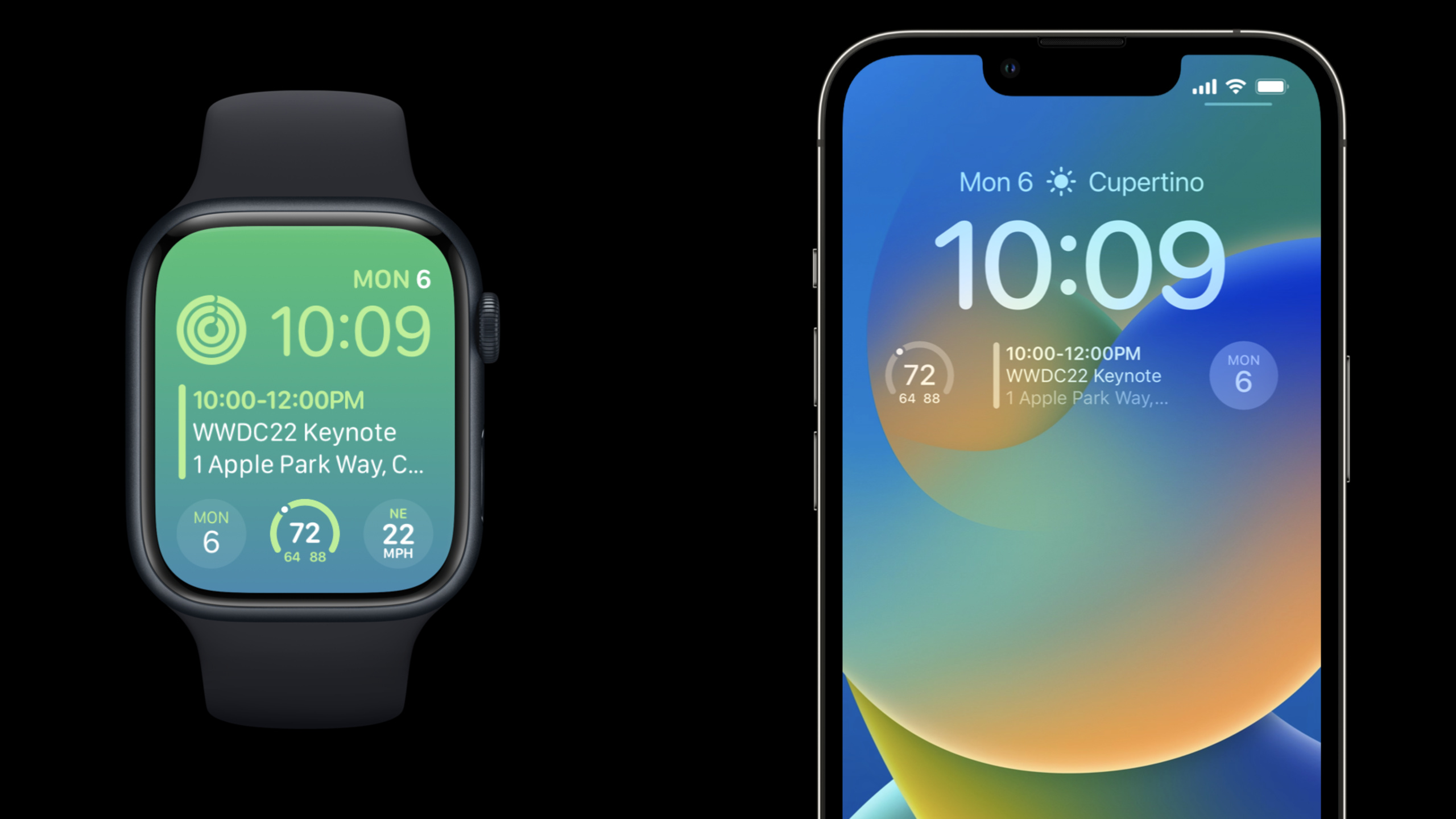
Devon from the watchOS team and Graham from the iOS team describe major expansions to WidgetKit on iOS 16 and watchOS 9. The core change is: watchOS’s complications are now built on WidgetKit, and iOS 16 adds accessory widgets on the lock screen.
Core Content
Complication’s goal is straightforward: give users a high-value piece of information that’s readable at a glance on the watch face, and drive clicks back to relevant locations in the app (01:07). In the past, watchOS developers mainly worked around ClockKit. iOS developers use WidgetKit for home screen widgets. The two sets of entrances are similar, but the code and mental model are separate.
iOS 16 and watchOS 9 merge this into WidgetKit. Apple givesWidgetFamilyaddedaccessoryRectangular、accessoryCircular、accessoryInline, watchOS also has additionalaccessoryCorner. The first three families appear on both the iOS lock screen and watchOS watch faces, and developers can share timelines, SwiftUI views, and existing Home Screen widget infrastructure (01:58).
This session takes Emoji Rangers as an example, starting from an existing iOS Home Screen widget, copying the same Widget Extension to watchOS, and then gradually adapting it to the small size family. The focus is not on “shrinking the large widget”, but on re-deciding what information is only displayed in each size: the circle only displays the avatar and recovery progress, the rectangle displays the name, level and countdown, and inline usesViewThatFitsSelect appropriate text in different widths (09:56).
Finally, we have to deal with the privacy environment of the lock screen and always-on dial. The iOS lock screen may show or hide content when the device is locked; watchOS always-on state reduces brightness and refresh rate. Provided by WidgetKitisLuminanceReducedandprivacySensitive(), allowing the same view to locally adjust for low brightness and privacy masking (15:02).
Detailed Content
1. Use accessory family to share iOS lock screen and watchOS watch face view
(02:11) The new accessory family is hung onWidgetFamilysuperior.accessoryRectangularSuitable for multi-line text and small charts;accessoryCircularGood for short messages, dashboards and progress;accessoryInlineis a line of text that appears above multiple watch face locations on watchOS and above the time on iOS.
Emoji Rangers previews three families simultaneously in Xcode Preview:
EmojiRangerWidgetEntryView(entry: SimpleEntry(date: Date(), relevance: nil, character: .spouty))
    .previewContext(WidgetPreviewContext(family: .accessoryCircular))
    .previewDisplayName("Circular")
EmojiRangerWidgetEntryView(entry: SimpleEntry(date: Date(), relevance: nil, character: .spouty))
    .previewContext(WidgetPreviewContext(family: .accessoryRectangular))
    .previewDisplayName("Rectangular")
EmojiRangerWidgetEntryView(entry: SimpleEntry(date: Date(), relevance: nil, character: .spouty))
    .previewContext(WidgetPreviewContext(family: .accessoryInline))
    .previewDisplayName("Inline")

#if os(iOS)
Key points:
- Line 1 creates the same
EmojiRangerWidgetEntryView, enter the same timeline entry. -.accessoryCircularUse circular dimensions to check that avatars, dashboards, and progress content fit inside. -.accessoryRectangularCheck multi-line text and image combinations with rectangular dimensions. -.accessoryInlineUse a line of text size to check if it will be truncated. -#if os(iOS)From the platform branch in the demo, the reason is that watchOS does not support all iOS system families (08:38).
2. Use widgetAccentable and background adaptation rendering mode
(03:25) The Accessory widget will be rendered by the system in three modes: full color, accented, and vibrant. watchOS can display colors completely, and can also divide content into accent groups and normal groups; the vibrant mode of the iOS lock screen will first desaturate and then map it into a material effect based on the lock screen background.
widgetAccentable()Used to tell the system which content belongs to the emphasis group:
VStack(alignment: .leading) {
    Text("Headline")
        .font(.headline)
        .widgetAccentable()
    Text("Body 1")
    Text("Body 2")
}.frame(maxWidth: .infinity, alignment: .leading)
Key points:
VStack(alignment: .leading)Align multi-line text to the left, consistent with the reading style of a rectangular accessory. -Text("Headline")is the most important information, such as a character’s name or status title. -.font(.headline)Using the system font style, the system will give appropriate font weights and font styles on iOS and watchOS (12:22). -.widgetAccentable()The mark title enters the accent color group, and the system will color it separately in accented mode. -frame(maxWidth: .infinity, alignment: .leading)Let the content fill the available width and avoid unnecessary centering in the rectangular area.
Some accessory require a system-tuned background. Session demonstrated using calendar circle styleAccessoryWidgetBackground:
ZStack {
    AccessoryWidgetBackground()
    VStack {
        Text("MON")
        Text("6")
            .font(.title)
    }
}
Key points:
ZStackStack the background and text in the same circular area. -AccessoryWidgetBackground()The system switches the appearance according to full color, accented, and vibrant modes.- first
TextLeave the week, the second oneTextPut date numbers. -.font(.title)Let the date number be the main visual message.
3. watchOS requires IntentRecommendation
(09:12) The iOS widget editing interface can fully configure Intent. watchOS requires developers to provide a preconfigured list. Emoji Rangers via rewriteIntentTimelineProviderofrecommendationsMethod returns these recommendations.
return recommendedIntents()
    .map { intent in
        return IntentRecommendation(intent: intent, description: intent.hero!.displayString)
    }
Key points:
recommendedIntents()It is a recommended intent source that the project already has. -.map { intent in ... }Convert each Intent into recommendations that watchOS can display. -IntentRecommendation(intent:description:)Tie the Intent itself to the description displayed in the editing interface. -intent.hero!.displayStringCharacter configuration from Emoji Rangers, used to tell the user which hero this recommendation corresponds to.
4. Small size interface relies on automatically updated ProgressView and date text
(10:37) The circular accessory is suitable for displaying an avatar, and then using edge progress to express the recovery time. The common practice requires frequent generation of timeline entries to keep the progress moving. Automatic updates for SwiftUIProgressViewAccept a date range and the system will keep the progress updated, so only one timeline entry is needed here.
ProgressView(interval: entry.character.injuryDate...entry.character.fullHealthDate,
             countdown: false,
             label: { Text(entry.character.name) },
             currentValueLabel: {
    Avatar(character: entry.character, includeBackground: false)
})
.progressViewStyle(.circular)
Key points:
interval:Enter the closed interval from the time of injury to the time of complete recovery. -countdown: falseIndicates that progress is progressed by intervals rather than in a countdown style. -labelProvide a character name to give the progress view a semantic label. -currentValueLabelReplace the current value area with the character’s avatar. -.progressViewStyle(.circular)Make the progression fit the appearance of the round accessory.
The rectangular accessory has a larger space and is suitable for three lines of information and avatar:
case .accessoryRectangular:
    HStack(alignment: .center, spacing: 0) {
        VStack(alignment: .leading) {
            Text(entry.character.name)
            Text("Level \(entry.character.level)")
            Text(entry.character.fullHealthDate, style: .timer)
        }.frame(maxWidth: .infinity, alignment: .leading)
        Avatar(character: entry.character, includeBackground: false)
    }
Key points:
case .accessoryRectangularProvides a separate layout for the rectangular family. -HStackPut the text on the left and the avatar on the right.- The first line displays the character name and the second line displays the level.
-
Text(entry.character.fullHealthDate, style: .timer)Displays remaining time using automatically updated date text. -Avatar(... includeBackground: false)Avoid superimposing background on small areas.
5. Use ViewThatFits to handle inline width differences
(13:13) Inline accessory is a line of text, and the available width in watchOS watch faces varies greatly.ViewThatFitsAccepting a set of candidate views, the system selects the first version that can be dropped completely without being truncated or cropped.
ViewThatFits {
    Text("\(entry.character.name) is resting, combat-ready in \(entry.character.fullHealthDate, style: .relative)")
    Text("\(entry.character.name) ready in \(entry.character.fullHealthDate, style: .timer)")
    Text("\(entry.character.avatar) \(entry.character.fullHealthDate, style: .timer)")
}
Key points:
- first
TextThe most complete information, suitable for iOS lock screen or wider watch slot. - the second
TextShorten the copy and keep the core to the character name and countdown. - third
TextUse avatars instead of names to serve the narrowest dial positions. - Candidates are ordered from longest to shortest to ensure that more complete information is displayed first when there is space.
6. Low brightness and privacy masks should be disassembled and processed
(16:18) watchOS always-on state will enter low brightness and low refresh rate. Developers can useisLuminanceReducedDetermine the current environment, remove time-sensitive content, and replace it with content more suitable for always-on display.
@Environment(\.isLuminanceReduced)
var isLuminanceReduced

var body: some View {
    if isLuminanceReduced {
        Text("🙈").font(.title)
    } else {
        Text("🐵").font(.title)
    }
}
Key points:
@Environment(\.isLuminanceReduced)Read the low-light state from the SwiftUI environment. -if isLuminanceReducedEnter the always-on low-brightness branch.- Low-brightness branches display more static content to avoid relying on high-frequency updates.
- Normal branch displays full content.
Privacy masking is for sensitive information. The default privacy mode will display the redacted version of the placeholder; if only some content is sensitive, you can add.privacySensitive()(16:52)。
VStack(spacing: -2) {
    Image(systemName: "heart")
        .font(.caption.bold())
        .widgetAccentable()
    Text("\(currentHeartRate)")
        .font(.title)
        .privacySensitive()
}
Key points:
Image(systemName: "heart")It is the heart rate icon and does not contain user privacy value. -.widgetAccentable()Adapt the icon to the accessory’s accent color. -Text("\(currentHeartRate)")Display specific heart rate, this item is sensitive data. -.privacySensitive()Only the heart rate text is marked, and the icon is retained when covered by the system.
Core Takeaways
-
**What to do: Extend the existing Home Screen widget to the lock screen and Apple Watch. ** Why it’s worth it: New accessory families and watchOS Widget Extensions can reuse existing WidgetKit timelines and SwiftUI views. How to start: Copy the existing iOS widget extension as watchOS target and declare it by platform branch
supportedFamilies, complete first.accessoryCircular、.accessoryRectangular、.accessoryInlinepreview. -
**What to do: Make a circular recovery progress complication for stateful Apps. ** Why it’s worth doing:
ProgressView(interval:)It can be automatically updated by the system and is suitable for time intervals such as fitness recovery, focus timing, and game character cooling. How to start: Place the core icon in the circular familycurrentValueLabel, pass the start and end time toProgressView(interval:countdown:label:currentValueLabel:)。 -
**What to do: Write three levels of length for a line of status copy. ** Why it’s worth doing: The width of the Inline accessory changes depending on the watch face and lock screen position, and a single long sentence can easily be cut off. How to start: Use
ViewThatFitsProvide candidate views in the order of “complete sentences, short sentences, icons plus time” and check them in Xcode Preview.accessoryInline。 -
**What to do: Create a privacy hierarchy for lock screen data. ** Why it’s worth doing: Both the iOS lock screen and watchOS always-on state may be displayed in an environment visible to others. WidgetKit supports covering only sensitive views. How to start: Mark specific values such as heart rate, balance, message content, etc.
.privacySensitive(), icons, titles, and category names remain visible. -
**What to do: Prepare a low-brightness version for the always-on watch face. ** Why it’s worth doing: The always-on state refreshes less frequently, and time-sensitive text and dynamic progress need to be downgraded. How to get started: Read
@Environment(\.isLuminanceReduced), remove countdowns, animations, or fast-changing data in low-brightness branches, leaving static icons and summarized states.
Related Sessions
- Go further with Complications in WidgetKit — Continue to look at watchOS-specific family, gauge, widget label, and details of migrating from ClockKit to WidgetKit.
- What’s new in SwiftUI — Complete the layout, graphics, and interface structure updates in SwiftUI 2022, and understand the context of these view modifiers.
- Compose custom layouts with SwiftUI — In depth
ViewThatFitsand custom layout, suitable for handling small size adaptation of accessory widgets. - Build a productivity app for Apple Watch — Understand how SwiftUI, text input, charts, and sharing serve wrist scenarios from the perspective of a complete watchOS App.
Comments
GitHub Issues · utterances