
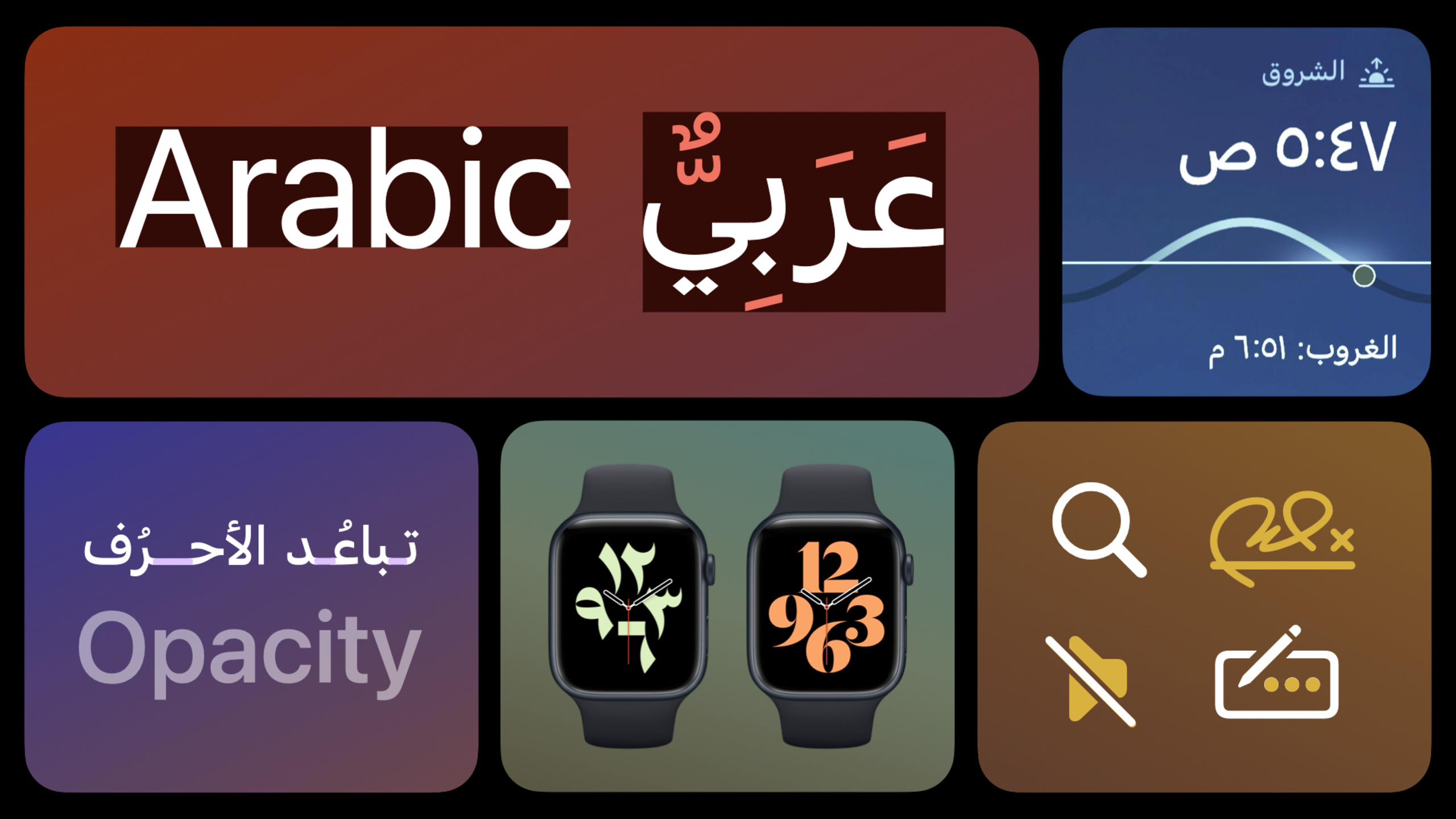
Highlight
Apple explains that Arabic interfaces require more than translated text: developers must also handle right-to-left layout flow, Arabic typography, directional icons, and Arabic numeral systems that vary by region.
Core Content
When an app prepares to enter the Arabic market, the easiest step is translating strings. That is not enough.
Arabic is written right to left. Mohamed Samir opens with scale: today roughly 660 million people use the Arabic script across more than 22 countries and regions. Translating text alone leaves a bigger problem: the interface still follows English reading order.
This affects how users enter a page and how they understand controls. Titles, paragraphs, columns, navigation bars, icons, tables, carousels, page indicators, and charts may all need rearrangement. Apple’s native frameworks handle much foundational directional behavior. Designers and developers still need to check content, graphics, fonts, symbols, and numbers—details that are easy to miss.
This session’s value is breaking “support Arabic” into four inspectable questions: interface direction, typography, icon direction, and numeral systems.
Detailed Content
1. Start by treating the page as a right-to-left wireframe
(02:55) Samir uses App Store Today story cards, story pages, and product pages to explain directionality. The best approach is to reduce the page to a wireframe first, then decide where each element should move in an Arabic context.
Title, button, and navigation bar order change. Paragraphs align right. Carousels and swipeable elements flow right to left. Images usually keep their original orientation because you localize interface flow, not mirror all visual content.
When checking this page, group elements into five categories:
- Navigation bars: order follows right-to-left reading; Pages and App Store examples use this approach.
- Titles: move to the right in Arabic interfaces.
- Paragraphs: text is always right-aligned.
- Carousels and swipe components: both interaction direction and animation direction reverse.
- Images, video, backgrounds: in the Weather example, content like sun rise direction should not be flipped.
(04:35) The Weather app shows an easy mistake: backgrounds, images, and video do not flip; the “weather throughout the day” carousel reverses; the temperature scale places low temperatures on the right and high on the left; page indicators advance right to left.
2. Time and charts should match local mental models
(05:47) The Calendar example shows that in Arabic contexts, dates, months, and years advance right to left, matching how physical calendars are used in the Arabic world. Apple also marks Islamic lunar month start dates with a red line in Calendar.
(06:22) Settings’ battery status page shows another detail: Toggle, Segmented Control, design, and interaction all mirror in Arabic layout. Charts with a time dimension need checking too. In the battery usage chart, earlier times appear on the right and later times on the left.
Check time-based charts with three questions:
- Where does it start: the timeline should begin on the right to match Arabic calendar behavior.
- How does it advance: earlier time on the right, later time on the left.
- Does country habit matter: Samir specifically notes that other chart directions depend on country and context; confirm before designing.
3. Arabic typography needs separate review
(07:16) A core feature of Arabic script is connection. A letter changes shape by position: isolated, word-initial, medial, and word-final forms can all differ. Arabic font libraries are therefore usually larger than Latin ones.
Arabic words are typically more compact but slightly taller because they use dots, vowel marks, and diacritics. If your app uses vocalization marks heavily, the interface needs more vertical spacing or text may be clipped.
(09:28) Apple provides SF Arabic. It matches the Latin SF family style, suits bilingual environments, and offers weights from Ultralight to Black. The system also auto-selects optical size by point size: larger sizes lean toward display style; smaller sizes prioritize body readability.
Typography checks can land on these specifics:
| Check item | Handling |
|---|---|
| Font choice | Prefer Apple-provided SF Arabic for system and third-party apps. |
| Vertical space | Heavy vocalization marks increase text height; avoid clipping. |
| Optical size | The system picks appropriate glyphs by size; large for display, small for readable body text. |
| Letter spacing | Arabic connection relies on Kashida; avoid incorrect spacing in unoptimized fonts. |
| Opacity | Apply opacity to whole words or phrases to avoid seams at letter joins. |
(11:44) This year Apple also introduced SF Arabic Rounded with weights from Ultralight to Black. The Reminders example shows its use in titles and body text. For the font family expansion, see “Meet the expanded San Francisco font family.”
4. Uppercase Latin letters change bilingual typography balance
(12:34) Arabic has no uppercase. Arabic glyphs in numeral fonts are usually designed to match lowercase Latin visual volume. When the interface uses all-uppercase Latin letters, Latin text looks larger and Arabic text looks smaller.
Samir’s fix is specific: in this scenario, increase Arabic font size by 10%. This especially improves readability at small sizes.
The check is direct: if the same interface has all-uppercase Latin text, compare against current Latin size and see whether Arabic looks too small. When compensation is needed, increase Arabic size by 10%. Do not mechanically enlarge when there is no all-uppercase Latin text.
5. Distinguish icons by “directional meaning” vs “physical meaning”
(14:22) Iconography is often the entry to flows or actions. In Arabic interfaces, icons cannot simply all be flipped.
The App Store Today tab icon represents text direction, so in Arabic its lines align to the right. The magnifying glass keeps its original direction because it suggests the angle most right-handed users hold it, independent of language direction.
Apple shows more examples: writing direction can go right to left while pen angle stays natural; speaker direction can change while slash direction stays consistent across Apple platforms; calendar dot direction can change while clock hands keep physical clock behavior.
Judge icons by meaning, not by flipping everything for the language:
| Icon type | Arabic interface handling |
|---|---|
| Symbols expressing text direction | Adapt for RTL, e.g. Today icon lines align right. |
| Magnifying glass | Keep original direction from right-hand use habit. |
| Calendar progress dots | Follow Arabic calendar direction. |
| Clock hands | Keep physical clock behavior. |
| Speaker shape | Direction can change for a more natural layout. |
| Slash | Keep consistency within the Apple ecosystem. |
(16:14) SF Symbols provides 300+ Arabic and right-to-left symbols. Designers can check the localization section in the SF Symbols app info panel for Arabic variants and other non-Latin variants. With system APIs, these RTL and localized symbols appear automatically in apps.
6. Arabic numerals have two common Western and Eastern forms
(17:13) The 0–9 we commonly use are called Western Arabic numerals. The other set is Eastern Arabic numerals. Both originated in the Arabic world and are used in different Arabic countries today.
Western forms are common in Morocco, Algeria, Tunisia, and other West African Arabic countries. Eastern forms are used in parts of the Levant and Gulf. Egypt, Saudi Arabia, and others use both forms.
(18:24) The system picks numeral form by user country automatically, or by user choice. Calculator, Calendar, and the Apple Watch Typograph face reflect this choice.
At implementation, confirm three things: the system decides numeral form by user country or user choice; the app must accommodate both Western and Eastern Arabic numerals; if the app targets a specific country, confirm which numeral form fits locally.
Core Takeaways
1. Build an RTL interface checklist
- What to do: Create an Arabic layout audit for key app pages, checking navigation bars, paragraphs, carousels, page indicators, charts, and toggles item by item.
- Why it’s worth it: The session states that native frameworks handle much foundational work, but content and component-level details still need human judgment.
- How to start: Pick one representative page each from home, detail, and settings; record results in two columns: “should move with reading direction” and “should keep original imagery.”
2. Add directionality tests for weather, health, and finance charts
- What to do: Check whether time-axis charts in Arabic interfaces advance right to left.
- Why it’s worth it: Weather, battery usage, and Calendar show that time mental models change with Arabic and local calendar behavior.
- How to start: Find all day/week/month/year data views; confirm earlier time is on the right and later time on the left.
3. Build an icon localization decision table
- What to do: Classify in-app icons into three groups: text direction, physical object, ecosystem consistency.
- Why it’s worth it: Today icon, magnifying glass, speaker, calendar dots, and clock hands are handled differently; you cannot mirror everything uniformly.
- How to start: Use the SF Symbols app localization info panel; prefer symbols that already have Arabic or RTL variants.
4. Run font proportion regression for bilingual interfaces
- What to do: Check labels, buttons, and card titles that mix uppercase Latin and Arabic.
- Why it’s worth it: The session recommends increasing Arabic font size by 10% when uppercase Latin makes Arabic look too small.
- How to start: Screenshot-compare buttons, tab titles, and short labels; focus on small sizes and all-caps English abbreviations.
5. Validate numeral forms by target country
- What to do: Check Western and Eastern Arabic numeral display on price, date, stats, calculator, and watch face screens.
- Why it’s worth it: Usage varies within the Arabic world; the system picks numeral form by country or user preference.
- How to start: List all number-heavy pages; check layout width, alignment, and readability with target country locale settings.
Related Sessions
- Get it right (to left) — Handle right-to-left localization behavior from a development perspective.
- Build global apps: Localization by example — Internationalization and localization with practical examples.
- Design for Arabic · صمّم بالعربي — Arabic-language version of this session’s design guidance.
- Meet the expanded San Francisco font family — Learn about the SF font family expansion, including SF Arabic Rounded.
Comments
GitHub Issues · utterances