
Highlight
Good navigation design makes users forget navigation exists. Sarah McClanahan walks through tab bars, hierarchical navigation, and modal presentation using a cycling app case study, showing how to move from feature clutter to a clear information architecture—and calling out common anti-patterns: using “Home” as a catch-all, duplicating features across tabs, and overusing modals that interrupt user flow.
Core Content
Navigation problems are often framed as “which control to pick”: tab bar or sidebar? push or modal? But this session starts earlier—first understand your information structure, then choose the matching navigation pattern. (00:30)
Sarah uses a cycling route app throughout. In the initial version, everything was crammed into the first tab: route list, route details, profile, settings, favorites—all on one screen, with users guessing where to go. The team’s first instinct was simple: “put it in the first tab and users will see it.” The opposite happened: users found nothing, because information had no hierarchy and everything looked equally important. (02:15)
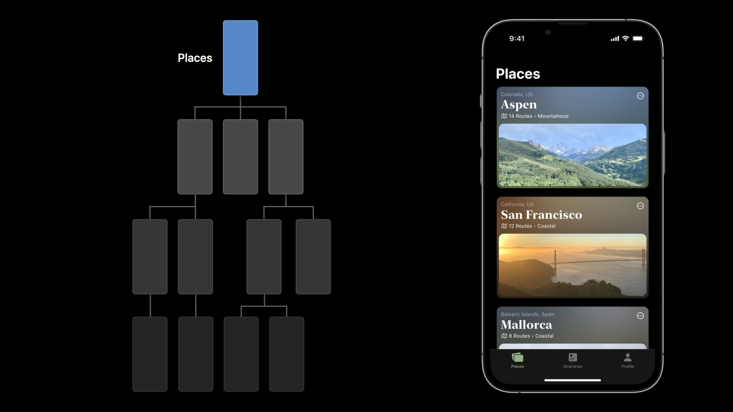
The redesign re-examined information structure, not just controls. What is peer-level? What is parent-child? What is a temporary task? After answering those three questions, the tab structure emerged naturally: routes, favorites, and profile—hierarchical navigation within each tab, and modal presentation for creating routes. These choices were derived from information structure, not picked at random. (04:40)
Hierarchical navigation is about helping users know where they are. Sarah stresses that the back button label should show the previous screen’s title, not “Back”; the current screen’s title should always be visible; and navigation depth should not exceed three levels—go deeper with a modal or a separate tab. (08:10)
Modal presentation is the easiest pattern to misuse. Sarah offers one rule: use a modal when “the user needs to complete one focused task before returning to the main flow.” Creating content, filling forms, selecting photos—these are good modal scenarios. Popping an ad, forcing a rating, or unnecessary notifications—these should not use modals. She also calls out a common mistake: modals inside modals, where users lose track of depth and dismiss behavior becomes unpredictable. (12:30)
Detailed Content
From feature clutter to clear information architecture
(01:50) The cycling app’s initial design is a classic “home does everything” anti-pattern. All features on the first screen, no grouping, no priority. Sarah’s diagnostic steps:
- List every feature
- Group by user mental model (not your code structure)
- Separate peer relationships (tabs) from parent-child relationships (hierarchical navigation)
- Identify temporary tasks (modals)
The grouping: route-related (browse, search, details), personal (favorites, history, profile), settings (preferences, notifications, privacy). Three tabs map to three user intents, each with an icon and title that stand on their own.
Key points:
- Group features by user goals, not code modules
- Each tab should work on its own—users entering from any tab should know where they are
- A “Home” tab is the root of many problems: it communicates nothing and just piles everything together
Common tab bar pitfalls
(05:20) Sarah lists three frequent mistakes:
Duplicating the same feature across multiple tabs. It looks like more exposure, but it breaks the user’s mental model of information architecture. Users wonder: which tab does this belong to? If different tabs lead to the same page, tabs lose their meaning.
More than five tabs. Beyond five, iOS shows a “More” entry and hides extra items. Sarah’s advice: if you think you need six tabs, ask whether you mixed up peer and parent-child relationships. When you exceed five, use hierarchical navigation to share the load.
Icons without text. Icons can aid recognition but cannot replace text labels. Icon-only tabs force users to guess, adding cognitive load. Even system icons should have text labels.
Spatial awareness in hierarchical navigation
(07:30) Hierarchical navigation is about spatial sense—push and pop are just the mechanics. Sarah’s three principles:
- Back button label shows the previous screen’s title, not “Back”
- Current screen title stays visible; don’t hide it on scroll
- Keep depth to three levels or less; beyond that, split into a new tab or use a modal
She also notes a detail: the list row disclosure indicator (the small chevron) is an important visual cue. It says “tap here to go deeper.” If there is no next level, don’t show the arrow—or users tap, nothing happens, and they think the app is broken.
Using modals correctly
(11:00) A modal interrupts the current flow so the user can finish a standalone task. Sarah’s framework:
Good modal scenarios:
- Creating new content (posts, routes, contacts)
- Choices required before continuing (photos, dates)
- Tasks that need full attention (forms, editing details)
Poor modal scenarios:
- Displaying information (use push navigation)
- Non-critical alerts (use banner or toast)
- Tasks that can finish asynchronously (use background processing)
- Modal stacked on modal (users lose track of depth and dismiss targets)
Dismissal matters too. Sarah stresses: provide a clear close button or swipe-to-dismiss; if the user edited content in the modal, confirm before closing—“Are you sure you want to discard changes?” That protects user data; it is not needless friction.
Core Takeaways
-
What to do: Run an information architecture audit on your app.
Why it matters: Sarah’s diagnostic method applies directly—list every feature, group by user goals, separate peer/hierarchical/temporary relationships. Many navigation messes are structural, not wrong controls.
How to start: On paper, list every screen, regroup by “what the user wants to accomplish,” then compare to your current tab structure. -
What to do: Review every modal use and remove unnecessary ones.
Why it matters: Modals are the easiest pattern to overuse. Sarah’s rule is practical—modal only when the user cannot return to the main flow without finishing the task; otherwise consider push or other non-blocking patterns.
How to start: Search your code forpresentandsheet; for each, ask whether this scene truly needs to block the current flow. -
What to do: Change back button labels to the previous screen’s title.
Why it matters: Sarah emphasizes spatial awareness—users need to know where “back” goes. Generic “Back” is less useful than “Route List.” This is a very low-cost improvement.
How to start: UIKit uses the previous view controller’s title for the back button automatically—verify your titles accurately describe each screen.
Related Sessions
- What’s new in UIKit — learn about the latest updates to uikit including new navigation styles, improved collection view performance, and more.
- Design app experiences with charts — learn how to design effective data visualization experiences using swift charts and the latest charting apis.
- The craft of SwiftUI API design — learn how apple designs swiftui apis by looking at real examples, and discover principles for designing your own apis.
- Design an effective infographic — learn principles for creating clear, accessible infographics that communicate complex information effectively.
- Design for Arabic — learn the foundations of designing apps and games for arabic-speaking audiences, including layout, typography, and iconography.
Comments
GitHub Issues · utterances