
Highlight
SwiftUI supports variants of SF Symbols and four rendering modes at WWDC21, developers can use
Image、Label、foregroundStyle、symbolVariantandsymbolRenderingModeControl symbol semantics, size, and color.
Core Content
There are often many small icons in a card app: hearts, spades, rule books, personal information, and undo buttons. They appear to be just decoration, but actually impact accessibility, dynamic fonts, dark mode, and cross-platform appearance.
In the past, developers often hand-picked symbol names. To use the filled version of the iOS tab bar, justperson.circle.fillWrite code. macOS needs an outline version, and another name. Custom symbols also require additional processing of VoiceOver text. Color is more troublesome. An undo button requires both a white arrow and a red background. It is difficult to express it with just a single color tint.
Apple has completed this link in SF Symbols 3 and SwiftUI. Both system symbols and custom symbols can be passedImageandLabelPresent. Symbols can be embeddedText, followed by a line break with the text. SwiftUI components automatically select the appropriate symbol variant. Developers can also usesymbolVariant、symbolRenderingModeandforegroundStyleExplicitly control the entire view tree.
This brings the code back to business meaning. Write the basic symbol name in the label bar, and the platform can choose fill or outline. If the list needs to be filled in, add a modifier to the outer layer. If the button needs multiple layers of color, just giveforegroundStylePass in multiple styles. Symbols still follow fonts, dynamic typing, dark mode and platform rules.
Accessibility starts with symbol creation
LabelBind the title and icon together. Many SwiftUI built-in components display a title, an icon, or both depending on the context. VoiceOver can also use titles directly as text descriptions.
Only the symbols of the pictures require additional checking. System symbols may have default accessibility descriptions, but the same icon may not necessarily have the same meaning in different apps. Custom symbols can also be created viaLocalizable.stringsProvide localized text for the image name and SwiftUI will use it for accessibility labels.
Variants allow code to write less platform details
iOS tab bars often use fill symbols. In the past, developers had to choose.fillFor the ending symbol, you also need to know whether a certain symbol has a filled version.
WWDC21’s SwiftUI will let views such as tab bars automatically select specific variants. Developers use base names to choose the appropriate appearance for components on different platforms. If you want to apply the same rules to your own components, you can putsymbolVariant(.fill)Place it on the parent view.
Rendering mode leaves color rules to the symbol level
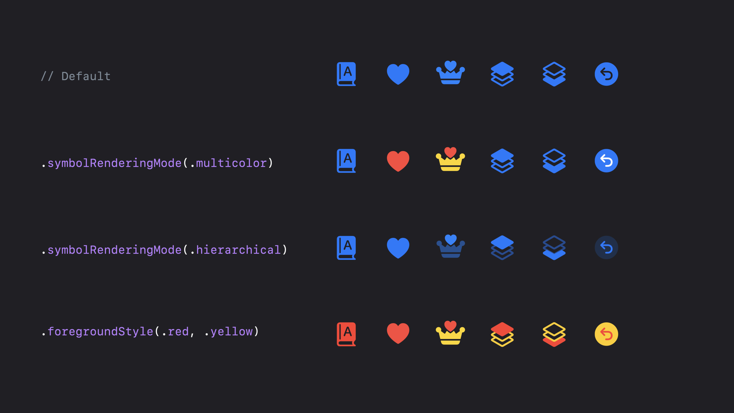
SF Symbols supports four rendering modes: monochrome (single color), multicolor (multicolor), hierarchical (layered) and palette (palette).
Monochrome is suitable for a group of icons to maintain a unified color. Multi-color uses symbols with built-in colors, which is suitable for icons with inherent color meanings such as card suits. Layering uses a foreground style to generate different opacity, highlighting key parts of the symbol. The palette allows up to three styles to control different levels, suitable for buttons with foreground and background.
Detailed Content
Create system symbols and custom symbols
(00:45) SwiftUI usesImage(systemName:)To display system symbols, useLabel(_:systemImage:)Combine titles and system symbols. Custom symbols use resource names,ImageandLabelThere are corresponding initializers.
import SwiftUI

struct SymbolBasicsView: View {
    var body: some View {
        VStack(alignment: .leading, spacing: 12) {
            Image(systemName: "heart")

            Label("Heart", systemImage: "heart")

            Image("queen.heart")

            Label("Queen of Hearts", image: "queen.heart")
        }
        .padding()
    }
}
Key points:
import SwiftUIintroduceImage、Label、VStackandView。SymbolBasicsViewis a view that can be dropped directly into a SwiftUI app. -Image(systemName: "heart")Displays the system-provided heart symbol. -Label("Heart", systemImage: "heart")Provide both title and symbol. -Image("queen.heart")Load custom symbols from app resources. -Label("Queen of Hearts", image: "queen.heart")Bind custom symbols to titles. -.padding()Leave margins for example content to facilitate previewing.
Add accessibility text to image-only symbols
(02:33)LabelText descriptions are provided naturally. onlyImageThe scenario requires the developer to confirm whether the content read by VoiceOver meets the business meaning. System symbols can be addedaccessibilityLabel, custom symbols can be found inLocalizable.stringsProvide localized text for image names.
import SwiftUI

struct AccessibleSymbolsView: View {
    var body: some View {
        VStack(spacing: 12) {
            Image(systemName: "heart")
                .accessibilityLabel("Ace of Hearts")

            Image(systemName: "person.circle")
                .accessibilityLabel("Profile")

            Image("queen.heart")
        }
        .padding()
    }
}

// Localizable.strings
// "queen.heart" = "Queen of Hearts";
Key points:
Image(systemName: "heart")Only the icon is displayed, with no visible title. -.accessibilityLabel("Ace of Hearts")Describe the heart icon as the meaning of the playing card in the current app. -Image(systemName: "person.circle")Use the profile picture symbol. -.accessibilityLabel("Profile")Have VoiceOver read “Profile.” -Image("queen.heart")Use custom symbols. -Localizable.stringsinside"queen.heart"Provide default accessibility text for custom image names.
Put symbols into a text
(02:59) SwiftUI allows string interpolationImage(systemName:)EmbedText. This method is suitable for symbols that wrap with text, such as the forward arrow in a contact list.
import SwiftUI

struct InlineSymbolTextView: View {
    var body: some View {
        Text("""
            Thalia, Paul, and
            3 others \(Image(systemName: "chevron.forward"))
        """)
        .font(.body)
        .padding()
    }
}
Key points:
Text(""" ... """)Use a multiline string to display two lines of text. -\(Image(systemName: "chevron.forward"))Insert the system arrow symbol into the text flow. -.font(.body)Make text and inline symbols use the body text style. -.padding()Make it easier to see the line wrapping effect in the sample preview.
Adjust appearance with foreground styles, fonts and scaling
(03:14)foregroundStyleControl symbol and text color. It can receive either a concrete color or a semantic style such as current tint or secondary.fontAffects both title and symbol sizes.imageScaleOnly changes the size of the symbol relative to the text.
import SwiftUI

struct SymbolStylingView: View {
    var body: some View {
        VStack(alignment: .leading, spacing: 12) {
            Label("Heart", systemImage: "heart")
                .foregroundStyle(.red)

            Label("Heart", systemImage: "heart")
                .foregroundStyle(.tint)

            Label("Heart", systemImage: "heart")
                .foregroundStyle(.secondary)

            Label("Heart", systemImage: "heart")
                .font(.caption)

            Label("Heart", systemImage: "heart")
                .imageScale(.large)
        }
        .padding()
    }
}
Key points:
- first paragraph
LabelUse the system heart symbol. -.foregroundStyle(.red)Draw text and symbols red. -.foregroundStyle(.tint)Use the current environment’s accent color. -.foregroundStyle(.secondary)Use secondary foreground styles. -.font(.caption)Let both text and symbols use the caption text style and follow dynamic type scaling. -.imageScale(.large)Only the proportion of the symbol relative to the text is changed.
Let the component automatically or manually select symbol variants
(04:23) SwiftUI’s tab bar will automatically select a symbol variant that suits itself. Developers attabItemThe base symbol name is used here and the system will apply variations such as padding where necessary.
import SwiftUI

struct CardsTabView: View {
    var body: some View {
        TabView {
            Text("Cards").tabItem {
                Label("Cards", systemImage: "rectangle.portrait.on.rectangle.portrait")
            }
            Text("Rules").tabItem {
                Label("Rules", systemImage: "character.book.closed")
            }
            Text("Profile").tabItem {
                Label("Profile", systemImage: "person.circle")
            }
            Text("Magic").tabItem {
                Label("Magic", systemImage: "sparkles")
            }
        }
    }
}
Key points:
TabViewCreate tabbed navigation.- each
TextIs a tab page content. -.tabItemDefine the title and symbol of the tab. -Label("Cards", systemImage: ...)Use basic symbol names, no code is written.fillsuffix. -sparklesWithout padding, the system can still handle available variants.
(05:12) Your own list can also be usedsymbolVariant(.fill). This modifier writes a variant into the environment, which applies to symbols throughout the view hierarchy.
import SwiftUI

struct FilledCardListView: View {
    var body: some View {
        List {
            Label("Ace of Hearts", systemImage: "suit.heart")
            Label("Ace of Spades", systemImage: "suit.spade")
            Label("Ace of Diamonds", systemImage: "suit.diamond")
            Label("Ace of Clubs", systemImage: "suit.club")
            Label("Queen of Hearts", image: "queen.heart")
        }
        .symbolVariant(.fill)
    }
}
Key points:
ListDisplay a set of card entries.- first four
LabelUse system suit symbols. -Label("Queen of Hearts", image: "queen.heart")Use custom symbols. -.symbolVariant(.fill)Request that symbols within the list use padding variants. - This modifier can affect both system symbols and custom symbols that follow naming rules.
Use multicolor and layered rendering modes
(06:41)symbolRenderingMode(.multicolor)Use the multi-color definitions that come with the symbol. It is suitable for symbols such as hearts, spades, diamonds, and clubs whose colors directly express their meaning. If a symbol does not have a multicolor version, the system falls back to monochrome rendering.
import SwiftUI

struct MulticolorCardListView: View {
    var body: some View {
        List {
            Label("Ace of Hearts", systemImage: "suit.heart")
            Label("Ace of Spades", systemImage: "suit.spade")
            Label("Ace of Diamonds", systemImage: "suit.diamond")
            Label("Ace of Clubs", systemImage: "suit.club")
            Label("Queen of Hearts", image: "queen.heart")
        }
        .symbolVariant(.fill)
        .symbolRenderingMode(.multicolor)
    }
}
Key points:
ListStill using the same set of card tags. -.symbolVariant(.fill)Request the fill variant first. -.symbolRenderingMode(.multicolor)Request the use of symbol built-in colors.- Symbols without multicolor definition fall back to monochrome mode.
- SF Symbols app can check whether system symbols support multi-color, and can also add multi-color support to custom symbols.
(07:10)symbolRenderingMode(.hierarchical)Draws the symbol using the current foreground style, while applying different opacity levels to different levels within the symbol. It’s suitable for emphasizing key parts of a complex icon.
import SwiftUI

struct HierarchicalButtonsView: View {
    var body: some View {
        HStack(spacing: 16) {
            Button(action: {}) {
                Image(systemName: "square.3.stack.3d.top.fill")
            }
            Button(action: {}) {
                Image(systemName: "square.3.stack.3d.bottom.fill")
            }
        }
        .symbolRenderingMode(.hierarchical)
        .font(.largeTitle)
        .padding()
    }
}
Key points:
HStackArrange two buttons horizontally. -Button(action: {})Define the click action, which is empty in the example.- first
ImageUse the top deck symbol. - the second
ImageUse the bottom deck symbol. -.symbolRenderingMode(.hierarchical)Let both symbols use layered mode. -.font(.largeTitle)Enlarge the button symbol to make it easier to observe the level transparency.
Use palette rendering to control multi-layer colors
(07:50)foregroundStyleCan receive multiple styles. SwiftUI will use palette rendering mode to assign these styles to different levels of symbols. Undo button usage in lectures.circle.fillVariation, and then set colors for the arrow, circular background, and third layer.
import SwiftUI

struct PaletteUndoButtonView: View {
    var body: some View {
        Button(action: {}) {
            Image(systemName: "arrow.uturn.backward")
        }
        .symbolVariant(.circle.fill)
        .foregroundStyle(.white, .yellow, .red)
        .font(.largeTitle)
        .padding()
    }
}
Key points:
Button(action: {})Create a clickable button. -Image(systemName: "arrow.uturn.backward")Shows the undo arrow. -.symbolVariant(.circle.fill)Request circle fill variant to generate button background. -.foregroundStyle(.white, .yellow, .red)Three foreground styles are available.- If a symbol has only primary and tertiary content, the first and third styles will be used.
-
.font(.largeTitle)Make the symbol appear at a larger size.
(09:00)foregroundStyleReceived isShapeStyle. In addition to color, you can also use.secondaryor.regularMaterial. This allows the symbol to maintain a systematic look in front of a blurred or material background.
import SwiftUI

struct AdvancedForegroundStylesView: View {
    var body: some View {
        VStack(spacing: 20) {
            Button(action: {}) {
                Image(systemName: "arrow.uturn.backward")
            }
            .symbolVariant(.circle.fill)
            .foregroundStyle(.white, .red)

            Button(action: {}) {
                Image(systemName: "arrow.uturn.backward")
            }
            .symbolVariant(.circle.fill)
            .foregroundStyle(.white, .secondary)

            Button(action: {}) {
                Image(systemName: "arrow.uturn.backward")
            }
            .symbolVariant(.circle.fill)
            .foregroundStyle(.red, .regularMaterial)
        }
        .font(.largeTitle)
        .padding()
    }
}
Key points:
VStackExample of three buttons arranged vertically.- Use the first button
.whiteand.redSet two layers of color. - Use the second button
.secondaryAs a second layer of styles, it is suitable to follow the visual hierarchy of the environment. - The third button is for
.regularMaterialAs a second layer of styles, you can make material effects appear at the symbol level. -.font(.largeTitle)Act on the entireVStackabove, enlarging the three symbols uniformly.
Core Takeaways
-
What to do: Make every item on the settings page or account page semantic
Label. Why it’s worth doing:LabelThe title and symbol will be bound, and the SwiftUI component can display the icon, title, or both contextually, and provide a text source for VoiceOver. How to start: PutHStack { Image(...); Text(...) }Change toLabel("Profile", systemImage: "person.circle"), then add as needed.labelStyle(...)。 -
What to do: Use basic symbol names for the tab bar and sidebar. Why it’s worth doing: SwiftUI will automatically select the appropriate variant in components such as the tab bar, so you don’t have to write the code manually.
.fillSuffix can also be adapted across platforms. How to start: IntabItemused inLabel("Cards", systemImage: "rectangle.portrait.on.rectangle.portrait"), avoid writing directlyrectangle.portrait.on.rectangle.portrait.fill。 -
What to do: Add multi-color symbols to the category list. Why it’s worth doing:
symbolRenderingMode(.multicolor)You can use SF Symbols built-in colors to let symbols such as health, weather, and card suits retain their meaning. How to start: Add outside the list.symbolRenderingMode(.multicolor), use the SF Symbols app to check if the target symbol supports multi-color. -
What to do: Use layered mode for complex tool buttons. Why it’s worth doing:
symbolRenderingMode(.hierarchical)Use a foreground style to generate multi-level transparency, suitable for icons with multiple visual levels such as decks, layers, and equipment. How to start: Add outside the button group.symbolRenderingMode(.hierarchical), then use.foregroundStyle(.tint)or.foregroundStyle(.secondary)Control the overall color scheme. -
What to do: Make an undo, delete or confirm button with a background shape. Why it’s worth doing: Palette rendering can specify styles for the symbol foreground and background separately, which is closer to real button design than monochrome tint. How to get started: Use
Image(systemName: "arrow.uturn.backward"),Add to.symbolVariant(.circle.fill), then use.foregroundStyle(.white, .red)or.foregroundStyle(.white, .yellow, .red)Specify the level color.
Related Sessions
- What’s new in SF Symbols — Learn about SF Symbols 3’s new symbols, color rendering modes, and system colors.
- Create custom symbols — Learn how to make custom SVG symbols support layering, palettes, and multi-color rendering.
- SF Symbols in UIKit and AppKit — Compare the APIs for configuring colored symbols in UIKit and AppKit.
- Explore the SF Symbols 3 app — Use the SF Symbols app to examine symbol variations, rendering modes, and color levels.
- Add rich graphics to your SwiftUI app — A deep dive into SwiftUI’s foreground styles, materials, and graphics system.
Comments
GitHub Issues · utterances