
Highlight
SF Symbols 3 app adds collections, compatibility checks, localization previews, new rendering mode previews, custom symbol annotations, and Copy Images. Developers can manage system symbols and custom symbols in the complete process from design to development.
Core Content
To make a card game, the interface requires many small icons. Inviting players must have a “person plus number”. The four suits are spades, hearts, clubs and diamonds. There must be a book at the entrance to the rules. Deck manipulation also requires stacking icons.
Before, this thing would have fallen apart easily. Designers look for icons in the library, and engineers guess symbol names in the code. Whether symbols support older systems, whether they change with language orientation, and whether they can maintain color in dark mode are all checked separately. Custom icons will also fall into ordinary SVG or PNG resources, losing the alignment, font weight and rendering capabilities of SF Symbols.
The SF Symbols 3 app combines these steps into one tool. Developers can first build a collection to put together the symbols used in the project. When a symbol is selected, the Information Inspector displays the name, obsolete name, SF Symbols version, and localized representation. The Render Inspector can preview Monochrome, Multicolor, Hierarchical, and Palette modes.
This directly solves breakpoints in the development process. During the design stage, you can use Copy Symbol or Copy Image to put symbols into the design draft. During development, you can copy the symbol name or export the complete custom symbol to Xcode. Custom symbols can also be used to annotate layers in the app and access SF Symbols 3’s new rendering mode.
Collect symbols starting from the project scene
The card game example is very specific. First create the Card Game collection, then drag in and add player symbols from the Human category. Then searchsuitFind four colors, searchstackFind deck, searchbookFind the rules entry.
The function of the collection is to separate “the symbol I am using” from more than 3000 system symbols. Subsequent checks for compatibility, previewing colors, and copying to design drafts all start from this short list.
Check compatibility and localization
The same visual symbol may have new and obsolete names. Add player symbols in speech,person.fill.badge.plusAvailable starting with SF Symbols 2.0, corresponding to iOS 14. obsolete nameperson.badge.plus.fillAvailable starting from SF Symbols 1.0, corresponding to iOS 13.
If the app still supports iOS 13, the old name can solve compatibility issues. Wait until the minimum system version is increased before switching to the new name. This judgment comes from the information checker and does not require developers to try on different systems one by one.
Localization is also checked here. The rule book symbols will display corresponding text according to the user’s language, and will also adjust the opening direction of the book according to the left-to-right or right-to-left language direction. By default, symbol names without a suffix are used, allowing the system to choose the representation in the user’s language.
Preview the four rendering modes of SF Symbols 3
The Rendering Inspector places symbol color previews within the tool. Monochrome mode uses one color. The multi-color mode uses the built-in colors of the symbols. The card suit will automatically make the hearts and diamonds red, spades and clubs black, and will also adapt to the dark mode.
SF Symbols 3 adds layering and color palettes. In the layered mode, only one color is selected, and the system uses different opacity to represent the depth of the layer. Palette mode allows specifying two or three colors for finer control over different parts of the symbol.
Custom symbols enter the same process
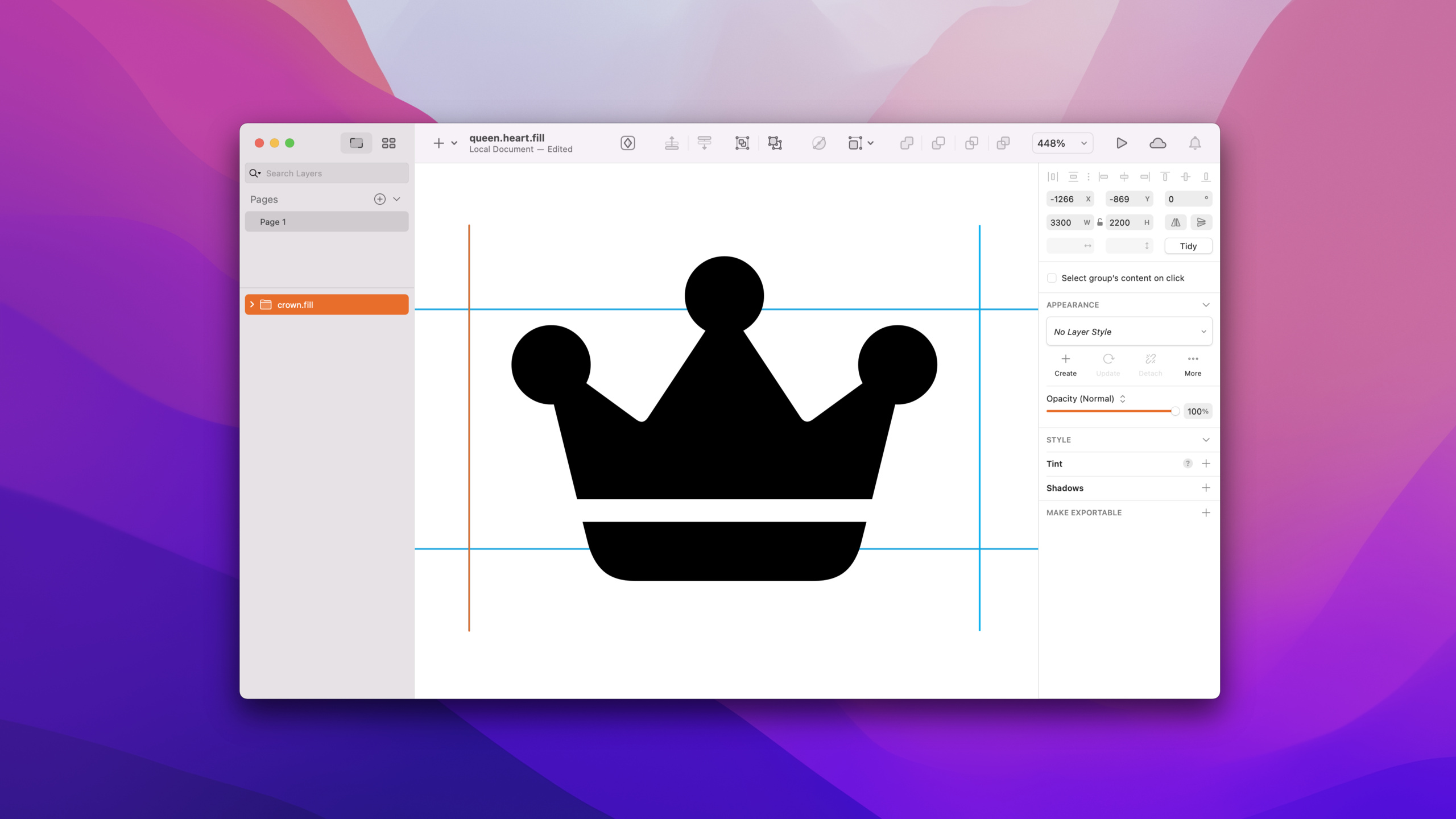
There is no “Queen of Hearts” symbol in the system library. Speech fromcrown.fillTo start, use File > Duplicate as Custom Symbol to copy it as a custom symbol, and then rename itqueen.heart.fill。
Shape modification is done with external vector tools. The SF Symbols app exports the template SVG. The designer uses tools such as Sketch to modify the path, and then drags the edited template back into the custom symbol. The symbols are updated immediately.
Custom symbols can also mark new rendering modes. In multi-color mode, drag the red heart path to a new layer and make it red, and make the lower part of the crown yellow. In layered mode, place the heart on the primary layer and the rest of the crown on the secondary layer.
Detailed Content
Organize bullets with collections
(00:54) SF Symbols 3 app can create collections using the plus sign in the upper left corner. Collection is used to save the symbols selected in the current project.
Collection: Card Game

person.badge.plus.fill
suit.spade.fill
suit.heart.fill
suit.club.fill
suit.diamond.fill
book
Key points:
Collection: Card GameRepresents building a collection of items for a card game. -person.badge.plus.fillIs the old name for the added player symbol used in speech for compatibility with iOS 13. -suit.spade.fill、suit.heart.fill、suit.club.fill、suit.diamond.fillCorresponding to four card suits, derived from search termssuit。bookUsed for rules entry, the presentation demonstrates that it will adjust the visual representation with localization.
When choosing a symbol name, check the system version first.
(02:37) The Information Inspector displays symbol names and available versions. There are two available names for the Add Player symbol in the speech.
let modernName = "person.fill.badge.plus"     // SF Symbols 2.0, iOS 14
let legacyName = "person.badge.plus.fill"     // SF Symbols 1.0, iOS 13
let targetMinimumOS = "iOS 13"
let selectedName = legacyName
Key points:
modernNameFrom Information Checker, suitable for apps with minimum support for iOS 14 and newer. -legacyNameis a deprecated name with a warning mark, but it can be overridden in iOS 13. -targetMinimumOSIndicates the constraints in the speech: There are still people in the family using the old system. -selectedNameThe old name was chosen to make the same visual symbol available on iOS 13.- The obsolete name is only suitable for compatibility with old systems; after the minimum version is increased, it should be migrated to the new name.
Localized symbols are given priority to the system for selection.
(03:43) The Information Inspector shows how symbols look in different localizations. Book symbols will be replaced with the user’s local text and the text direction will also be adapted.
let automaticLocalizedSymbolName = "book"
let arabicSpecificSymbolName = "book.ar"
let chineseSpecificSymbolName = "book.zh"
let nameUsedInMostApps = automaticLocalizedSymbolName
Key points:
automaticLocalizedSymbolNameWithout a localization suffix, the system selects the representation in the user’s preferred language. -arabicSpecificSymbolNameShow what the speech mentioned.arSuffix to specify a specific localization in Xcode. -chineseSpecificSymbolNameShow what the speech mentioned.zhsuffix. -nameUsedInMostAppsKeep names without suffixes to prevent developers from manually determining user language and book orientation.
Preview rendering mode in app
(04:28) The Render Inspector can switch between four modes and preview color, background, and layer effects.
Monochrome: one color, such as system purple
Multicolor: intrinsic colors, such as red hearts and diamonds
Hierarchical: one color with opacity-based layers
Palette: two or three specified colors
Key points:
MonochromeUse a single color, suitable for common toolbars and navigation icons. -MulticolorUsing the symbols’ built-in colors, the card suits automatically differentiate between red and black. -HierarchicalIt is a new mode in SF Symbols 3 that uses a color and transparency to express levels. -Paletteis a new mode in SF Symbols 3 that allows two or three colors to be specified.- The background selector can test the dark mode, and the spades and clubs will adjust their colors with the dark background during the speech.
Copy custom symbols from system symbols
(06:20) When there is no ready-made icon, you can copy a custom symbol from the system symbol. Speech fromcrown.fillcopy outqueen.heart.fill。
Select: crown.fill
Menu: File > Duplicate as Custom Symbol
Rename: queen.heart.fill
Export: template SVG
Edit: vector editor
Import: drag edited template back onto the custom symbol
Key points:
Select: crown.fillChoose a system symbol that is close to the target shape as a starting point. -File > Duplicate as Custom SymbolCreate custom symbols within the SF Symbols app. -Rename: queen.heart.fillGive the custom symbol a business-related name. -Export: template SVGExport editable templates. -ImportUse drag and drop to place the modified template back into the custom symbol and the app will update instantly.
Label color layer for custom symbols
(07:12) After the custom symbol is selected, a label control will appear in the sidebar. Gallery view provides a larger editing view.
Multicolor annotation:
  heart layer -> red
  lower crown layer -> yellow

Hierarchical annotation:
  heart layer -> primary
  lower crown layer -> secondary
Key points:
heart layer -> redMulti-color annotation from the speech, with the heart part layered separately and colored red. -lower crown layer -> yellowPlace the lower part of the crown onto the yellow layer. -heart layer -> primarySet the red heart as the main layer in layered mode. -lower crown layer -> secondarySet the rest of the crown as secondary.- After the same custom symbol is added to the collection, all new rendering modes can be previewed together with the system symbols.
Design drafts use Copy Symbol and Copy Image
(09:04) When placing system symbols, monochrome rendering, and text together, it is recommended to use Copy Symbol. It will paste the symbol as text into the design tool.
System symbol + text + monochrome:
  Edit > Copy Symbol
  Command-C
  Paste as text

Custom symbol or color rendering:
  Edit > Copy Image
  Option-Command-C
  Copy Image As: PNG or SVG, point size, pixel scale
Key points:
Edit > Copy SymbolSuitable for system symbols and monochrome mode. -Paste as textLet the symbol use SF fonts, automatically baseline align and match the font weight with the surrounding text. -Edit > Copy ImageSuitable for custom symbols, and Multicolor, Hierarchical, Palette rendering modes. -Copy Image AsYou can choose PNG or SVG, and specify point size and pixel scale.- Copy Image is for design drafts; if you want to put it into an Xcode project, you should use Export Symbol to retain complete custom symbol capabilities.
Core Takeaways
-
What to do: Create a “bullet list” for the application.
- Why it’s worth doing: Collections can separate the actual symbols used from more than 3000 system symbols, and design and development work around the same list.
- How to start: Open the SF Symbols 3 app, use the plus sign to create a project collection, drag the searched system symbols into it, and then check the name, available version and localization performance one by one.
-
What to do: Create a symbolic name migration table for apps that still support the old system.
- Why it’s worth doing: The information inspector will show the available versions of new and obsolete names, which can prevent lower version systems from finding symbols.
- How to start: Select key symbols and record current and abandoned names. For example, put
person.fill.badge.plusandperson.badge.plus.fillPut it into the migration table and replace it after the minimum system version is increased.
-
What to do: Make a symbol preview check for the internationalized interface.
- Why it’s worth doing: Some symbols will change with the language and writing direction. Previewing in advance can identify orientation issues with rule books, arrows, and text-related icons.
- How to get started: View localization performance in the Information Inspector. It is preferred to use unsuffixed symbol names in the code, for example
book, allowing the system to select the appropriate version based on the user’s language.
-
What to do: Make a custom SF Symbol for the branding feature.
- Why it’s worth it: Custom symbols can be connected to the font weight, size and new rendering mode of SF Symbols, which is more suitable for the system interface than ordinary image resources.
- How to start: Select a system symbol close to the target, execute File > Duplicate as Custom Symbol, export the template SVG, modify it in the vector tool, and then drag it back to the SF Symbols app.
-
What to do: Put the colored icons into the design draft for verification first.
- Why it’s worth doing: Copy Image can put custom symbols or color-rendered symbols into the design draft as PNG/SVG, and the team can confirm the visual effect before entering Xcode.
- How to get started: Set Multicolor, Hierarchical or Palette in the Render Inspector, go to Edit > Copy Image, specify the size and format using Copy Image As if necessary.
Related Sessions
- What’s new in SF Symbols — Introducing new symbols, layered rendering, palette rendering, and multi-color updates in SF Symbols 3.
- Create custom symbols — An in-depth explanation of custom symbol templates, path editing, layer annotations, and interpolation workflows.
- SF Symbols in UIKit and AppKit — Shows specific APIs for UIKit and AppKit to use colorful SF Symbols.
- SF Symbols in SwiftUI — Demonstrates how to use system symbols, custom symbols, variants, and rendering modes in SwiftUI.
Comments
GitHub Issues · utterances