
Highlight
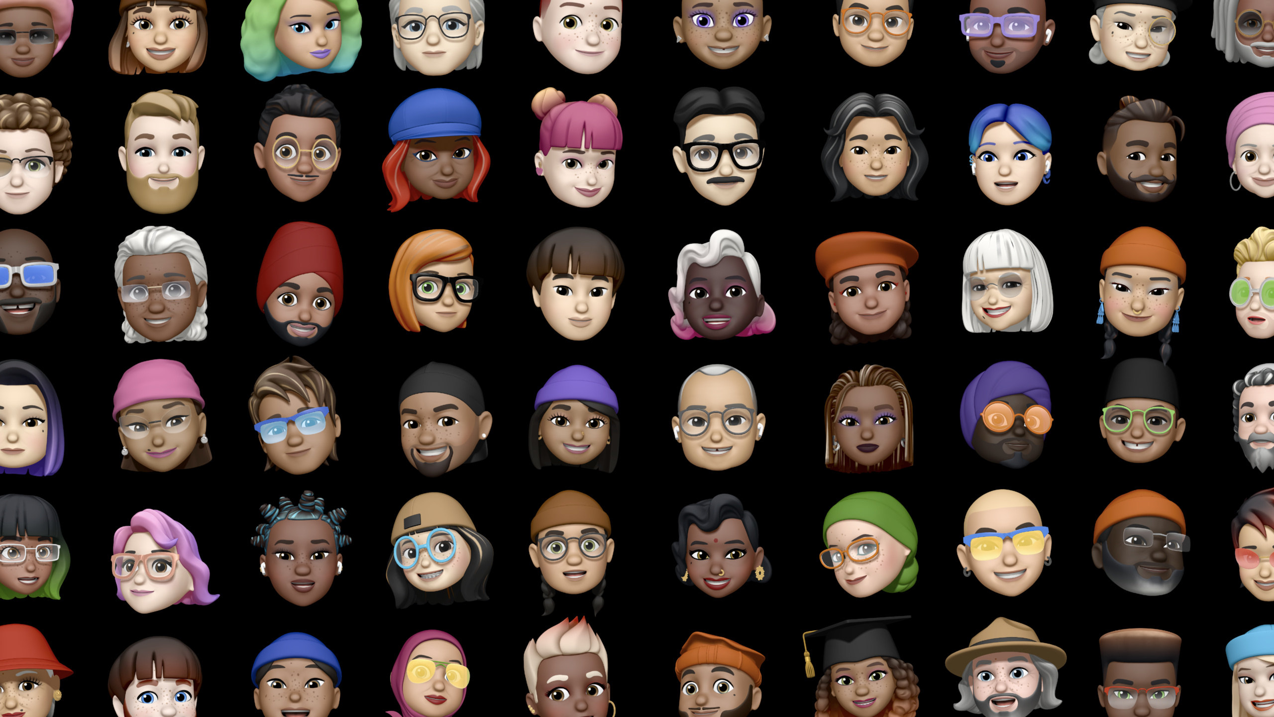
Apple has broken down inclusive design into six checkable content practices to help developers start with App Store screenshots, interface copywriting, accessibility, localization, color and identity expression, so that apps and games can serve a wider range of people.
Core Content
Many apps carefully check crashes, performance, and screenshot size before release, but rarely check the names, food, holidays, and avatars that appear in the screenshots. Developers often draw material from their own life experiences. The social app is for a group of acquaintances to go boating, the to-do app is for calling John back and buying birthday dinner, and the food app is for pancakes, pizza and burgers.
These contents may seem harmless, but they will tell users the fact: who this product serves by default. The App Store has 500 million weekly visitors, spanning more than 175 regions and 40 languages. Before users download the app, they can already tell whether they are being considered based on the name, preview video, screenshots, and marketing copy.
Apple did not announce a new framework during this presentation. It offers a set of design checkpoints: tell diverse stories, avoid stereotypes, adopt accessibility, localize culturally, use color sparingly, and encourage self-expression.
The focus of this method is to reduce “inclusiveness” to specific interfaces. A gear button can’t just make VoiceOver say “gear shape two.” A family sharing function cannot only provide three fixed roles of father, mother, and child. A name form cannot reject input because of hyphens, accents, length, or last name structure.
What developers get is a checklist of practices. It requires that every point of user-facing content embrace the same question: Does this interface hold up for people of different languages, abilities, cultures, genders, ages, and family structures.
Detailed Content
App Store Screenshot: Check whose story you are telling first
(04:18) The first practice is Tell diverse stories. Apple notes that app names, descriptions, preview videos and screenshots will tell who the product is built for. The sample content in the screenshots must also be designed, not just the most familiar names and scenes.
Inclusive screenshot audit
1. social app: kayaking trip -> community service with a more diverse group
2. to-do app: return John's call -> return Abhi's call
3. to-do app: shop for dinner -> plan Diwali
4. to-do app: read a familiar book -> read Chinua Achebe
5. to-do app: practice an instrument -> practice sign language
6. food app: pancakes, pizza, hamburgers -> foods from more cultures
Key points:
social appExamples of screenshots of social applications in corresponding speeches. -kayaking tripIt’s the familiar lifestyle that developers might think of first. -community serviceChange the screenshot into a public scene that more people can understand. -return Abhi's callReplace the default circle of acquaintance names with specific names. -plan DiwaliTrade your to-do list for a holiday that over a billion people will celebrate. -read Chinua AchebeIntroduce less represented authorial voices. -practice sign languageLet screenshots proactively show inclusion for the Deaf community. -foods from more culturesWarn food apps not to only show common American foods.
This checklist is great for checking App Store assets before publishing. Each screenshot asks: are the names, activities, food, holidays, and conversations here only drawn from the lives the development team is most familiar with.
Stereotyping: Make both language and functionality make fewer assumptions
(07:55) The second practice is Avoid stereotypes. Apple cited two specific directions: gender dichotomy in language, and family role assumptions in function.
Copy and role audit
1. unknown gender: he / she -> they
2. video greeting: Hey, guys! -> Hey, everyone!
3. placeholder avatar: masculine person icon -> non-gendered human icon
4. SF Symbols: use gender-neutral glyphs when a generic person is needed
5. family roles: father, mother, child -> family member
6. family size: fixed slots -> start with account owner, then let people add members
Key points:
he / she -> theyAdvice from using gender-neutral pronouns when the gender is unknown in speech. -Hey, guys! -> Hey, everyone!Change the video and interface greetings to reach more people. -masculine person iconThe “universal user” will be male by default. -non-gendered human iconAvoid avatar placeholders that imply gender. -SF SymbolsBeing Named in Speech provides gender-neutral glyphs that can be used in apps and games. -father, mother, childSingle parent, same-sex parent, multi-generational, adult child and guardian households will be excluded. -family memberPreserve functional semantics while letting go of unnecessary role assumptions.
There is a word check to be done here, as well as a functional structure check. The shared movie library example in the speech illustrates that if the data model only accepts fathers, mothers and children, no matter how friendly the interface copy is, it will not be able to serve other families.
Accessibility: Let system capabilities enter the default testing process
(13:47) The third practice is Adopt accessibility. The first counterexample Apple gives is icon buttons. After the user enters the application, VoiceOver only reads “gear shape two, button”. This means that the system knows that it is a gear icon, but does not know that it represents account settings in the current application.
Accessibility implementation checklist
1. Dynamic Type: use SwiftUI or UIKit text and layout systems
2. Bold Text: thicken non-text elements that affect legibility
3. VoiceOver glyph button: Gear shape two, button -> Account settings, button
4. VoiceOver state button: glyph button -> Remove favorite, button
5. VoiceOver order: make the prominent Post button read before top-left content
6. Test menu: VoiceOver, Increase Contrast, Reduce Transparency, Reduce Motion, Grayscale Color Filter
7. Control Center: add Text Size toggle for quick testing
Key points:
Dynamic TypeThe interface is required to cover the text size range of iOS. -SwiftUI or UIKit text and layout systemsIt is the automatic adaptation entrance mentioned in the speech. -Bold TextWhen turned on, elements such as dots and lines that are not text but affect readability will also be bolded. -Gear shape two, button -> Account settings, buttonNote that VoiceOver tags should express business functions. -Remove favorite, buttonThe description label can also reflect the button state. -Post button read before top-left contentCorresponds to an example of specifying the reading order in a speech. -VoiceOver、Increase Contrast、Reduce Transparency、Reduce Motion、Grayscale Color FilterThese are all test items that the talk recommends putting into the Accessibility Shortcut menu. -Text Size toggleYou can put it into the Control Center to quickly switch font sizes.
This part goes into the development process. The talk recommends developers try out the app themselves by turning on these settings: grayscale mode to check for dependence on color, mute mode to check for dependence on audio, and large font sizes to check for text truncation and layout clipping.
Localization: In addition to translating text, cultural scenes must also be replaced
(19:20) The fourth practice is Localize for culture. The speech first distinguished between translation and localization. Translation handles language, word length, writing system, dubbing, subtitles, time, phone number, and currency. Localization also deals with cultural implications.
Localization content checklist
1. idiom: Nine cows and one hair -> a drop in the bucket -> a tiny amount
2. app copy: Plan your vacation from A to Z -> Plan your vacation from beginning to end
3. cooking app in India: translate to Hindi -> adapt recipes and ingredients
4. recipe content: beef and sausages -> dishes relevant to local dietary customs
5. festival content: surface recipes typically eaten during local festivals
6. game content: avoid caricatures of real cultures in characters and environments
Key points:
Nine cows and one hairis a Chinese expression used in speech to illustrate that idioms are difficult to understand cross-culturally. -a drop in the bucketIt is the corresponding English idiom. -a tiny amountIt is the direct meaning and the easiest to translate. -Plan your vacation from A to ZRelying on English alphabetical order, it will fail when put into languages such as Korean. -Plan your vacation from beginning to endUse direct language to reduce translation costs. -translate to Hindi -> adapt recipes and ingredientsIt shows that cooking applications in the Indian market cannot just complete interface translation. -beef and sausagesMay conflict with local food habits and religious culture. -local festivalsProvides an entrance to make content more relevant to local life. -avoid caricaturesRegarding game characters and environments, avoid making real-life ethnic groups into materials for enemies, exotic aliens, or fantasy races.
Apple gives a practical standard here: If a sentence of copy relies on idioms, slang, humor, or metaphors, prioritize changing it to straightforward expressions. Straightforward copy is easier to understand and easier to translate.
Color: The same color has different meanings in different regions
(24:36) The fifth practice is Use color mindfully. Colors have cultural meanings, as well as accessibility issues. The speech gave an example of the Stocks (stock market) application: most localized versions use green to indicate increases and red to indicate decreases; when the region is set to mainland China, increases are displayed in red.
Color checklist
1. culture: green for gains, red for losses -> Mainland China uses red for gains
2. status dots: unread color dot + flagged color dot -> replace one dot with a glyph
3. contrast setting: test with Increase Contrast turned on
4. system palette: use iOS system colors to get high-contrast support
5. custom palette: calculate luminosity ratio between text and background
6. target ratio: aspire to at least 4.5:1 when Increase Contrast is on
Key points:
green for gains, red for lossesIt is the stock color custom in many areas. -Mainland China uses red for gainsInstructions for localizing Stocks from the talk. -replace one dot with a glyphSolve the problem that color-blind users cannot distinguish between “unread” and “marked” by color alone. -Increase ContrastIs the system setting for the speech suggestion test. -iOS system colorsContains additional color collections supporting high contrast mode. -custom paletteDevelopers need to calculate the luminosity ratio of text and background by themselves. -4.5:1is the lowest ratio Speech recommends working toward in high-contrast mode.
This part is most easily mistaken for visual detail. The actual problem is information encoding. If only colors are used to express status, color-blind users may not see the difference; if the meaning of colors is not adjusted according to region, users may get the opposite understanding.
Self-expression: Forms should not limit how users identify themselves
(28:05) The sixth practice is Encourage self-expression. Apple starts with the name sheet. Many people’s names contain hyphens, accents, and may be longer than common limits. Some areas do not have a “first name + last name” structure.
Identity input checklist
1. name validation: allow hyphens and accents
2. name length: avoid fixed minimum and maximum assumptions
3. name structure: first name + last name -> full name field when appropriate
4. personal address: ask for preferred name
5. gender field: Male, Female, Other -> wide range of options plus custom entry
6. gender visibility: allow public or private
7. character creation: age, skin color, body type, hair, clothing, language, vocal tone
8. game design: do not bucket hair, clothing, or voice by gender when gender is not needed
Key points:
allow hyphens and accentsCorresponds to common reasons for name verification failures in speeches. -avoid fixed minimum and maximum assumptionsAvoid short and long names from being rejected. -full name fieldSuitable for scenarios where splitting the legal name is not required. -preferred nameLet the app address the user more closely in the future. -wide range of options plus custom entryAn example from Bumble of offering multiple gender options when signing up and allowing submission of customizations. -allow public or privateLet users control whether gender information is displayed. -age, skin color, body type, hair, clothing, language, vocal toneCharacter creation example from the game “Say No! More.” -do not bucket hair, clothing, or voice by genderExplain that when the function does not require gender, you do not need to ask for gender.
Form designers often write product assumptions into database fields. The speech reminds developers to ask whether the field is really needed before deciding on the input method. Don’t ask if you can; if you must ask, give the user space for expression and modification.
Core Takeaways
-
What to do: Conduct a pre-launch content audit of App Store screenshots. Why it’s worth it: The presentation points out that screenshots, names, preview videos, and descriptions will tell users who the product is built for before they download it. How to get started: List the names, activities, foods, holidays, and conversations in all screenshots, and replace the default circle of acquaintance materials with more cultural and lifestyle examples.
-
What to do: Add a “Copy Inclusion Check” script or manual checklist to your app. Why it’s worth doing: The speech gives specific replacements, e.g.
he / sheChange tothey,Hey, guys!Change toHey, everyone!. How to get started: Scan localization strings to flag gender dichotomies, ableist words, idioms, slang, and metaphors before giving them to real users or localizers for review. -
What to do: Add accessibility settings to every UI regression test. Why it’s worth doing: The talk recommends testing your app using VoiceOver, Increase Contrast, Reduce Transparency, Reduce Motion, Grayscale Color Filter, and Text Size. How to start: Add a new round of system settings test to the test list; focus on checking the VoiceOver pronunciation of icon buttons, large font size truncation, whether the status is distinguishable in grayscale, and whether the plot or operations are lost when muted.
-
What to do: Establish a “translation + content replacement” process for international markets. Why it’s worth it: A cooking app in a presentation, even if translated into Hindi, may still fail because content like beef and sausages don’t fit the local food culture. How to get started: Each time you enter a region, start by listing units, currencies, foods, holidays, colors, and taboo content; have local personnel review recommended content and default examples.
-
What to do: Redo the name and identity fields on the registration page. Why it’s worth doing: The talk points out that name length, hyphens, accents, last name structure, and gender options all impact whether users can express themselves. How to get started: Prioritize the use of a single full name field and preferred name (preferred name); the gender field only appears when the product really needs it, and provides access to customization, privacy control, and subsequent modification.
Related Sessions
- The process of inclusive design — Talk about how to continue to do inclusive design from the perspective of team, research and development process.
- Developer spotlight: Accessibility — Understand how accessibility drives product innovation through real developer experience.
- Create accessible experiences for watchOS — Demonstrates the specific implementation of Dynamic Type, VoiceOver, and AssistiveTouch in watchOS applications.
- Localize your SwiftUI app — Talk about how SwiftUI apps do strings, localization formats, and Xcode 13 workflow.
- Explore the SF Symbols 3 app — Introduces how to use SF Symbols to choose clearer and more inclusive interface icons.
Comments
GitHub Issues · utterances