
Highlight
SF Symbols 3 adds layering, palette, and multi-color rendering configurations to UIKit and AppKit. Developers can use system symbols to create colorful icons that are scalable, adaptable to dark mode, and can embed text.
Core Content
In the past, when using SF Symbols in UIKit and AppKit, the most common method was to add monochrome symbolstintColor. The play button, navigation bar icon, and settings page icon can all do this. The problem arises in more complex interfaces: a voicemail action button needs to have both a white icon and a red background, a health category icon needs to retain the system-defined multi-color appearance, and a hotel amenity label needs to put the icon within a line of text.
If monochrome symbols continue to be used in these scenarios, developers often have to switch to bitmap resources or manually maintain multiple symbol names. Bitmaps lose size, weight, dynamic typing, and system appearance adaptation of SF Symbols. Hand splicing.circle.fillSuch a name can also easily lead to a disconnect between the code and the design draft.
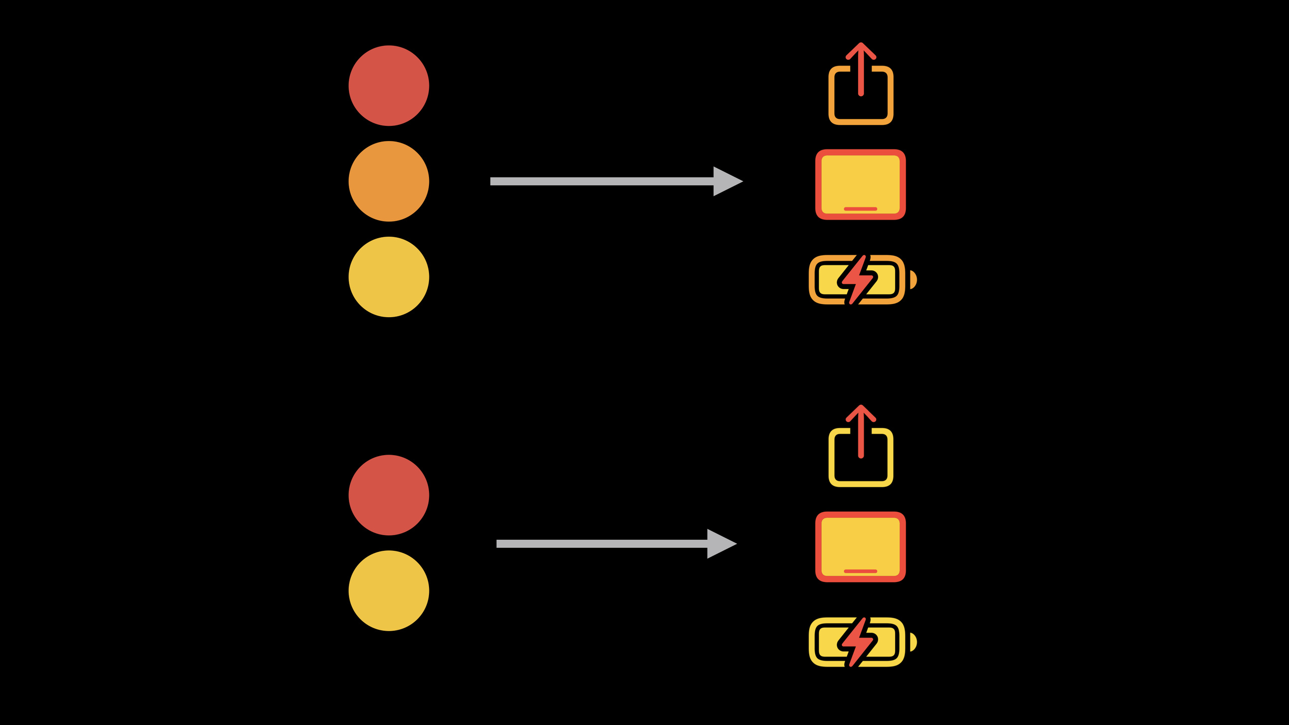
Apple split symbols into three levels: primary, secondary, and tertiary in SF Symbols 3. UIKit and AppKit NewSymbolConfigurationColor configuration allows each layer to be colored according to rules. Layered mode derives transparency from a single color, palette mode explicitly specifies multiple colors, and multicolor mode uses symbolic built-in colors.
This thing directly solves two troubles in the interface. First, components such as buttons, lists, and control centers can continue to use system symbols and gain color vision. Second, the same set of configurations can be combined with size, font weight, and text attachments, and symbols remain consistent in image views, buttons, and rich text.
From monochrome to layered colors
Monochrome symbols are still the default behavior. The code just needs to be createdUIImageorNSImage, and then set tint or accent color to the hosting view. It is suitable for icons such as play, return, and close that have only one visual level.
Layered colors are used for symbols that require light and dark gradations. The developer only provides one primary color, and the system generates a secondary color with lower transparency based on the symbol layer. The device icons in Control Center are like this: they need to have a unified color system, and they also need to have a hierarchy of subjects and details.
Color palette allows buttons to maintain design intent in dark mode
The three action buttons in the voicemail interface need different colors: the speaker button uses the theme color and gray, the dial button uses white and the theme color, and the delete button uses white and red. If you only use monochrome symbols, the light mode may look correct. When switching to dark mode, the hollows inside the symbols will reveal the background color, and the design intent of the white icons will be lost.
Palette mode fills symbol layers with explicit colors. Developers can fix the inner layer to white and bind the background or auxiliary layer to.tintColoror.systemRed. In this way, when the interface style changes, the buttons will still be displayed according to the design draft.
Multicolor symbols retain system-defined colors
Some symbols are already colored themselves, such as health, weather or category icons. UIKit supports multi-color symbols in iOS 15. Developers express “prefer multi-color versions” through configuration, and the system will use built-in colors when symbols support it.
Not all symbols support multicolor. The SF Symbols app’s inspector lets you see which rendering modes a symbol supports. You can also set tint color in the code as a fallback, so that symbols that do not support multi-color still have the appropriate color.
Detailed Content
Monochrome symbols: default behavior still works
(01:52) Monochrome mode has only one color, usually the tint or accent color from the image view. It is the default rendering mode and no additionalSymbolConfiguration。
let playImage = UIImage(systemName: "play")

playImageView.image = playImage
playImageView.tintColor = .systemBlue
Key points:
UIImage(systemName:)Created from system symbol libraryplayicon. -playImageView.imagePlace the symbol into the picture view. -playImageView.tintColorSpecifies the color of the monochrome symbol.- The code does not create a color configuration because monochrome is the default mode.
Layering symbol: generate layers with one color
(03:00) Layered mode uses a layer hierarchy of symbols. The color passed in is used for the primary layer, and the secondary and tertiary layers use the derived color with reduced transparency.
var image = NSImage(systemSymbolName: "ipad.landscape",
                    accessibilityDescription: "iPad")

let config = NSImage.SymbolConfiguration(hierarchicalColor: .label)

deviceView.image = image
deviceView.symbolConfiguration = config
Key points:
NSImage(systemSymbolName:accessibilityDescription:)Create an AppKit symbol image and provide an accessibility description. -NSImage.SymbolConfiguration(hierarchicalColor:)Request layered color rendering. -.labelAs the main color, it will dynamically change with the system text color. -deviceView.symbolConfigurationApply the configuration to the picture view.- If a symbol is missing a level, the corresponding derived color will not be used.
Image variants: uniform request shape on container
(04:13) The button is first initialized with basic symbols. The button configuration API of iOS 15 is used here, and the image of each button is placed in the configuration.
let speakerConfig = UIButtonConfiguration.plain
speakerConfig.image = UIImage(systemName: "speaker.wave.2")

let callConfig = UIButtonConfiguration.plain
callConfig.image = UIImage(systemName: "phone")

let deleteConfig = UIButtonConfiguration.plain
deleteConfig.image = UIImage(systemName: "trash")
Key points:
UIButtonConfiguration.plainCreate a backgroundless button configuration. -speaker.wave.2、phone、trashare the three basic symbol names.- Each configuration only specifies the picture first, and the color is later processed with the symbol configuration.
(04:44) Image variants can be set on container views. Variants are propagated down the view hierarchy, and the inner image view gets the request.
actionsView.imageVariant = .circle
actionsView.imageVariant = .circle.fill
Key points:
.circleRequest round variant, no need to put.circlespelled into the symbol name. -.circle.fillRequest filled circle variant.- Configuration is placed in
actionsViewon, will affect multiple button images in the container. - If a symbol does not have this variant, the original image is used.
Palette notation: Explicitly control the color of each layer
(05:09) Palette mode receives an array of colors. Color is applied to the symbol layer level. The speaker button here uses view tint color and system gray.
let config = UIImage.SymbolConfiguration(paletteColors: [.tintColor, .systemGray2])

speakerConfig.preferredSymbolConfigurationForImage = config
speakerButton.configuration = speakerConfig
Key points:
UIImage.SymbolConfiguration(paletteColors:)Create a palette configuration. -.tintColorIt is a UIKit dynamic color that will be resolved to the tint color of the current view. -.systemGray2Gives another layer a fixed system gray color. -preferredSymbolConfigurationForImageAttach the symbol configuration to the button image. -speakerButton.configurationApply full button configuration.
(05:40) The dial button requires a white symbol and a theme color background. Palette mode can write white into the configuration to prevent the hollow area from showing through the background in dark mode.
let config = UIImage.SymbolConfiguration(paletteColors: [.white, .tintColor])

callConfig.preferredSymbolConfigurationForImage = config
callButton.configuration = callConfig
Key points:
.whiteExplicitly specify a layer to use white. -.tintColorHave another layer follow the theme color of the view where the button is located.- Configuration binding in
callConfigon, finally assigned tocallButton。
(05:56) The delete button changes the second color to system red. The color of dangerous operations does not depend on the view tint color.
let config = UIImage.SymbolConfiguration(paletteColors: [.white, .systemRed])

deleteConfig.preferredSymbolConfigurationForImage = config
deleteButton.configuration = deleteConfig
Key points:
.whiteMake sure the inner icon area remains white. -.systemRedGives system red to delete operations.- The same set of button configuration processes can be reused for different operations.
Dynamic tint color: color can be parsed following the view
(06:46).tintColorIs UIKit’s dynamic color. It can be used on symbol layers as well as normal interface properties.
view.backgroundColor = .tintColor
label.textColor = .tintColor
searchField.tokenBackgroundColor = .tintColor
tabBarItem.badgeColor = .tintColor
Key points:
view.backgroundColorYou can use dynamic tint color directly. -label.textColorWill be resolved to the tint color of the environment where the label is located. -searchField.tokenBackgroundColorandtabBarItem.badgeColorThe same dynamic color can also be used.- Dynamic colors still adhere to UIKit’s parsing rules.
Multi-color symbols: Give priority to using the built-in color of the symbol
(09:03) If you directly create a system image and assign it to the cell, you will get the default monochrome rendering.
let image = UIImage(systemName: category.iconName)

cell.imageView.image = image
Key points:
category.iconNameSave the SF Symbol name corresponding to the category. -UIImage(systemName:)Only responsible for creating symbol images.- UIKit uses the default monochrome mode when no rendering configuration is set.
(09:13) To request a multi-color version, you need to createpreferringMultiColorConfigure and assign to image view. For symbols that do not support multicolor, tint color still provides a fallback color.
let image = UIImage(systemName: category.iconName)

let config = UIImage.SymbolConfiguration.preferringMultiColor

let tintColor = category.colorForIcon

cell.imageView.image = image
cell.imageView.preferredSymbolConfiguration = config
cell.imageView.tintColor = tintColor
Key points:
UIImage.SymbolConfiguration.preferringMultiColorRequest the use of multi-color rendering in preference. -category.colorForIconProvides a fallback tint color for the current category. -preferredSymbolConfigurationApply multicolor preference to image view. -tintColorWill affect single color fallback, but also affect multi-color symbols with tint layer.- Whether the symbol supports multi-color can be checked in the inspector of the SF Symbols app.
Combined configuration: combine size and color into one configuration
(12:40) Only one symbol configuration can be applied to an image view. To control size and color at the same time, you need to create multiple configurations first, and then useapplyingmerge.
let image = UIImage(systemImage: "ipad.and.iphone")
headerView.image = image

let fontConfig = UIImage.SymbolConfiguration(pointSize: 60, scale: .large)
let colorConfig = UIImage.SymbolConfiguration(hierarchicalColor: .systemBlue)
let config = fontConfig.applying(colorConfig)

headerView.preferredSymbolConfiguration = config
Key points:
UIImage(systemImage:)createipad.and.iphoneSymbol pictures. -fontConfigSpecify 60 point size and large scale. -colorConfigSpecifies that the primary color of the layered color is system blue. -fontConfig.applying(colorConfig)Generates a new configuration that includes both size and color. -headerView.preferredSymbolConfigurationApply final configuration.
Rich text symbols: Embed colored symbols into Attributed String
(13:20) Colored symbols can be placed as text attachmentsNSAttributedString. A typical scenario is the list of hotel room amenities: the TV icon and text need to be typed on the same line.
let amenitiesString = NSMutableAttributedString(...)

if (room.amenities.contains(.tv)) {
    let config = UIImage.SymbolConfiguration(
                         hierarchicalColor: .systemGreen)
    let tvImage = UIImage(systemImage: "tv",
                          withConfiguration: config)

    let attachment = NSTextAttachment(image: tvImage)
    let attachmentString = NSAttributedString(attachment:
                                               attachment)
    let tvString = attachmentString.mutableCopy()
    tvString.append(NSAttributedString(" TV, "))

    amenitiesString.append(tvString)
}
Key points:
NSMutableAttributedString(...)Save the rich text that will eventually be displayed. -room.amenities.contains(.tv)Determine whether the room contains television facilities. -UIImage.SymbolConfiguration(hierarchicalColor:)Assign green layered rendering to the TV symbol. -UIImage(systemImage:withConfiguration:)Create a configured symbol image. -NSTextAttachment(image:)Turn images into text attachments. -NSAttributedString(attachment:)Wrap attachments into rich text snippets. -tvString.appendAppend text after the icon. -amenitiesString.appendAdd this paragraph to the complete list of facilities.
(13:51) Labels that display rich text still need to set the font and text color. Monochrome symbols automatically use the text color; symbols with color configurations require the color to be specified explicitly in the configuration.
let amenitiesLabel = UILabel()

amenitiesLabel.textColor = .systemGreen
amenitiesLabel.font = UIFont.systemFont(ofSize: 25)

amenitiesLabel.attributedString = amenitiesString
Key points:
UILabel()Create a label that displays facility text. -textColorMake the text part use system green. -fontSet the 25-point system font, and the symbol attachments will follow the font size in the string. -attributedStringGive the rich text constructed previously to the label for display.
Core Takeaways
-
What to do: Add a stateful SF Symbol to each item on the settings page. Why it’s worth doing: Layered mode can use a theme color to express the enabled state, and palette mode can use white and red to express dangerous operations. How to start: Set on the image view of the cell
preferredSymbolConfiguration, for ordinary itemsUIImage.SymbolConfiguration(hierarchicalColor:), delete items withUIImage.SymbolConfiguration(paletteColors:)。 -
What to do: Change operation buttons such as call, voice, and delete to round filled symbols. Why it’s worth doing: Image variations can be requested uniformly at the container level
.circle.fill, the code does not need to manually maintain multiple symbol names. How to get started: Set on the button containerimageVariant, and then give eachUIButtonConfigurationConfigure differentpreferredSymbolConfigurationForImage。 -
What to do: Add system multi-color icons and single-color fallback to the category list. Why it’s worth doing: Multi-color symbols can retain the colors designed by Apple for symbols; symbols that do not support multi-color can still maintain category colors through tint color. How to get started: Create
UIImage.SymbolConfiguration.preferringMultiColor, set tocell.imageView.preferredSymbolConfiguration, and synchronize settingscell.imageView.tintColor。 -
What to do: Embed colorful facility icons in text descriptions of hotels, shopping, health records, etc. Why it’s worth doing:
NSTextAttachmentYou can put SF Symbol into rich text, and the symbol will follow the text size. How to start: Use a belthierarchicalColorofUIImagecreateNSTextAttachment, and then package the attachment intoNSAttributedStringappend toNSMutableAttributedString。 -
What to do: Create layered illustration-style icons for large empty status pages or headers. Why it’s worth doing:
applyingPoint size, scale and color can be combined into one configuration, and icons still use SF Symbols at different sizes. How to start: Create firstUIImage.SymbolConfiguration(pointSize:scale:), create againUIImage.SymbolConfiguration(hierarchicalColor:),usefontConfig.applying(colorConfig)After merging, assign it to image view.
Related Sessions
- What’s new in SF Symbols — Learn about SF Symbols 3’s new symbols, color rendering modes, and custom symbol annotations.
- Create custom symbols — Learn how to draw and annotate layering, palettes, and multicolor modes for custom symbols.
- Explore the SF Symbols 3 app — Use the SF Symbols app to check supported rendering modes and preview color effects for symbols.
- SF Symbols in SwiftUI — Use the same set of SF Symbols color capabilities in SwiftUI.
Comments
GitHub Issues · utterances