
Highlight
SF Symbols 3 allows custom SVG symbols to carry 3.0 template data, rendering mode annotations and interpolation sources, allowing developers to integrate their icons into monochrome, layered, palette and multi-color rendering processes.
Core Content
Many apps will encounter a small problem: the system icon library is very large, and there is still no icon that fully meets the business meaning.
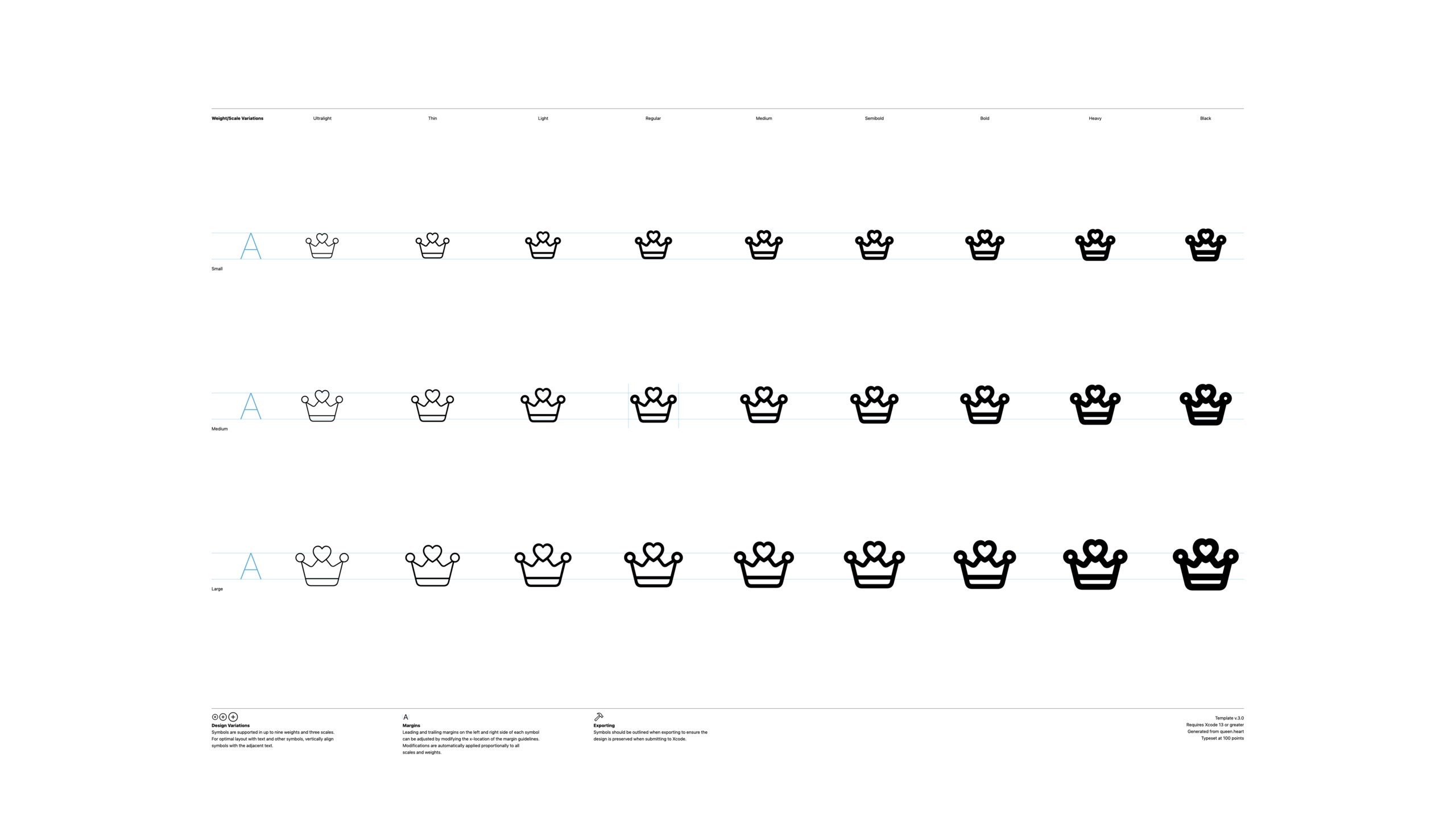
The example in the speech was a card game. SF Symbols already offers four suits, as well as deck icons. But the app needs a “Queen of Hearts” symbol to represent a special card in the game. The system library does not have this specific icon.
The past practice was to draw an ordinary SVG in the design tool and then use it as an image. This would lose the advantages of SF Symbols. Icons may not necessarily align with the text baseline, nor may they follow changes in bold text, different control sizes, and system appearance.
SF Symbols 3 does this by using custom symbol templates. The template itself is SVG, but inside it is design variations, margins, paths, and render mode data. After developers put their own paths into the template, the system can continue to use it as an SF Symbol.
This lecture revolves around a complete process: first copy the custom symbol from the existing crown symbol, then export the 3.0 template, use the design tool to modify the path, then import it into the SF Symbols app for annotation, and finally export it to Xcode or colleagues for use.
3.0 templates resolve limitations of old templates
SF Symbols 3 introduces 3.0 custom symbol templates. It requires Xcode 13 or newer.
Margin guides for new templates have more explicit naming, e.g.Regular-Msuffix. As long as the suffix matches a certain design variant, the left and right margins in the template will be recognized by the system. This allows optical centering to be adjusted for individual weights and sizes.
3.0 templates can also embed rendering mode information. Monochrome and multicolor can be written to templates, as can new hierarchical and palette modes. Custom symbols are no longer just black and white paths.
Annotation makes the path a renderable layer
After custom symbols are imported back into the SF Symbols app, they can be annotated. The basic unit of annotation is the path. Developers combine paths into layers and assign colors or hierarchical groups to layers.
In multicolor mode, layers are assigned colors. In hierarchical mode, layers are assigned hierarchical groups such as primary, secondary, and tertiary. Palette mode also uses the same hierarchical annotation data.
This solves a common problem: the designer has drawn the icon, but the engineer doesn’t know which part should use the brand color and which part should follow the system accent color. Annotation puts this information back into the symbol file.
Interpolation reduces hand drawing of 27 variants
SF Symbols’ complete template comes in multiple weights and three sizes. Drawing all 27 variations by hand is easy to make mistakes.
SF Symbols 3 provides variable setup. If there are three design sources of Ultralight-Small, Regular-Small, and Black-Small in the template, and the number of paths, path order, and number of points are all compatible, the system can generate other variants through interpolation.
This changes the workload. The developer did the Regular-Small first, then copied it to the other two sources, moving only the existing points and control points. As long as no paths are added or deleted, no paths are rearranged, and no points are added or deleted, the template can generate the remaining variations.
Detailed Content
3.0 Custom symbol template
(03:01) The custom symbol template version for SF Symbols 3 is 3.0. It requires Xcode 13 or newer. Templates can save margins, rendering mode data, and advanced build information.
The talk clearly mentioned that the left and right margin guidelines for 3.0 templates will use design variant suffixes, e.g.Regular-M. If you want to set optical margins for a variant, the guide name must be suffixed accordingly.
<svg xmlns="http://www.w3.org/2000/svg" viewBox="0 0 3300 2200">
  <g id="Guides">
    <path id="left-margin-Regular-M" d="M 960 0 L 960 2200" />
    <path id="right-margin-Regular-M" d="M 2340 0 L 2340 2200" />
  </g>
  <g id="Symbols">
    <g id="Regular-M">
      <path id="crown-outline" d="M 1000 1400 L 1200 900 L 1500 1250 L 1650 760 L 1800 1250 L 2100 900 L 2300 1400 Z" />
    </g>
  </g>
</svg>
Key points:
<svg>Indicates that the custom symbol template uses SVG format. -left-margin-Regular-MIndicates the left margin guide for Regular font weight and Medium size. -right-margin-Regular-MRight margin guide representing variations of the same design. -Regular-MIt is a grouping of design variations, and the suffix needs to correspond to the margin guide. -pathare vector paths of symbols, and the SF Symbols app will make rendering mode annotations based on these paths.
The focus here is not on the specific coordinates, but on the naming rules. 3.0 templates rely on suffixes to associate margins with design variations.
Make custom symbols starting from existing symbols
(04:53) Lecture from SF Symbols appcrownsymbol begins. The approach is to searchcrown, select via the context menuDuplicate as Custom Symbol, againCustom.crownRename toQueen.heart。
The advantage of this process is that the weight, size, and alignment references of existing symbols are directly inherited. Custom icons don’t start with a blank canvas.
SF Symbols app
1. Search: crown
2. Context menu: Duplicate as Custom Symbol
3. Rename: Custom.crown -> Queen.heart
4. File -> Export Template, or Command + E
5. Choose 3.0 template, static setup
Key points:
Search: crownUse existing SF Symbols as design references. -Duplicate as Custom SymbolCopy system symbols to a custom symbol collection. -Queen.heartIt is a more specific symbol name to facilitate subsequent identification in engineering and design documents. -Export TemplateExports an SVG template that can be edited in Sketch, Illustrator, or Figma. -static setupSuitable for scenarios where only one or two variants are designed.
The talk also mentioned that old 1.0 and 2.0 custom symbol templates can be dragged into the SF Symbols app. The application will add them to the current collection and convert them into 3.0 templates.
Avoid breaking rendering mode when drawing
(08:56) If the custom symbol wants to support rendering modes other than monochrome, the final design must meet three conditions: do not retain live strokes (live strokes), do not use open paths (open paths), and do not use special fills such as gradients and shadows.
The reason is straightforward. Multicolor and layered rendering require coloring closed shapes. Open paths do not have a closed fill area and cannot receive color. Live strokes look like lines in design tools, but they may not be used as stable filled shapes for annotation after exporting.
<svg xmlns="http://www.w3.org/2000/svg" viewBox="0 0 120 120">
  <path id="closed-heart" fill="#000000" d="M60 96 L22 58 C8 42 18 18 40 24 C50 27 56 36 60 44 C64 36 70 27 80 24 C102 18 112 42 98 58 Z" />
  <path id="closed-crown" fill="#000000" d="M20 92 L28 42 L48 66 L60 28 L72 66 L92 42 L100 92 Z" />
</svg>
Key points:
closed-heartis a closed path, useZclosure. -fill="#000000"Uses a normal plane fill, which can later be replaced by render mode data. -closed-crownIt is also a closed path, suitable for entering multi-color or hierarchical labeling processes.- Not in the code
stroke, to avoid relying on live strokes for the final shape. - There are no gradients, shadows or multi-color fills in the code to avoid overwriting the rendering data in the template.
The operation suggestion in the speech is: when designing, you can first use the stroke to match the line width of Regular-Medium, and then convert the stroke into a path after confirming the shape. After conversion, you can continue to make optical corrections, such as adjusting the curve inside the red heart that is too round or bulky.
Label multi-color, layered and palette modes
(12:06) When annotating, the developer opens the rendering mode tab in the gallery view of the SF Symbols app. Four modes are available: monochrome, hierarchical, palette, and multicolor. In non-monochrome mode, you can create and edit layers corresponding to the current mode.
In multi-color mode, put the crown on one layer and set it to system yellow; put the heart on another layer and set it to red. Apple recommends using system colors first, as system colors adapt to light, dark, high-contrast, and vibrancy scenes.
Multicolor annotation
Layer 1: crown
  Paths: crown paths
  Color: system yellow
Layer 2: heart
  Paths: heart paths
  Color: red
Layer 3: crown hollow parts
  Paths: transparent interior paths
  Opacity: lower opacity
Layer 4: heart hollow parts
  Paths: transparent interior paths
  Opacity: lower opacity
Key points:
Layer 1Group the crown paths into a group to facilitate unified color setting. -Color: system yellowUse system colors to follow changes in system appearance. -Layer 2Make the heart path separate and avoid sharing colors with the crown. -Layer 3andLayer 4Use low opacity to simulate gradation between the stroke and fill.- The same path can appear in multiple layers, which is how the stroke and fill effect is achieved in the presentation.
(14:36) Hierarchical mode uses the same layer idea, but the layer data is changed from color to hierarchy group. Speech sets the crown as secondary and the heart as primary.
Hierarchical annotation
Layer 1: crown
  Paths: crown paths
  Group: secondary
Layer 2: heart
  Paths: heart paths
  Group: primary
  Clear Behind: enabled
Key points:
Group: secondaryMakes the crown use secondary levels in layered rendering. -Group: primaryLet the hearts get the main level in layered rendering. -Clear Behind: enabledWork on the overlapping areas so that the crown doesn’t show underneath the transparent heart.- This layered data is also used by palette rendering mode.
(16:01) palette mode receives two or three colors. When two colors are passed, the colors will be assigned to the available hierarchical groups; when three colors are passed, the first color is given to the primary, the second color is given to the secondary, and the third color is given to the tertiary.
// For corresponding usage, see “SF Symbols in SwiftUI” and “SF Symbols in UIKit and AppKit” recommended at the end of this session
Image(systemName: "queen.heart")
    .symbolRenderingMode(.palette)
    .foregroundStyle(.red, .yellow)
Key points:
Image(systemName:)Create a SwiftUI image using a symbolic name. -.symbolRenderingMode(.palette)Requests palette rendering mode. -.foregroundStyle(.red, .yellow)Input two colors, and the system assigns colors according to the symbol’s hierarchical annotation.- This code shows the usage entrance after importing Xcode. The specific API explanation is covered by the relevant session.
Maintain path order to avoid annotation failure
(10:15) Mark the number of dependency paths and the order of the paths. The presentation uses the folder plus sign symbol: when both variants have four paths, the multicolor rendering can match; if the right variant scrambles the order of the paths, the green color of the plus sign may be applied to the folder.
Compatible path order
Variant A: [folder-fill, folder-stroke, badge-circle, badge-plus]
Variant B: [folder-fill, folder-stroke, badge-circle, badge-plus]

Broken path order
Variant A: [folder-fill, folder-stroke, badge-circle, badge-plus]
Variant B: [folder-fill, badge-circle, folder-stroke, badge-plus]
Key points:
Variant AandVariant BTwo design variants are represented.- The number of paths in the first group of lists is the same, and the order of the paths is also the same.
- The number of paths in the second set of lists is the same, but the order is different.
- Multi-color data is matched in path order. If the order is wrong, the colors will fall on the wrong path.
- If the symbol has been annotated, it is safe to modify the point; deleting, adding, or rearranging the entire path will cause the annotation data to be out of sync.
Use interpolation to generate additional design variants
(18:24) SF Symbols 3 can reduce manual drawing through variable templates if you plan to support more than three design variations. The developers only provide three design sources: Ultralight-Small, Regular-Small, and Black-Small. After the system checks path compatibility and point compatibility, it generates the remaining variants.
Interpolatable custom symbol requirements
Sources:
  - Ultralight-Small
  - Regular-Small
  - Black-Small
Path compatibility:
  - same number of paths
  - same path order
Point compatibility:
  - matching paths have the same number of points
Editing rule:
  - move existing points and control points only
Key points:
Ultralight-Small、Regular-Small、Black-Smallare three design sources. -same number of pathsEnsure that the paths of each source correspond. -same path orderEnsure that the path corresponds to the correct component. -same number of pointsEnsure that the points inside each path can be paired one by one. -move existing points and control points onlyis a core rule when making interpolable symbols.
(20:52) The three conditions for interpolation are: there are three design sources; the paths from all sources match; and the number of points in the corresponding paths matches. The lecture suggested making Regular-Small first, then copying it to Ultralight-Small and Black-Small, and only adjusting the positions of existing points.
Export 2.0 and 3.0 templates
(23:01) There are two options for distributing custom symbols: export a 2.0 template or a 3.0 template.
2.0 templates are used for back-deployment to older systems, such as iOS 14. It contains only single color data. Converting to 2.0 is a lossy operation and removes label data and explicit margins.
3.0 templates can carry multi-color, layered data, and custom margins, but are not backwards compatible. The presentation emphasized that exported 3.0 templates should be given directly to Xcode or re-imported into the SF Symbols app, as current design tools may not fully preserve embedded annotation data.
Distribution decision
Minimum deployment target: iOS 14
  Export: 2.0 template + 3.0 template
  Runtime: choose asset by OS version

Minimum deployment target: iOS 15 or later
  Export: 3.0 template only
  Runtime: use the 3.0 asset

Collaboration
  Export: 3.0 template
  Receiver: import into SF Symbols app before editing
Key points:
iOS 142.0 templates are required because the old system does not understand 3.0 data. -2.0 template + 3.0 templateLet the project select resources based on system version. -iOS 15 or laterYou can use only 3.0 templates. -CollaborationIn this scenario, the 3.0 template should be returned to the SF Symbols app to continue editing.- The design tool is suitable for editing single-color representation, but is not suitable for directly modifying 3.0 products with annotated data.
Core Takeaways
1. Create SF Symbol for product-specific concepts
- What to do: Make a custom symbol for the core objects of the app, such as membership level, task status, and favorite type.
- Why it’s worth it: Template 3.0 lets custom icons inherit text alignment, weight, size, and rendering mode.
- How to start: Find a system symbol with a similar shape in the SF Symbols app and use
Duplicate as Custom Symbol, export 3.0 static setup, complete Regular-Medium first.
2. Add multi-color and dark mode adaptation to the brand icon
- What to do: Split the brand icon into multiple path layers and assign system colors or custom colors to different layers in multi-color mode.
- Why it’s worth it: System colors adapt to light, dark, high contrast and vibrancy scenes.
- How to get started: Convert all final shapes to closed paths, import into SF Symbols app, create layer in multicolor mode and assign colors.
3. Add hierarchical semantics to toolbar symbols
- What to do: Make the custom symbols in the toolbar have a clear hierarchy between the primary color, secondary color, and weakened color.
- Why it’s worth doing: Hierarchical and palette modes can use the same annotation data. You only need to select the rendering mode and color on the project side.
- How to start: In hierarchical mode, put the main object into primary, the background or decoration into secondary or tertiary, and turn on Clear Behind for the overlapping area.
4. Build interpolable workflows for complete icon sets
- What it does: Generate 27 weight and size variations for a set of commonly used custom symbols.
- Why it’s worth it: As long as three design sources are compatible, SF Symbols 3 can generate the remaining variants through interpolation, reducing the time spent drawing them one by one.
- How to start: Export 3.0 variable setup, complete Regular-Small first, then copy to Ultralight-Small and Black-Small, move only existing points and control points.
5. Prepare downgrade resources for the old system
- What to do: Prepare both 2.0 and 3.0 custom symbol resources in a project that supports iOS 14.
- Why it’s worth it: The 2.0 template can display single-color symbols in the old system, and the 3.0 template can preserve multi-color and layered data in the new system.
- How to start: Export the 2.0 and 3.0 templates respectively from the SF Symbols app, and select the corresponding resources according to the system version in the project.
Related Sessions
- What’s new in SF Symbols — Learn about SF Symbols 3’s new symbols, rendering modes, and custom symbol capabilities.
- SF Symbols in UIKit and AppKit — Learn to use colored symbols and configure rendering modes in UIKit and AppKit.
- SF Symbols in SwiftUI — Learn to create symbols, set accessibility labels, and apply palette rendering in SwiftUI.
- Explore the SF Symbols 3 app — Familiar with the search, preview, custom symbol management and export process of the SF Symbols 3 app.
Comments
GitHub Issues · utterances