
Highlight
Apple has expanded support for large fonts, VoiceOver, and AssistiveTouch in watchOS 8. Developers can use SwiftUI accessibility modifiers to adapt Apple Watch Apps to visual and motion accessibility features.
Core Content
The Apple Watch screen is small. Many watchOS apps will stuff titles, icons, statuses, and buttons into a list cell. The default font size looks normal, but when the user increases the text size, the task description will be truncated and the buttons will be squeezed together.
This talk uses a plant care app to demonstrate the problem. The main interface displays the plant name, watering time, fertilizing time, light status, and buttons for recording tasks. This interface has high information density, which exposes common problems with watchOS accessibility.
The first issue is Dynamic Type. The fixed font size will not change with the system text size. When only one line of text is allowed, large font sizes will be truncated directly. Apple’s advice is specific: use the system text style, allow text to wrap, and switch to a vertical layout at large font sizes.
The second issue is VoiceOver (screen reading). A complex cell may contain multiple text, pictures and buttons. VoiceOver reads the icon names one by one, such as “Drop, image.” Users have to listen to a lot of meaningless elements before they can get to the next plant. The solution is to combine elements and provide scenario-oriented labels for tasks and buttons.
The third problem is custom controls. The watering frequency counter in the speech consists of a minus sign, a number, and a plus sign. Visual users understand it as a whole, VoiceOver users hear it as three discrete elements. SwiftUI providesaccessibilityElement()andaccessibilityAdjustableAction, you can turn it into an adjustable element.
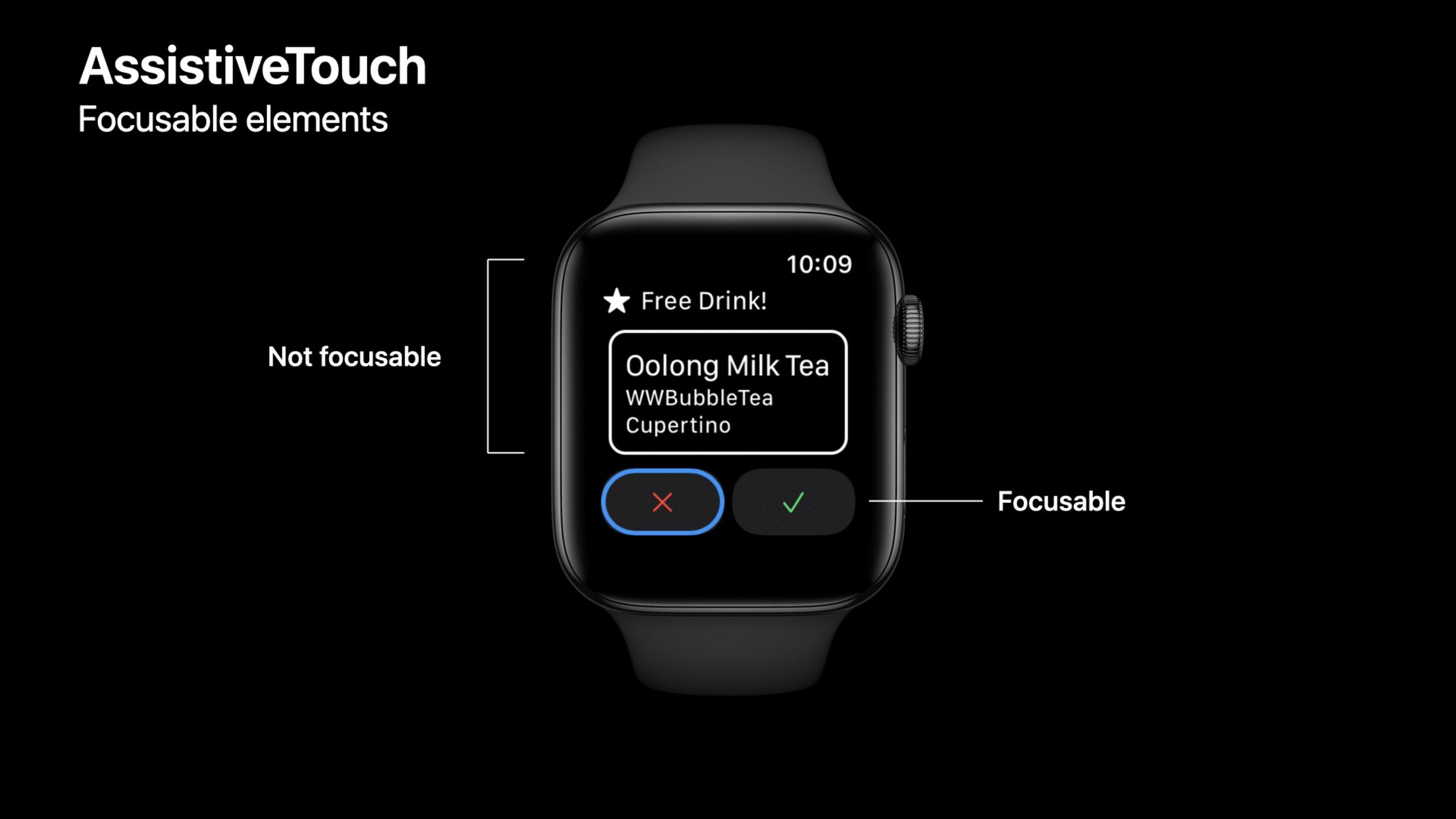
Finally, there’s AssistiveTouch in watchOS 8. Users can operate the watch with pinches, fists, or wrist movements without touching the screen. Developers need to check which elements can be focused, whether the cursor box is large enough, and whether custom actions can appear in the action menu.
Detailed Content
Dynamic Type: Use text styles instead of fixed font sizes
(04:48) The speech first deals with the problem of plant names not getting bigger. The reason is that the title uses a fixed font size. SwiftUI provides system text styles on watchOS that automatically scale based on the user’s text size settings.
struct PlantView: View {
    @Binding var plant: Plant

    var body: some View {
        VStack(alignment: .leading) {
            Text(plant.name)
                .font(.title3)
            HStack() {
                PlantImage(plant: plant)
                PlantTaskList(plant: $plant)
            }
            PlantTaskButtons(plant: $plant)
        }
    }
}
Key points:
@Binding var plant: PlantLet the view directly read and write external plant data. -VStack(alignment: .leading)Arrange the title, content, and buttons vertically and left-aligned. -Text(plant.name)Display plant name. -.font(.title3)Using the system text style, the text will follow the system text size changes. -PlantImage、PlantTaskListandPlantTaskButtonsResponsible for pictures, task lists and action buttons respectively.
(05:00) After the title can be scaled, the task text will also be truncated in large font sizes. The solution given in the speech is to relax the limit on the number of lines and give space for text wrapping.
struct PlantTaskLabel: View {
    let task: PlantTask
    @Binding var plant: Plant

    var body: some View {
        HStack {
            Image(systemName: task.systemImageName)
                .imageScale(.small)
            Text(plant.stringForTask(task: task))
        }
        .lineLimit(3)
        .font(.caption2)
    }
}
Key points:
let task: PlantTaskSave the current task type, such as watering or fertilizing. -Image(systemName: task.systemImageName)Use the corresponding SF Symbols icon for the task. -.imageScale(.small)Shrink the icon to prevent it from taking up text space. -Text(plant.stringForTask(task: task))Display task status text. -.lineLimit(3)Allows up to three lines to reduce truncation at large font sizes. -.font(.caption2)Dynamic Type continues to be supported using system text styles.
Large font size layout: switch structure according to sizeCategory
(05:48) After allowing line breaks, the interface may still be crowded. Speech selection readsizeCategory, switching to vertical layout after the font size reaches the threshold.
struct PlantContainerView: View {
    @Environment(\.sizeCategory) var sizeCategory
    @Binding var plant: Plant

    var body: some View {
        if sizeCategory < .extraExtraLarge {
            PlantViewHorizontal(plant: $plant)
        } else {
            PlantViewVertical(plant: $plant)
        }
    }
}
Key points:
@Environment(\.sizeCategory)Read the system text size setting. -@Binding var plant: PlantPass the same plant data to different layouts. -if sizeCategory < .extraExtraLargeDetermine whether the current font size is still suitable for horizontal layout. -PlantViewHorizontal(plant: $plant)Display the default and smaller font sizes in a compact layout. -PlantViewVertical(plant: $plant)Give labels and buttons more vertical space at larger font sizes.
VoiceOver: Reduce the number of accessible elements
(08:56) After turning on VoiceOver, the original interface will read out the plant name, picture name, task text, icon name and button. There are too many elements for the user to go through. The speech pointed out thatNavigationLinkAccessibility information for child elements can be automatically merged, making a plant cell an accessible element.
struct PlantCellView: View {
    @EnvironmentObject var plantData: PlantData
    var plant: Plant

    var plantIndex: Int {
        plantData.plants.firstIndex(where: { $0.id == plant.id })!
    }

    var body: some View {
        NavigationLink(destination: PlantEditView(plant: plant).environmentObject(plantData)) {
            PlantContainerView(plant: $plantData.plants[plantIndex])
                .padding()
        }
    }
}
Key points:
@EnvironmentObject var plantData: PlantDataRead the list of plants from the environment. -plantIndexpassidFind the current plant’s position in the array. -NavigationLinkMake the entire cell accessible to the editing interface. -PlantEditView(plant: plant).environmentObject(plantData)Connect edit pages to shared data. -PlantContainerView(plant: $plantData.plants[plantIndex])Binds the current plants in the array. -.padding()Expanding the blank space of cell content also makes the touch area more comfortable.
VoiceOver tag: Change the icon name to task semantics
(09:38) SF Symbols will provide a default reading, for example, the water drop icon may be read as “Drop”. In the plant care scenario, users need to hear “Watering in five days”. Speech added to task textaccessibilityLabel。
struct PlantTaskLabel: View {
    let task: PlantTask
    @Binding var plant: Plant

    var body: some View {
        HStack {
            Image(systemName: task.systemImageName)
                .imageScale(.small)
            Text(plant.stringForTask(task: task))
                .accessibilityLabel(plant.accessibilityStringForTask(task: task))
        }
        .lineLimit(3)
        .font(.caption2)
    }
}
Key points:
Text(plant.stringForTask(task: task))Keep the short text displayed on the screen. -.accessibilityLabel(...)Provides dedicated text for VoiceOver to read aloud. -plant.accessibilityStringForTask(task: task)Generate complete semantics based on task type, such as watering, fertilizing, and lighting.- After visual text and spoken text are separated, short copy can still be displayed on the small screen, and VoiceOver can read the complete context.
(10:03) Buttons also need semantic labels. Read only “Drop fill button” has no operational meaning. The lecture changes the button label to an action description such as “Log watering”.
struct PlantButton: View {
    let task: PlantTask
    let action: () -> Void
    @State private var isTapped: Bool = false

    var body: some View {
        Button(action: {
            self.isTapped.toggle()
            DispatchQueue.main.asyncAfter(deadline: .now() + 0.5) {
                self.isTapped.toggle()
            }
            action()
        }) {
            Image(systemName: task.systemImageFillName)
                .foregroundColor(task.color)
                .scaleEffect(isTapped ? 1.5 : 1)
                .animation(nil, value: 0)
                .rotationEffect(.degrees(isTapped ? 360 : 0))
                .animation(.spring(), value: 0)
                .imageScale(.large)
        }
        .buttonStyle(BorderedButtonStyle())
        .accessibilityLabel("Log \(task.name)")
    }
}
Key points:
let action: () -> VoidReceive business operations after the button is triggered. -@State private var isTappedSave temporary click animation state. -Button(action:)First switch the animation state, and then execute the incomingaction()。DispatchQueue.main.asyncAfterResume animation state after 0.5 seconds. -Image(systemName: task.systemImageFillName)Shows the fill icon corresponding to the task. -.scaleEffectand.rotationEffectResponsible for clicking feedback. -.buttonStyle(BorderedButtonStyle())Use border button style. -.accessibilityLabel("Log \(task.name)")Tells VoiceOver this is a button to record a task.
Custom controls: use adjustable action to express addition and subtraction
(11:07) The watering frequency counter consists of three visual elements. VoiceOver users hear “Remove, button. Eight. Add, button.” Speech encapsulates it into an element and uses swipe up and swipe down to perform increments and decrements.
struct PlantTaskFrequency: View {
    let task: PlantTask
    @Binding var plant: Plant
    let increment: () -> Void
    let decrement: () -> Void

    var value: Int {
        switch task {
        case .water:
            return plant.wateringFrequency
        case .fertilize:
            return plant.fertilizingFrequency
        default:
            return 0
        }
    }

    var body: some View {
        Section(header: Text("\(task.name) frequency in days"), content: {
            CustomCounter(value: value, increment: increment, decrement: decrement)
                .accessibilityElement()
                .accessibilityAdjustableAction { direction in
                    switch direction {
                    case .increment:
                        increment()
                    case .decrement:
                        decrement()
                    default:
                        break
                    }
                }
                .accessibilityLabel("\(task.name) frequency")
                .accessibilityValue("\(value) days")
        })
    }
}
Key points:
incrementanddecrementIt is an external increase or decrease operation. -valueRead watering or fertilizing frequency based on task type. -CustomCounter(value:increment:decrement:)Still responsible for the visual interface. -.accessibilityElement()Creates a new high-level accessibility element, ignoring child elements. -.accessibilityAdjustableActionMap VoiceOver’s increase and decrease gestures to business methods. -.accessibilityLabel("\(task.name) frequency")Provide a control name. -.accessibilityValue("\(value) days")Provides the current value, which will be read again when the value changes.
AssistiveTouch: allows static content to be focused
(19:50) AssistiveTouch will only focus on interactable elements. buttons, switches andNavigationLinkFocusable by default. ordinaryTextorLabelNot focused by default. The beverage information area in the speech itself can be clicked to open details, but the static text inside will not automatically become AssistiveTouch focus.
struct FreeDrinkView: View {
    @State var didCancel = false
    @State var didAccept = false
    @State var showDetail = false

    var body: some View {
        VStack(spacing:10) {
            FreeDrinkTitleView()

            FreeDrinkInfoView()
                .accessibilityRespondsToUserInteraction(true)

            HStack {
                CancelButton(buttonTapped: $didCancel)
                AcceptButton(buttonTapped: $didAccept)
            }
        }
        .onTapGesture {
            showDetail.toggle()
        }
        .sheet(isPresented: $showDetail, onDismiss: dismiss) {
            DrinkDetailModalView()
        }
    }
}
Key points:
@State var showDetailControl whether the details pop-up window is displayed. -FreeDrinkInfoView()Display beverage information. -.accessibilityRespondsToUserInteraction(true)Declare this static area to respond to user interaction. -HStackThe Cancel and Accept buttons within can already be focused by AssistiveTouch. -.onTapGesturelet the wholeVStackOpen details when clicked. -.sheet(isPresented:onDismiss:)Show details interface.
AssistiveTouch cursor box: contentShape determines the clickable area
(21:12) The AssistiveTouch cursor box is consistent with the clickable area of the element. A tiny ellipsis button will get a tiny cursor box, and the content may be cropped. for speechcontentShapeExpand the clickable area.
struct DrinkView: View {
    var currentDrink:DrinkInfo

    var body: some View {
        HStack(alignment: .firstTextBaseline) {
            DrinkInfoView(drink:currentDrink)

            Spacer()

            NavigationLink(destination: EditView()) {
                Image(systemName: "ellipsis")
                    .symbolVariant(.circle)
            }
            .contentShape(Circle().scale(1.5))
        }
    }
}
Key points:
HStack(alignment: .firstTextBaseline)Put the drink information and editing entry on the same line. -Spacer()Push the edit button to the right. -NavigationLink(destination: EditView())Provides operations to enter the editing interface. -Image(systemName: "ellipsis")Shows the ellipsis icon. -.symbolVariant(.circle)Use the round variant. -.contentShape(Circle().scale(1.5))Change the clickable area to a circle that is magnified 1.5 times, and the AssistiveTouch cursor box will also become larger.
AssistiveTouch action menu: reuse accessibilityAction
(22:48) AssistiveTouch’s actions menu displays system actions, as well as custom accessibility actions on elements. Already added for VoiceOveraccessibilityActionwill automatically appear in the AssistiveTouch menu.
PlantContainerView(plant: plant)
    .padding()
    .accessibilityElement(children: .combine)
    .accessibilityAction {
        // Edit action
    } label: {
        Label("Edit", systemImage: "ellipsis.circle")
    }
Key points:
PlantContainerView(plant: plant)Shows a plant cell. -.padding()Leave room for touch in cells. -.accessibilityElement(children: .combine)Combine child elements into one accessible element. -.accessibilityActionAdd custom actions. -Label("Edit", systemImage: "ellipsis.circle")Provide text and icons for the action menu.- When AssistiveTouch focuses on this element,
Editwill appear at the front of the action menu.
Core Takeaways
-
What to do: Add a large font layout to the Apple Watch To-Do App. Why it’s worth it: watchOS 8 supports larger accessible text sizes, and fixed layouts make it easy to truncate content. How to start: Put the pin
.font(.system(size:))Change to.font(.headline)、.font(.caption2)Wait for text style; read@Environment(\.sizeCategory), switching to vertical layout at large font sizes. -
What to do: Rewrite VoiceOver tags for fitness or medication reminder apps. Why it’s worth doing: Icon default labels usually describe the shape and the user needs to hear the task meaning. How to get started: Add status text and buttons
.accessibilityLabel(...), change icon names like “capsule” to business copywriting like “Take medicine at 9 PM”. -
What to do: Change the custom stepper to a VoiceOver adjustable control. Why it’s worth it: Controls spelled out with plus signs, numeric values, and minus signs can make VoiceOver navigation slower. How to get started: Use on custom controls
.accessibilityElement(), then use.accessibilityAdjustableActiondeal with.incrementand.decrement。 -
What to do: Check your watchOS App’s AssistiveTouch focus order. Why it’s worth doing: AssistiveTouch users rely on focus movement and action menus to complete actions, and small buttons and hidden interactions can get in the way. How to start: Open AssistiveTouch and test page by page; add a static area that will respond to clicks
.accessibilityRespondsToUserInteraction(true), use for small buttons.contentShape(...)Expand the clickable area. -
What to do: Put the secondary operations of list cells into the AssistiveTouch action menu. Why it’s worth it: The Apple Watch screen is small, and placing multiple buttons in a cell will increase the burden of navigation. How to start: Use the cell content
.accessibilityElement(children: .combine)Merge and reuse.accessibilityActionAdd edit, complete, delete and other actions.
Related Sessions
- SwiftUI Accessibility: Beyond the basics — An in-depth explanation of SwiftUI accessibility modifiers, previews, and new APIs, suitable for continuing to improve VoiceOver support in this article.
- Tailor the VoiceOver experience in your data-rich apps — Introduces how to control the main information and additional information read by VoiceOver in complex data scenarios.
- Support Full Keyboard Access in your iOS app — Explain focus, operations, and keyboard accessibility from a motion-assisted input perspective.
- What’s new in watchOS 8 — An overview of platform changes in watchOS 8 as context for understanding AssistiveTouch and watchOS App updates.
- The practice of inclusive design — Supplement inclusive thinking before barrier-free development from the perspective of the design process.
Comments
GitHub Issues · utterances