
Highlight
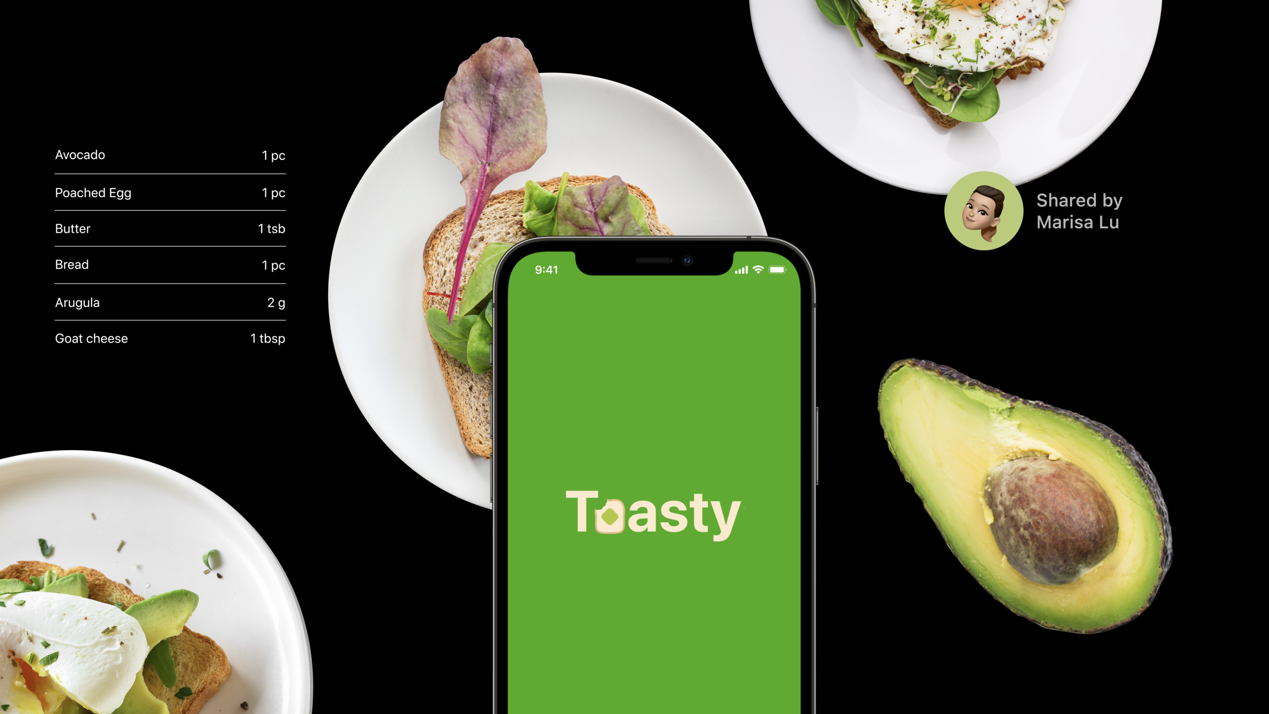
Apple uses the Toasty example to outline five methods for discoverable design: prioritizing features, providing visual cues, prompting gestures, organizing content by user behavior, and giving users control over personalized recommendations.
Core Content
Many apps have the same problem: the functions have been completed, but users don’t know they exist.
The most common remedy is onboarding. Open the app and let the user see a few screens of instructions. Toast app Toasty also encountered this problem. It can browse toast recipes, view toasts made by friends, and take photos to generate recipes.
If these functions are crammed into the introductory page one by one, users are likely to skip directly. Even if users finish reading, they may not be able to remember it a few minutes later.
The direction Apple gave in this session was: the interface should speak for itself. When users see the screen, they should be able to know what they can do and how to do it before taking action.
Return to user target from function list
Toasty has many functions. Browsing recipes, viewing my recipes, taking photos to generate recipes, search, settings, and about page can all be said to be important.
If you put them all on the home page, the interface will be crowded. If they are all included in the hamburger menu, the user cannot see the entrance.
Apple’s approach is to sort by user goals first. Browse recipes and view my most commonly used recipes in the bottom tab bar. Taking photos to generate recipes is important, but it is an action in “My Recipes”, so it is placed at the top of this page. Settings and personal preferences are changed infrequently and can be placed behind the profile icon.
The judgment criteria here are very specific: whether the function belongs to the core of the app, whether the user frequently uses it, and whether the entrance location is within the reach of fingers.
Replace the boot page with interface hints
Discoverable design does not require that all captions be removed.
It requires instructions to appear where users need them. If the icon is unclear, add a text label. The search box doesn’t make people know what to enter, so it just gives the prompt “Search by ingredients, location, and friends.” The camera function requires the user to put the toast in the right position, display the outline in the camera screen, disable the shutter button, and give animation and tactile feedback when the angle is appropriate.
This is more straightforward than telling it in advance on the introductory page. The same information is only useful when the user is operating.
Personalized recommendations must also be controllable
Toasty also has machine learning recommendations. It generates Tasty Picks (personalized recommendations) based on the recipes the user likes.
The problem with recommender systems is that the source is not transparent. Users see a set of toasts and don’t know whether it’s an editor’s pick or the result of machine learning, or how to correct it.
Apple’s approach is to write out the reason, such as “Because you added avocado toast.” Users know that the recommendation comes from the avocado toast they added. Then provide the “Edit suggestion” button to let the user choose “Suggest Less Avocado Toast” or “Stop Suggesting Avocado Toast”.
Recommendations need to be transparent. Only when users can understand the source and modify the results will they continue to trust it.
Detailed Content
No code snippets are provided for this session. It is a design methods talk. Next, an executable SwiftUI prototype is used to implement the key methods in transcript onto the interface structure. The examples only use system controls and copy, and do not introduce custom APIs that are not present in the talk.
1. Arrange functions by importance
(03:18) Apple’s first principle is to prioritize important features. Core functions should be visible immediately, and non-core functions can be navigated one more time.
Toasty doesn’t cram all the functionality into one screen, nor does it fit into a hamburger menu. It puts “Recommendations” and “My Recipes” into the tab bar, “New Recipe” at the top of the My Recipes page, and personal preferences into the profile icon.
import SwiftUI

struct ToastyAppView: View {
    var body: some View {
        TabView {
            ForYouView()
                .tabItem {
                    Label("For You", systemImage: "sparkles")
                }

            RecipesView()
                .tabItem {
                    Label("Recipes", systemImage: "book")
                }
        }
    }
}

struct ForYouView: View {
    var body: some View {
        NavigationView {
            List {
                Section("Tasty Picks") {
                    Text("Restaurant toast near you")
                    Text("Toast shared by friends")
                }
            }
            .navigationTitle("For You")
            .toolbar {
                Button {
                    showProfile()
                } label: {
                    Image(systemName: "person.crop.circle")
                }
            }
        }
    }
}

struct RecipesView: View {
    var body: some View {
        NavigationView {
            List {
                Button {
                    captureToast()
                } label: {
                    Label("New", systemImage: "camera")
                }

                Section("My Recipes") {
                    Text("Avocado toast")
                    Text("Blueberry toast")
                }
            }
            .navigationTitle("Recipes")
            .searchable(text: .constant(""), prompt: "Search ingredients, places, or friends")
        }
    }
}

func showProfile() {}
func captureToast() {}
Key points:
TabViewPut the two most important and most frequent pages into the bottom tab bar so that users can see them when they open the app.Label("For You", systemImage: "sparkles")Provide both text and icons to avoid unclear meanings of icons.toolbarThe profile button carries personal preferences and is suitable for content that is not modified frequently.Buttonput onRecipesViewat the top of the list to keep “Photo to Generate Recipe” prominently within relevant pages..searchableofpromptAn input example is given to solve the problem of not knowing what to search for when the search box is blank.
2. Use text, icons and context to provide visual cues
(08:12) The second principle is visual cues. The role of visual cues is to tell users what an element is, what it can do, and when it should be done.
Apple mentions three examples in Toasty. The icons in the bottom tab bar require text labels. A camera icon alone is not enough for the camera button, as the camera could mean taking a photo, scanning a document, or scanning a QR code. The search box needs to prompt users to search by ingredients, location, or friends.
import SwiftUI

struct DiscoverableSearchView: View {
    @State private var query = ""

    var body: some View {
        NavigationView {
            List {
                Section("Try searching") {
                    Text("Ingredients")
                    Text("Places")
                    Text("Friends")
                }

                Section("Actions") {
                    Button(action: captureToast) {
                        Label("New", systemImage: "camera")
                    }
                }
            }
            .navigationTitle("Toasty")
            .searchable(
                text: $query,
                prompt: "Search ingredients, places, or friends"
            )
        }
    }
}

func captureToast() {}
Key points:
@State private var querySave the search input and the example can be run directly in SwiftUI.Section("Try searching")Provide searchable content types in the interface to help users start typing.Label("New", systemImage: "camera")Using “New” to describe the camera button results in a new recipe..searchableofpromptPut the prompt for “ingredients, places, or friends” in the transcript into the system search box.NavigationViewandListUse common iOS structures to reduce user learning costs.
3. Use gestures as shortcuts and use animation prompts
(12:59) The third principle is hint at gestures. Gestures make navigation smoother, but the gestures themselves are invisible.
Apple’s advice is straightforward: Prioritize the use of platform standard gestures; custom gestures should be close to the real world; gestures should only be used as shortcuts and should not replace visible buttons.
Toasty’s recipe details page supports sliding down to return to the list, while retaining a clear return button. When clicking the back button, the animation direction is also downward, suggesting that the user can slide down.
import SwiftUI

struct RecipeDetailView: View {
    @Environment(\.dismiss) private var dismiss
    @State private var offsetY: CGFloat = 0

    var body: some View {
        VStack(spacing: 24) {
            Button("Back to recipes") {
                withAnimation(.easeInOut) {
                    offsetY = 700
                }
                dismiss()
            }

            Text("Avocado toast")
                .font(.largeTitle)

            Text("Swipe down as a shortcut to go back.")
                .foregroundStyle(.secondary)
        }
        .offset(y: offsetY)
        .gesture(
            DragGesture()
                .onEnded { value in
                    if value.translation.height > 120 {
                        dismiss()
                    }
                }
        )
    }
}
Key points:
@Environment(\.dismiss)Use system-provided shutdown capabilities to preserve a clear return path.Button("Back to recipes")It is the main operation entrance, and users do not need to discover gestures first.withAnimation(.easeInOut)Make the movement direction after clicking the button consistent with the sliding gesture..offset(y: offsetY)Make the view move down, matching the “swipe down to go back” direction.DragGestureOnly triggered when the user slides down beyond the thresholddismiss(), gestures are shortcuts.
4. Organize large amounts of content based on user behavior
(17:37) The fourth principle is organize by behavior. When there is a lot of content, classification cannot only look at the data fields, but also depends on how users discover the content in real life.
Toasty was originally categorized by ingredients, such as avocado and blueberries. But there are too many combinations of ingredients, and users will be overwhelmed by classification. Later it was changed to restaurant recommendations, friends’ sharing and Tasty Picks. The first two categories come from real-life behaviors: trying new restaurants, listening to recommendations from friends. The third category comes from personalized recommendations.
import SwiftUI

struct ToastCategory: Identifiable {
    let id = UUID()
    let title: String
    let items: [String]
}

struct BehaviorBasedContentView: View {
    let categories = [
        ToastCategory(
            title: "From restaurants",
            items: ["Cafe avocado toast", "Market tomato toast"]
        ),
        ToastCategory(
            title: "Shared by friends",
            items: ["Mylène's blueberry toast", "Jiabao's banana toast"]
        ),
        ToastCategory(
            title: "Tasty Picks",
            items: ["Suggested sesame toast", "Suggested honey toast"]
        )
    ]

    var body: some View {
        List(categories) { category in
            Section(category.title) {
                ForEach(category.items, id: \.self) { item in
                    Text(item)
                }
            }
        }
        .navigationTitle("For You")
    }
}
Key points:
ToastCategoryRepresents a visible category, and the category name comes from the user behavior scenario.From restaurantsIn the corresponding transcript, the user discovers new toast through the restaurant.Shared by friendsCorresponds to the discovery path recommended by friends.Tasty PicksCorresponds to personalized content generated by machine learning recommendations.Section(category.title)Use headings to group content so users can see category boundaries at a glance.
5. Let users understand and control the recommendation system
(22:35) The fifth principle is convey a sense of control. Users need to know where recommendations come from and be able to modify unwanted recommendations.
Apple distinguishes between explicit feedback and implicit feedback. Explicit feedback is when the user actively tells the system what they want to see more or less of. Implicit feedback comes from user actions, such as viewing a recipe, sharing toast, or adding a recipe.
Toasty ends up explaining the consequences with clearer copy: “Suggest toast like this” “Because you added avocado toast” “Edit suggestion”.
import SwiftUI

struct RecommendationControlView: View {
    @State private var showingEditOptions = false

    var body: some View {
        VStack(alignment: .leading, spacing: 16) {
            Text("Tasty Picks")
                .font(.title)

            HStack {
                Text("Because you added avocado toast")
                    .foregroundStyle(.secondary)

                Button("Edit suggestion") {
                    showingEditOptions = true
                }
            }

            Text("Banana avocado toast")
                .font(.headline)

            HStack {
                Button("Suggest toast like this") {
                    suggestMore()
                }

                Button("Less") {
                    suggestLess()
                }
            }
        }
        .padding()
        .confirmationDialog("Edit suggestion", isPresented: $showingEditOptions) {
            Button("Suggest Less Avocado Toast") {
                suggestLessAvocadoToast()
            }

            Button("Stop Suggesting Avocado Toast", role: .destructive) {
                stopSuggestingAvocadoToast()
            }
        }
    }
}

func suggestMore() {}
func suggestLess() {}
func suggestLessAvocadoToast() {}
func stopSuggestingAvocadoToast() {}
Key points:
Text("Because you added avocado toast")Disclose the source of input for recommendations and explain why you are seeing them.Button("Edit suggestion")Write recommendations directly that users can edit, instead of hiding them in a more menu with only icons.Button("Suggest toast like this")Use verbs to describe the consequences of clicking to influence recommendations.Button("Less")Correspond to explicit feedback that reduces similar content.confirmationDialogShowing two specific options, users can choose to recommend less or stop recommending avocado toast.
Core Takeaways
-
What to do: Add a “recommended templates based on recent behavior” homepage section to the Notes App. Why it’s worth doing: Session mentioned that personalized content is suitable for a large number of content scenarios, but the source must be disclosed. How to get started: Generate recommendations using recently created note types and write “Because you recently created meeting notes” under the block title with the “Edit Suggestions” button next to it.
-
What to do: Add visible alternative entrances to gesture operations in image editing apps. Why it’s worth doing: Apple recommends gestures as shortcuts and not replacements for primary actions. How to start: Keep the two-finger zoom and sliding switching filters, while providing the “Zoom”, “Previous” and “Next” buttons in the toolbar, and make the animation direction consistent with the gesture.
-
What to do: Add examples of inputable content to the search page. Why it’s worth doing: The search box is prone to blank pages, and users don’t know what to search for. How to start: In
.searchableIn the prompt, write the searchable dimensions, such as “Search for items, members, or tags” and display three example queries in an empty state. -
What to do: Redesign the classification of content-based apps without grouping them by database fields. Why it’s worth doing: In the session, Toasty changed the classification from ingredients to restaurants, friends and recommendations, and the classification is closer to the discovery behavior. How to start: Interview how users find the content, use “source”, “scenario” and “relationship” as first-level groupings, and then use
SectionOr a card title to reinforce the border. -
What to do: Add “why you saw it” and “reduce this content” to your recommendation flow. Why it’s worth doing: Users can understand the source of implicit feedback and can correct the recommendation results. How to start: Display the reason under the recommendation card, such as “Because you have collected X”, and then provide two operations: “Reduce similar content” and “Stop recommending X”.
Related Sessions
- The practice of inclusive design — Start with language, images, and interface content to reduce obstacles for users to understand and use the App.
- Design great actions for Shortcuts, Siri, and Suggestions — Talk about how to design functions into actions that users can understand, combine, and automate.
- Design for Safari 15 — Talk about the design constraints of websites and Web Apps under the new interface of Safari 15.
- Explore the latest updates to SF Symbols — Icon meaning and visual hierarchy are part of discoverable design, and this session complements the system icon design approach.
Comments
GitHub Issues · utterances