
Highlight
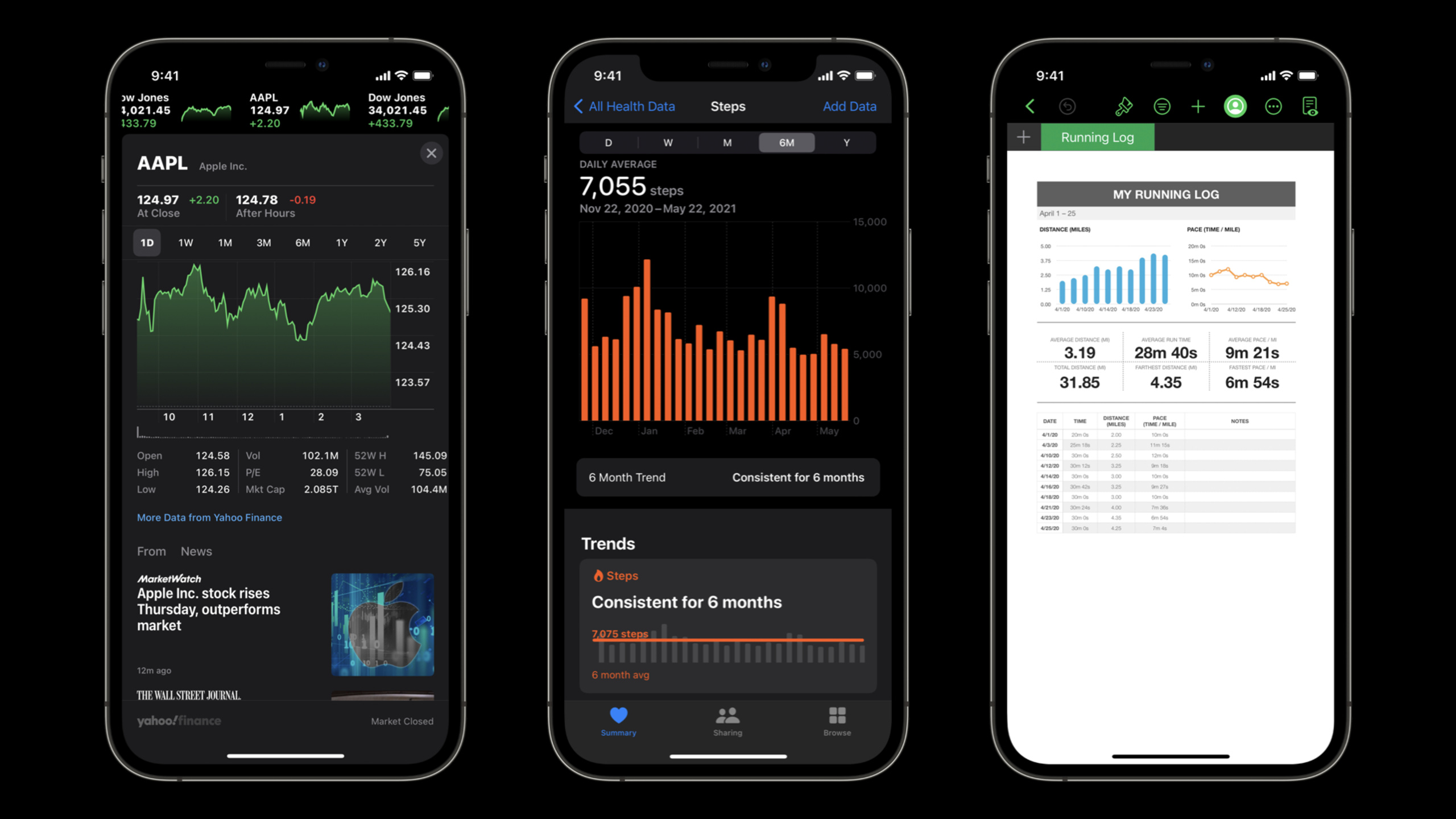
Apple adds Audio Graphs to VoiceOver and passes
AXChart、accessibilityChartDescriptorand chart description objects allow developers to transform visual charts into accessible data experiences that are playable and explorable.
Core Content
Many applications use charts to display data. Health trends, financial changes, car fuel consumption, birth rate curves, users can see peaks, trends and anomalies at a glance.
The problem is that charts rely on visuals by default. Blind and low-vision users cannot see the trend of the lines, and it is difficult to quickly judge the meaning of the data from a long list of raw data points.
The remedy in the past has typically been to stuff data points into an accessibility tree. VoiceOver can read the points one by one, but users have to spell out the trends in their minds. With too many data points, navigation will slow down.
Apple gave a more direct solution at WWDC21: first make the graph itself a VoiceOver navigable semantic container, and then use Audio Graphs (audio graphs) to convert the data sequence into sound. The higher the value, the higher the pitch; the lower the value, the lower the pitch. Users can play the entire curve or drag to explore specific values at a location.
This set of capabilities solves the same pain point: the value of a chart is not just a single number, but also includes trends, shapes, and outliers. Audio Graphs make this information available to VoiceOver users in seconds.
Visual charts must also be readable first
Diagram accessibility doesn’t just serve VoiceOver. Users with low vision and color vision impairment also need clearer visual encoding.
Apple recommends developers do three things first: improve the contrast between foreground and background, avoid confusing colors like red, green or blue and yellow, and use symbols to help distinguish data series. For example, using dots for one line and squares for the other allows users to distinguish categories without relying on color.
If the product design limits default styles, it can also respond to system accessibility settings. Increase symbols when Differentiate Without Color is on; use higher contrast colors when Increase Contrast is on; reduce transparency when Reduce Transparency is on.
VoiceOver needs to be able to enter the chart
A chart view usually just draws its own content. VoiceOver doesn’t know how many data points there are, or where each point is on the screen.
The first step in this session is to declare the chart view as a semantic container and create aUIAccessibilityElement. This allows users to navigate through the data points one by one using VoiceOver and hear the X and Y values for each point.
Audio Graphs are responsible for expressing trends
Point-by-point navigation can answer “what is a certain point?” Audio Graphs answers “What does this curve look like?”
Developer implementationAXChartprotocol, returns aAXChartDescriptor. This description object contains title, summary, axis, and data series. Once VoiceOver gets this structured information, it can provide playback, interactive dragging, reading of data values, and chart detail views.
Detailed Content
1. Use visual rules to lower the reading threshold
(07:02) Apple starts with visual design. Charts should try to use high-contrast colors. The talk suggested using the Color Contrast Calculator in Xcode’s built-in Accessibility Inspector to check the ratio and aim for at least 4.5:1.
There is no dedicated Code tab snippet for this section. The system settings mentioned in the session can be organized into inspection entries.
import UIKit
import SwiftUI

let reduceMotionEnabled = UIAccessibility.isReduceMotionEnabled

struct ChartStyleProbe: View {
    @Environment(\.accessibilityReduceMotion) private var reduceMotion

    var body: some View {
        Text(reduceMotion ? "Reduce Motion" : "Default Motion")
    }
}
Key points:
import UIKitintroduceUIAccessibility。UIAccessibility.isReduceMotionEnabledCorresponds to the Reduce Motion setting in UIKit.import SwiftUIIntroducing SwiftUI’s environment value system.@Environment(\.accessibilityReduceMotion)Read Reduce Motion state in SwiftUI.bodySwitch the display content according to the system settings, and the same entrance can be used to reduce animation or motion effects in real charts.
(09:40) If the default chart cannot always display symbols, symbols should be added when Differentiate Without Color is turned on. Increase Contrast should use higher contrast colors when on. Reduce Transparency should reduce transparency effects when turned on.
This principle is suitable for placing in the chart style layer. Don’t hard-code the line color, point shape, and transparency into the drawing function. Focus on generating styles first, and then hand them over to the drawing code for use.
2. Let the chart become a VoiceOver semantic container
(10:47) The example in the talk is from an ordinaryChartViewstart. view holdsChartModel, there are titles and data points in the model.
class ChartView: UIView {
    let model: ChartModel

    func drawChart() {
        // ...
    }
}

struct ChartModel {
    let title: String
    let dataPoints: [DataPoint]

    struct DataPoint {
        let name: String
        let x: Double
        let y: Double
    }
}
Key points:
ChartViewIs a custom chart view.modelSave the data that needs to be displayed in the chart.drawChart()It means that the drawing logic is already available, and the speech does not expand on the drawing details.ChartModel.titleCan be used as an accessibility label for charts.dataPointsis a collection of points on the chart.DataPoint.xandDataPoint.yCorrespond to the X-axis and Y-axis values respectively.
(10:48) The next step is to override the accessibility properties of the chart view.accessibilityContainerTypeUsed to tell VoiceOver: this view is a group of related elements.accessibilityLabelUsed to read the chart title aloud.accessibilityElementsReturns the elements within the chart that can be navigated.
extension ChartView {
    public override var accessibilityContainerType: UIAccessibilityContainerType { … }
    public override var accessibilityLabel: String? { … }

    public override var accessibilityElements: [Any]? {
        get {
            return model.dataPoints.map { point in
                let axElement = UIAccessibilityElement(accessibilityContainer: self)
                axElement.accessibilityValue = "\(point.x) cups, \(point.y) lines of code"
                axElement.accessibilityFrameInContainerSpace = frameRect(for: point)
                return axElement
            }
        }
        set {}
    }

 private func frameRect(for dataPoint: DataPoint) -> CGRect {
Key points:
accessibilityContainerTypeThe semantic grouping type should be returned, corresponding to the speechsemanticGroup。accessibilityLabelTypically use a chart title to let VoiceOver identify the current chart.accessibilityElementsConvert each data point into an accessible element.UIAccessibilityElement(accessibilityContainer: self)Hang the element below the current chart view.accessibilityValueIt is the data point content read by VoiceOver. In actual projects, plural rules should be localized and processed.accessibilityFrameInContainerSpaceTells VoiceOver the location of this data point in the chart container.frameRect(for:)You can reuse the existing point calculation logic when drawing charts.
(13:30) If the chart has hundreds or thousands of points, don’t create elements for each point. Apple recommends splitting the chart into reasonable intervals and creating an accessibility element for each interval. This improves the navigation experience and reduces performance pressure.
3. Prepare structured model for Audio Graphs
(14:23) Audio Graphs requires more than just a list of points. VoiceOver also requires a title, summary, axis range, and axis title.
struct ChartModel {
    let title: String
    let summary: String
    let xAxis: Axis
    let yAxis: Axis
    let data: [DataPoint]

    struct Axis {
        let title: String
        let range: ClosedRange<Double>
    }

    struct DataPoint {
        let name: String
        let x: Double
        let y: Double
    }
}
Key points:
titleIt is the chart title and will enter the chart description object.summaryChart-like alt text that explains the most important takeaways from the data in one or two sentences.xAxisDescribe the X-axis.yAxisDescribe the Y-axis.Axis.titleis the axis name.Axis.rangeIt is the minimum value to the maximum value that the coordinate axis can display.dataIt is the real data of the chart.DataPointGo ahead and save the name, X value, and Y value.
(17:45)summaryVery critical. The talk likens it to alt text for charts. It appears in the Audio Graph Explorer view to help VoiceOver users grab data conclusions before entering sound exploration.
4. ImplementationAXChartprotocol
(15:08) To enable Audio Graphs, first import the Accessibility framework, and then let the chart view complyAXChartprotocol. This protocol requires only one property to be implemented:accessibilityChartDescriptor。
import Accessibility

extension ChartView: AXChart {

public var accessibilityChartDescriptor: AXChartDescriptor? {
    get {
    }
    set {}
    }
}
Key points:
import AccessibilityIntroducing Audio Graphs related types.extension ChartView: AXChartIndicates that this view can provide a diagram description to the system.accessibilityChartDescriptorIt is the entrance for VoiceOver to obtain the chart structure.getThe description object needs to be constructed and returned.set {}Keep the property writable interface, writing is not handled in the example.
After implementing this property, the Audio Graph entry will appear in VoiceOver’s Rotor. Users can enter Chart Details, play audio charts, or enter interactive mode to drag and explore.
5. Describe the axis title, range and value reading method
(15:35) The axis description object tells VoiceOver: whether this axis is a numerical axis or a category axis, what is the display range, where are the grid lines, and how should the values be read.
public var accessibilityChartDescriptor: AXChartDescriptor? {
    get {
        let xAxis = AXNumericDataAxisDescriptor( … )
        let yAxis = AXNumericDataAxisDescriptor(title: model.yAxis.title,
                                                range: model.yAxis.range,
                                                gridlinePositions:[],
                                                valueDescriptionProvider: { value in
            return "\(value) lines of code"
        })
    }
    set {}
}
Key points:
AXNumericDataAxisDescriptorUsed for numerical axes.xAxisThe parameters are omitted in the example, and the lecture explains that if the X-axis is categorical data, the categorical axis should be used to describe the object.yAxisusemodel.yAxis.titleAs the axis title.range: model.yAxis.rangeProvides the Y-axis display range.gridlinePositions: []Indicates that this example does not provide grid line positions.valueDescriptionProviderControl how VoiceOver speaks readings."\(value) lines of code"Let VoiceOver read values with units instead of just speaking bare numbers.
(16:02) If grid line positions are provided, Audio Graphs uses haptic feedback to represent the grid lines during playback and interaction. The lecture example does not have X-axis gridlines, so an empty array is passed in.
6. Give the data series toAXChartDescriptor
(16:55) After the coordinate axis is completed, the data series must also be provided. Use one per seriesAXDataSeriesDescriptordescribe. Finally, the title, abstract, axis and series are combined intoAXChartDescriptor。
public var accessibilityChartDescriptor: AXChartDescriptor? {
    get {
        let xAxis = AXNumericDataAxisDescriptor( … )
        let yAxis = AXNumericDataAxisDescriptor( … )
        let series = AXDataSeriesDescriptor( … )
        return AXChartDescriptor(title: model.title,
                                 summary: model.summary,
                                 xAxis: xAxis,
                                 yAxis: yAxis,
                                 additionalAxes: [],
                                 series: [series])
    }
    set {}
}
Key points:
xAxisIs the X-axis description object.yAxisIs the Y-axis description object.seriesIs the data series description object.AXDataSeriesDescriptorRequires the series name, whether it is continuous, and the actual data points.- Discrete data represented visually as points or bars,
isContinuousShould be passed onfalse。 - Continuous data visually represented by lines,
isContinuousShould be passed ontrue。 AXChartDescriptor.titleUse chart titles.summaryUse summaries in the model to provide users with graphical conclusions.additionalAxes: []Indicates that the example has no additional axes.series: [series]Give the data series to VoiceOver.
(17:24) The speech suggested mapping the data in the model intoAXDataPointarray. This step allows VoiceOver to get the actual values of the chart. Audio Graphs can then play the trend, read the value of the current position, and display the chart details in the Explorer view.
Core Takeaways
1. Add Audio Graphs to the health trend graph
- What to do: Add audio playback and drag exploration to trend charts such as steps, heart rate, sleep duration, etc.
- Why it’s worth doing: The focus of this type of graph is on trends and peaks, and Audio Graphs can convert trends into pitch changes.
- How to start: Organize existing trend graph models and supplement
title、summary、xAxis、yAxisand data points, then implement it on the chart viewAXChartandaccessibilityChartDescriptor。
2. Add a summary to the asset curve of the financial management app
- What to do: Add one or two sentence chart summaries to asset, budget, and expense charts.
- Why it’s worth it: VoiceOver users can hear the most important data conclusions before entering Audio Graph Explorer.
- How to start: Generate for each chart
summaryfields, such as highest value, lowest value, increasing or decreasing trend, and then pass it toAXChartDescriptor(summary:)。
3. Provide trend and abnormal point exploration for scatter plots
- What: Provides a playable data series for scatter plots, allowing users to hear overall increases, decreases, and outliers.
- Why it’s worth doing: The car weight and fuel consumption examples from the talk show how scatter plots can also detect trends and outliers through sound.
- How to start: Map each sample to
AXDataPoint,useAXDataSeriesDescriptorDescribe the series. discrete point plotisContinuoususefalse。
4. Interval-level VoiceOver navigation for data-intensive charts
- What to do: When a chart has a large number of data points, break the data into navigable segments by time, value range, or sampling interval.
- Why it’s worth doing: Point-by-point navigation will cause VoiceOver users to slide back and forth among hundreds of elements, resulting in a poor experience and affected performance.
- How to start: In
accessibilityElementsDo not map all original points directly, first aggregate them into reasonable intervals, and then createUIAccessibilityElement。
5. Make a set of accessible chart style switches
- What: Centrally manage high-contrast colors, symbology, transparency, and animation strategies.
- Why it’s worth it: The visual readability of charts directly impacts low vision and color vision impaired users.
- How to start: Read system settings such as Differentiate Without Color, Increase Contrast, Reduce Transparency, Reduce Motion, etc., and switch colors, symbols and effects in the chart style layer.
Related Sessions
- Tailor the VoiceOver experience in your data-rich apps — Explanation
AXCustomContent, suitable for use with on-demand reading of chart details. - SwiftUI Accessibility: Beyond the basics — Demonstrates advanced practices for SwiftUI accessibility.
- Support Full Keyboard Access in your iOS app — Let iOS apps navigate and operate through the keyboard.
- Create accessible experiences for watchOS — Talk about accessible experience design on watchOS.
- Accessibility by design: An Apple Watch for everyone — Understand Apple’s approach to accessibility from a product design perspective.
Comments
GitHub Issues · utterances