
Highlight
SF Symbols 3 adds nearly 600 new icons (total over 3,000), expands localized language support, introduces Hierarchical and Palette rendering modes, and enables fine color control through layer annotations.
Core Content
Symbols are the most basic communication elements of user interfaces
When you click on the settings page of an app, the gear icon is the symbol.Symbols are the simplest form of communication between users and products. They are independent of language and help users quickly navigate and trigger actions.
SF Symbols combines these symbols into an icon library that works seamlessly with the San Francisco font.Each symbol comes in nine weights and three sizes, automatically aligns with text labels, and supports accessibility features such as dynamic fonts and bold text.
(00:48)
Symbol variations: outlined, filled, slash
The same symbol can have multiple forms.The default is outlined (wireframe version) because it matches the stroke style of the text.When you need a more prominent effect, the filled version provides a larger area to hold the color.
There is also a slash variant, which is used to remove or disable a feature.The enclosed variant places the symbol in a circle, square, etc. container.
(03:05)
Localization extension: supports Arabic, Hebrew, etc.
This year we have expanded the text system coverage of SF Symbols, adding designs for Arabic, Hebrew, and Devanagari, as well as variants of Chinese, Japanese, Korean, and Thai.
These localized symbols automatically adapt to the user’s device language, including right-to-left writing systems.If a symbol loses its intended effect when mirrored, a specialized version will need to be designed for a specific writing system.
(06:25)
Detailed Content
Anatomy of symbols: closed paths and points compatible
Each symbol starts from a vector point and consists of straight line segments and Bezier curves forming a path.The design source of the symbol must be a fully enclosed shape so that it maintains a consistent shape when interpolated between different weights and sizes.
Key Design Rules:
- Use closed paths, no open endpoints
- Strokes must be converted to outlines
- All variants must be point compatible (same number of vector points)
The advantage of this design is that the system can smoothly interpolate between different font weights to achieve changes in nine font weights.
(08:35)
Layer annotation: define primary and secondary relationships
Symbols can combine multiple objects. For example, the sharing symbol is a combination of arrows and squares.Through layer annotations, we can group these objects:
- Primary (main floor)
- Secondary
- Tertiary (third floor)
This sets the stage for color control.For example, the screen within a circular container is usually labeled tertiary, while the foreground element is labeled primary.
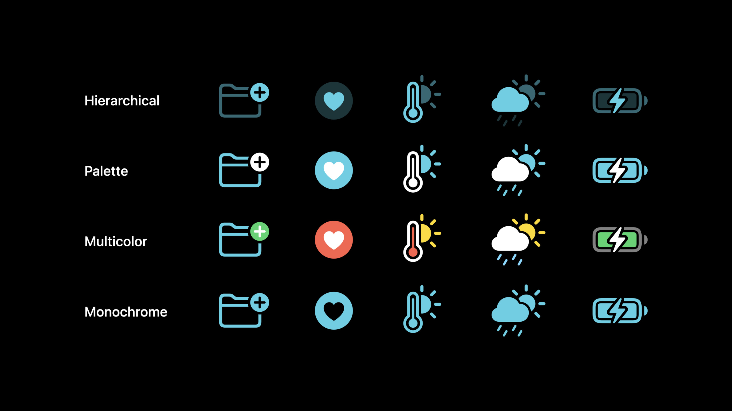
Four rendering modes
1. Monochrome (monochrome mode)
This is the mode closest to the nature of typography, using a single color for all symbols, emphasizing consistency rather than differentiation.Use when you need symbols to be mixed up without any one being highlighted.
Image(systemName: "heart.fill")
    .symbolRenderingMode(.monochrome)
    .foregroundStyle(.red)
Key points:
- Use the same color for all parts
- Transparency is applied to the entire symbol, ignoring layer annotations
- Suitable for toolbars, navigation bars and other scenes that require a unified appearance
2. Hierarchical
Use a single color but create visual hierarchy through varying opacity.The main layer is 100% opaque, with the secondary and third layers having decreasing transparency.
Image(systemName: "cloud.sun.rain.fill")
    .symbolRenderingMode(.hierarchical)
    .foregroundStyle(.blue)
Key points:
- The main layer is fully saturated, the second layer is translucent, and the third layer is lighter
- Automatically assign transparency based on layer annotations
- Suitable for scenes that need to emphasize structure but maintain a single tone
(11:30)
3. Palette (Palette mode)
Allows the use of two or more contrasting colors, each color can be controlled independently.Annotations are based on the same layer, but each layer can be assigned a different color.
Image(systemName: "person.2.fill")
    .symbolRenderingMode(.palette)
    .foregroundStyle(
        .blue,
        .orange,
        .red
    )
Key points:
- Supports up to three layers of independent colors
- Three color parameters are required when the tertiary is present, otherwise the secondary color will be applied to the tertiary
- Suitable for scenarios where clear distinction between different elements within a symbol is required
4. Multicolor (multicolor mode)
Express the inherent color of the symbol, reflecting the appearance of objects in the physical world, or conventional color semantics (for example, adding is green, deleting is red).
Image(systemName: "globe.americas.fill")
    .symbolRenderingMode(.multicolor)
Key points:
- Use predefined color schemes for symbols
- Can be full color, partial color (some with accent color)
- Symbols without multicolor information are downgraded to monochrome mode
(15:53)
Color library update
SF Symbols 3 updated color libraries:
- Brown is now available on all platforms, previously only on macOS
- Teal redefined to a greener hue
- Cyan (cyan) is a new color name, using the old Teal color value
- Indigo and Purple have more consistent hue definitions across all platforms
All colors automatically adapt in light, dark and high-contrast looks.
Core Takeaways
1. Use Hierarchical mode to improve the readability of list items
- What: In complex lists, use Hierarchical mode for each list item’s icon
- Why it’s worth doing: In monochrome mode, all icons have the same visual weight. Hierarchical mode distinguishes primary and secondary elements through transparency, making the icon structure clearer.
- How to start: Find the symbol used in the list and change the rendering mode to
.hierarchical, observe whether the primary and secondary elements are easier to identify
2. Use Palette mode to create visual groupings for function buttons
- What to do: Use the same Palette color scheme for a group of related function buttons
- Why it’s worth it: Users can quickly identify functional categories through color, reducing cognitive load
- How to start: Define three to four color schemes (such as orange for editing, red for deletion, and blue for sharing) and apply them to the icons of the corresponding functional groups
3. Follow the closed path principle when customizing symbols
- WHAT TO DO: When designing a custom symbol in Figma or Illustrator, make sure all paths are closed and strokes are turned into outlines
- Why it’s worth it: Only closed paths can correctly interpolate between SF Symbols’ multiple weights, ensuring symbols remain consistent across sizes
- How to start: Use the SF Symbols 3 application to export the symbol template, draw on the template, and check if there are open paths before exporting
4. Design a symbol coloring system for your app
- What to do: Define a set of color matching rules for Palette mode based on the app’s brand color and functional classification
- Why it’s worth doing: Unified color matching allows users to establish color semantic memory and improve the professionalism and consistency of the interface.
- How to start: List all scenes using symbols in the app, group them by function, define 2-3 color schemes for each group and document them
5. Use Multicolor mode to strengthen brand recognition
- What to do: For brand iconic elements (such as App logo icons), use Multicolor mode to maintain their inherent colors
- Why it’s worth it: Symbols in Multicolor mode retain the original colors of the design, which can strengthen brand recognition and emotional connection.
- How to start: Select symbols with strong color semantics (such as weather icons, brand icons), and set the rendering mode to
.multicolor
Related Sessions
- Create custom symbols — Learn how to design your own SF Symbols, including drawing rules and layer annotations
- Explore the SF Symbols 3 App — Learn more about what the SF Symbols 3 App does and how to use it
- Design for Apple Platforms — Apple platform design principles and best practices for symbol usage
- SF Symbols 2 — Basic knowledge of SF Symbols at WWDC20, recommended to watch first
Comments
GitHub Issues · utterances