
Highlight
Introduced in iOS 15
UIButtonConfiguration, using declarative configuration instead of property-by-property settings, and adding toggle button, pop-up button andUIMenuThe radio-select submenu allows the button to evolve from “able to click” to “able to express”.
Core Content
Buttons are the most common control in every app, but UIKit’s button API has been primitive for years.You need to set the title, icon, background color, rounded corners, and spacing. Each attribute must be adjusted individually.You have to manually update the style when the state changes, and the code is scattered everywhere.
For iOS 15UIButtonConfigurationThe button system has been completely restructured.The core idea is to package all the visual attributes of the button into a value type configuration, and change the appearance of the button by modifying the configuration.The system provides four preset styles (plain, gray, tinted, filled), supports title + subtitle + icon combination, dynamic type, multi-line text, and can also display a loading indicator.
More practical is the addition of two new button behaviors: toggle button (toggle the selected state like a switch) and pop-up button (click to pop up the menu and display the currently selected item).Both behaviors are based onUIActionandUIMenu, no need to write additional proxy methods.
Use Configuration to create buttons
(02:13)
The easiest way to get started: assign a configuration to an existing button.
let signInButton = UIButton(type: .system)
signInButton.configuration = .filled()
signInButton.setTitle("Sign In", for: [])
Key points:
UIButtonwill automatically replace old APIs such assetTitle) The set title and icon are integrated into the configuration- This means that migration can be done gradually without having to rewrite all the button code at once
Custom Configuration
(03:20)
Use the structure method to configure the button, and set all properties at once:
var config = UIButton.Configuration.tinted()
config.title = "Add to Cart"
config.image = UIImage(systemName: "cart.badge.plus")
config.imagePlacement = .trailing
addToCartButton = UIButton(configuration: config, primaryAction: ...)
Key points:
imagePlacementControls which side of the text the icon is on (.leadingor.trailing)- The system will automatically handle the spacing between icons and text
State-driven dynamic updates
(04:45)
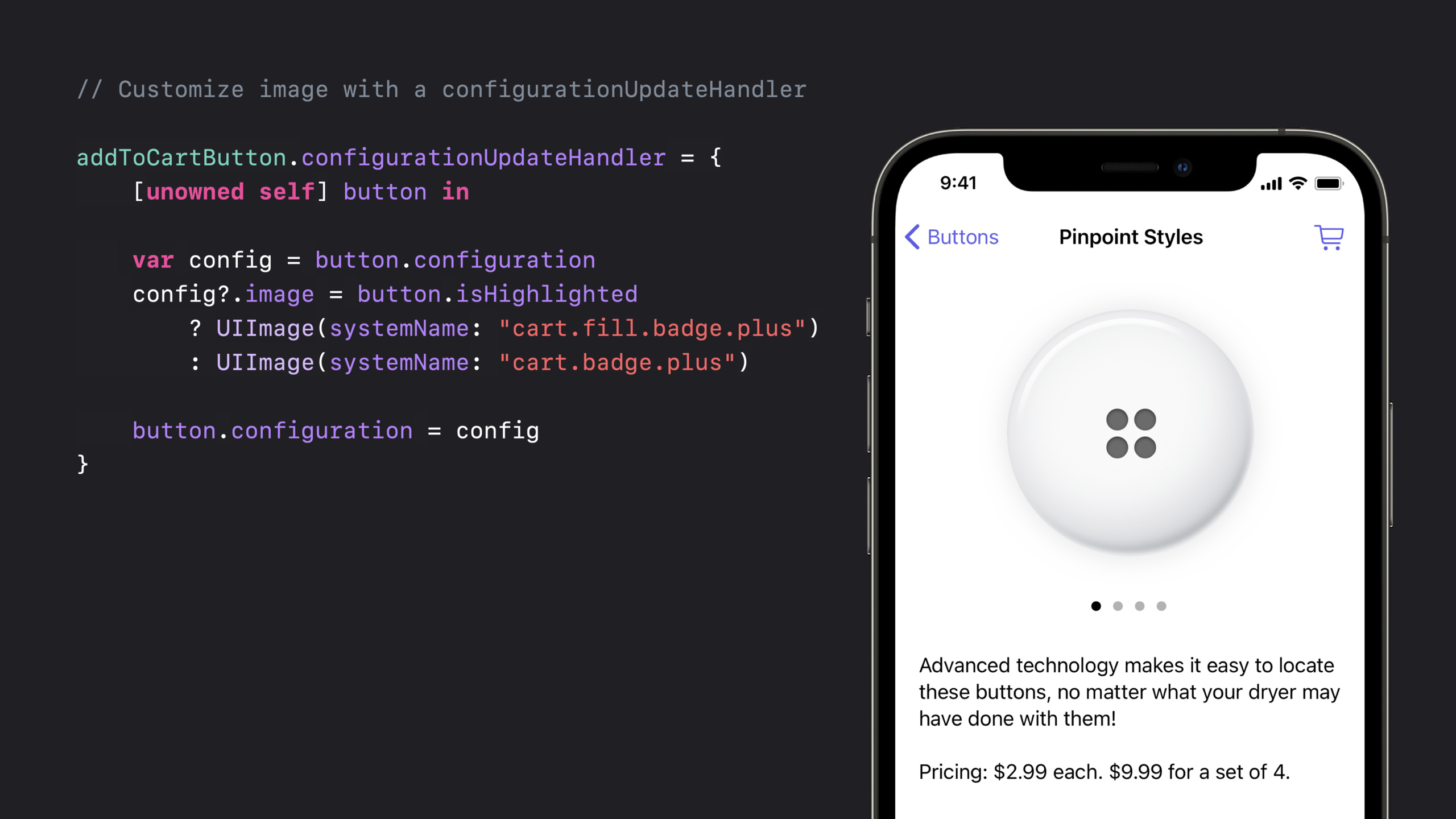
When the button is pressed, the icon changes from wireframe to solid. This effect is usedconfigurationUpdateHandleraccomplish:
addToCartButton.configurationUpdateHandler = { [unowned self] button in
    var config = button.configuration
    config?.image = button.isHighlighted
        ? UIImage(systemName: "cart.fill.badge.plus")
        : UIImage(systemName: "cart.badge.plus")
    config?.subtitle = self.itemQuantityDescription
    button.configuration = config
}
Key points:
configurationUpdateHandlerAutomatically called when the button state changes- The current configuration is read first in the closure, and then assigned back after modification.
isHighlighted、isSelected、isEnabledIt will be triggered when the status changes.
Manually trigger updates when external data changes:
private var itemQuantityDescription: String? {
    didSet {
        addToCartButton.setNeedsUpdateConfiguration()
    }
}
Key points:
setNeedsUpdateConfiguration()Flag button needs updating- The system will call it in the next run loop
configurationUpdateHandler
Completely customizable styles
(08:26)
useUIBackgroundConfigurationFine control of background:
var config = UIButton.Configuration.filled()
config.buttonSize = .large
config.image = UIImage(systemName: "cart.fill")
config.title = "Checkout"
config.background.backgroundColor = .buttonEmporium

let checkoutButton = UIButton(configuration: config, primaryAction: ...)

checkoutButton.configurationUpdateHandler = { [unowned self] button in
    var config = button.configuration
    config?.showsActivityIndicator = self.isCartBusy
    button.configuration = config
}
Key points:
buttonSizehave.small、.medium、.largeThree presetsshowsActivityIndicatorWhen true, show the loading animation, replacing the icon if necessarybackground.backgroundColorSet a custom background color and the system will still automatically handle the darkening effect for pressed and disabled states
Toggle Button
(11:56)
Toggle button automatically switches every time you clickisSelectedstatus, behaves likeUISwitchBut more compact:
let stockToggleAction = UIAction(title: "In Stock Only") { _ in
    toggleStock()
}

let button = UIButton(primaryAction: stockToggleAction)
button.changesSelectionAsPrimaryAction = true
button.isSelected = showingOnlyInStock()
Key points:
changesSelectionAsPrimaryAction = trueEnable toggle behavior- The system automatically flips when clicked
isSelected - can be found in
configurationUpdateHandlermedium basisisSelectedchange appearance UIBarButtonItemAlso addedisSelectedAttribute, supports the same toggle behavior
Pop-up Button
(14:30)
Pop-up button clicks the pop-up menu. After selecting an item, the button title automatically updates to the selected item:
let colorClosure = { (action: UIAction) in
    updateColor(action.title)
}

let button = UIButton(primaryAction: nil)
button.menu = UIMenu(children: [
    UIAction(title: "Bondi Blue", handler: colorClosure),
    UIAction(title: "Flower Power", state: .on, handler: colorClosure)
])
button.showsMenuAsPrimaryAction = true
button.changesSelectionAsPrimaryAction = true

// Read the current selection
updateColor(button.menu?.selectedElements.first?.title)

// Set the selection programmatically
(button.menu?.children[selectedColorIndex()] as? UIAction)?.state = .on
Key points:
showsMenuAsPrimaryAction = trueLet click pop up menu directlychangesSelectionAsPrimaryAction = trueMake buttons have pop-up behavior- Button titles and icons automatically display the currently selected item
selectedElementsAlways return one element (radio constraint)
Radio submenu
(18:18)
Nest radio submenus within pull-down menus, such as sorting options:
let sortMenu = UIMenu(title: "Sort By", options: .singleSelection, children: [
    UIAction(title: "Title", handler: sortClosure),
    UIAction(title: "Date", handler: sortClosure),
    UIAction(title: "Size", handler: sortClosure)
])

let topMenu = UIMenu(children: [
    UIAction(title: "Refresh", handler: refreshClosure),
    UIAction(title: "Account", handler: accountClosure),
    sortMenu
])

let sortSelectionButton = UIBarButtonItem(primaryAction: nil, menu: topMenu)
Key points:
options: .singleSelectionMake the submenu into radio mode- Selected behaviors are automatically managed, no need to manually maintain state
- The same radio constraint applies to nested submenus
Detailed Content
Four preset styles
iOS 15 provides four basic button styles:
| Style | Appearance | Applicable scenarios |
|---|---|---|
| plain | no background, text + icon | toolbar, navigation bar |
| gray | Gray rounded corners background | Secondary operations |
| tinted | Transparent background with theme color | Emphasis but not too prominent |
| filled | solid filled theme color | main operations |
Layout control
UIButton.ConfigurationProvides fine layout control:
var config = UIButton.Configuration.filled()
config.contentInsets = NSDirectionalEdgeInsets(top: 8, leading: 16, bottom: 8, trailing: 16)
config.imagePadding = 8
config.titlePadding = 4
config.titleAlignment = .leading
config.imagePlacement = .top
Key points:
contentInsetsControls the spacing between the button content area and the borderimagePaddingControl the spacing between icons and texttitlePaddingControl the spacing between multi-line titlesimagePlacementsupport.leading、.trailing、.top、.bottom
Mac Catalyst automatic adaptation
(15:43)
New button types are automatically converted to native Mac styles on Mac Catalyst:
- Pull-down button becomes Mac’s bezeled pull-down button
- Pop-up button becomes Mac’s pop-up button
- Toggle button becomes Mac’s toggle button
If you want to keep the iPad style (such as prominent custom buttons), you can set:
checkoutButton.behaviorStyle = .ipadCore Takeaways
- Replace all custom button subclasses
- What to do: Inherit the project
UIButtonWrite a custom button class and gradually migrate toUIButtonConfiguration - Why is it worth doing: In order to make “rounded buttons with icons” or “buttons that change color when pressed”, many people wrote
CustomButton: UIButton.Now the system supports it natively, and the code has been reduced from dozens of lines to just a few lines. - How to start: Find the simplest custom button and use
.filled()or.tinted()Configuration replacement, batch migration after verifying that the appearance is consistent
- Replace UISwitch with Toggle Button
- What to do: On the settings page, filter conditions, etc., select
UISwitchChange to toggle button with text label - Why it’s worth doing:
UISwitchOnly the switch status has no text description, so the user does not know what is being switched.Toggle button combines labels and controls into one, saving space and making the semantics clearer - How to start:
changesSelectionAsPrimaryAction = true+ inconfigurationUpdateHandlerbased onisSelectedSwitch icons and colors
- Replace Segmented Control with Pop-up Button
- What to do: Use pop-up button instead when there are more than 3-4 options
UISegmentedControl - Why it’s worth doing: Segmented control will cut off the text or overflow the screen when there are many options.Pop-up button is not limited by width and can also display hierarchical structure
- How to get started: Create
UIMenu+showsMenuAsPrimaryAction = true+changesSelectionAsPrimaryAction = true
- Create a submit button with loading status
- What: The form submit button displays a loading animation during the request and resumes after the request is completed
- Why it’s worth doing:
showsActivityIndicatorImplemented with one line of code, the system will automatically handle icon replacement and animation without manual management.UIActivityIndicatorView - How to start: In
configurationUpdateHandlerSet according to request statusconfig?.showsActivityIndicator = isLoading
- Unify the styles of all buttons in the app
- What to do: Define a set of App-level button configuration factory methods, and all buttons are created through the factory
- Why it’s worth doing:
UIButtonConfigurationIt is a value type and can be reused and combined.definitionprimaryButtonConfig()、secondaryButtonConfig()Wait for factory methods to ensure consistent button styles across the app - How to start: Write one
ButtonStyleEnumeration, each case returns preconfiguredUIButton.Configuration
Related Sessions
- What’s new in UIKit — Overview of UIKit’s annual new features
- Build interfaces with style — Using the new button system in Interface Builder
- What’s new in Mac Catalyst — New features of Mac Catalyst, including button auto-adaptation
Comments
GitHub Issues · utterances