
Highlight
Apple demonstrated using PlaygroundSupport to display SwiftUI live views in Xcode-compatible Swift Playground, and using multiple files, environment modifiers, @State and Button for interactive preview, allowing developers to verify SwiftUI prototypes on iPad or Mac.
Core Content
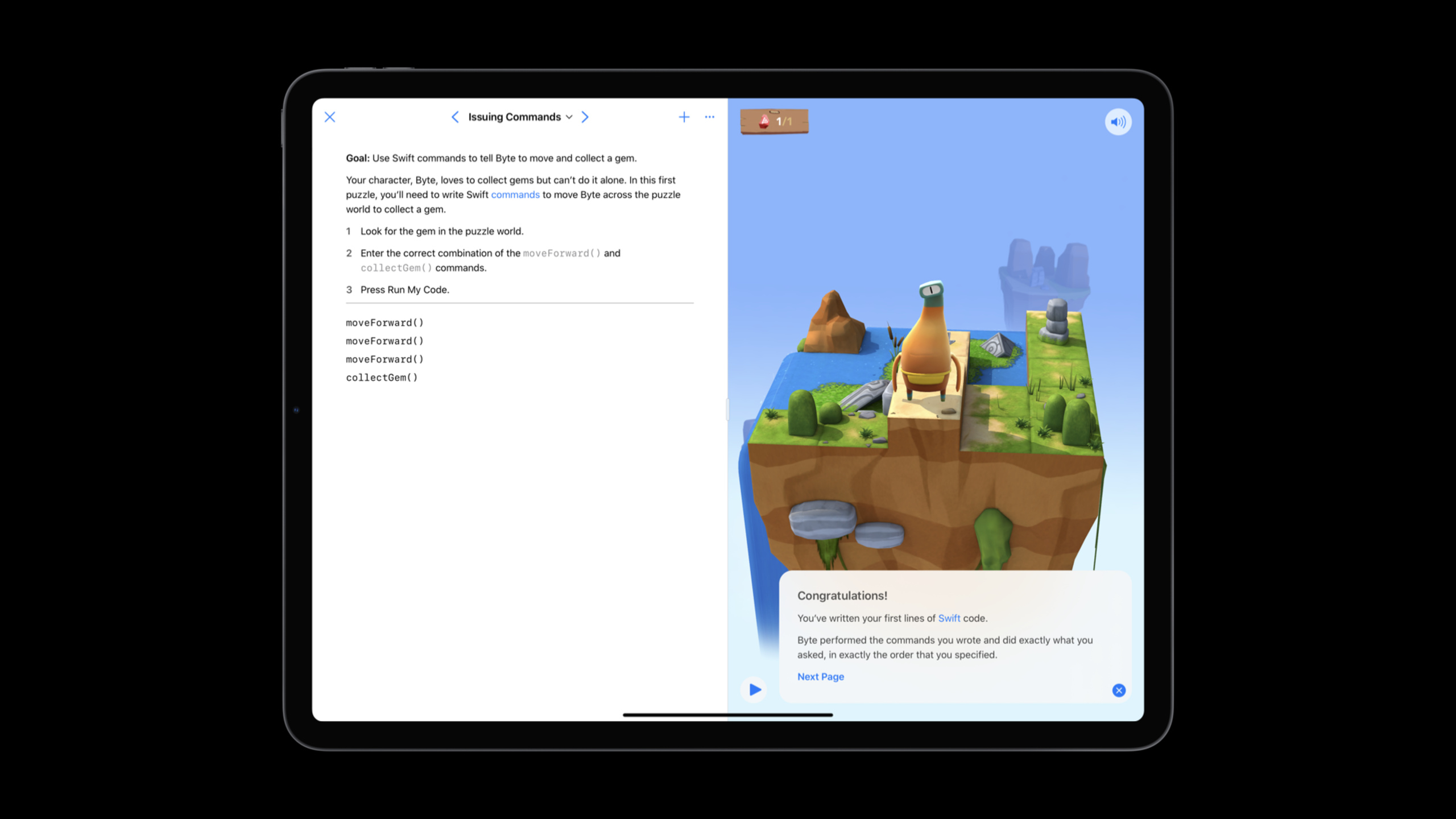
Many people regard Swift Playgrounds as the entry point for learning Swift. The opening of this session reminds developers that it can also take on more practical prototyping work: creating an Xcode Playground on an iPad or Mac, writing a SwiftUI view, running the live view, and bringing the results back to Xcode.
The speaker used the progress view of a task tracking app as an example. Goals are small: Draw a circular progress summary with a percentage in the center. Putting it in a complete project for debugging will interrupt the idea; putting it in a playground, you can use it firstCircle、ZStackandTextSpell out the shape, then use the Run button or Command-R to see the result.
The value of Swift Playgrounds goes beyond running a section of SwiftUI. It provides editing capabilities such as code completion, color literals, dragging braces to wrap existing code, keyboard shortcuts, and more. After the view becomes complex, you can alsoProgressViewMove to a separate file and leave the main page to preview the code.
The last paragraph turns the playground into a custom preview canvas. Main page creationPreviewview, showing two at a timeProgressView, one of which switches to dark mode. Plus@State、withAnimationandButton, live view can test different progress values and animation feel.
Detailed Content
Create SwiftUI live view
(02:23) The speaker first creates a blank Xcode Playground because subsequent work will bring back Xcode. When writing SwiftUI view, the main page needs to import SwiftUI and PlaygroundSupport to control the live view.
import SwiftUI
import PlaygroundSupport
Key points:
SwiftUIsupplyView、Text、Circle、ZStack、VStackand other interface types. -PlaygroundSupportProvides access to custom playground behavior.- transcript clearly states that it is for showing live views.
- This option allows the playground page to host SwiftUI previews instead of just outputting console results.
(03:05) YesProgressViewAfterwards, the main page sets the live view with the current Playground page. After running the code, the SwiftUI view will be displayed in the live view area of the Playground.
PlaygroundPage.current.setLiveView(ProgressView())Key points:
PlaygroundPage.currentVisit the current page. -setLiveViewGive a SwiftUI view to the Playground for display. -ProgressView()is the prototype view in the demo.- This step connects SwiftUI writing and visual results.
Create a progress view from a simple shape
(03:59) The progress view starts with a circle. Speakers useCircle, add stroke and foreground color, and run Command-R to see the results.
Circle()
	.stroke(lineWidth: 25)
	.foregroundColor(.blue)
Key points:
Circle()It is the basic shape of SwiftUI. -.stroke(lineWidth: 25)Make the circle appear as a stroke. -.foregroundColor(.blue)Set a color for the stroke.- After running, it was found that the size and line width were inappropriate, and the speaker continued to adjust the values directly.
(05:03) When the circle is too large, the example adds padding to the entire view. This snippet also shows that the Playground is suitable for experimenting with visual parameters: modify a number and immediately rerun the comparison results.
ProgressView().padding(150)Key points:
ProgressView()Is the SwiftUI view to display. -.padding(150)Add fixed white space to the outer layer.- This modification occurs at the initialization of the live view and does not require changing the entire app layout first.
- In the transcript, the speaker uses Command-R to run it repeatedly until the effect is close to the desired effect.
(05:17) Center Percentage PassedZStackStack on the circle. The speaker also demonstrated Swift Playgrounds’ brace dragging: dragging the closing brace down will wrap the existing circle code into a new stack.
ZStack { }Key points:
ZStackUsed to stack subviews on the same plane.- empty
{ }It is an official snippet, and subsequent operations put the existing circle code into it. - This step addresses the layout structure, not the visual parameters.
- Playground’s brace dragging reduces the need to manually cut indents.
(05:50) The percentage of the center of the circle is first hardcoded into text. For prototypes, this step is sufficient to verify the visual position.
Text("25%")Key points:
Text("25%")Is a SwiftUI text view.- put it in
ZStackIt will then be stacked with the circular progress. - Write down 25 percent in the transcript first, and then change the progress into status.
- This order is suitable for prototyping: verify the shape first, then plug in the data.
Split the view into a separate file
(08:07) After the view becomes complex, the speaker creates a newProgressViewFile, putProgressViewstruct is cut from the main page. Since it goes into a separate module, the type, body and initializer all need to be public.
public struct ProgressView: View {Key points:
publicMake the main page accessible in a separate fileProgressView。ViewThe protocol still comes from SwiftUI, so the new file is also neededimport SwiftUI.- transcript clearly says this is because the code is now in a separate module.
- The main page can therefore focus on writing previews instead of mixing implementation code.
(09:35) Swift Playgrounds will prompt for fixes at the problem point. The speaker clicks issue dot, accepts fix-it, and putsbodyAlso changed to public.
public var body: some View {Key points:
- SwiftUI view
bodyIt is a property that needs to be accessed when using the view externally. -some ViewKeep return types from exposing concrete composite views. - This snippet comes from the official code snippet, not a handwritten completion.
- Playgrounds’ issue dot and fix-it help quickly fix access control.
(09:43) The speaker also marked the initializer as public, because the main page will next create different progress valuesProgressView。
public init(_ progress: Double = 0.3) {Key points:
- initializer receives
DoubleType progress value. - The default value is
0.3, the view can also be created without passing parameters. - It must be public and can be called by the main page.
- This prepares for custom preview input later.
Create light mode and dark mode previews
(10:06) New main pagePreviewview, put multipleProgressViewput inVStack. This takes advantage of a key fact in the transcript: the entire live view area is canvas, allowing multiple views to be displayed.
VStack(spacing: 30) {
  ProgressView()
  ProgressView()
}
Key points:
VStack(spacing: 30)Arrange two progress views vertically.- two
ProgressView()Can be used to compare different environments. - This structure makes the Playground live view a custom preview.
- It corresponds to the goal of “show my view more than once” in transcript.
(10:49) In order to clearly see the difference between light and dark modes, the system background color is added to the outer layer of the preview. The speaker lets code completion fill in UIKit’ssecondarySystemBackground。
.background(Color(UIColor.secondarySystemBackground))Key points:
Color(UIColor.secondarySystemBackground)Bridge UIKit system colors to SwiftUI.- The system background color will change according to the environment.
- The preview area is closer to the real system interface.
- The purpose of this step in transcript is to make it easier to see the light/dark difference.
(11:11) The main page is last displayedPreview, instead of directly displaying a singleProgressView。
Preview()Key points:
Preview()Is a custom preview container.- it puts multiple copies
ProgressViewOrganized in a live view. - In this way, the main page does not need to host the real app entrance.
- For SwiftUI prototypes, the preview view itself is the test fixture.
(11:32) The second oneProgressViewSwitch to dark mode via environment modifier. After running again, the playground displays both light mode and dark mode.
.environment(\.colorScheme, .dark)Key points:
.environmentOverwrite the environment value read by the subview. -\.colorSchemePoint to color mode. -.darkHave one of the previews render in dark mode.- This allows you to inspect two looks side by side in a playground.
Make the preview interactive
(12:10) Finally, the speaker drives the progress value with a state variable. The live view is fully interactive, so you can click the button in the playground to observe the animation.
@State var progress = 0.25Key points:
@StateSave progress inside SwiftUI view.- initial value
0.25Corresponds to 25 percent. - State changes drive view re-rendering.
- This variable is then passed to two
ProgressView。
(12:18) Both previews use the same progress value. In this way, when the button is clicked, the light mode and dark mode will be updated together.
ProgressView(progress)Key points:
progressis the state of the previous step.- The initializer has been marked public in a separate file.
- The same input can drive multiple preview instances.
- This keeps performance comparable across different environments.
(12:32) The minimum interaction is just to increase the progress by 25 percent. The official clip first shows the version without animation.
func increment() {
  self.progress += 0.25
}
Key points:
increment()Is the method that the button action will call. -self.progress += 0.25Add a quarter each time.- it modifies directly
@State. - After modifying state, SwiftUI is responsible for refreshing the views that depend on it.
(12:40) The speaker then included the same line of status modificationswithAnimation. This animates progress changes without changing the call point.
func increment() {
  withAnimation {
    self.progress += 0.25
  }
}
Key points:
withAnimationWrapping status changes.- Animations are attached to view changes triggered by this state.
- The original progress calculation has not changed.
- Playground live view can directly test the animation feel.
(12:52) button usageincrementas action. It puts the interaction portal into preview instead of waiting for the complete app to be written and then verified.
Button(action: increment)Key points:
ButtonIt is an interactive control of SwiftUI. -action: incrementBind the status update method above.- button placed
VStack, and both previews share the same state. - ProgressView will work and play animation after clicking button in transcript.
Button(action: increment) {
  Text("Increment Progress")
}
Key points:
- This snippet adds a text label to the button.
-
Text("Increment Progress")Is the button display content. - action and label together form a complete button.
- Click it in the Playground to check the view performance under different progress values.
Core Takeaways
-
Make a SwiftUI control draft board: What to do: Put the single SwiftUI control being designed into the Xcode Playground and run it separately with live view. Why it’s worth doing: session shows the results from
Circle、ZStack、TextThe start verification progress view is lighter than entering the complete app process. How to get started: Create a blank Xcode Playground and import itSwiftUIandPlaygroundSupport,usePlaygroundPage.current.setLiveViewShow the target view. -
Make a light/dark side-by-side preview page: What to do: Write a preview-only page for key components
Previewview, rendering multiple components at once. Why it’s worth doing: For presentationsVStackand.environment(\.colorScheme, .dark)Check both light and dark modes. How to start: Put the real components into separate files, and only keep the main pagePreview()。 -
Make an interactive state test bed: What to do: Add to preview
@State, buttons and animations to test the feedback of controls under different input values. Why it’s worth doing: End the session with progress state andwithAnimationVerify progress changes without first accessing real data sources. How to start: Declare it in the preview view@State var progress, pass it into the component, and then useButton(action:)Modify it. -
Make a SwiftUI parameter adjustment playground shared by the team: What to do: Put design parameters such as color, spacing, line width, etc. into the playground, and let design and development try it out together. Why it’s worth doing: Transcript showcases color literals, code completion, and brace dragging, perfect for quickly adjusting visual details. How to get started: Turn a few candidate values in the design into SwiftUI snippets in the playground, and take a screenshot or share the playground file after running.
Related Sessions
- Explore Packages and Projects with Xcode Playgrounds — Continue to learn how Xcode Playgrounds handles resource, package, and project integration.
- Structure your app for SwiftUI previews — Learn to organize your SwiftUI view’s input and sample data to better fit previews.
- Visually edit SwiftUI views — See how Xcode previews canvas can be used for visual editing and multi-environment inspection.
- Add custom views and modifiers to the Xcode Library — Put reusable SwiftUI views and modifiers into the Xcode Library to connect prototypes and engineering reuse.
- Create Swift Playgrounds content for iPad and Mac — If you want to create an official Swift Playgrounds book, you can continue from this page.
Comments
GitHub Issues · utterances