
Highlight
Xcode 12 strings together pseudo-language previews, runtime language selection, Auto Layout localization warnings, and Grid View/Stack View repair processes, allowing developers to discover layout issues caused by long text, dynamic fonts, and right-to-left languages before translation is complete.
Core Content
When many teams do localization for the first time, the first thing they deal with is the string file. Interface layout is often left to last. The problem is that once the translator enters the app, the button that was originally placed will be cut off, the original fixed-width input box will burst the window, and the Arabic interface may also expose a row of constraints designed only from left to right.
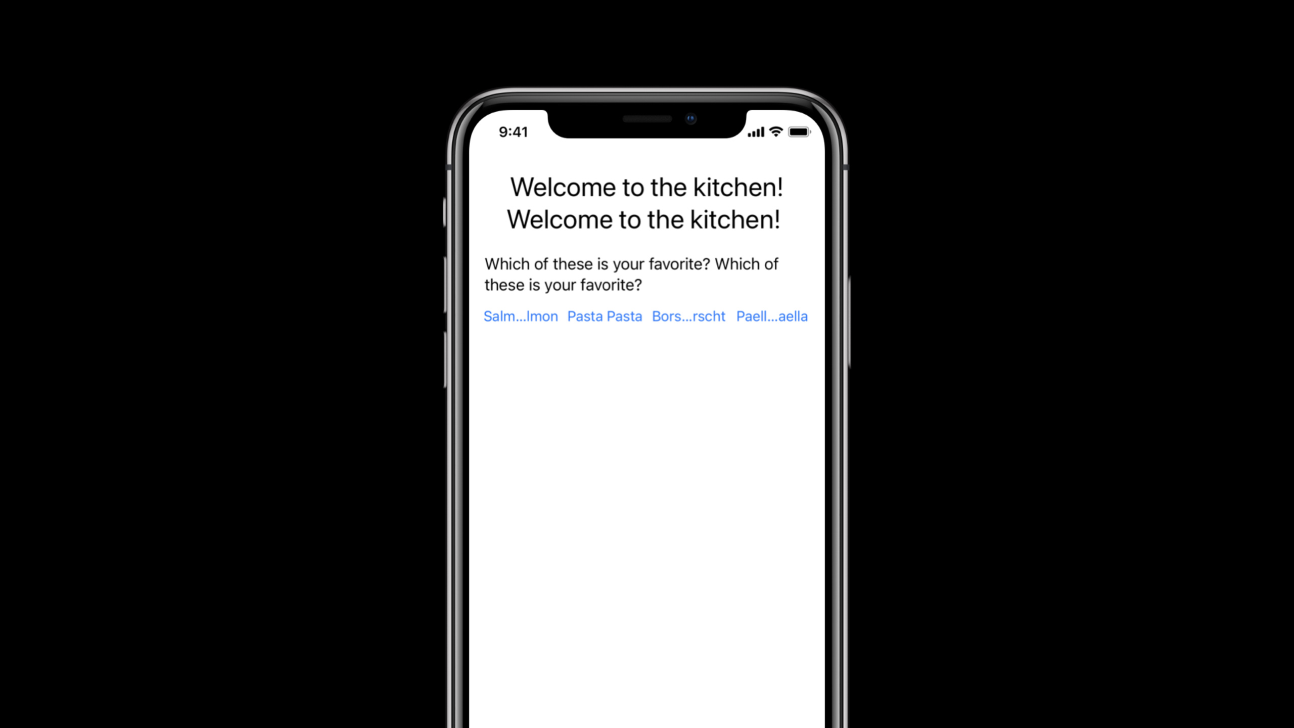
This session starts from an earlier point in time: don’t wait for translation to complete before checking the UI. Paul Borokhov demonstrated in Xcode that developers can use Double Length Pseudolanguage to first lengthen the text in each control, and then use a runtime language like Arabic to verify whether the interface is flipped. This way, problems arise during the development phase, rather than after delivery to the translator or testing team.
The solution provided by Apple is not to manually adjust a layout for each language. The core approach is to make controls rely on the natural size of the content, allow text to wrap, change fixed width to minimum width, and hand over a group of controls to Stack View or Grid View management. Xcode 12’s preview, scheme options, Auto Layout fix-it, and Embed In operations work together, allowing developers to fix these problems in the same design process.
This is also where localization is most underestimated. It looks like a translation issue, but is actually a UI flexibility issue. As long as width, spacing, or single lines of text are hard-coded into the English interface, the new language simply exposes hidden layout assumptions.
Detailed Content
Remove the fixed width first and let the text determine its own space
(00:39) The session begins by listing cross-platform rules: Do not use fixed width or fixed frame for controls containing text. Remember to call the handwritten layoutsizeToFit, Auto Layout should not add fixed width constraints to text controls, and SwiftUI should not hard-code explicit frames for text views.
Text control layout check
  -> manual layout: call sizeToFit
  -> Auto Layout: remove fixed width, or change it to greater than or equal
  -> SwiftUI: do not give text views explicit frames that only fit English
  -> UILabel: set number of lines to 0 so translated text can wrap
Key points:
sizeToFitCorresponding to the manual layout suggestion in transcript, the content is used to calculate the control size.number of linesSet to 0 for iOS demo, UILabel defaults to single line, double length pseudo language will truncate the text.- Fixed width constraints can be removed or changed to a “greater than or equal to” minimum width.
- Same principle for SwiftUI scenarios: don’t lock text controls into an explicit width that’s only suitable for English.
(01:17) Fixed spacing can also create problems. There is a large white space between the Publish and Cancel buttons in the demo. English looks normal, but after the Greek translation becomes longer, the entire window is stretched. It’s better to have the buttons eat up the white space instead of letting the window size grow with the translation.
Publish button  >= flexible space >=  Cancel button
Fixed width     -> greater than or equal minimum width
Fixed gap       -> Stack View or flexible constraint
Key points:
- Don’t rely on fixed white space between remote controls to preserve layout.
greater than or equalConstraints preserve minimum size while allowing longer translations to expand.- Stack View can manage flexible distribution among a group of controls.
- This type of fix does not change the business logic, it just removes the English length assumption at the layout level.
Use pseudo-language preview to create stress tests without translation
(03:07) The first iOS demo opens document preview and selects Double Length Pseudolanguage. Titles and regular tags immediately reveal a problem: they need to allow for line breaks. After fixing the labels, the buttons were still cut off, so the layout was changed from a horizontal group of buttons to a stack view that switches to a vertical orientation when there’s not enough space.
Document Preview
  -> English
  -> Double Length Pseudolanguage
  -> inspect labels and buttons before real translations exist
Key points:
- Document Preview does not require build and run, and is suitable for quickly checking visual changes in storyboards or XIBs.
- Double Length Pseudolanguage will lengthen the text in controls and labels to simulate a more verbose language.
- When fixing labels, focus on allowing line breaks; when fixing button groups, focus on providing alternate layouts for narrower widths.
- The speaker also adds context to the title text in the Identity Inspector’s Localizer Hint to help the translator understand the purpose of the string.
(04:03) Alternate arrangements of button groups require runtime code to participate. The speaker puts the button into the horizontal stack view and then queries its layout fitting size. If there is not enough space, change the orientation to vertical. This custom class has been written. The demo just sets the class in the storyboard and connects the leading constraint of the stack view.
Horizontal Stack View
  -> query layout fitting size
  -> if content no longer fits
  -> switch orientation to vertical
Key points:
- There are no official code snippets here, the session emphasizes the implementation strategy.
layout fitting sizeUsed to determine whether the current content can fit under the current width.- Orientation switching solves the problem of four buttons being cut off at the same time on double-length or narrow-screen devices.
- This logic will also serve Dynamic Type, as larger fonts and narrower screens create similar pressures.
Use Scheme, Accessibility Inspector and Environment Overrides for runtime verification
(04:59) The preview can only cover part of the problem. The direction switching of the button group is a code behavior and must be built and run. Xcode’s Scheme Editor can select Double Length Pseudolanguage in Options, then use Command-Control-R to restart the built version to verify the runtime layout.
Scheme Editor
  -> Run
  -> Options
  -> App Language
  -> Double Length Pseudolanguage
Key points:
- The Scheme option brings pseudo-language to runtime, enabling testing of code-driven layout changes.
- Command-Control-R is used to relaunch already built version, suitable for repeated verification of the same build product.
- Labels in the demo wrap correctly, and the stack view switches to vertical orientation as expected.
- The same interface will also trigger tighter layout conditions under the first-generation iPhone SE and larger Dynamic Type.
(05:23) Dynamic Type is also a source of pressure for localized layout. The speaker tested using the first-generation iPhone SE to increase the maximum non-accessibility font size, and even English text would cause the button group to switch to vertical orientation. Then use the Accessibility Inspector and Xcode’s Environment Overrides to change back to the default font size and the layout to return to horizontality.
Accessibility Inspector / Environment Overrides
  -> change Dynamic Type
  -> verify stack view orientation and text wrapping
Key points:
- Larger fonts and longer translations will increase the space occupied by the text.
- Small-screen devices can expose crowding issues in button groups, forms, and navigation bars in advance.
- Accessibility Inspector is suitable for quickly adjusting the Dynamic Type when connecting devices.
- Environment Overrides puts these environment changes into the Xcode debugging process.
Fix macOS forms with Auto Layout fix-it and Grid View
(07:21) The second demo is a macOS XIB without Auto Layout constraints. Xcode shows localization issues in document sidebar. After turning on Double Length Pseudolanguage, the control does not grow with long text; after running Arabic, the UI does not flip.
Resolve Auto Layout Issues
  -> Add Missing Constraints for all views in the window
  -> Remove Constraint for unnecessary fixed width
  -> Set Constraint to Greater Than Or Equal To A Minimum Width
  -> Fixed Leading and Resizing Trailing Constraints
Key points:
- Add Missing Constraints can first add a set of basic constraints, but it will not automatically obtain a perfect localized layout.
- The fixed width on the Publish button does not need to be retained, fix-it can be deleted directly.
- The OK button requires a minimum width, which should be changed to greater than or equal, rather than fixed at 70.
- The space on the right side should be allowed to change flexibly between Publish and Cancel to prevent the two buttons from covering each other.
(09:38) The upper part of the form looks like a spreadsheet: label on the left, text field and checkbox on the right. The speaker did not continue to stack a single constraint, but selected the text field and checkbox, clicked Embed In, and selected Grid View. The Grid View takes over the internal layout, and the outer layer only needs to constrain the Grid View to the window content view.
Embed In
  -> Grid View
  -> constrain Grid View top / leading / trailing / bottom
  -> merge first-row cells
  -> move checkbox to second column
Key points:
- Grid View is suitable for macOS forms with clear rows and columns.
- After placing internal controls into Grid View, it is no longer necessary to hand-write external constraints for each control.
- The top header can span two columns via merge cells.
- The checkbox can be dragged directly to the target cell to allow the structure to reflect the real visual relationship.
(11:50) Grid View also needs to set properties. When text is included, row alignment is set to First Baseline; xPlacement is set to Fill; spacing uses standard spacing, corresponding to row spacing 12 and column spacing 8. Then set the horizontal hugging priority of name and description labels to 749, so that the first column only takes up the necessary width.
Grid View attributes
  row alignment: First Baseline
  xPlacement: Fill
  row spacing: 12
  column spacing: 8

Labels
  horizontal hugging priority: 749

Grid View
  vertical content hugging priority: 600
Key points:
- First Baseline aligns text lines according to the baseline, making the form read neater.
- Fill lets content use available horizontal space.
- Standard spacing comes from the Human Interface Guidelines to avoid writing spacing as hard-coded values that are only suitable for the current language.
- 749 is lower than the label’s default compression priority 750 and higher than the window holding priority 500, so the first column will stick to the label without compressing the text first.
Finally, we still need to find native language users for testing
(13:32) Automated inspection can only find mechanical problems such as size, truncation, and flipping. The end of the session emphasized that native testers will find another type of problem: inconsistent system terminology, translations out of context, and certain truncation or cropping that is not obvious to non-native developers.
Before release
  -> run pseudo language checks
  -> run right-to-left language checks
  -> test Dynamic Type and small devices
  -> ask native speakers to review real localizations
Key points:
- Pseudo-language is suitable for revising the layout in advance and does not guarantee the quality of real translation.
- Right-to-left languages require real runtime verification to confirm that constraints, icon orientation and window arrangement can be flipped.
- When adding a new language or overhauling the UI, native language testing is the most important.
- Localization will leave a first impression on users in new markets, and the quality of the layout directly affects trust.
Core Takeaways
-
What to do: Create a pseudo-language checklist for all key storyboards and XIBs. Why it’s worth doing: Xcode document preview can simulate long text when there is no translation file, exposing fixed width and single-line labels in advance. How to start: Open preview, switch to Double Length Pseudolanguage, and change the truncation controls one by one to wrappable, expandable or reflowable.
-
What to do: Prepare narrow spaces for button groups and toolbars. Why it’s worth doing: The four horizontal buttons in the session will be cut off on double length and small screens, and the stack view can be cut to the vertical direction when there is insufficient space. How to start: First put similar buttons into the Stack View, then use layout fitting size to determine whether the content can fit, and switch the axis if it fails.
-
What to do: Migrate macOS forms to Grid View. Why it’s worth doing: Using a single constraint in a columnar form is expensive to maintain. Grid View can manage cells, baselines, spacing, and column widths. How to get started: Select the relevant input control, use Embed In > Grid View, then set First Baseline, Fill, standard spacing and appropriate hugging priority.
-
What to do: Incorporate Dynamic Type into localized layout testing. Why it’s worth it: Large font sizes and long translations both enlarge the text footprint and can trigger the same type of truncation. How to start: Use Accessibility Inspector or Environment Overrides to change the font, and use the small-screen Simulator to run the same interface.
-
What to do: Write a Localizer Hint to the translator. Why it’s worth doing: The title tags in the demo add context through the Identity Inspector, reducing the chance of translators misunderstanding the purpose of the string. How to start: Check button, title and status copy, and add localizer hint to strings with easily ambiguous meanings.
Related Sessions
- Formatters: Make data human-friendly — After the layout can accommodate translation, use Formatters to handle dates, units, names, lists, numbers, and pluralization rules.
- Swift packages: Resources and localization — If the localization content comes from a Swift package, continue to learn how the package carries resources and localization strings.
- Visually edit SwiftUI views — Continue to see how Xcode previews and visual editing can shorten the UI iteration path.
- Become a Simulator expert — Complete runtime testing of localized layouts with Simulator devices, environments, and run configurations.
Comments
GitHub Issues · utterances