
Highlight
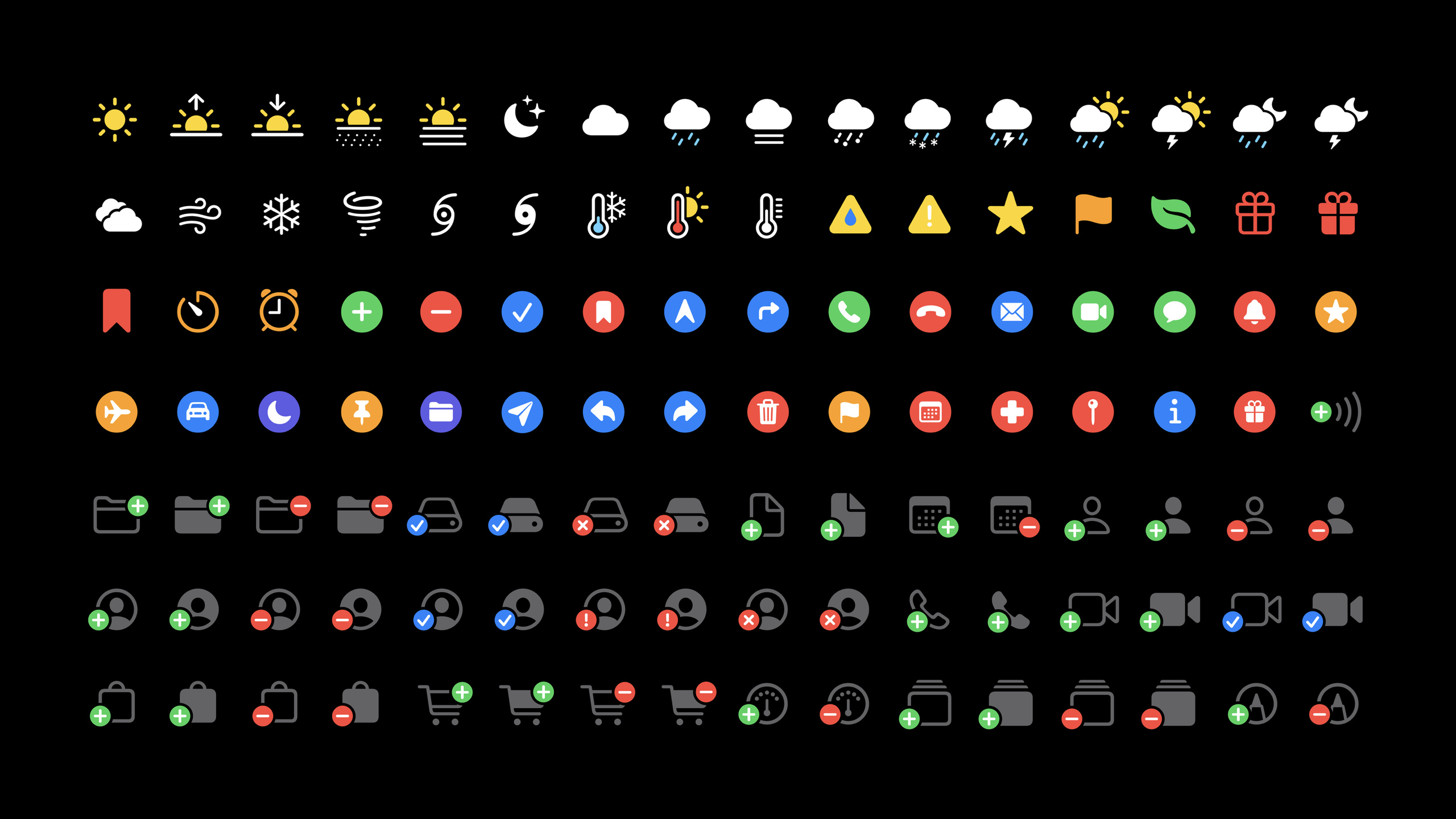
SF Symbols 2 expands Apple’s system icon library to macOS Big Sur, and adds more than 750 symbols to the original 1,500+ symbols, while also adding Template V2, localization, multi-color symbols and layout alignment rules.
Core Content
The problem with many App icons is not the lack of a beautiful graphic. The real trouble is that the icons have to work with the text: when the font size changes, the icons cannot appear thicker; after the user turns on a larger Dynamic Type (dynamic font), the symbols in the buttons also change; when the interface switches to Arabic or Hebrew, the direction-related symbols have to adapt to the reading order from right to left.
The idea of SF Symbols is to put icons into a typesetting system. It is designed together with the San Francisco font, providing three scales: small, medium, and large, and making stroke compensation between different scales. In this way, when the icon is close to the text, the developer does not need to manually guess the width and height, and the visual weight and baseline relationship can be maintained.
SF Symbols 2 solves the second-level problem: this system needs to cover more platforms and more scenarios. macOS Big Sur begins to natively support SF Symbols; more than 750 new symbols have been added to the symbol library; the SF Symbols app supports custom collections; Template V2 uses line margins to express positive and negative margins; localized symbols continue to expand; multi-color symbols allow icons such as weather and folder badges to have preset colors.
Detailed Content
1. Use symbol names in UIKit instead of copied glyphs
(05:28) The entrance to UIKit isUIImage(systemName:). It is emphasized in the session that the symbol name displayed by the SF Symbols app should be used in the code, for exampleplay.fillandshuffle, do not copy the graphic characters themselves into the source code.
// SF Symbols: simple usage and symbol configuration

import UIKit

class MainPlayerViewController: UIViewController {

    @IBOutlet weak var playButton: UIButton!
    @IBOutlet weak var shuffleButton: UIButton!
    @IBOutlet weak var playImageView: UIImageView!
    @IBOutlet weak var shuffleImageView: UIImageView!

    override func viewDidLoad() {
        super.viewDidLoad()
        setupButtons()
    }

    func setupButtons() {
        let buttonConfig = UIImage.SymbolConfiguration(textStyle: .headline, scale: .small)
        playImageView.preferredSymbolConfiguration = buttonConfig
        playImageView.image = UIImage(systemName: "play.fill")
        shuffleImageView.preferredSymbolConfiguration = buttonConfig
        shuffleImageView.image = UIImage(systemName: "shuffle")
    }

    @IBAction func playAction(_ sender: Any) {
    }

    @IBAction func shuffleAction(_ sender: Any) {
    }

}
Key points:
UIImage.SymbolConfiguration(textStyle: .headline, scale: .small)Specify both text style and symbol scale.textStyleLet the symbols follow the changes of Dynamic Type. The transcript demonstrates that the text and symbols become larger or smaller together.preferredSymbolConfigurationput onUIImageView, so that both icons share the same set of visual configurations.UIImage(systemName: "play.fill")andUIImage(systemName: "shuffle")Use symbol name; the session clearly states that copying the symbol itself will cause the code to become unusable.
2. Using Image, Label and text attachments in SwiftUI
(07:44) SwiftUI is shorter.Image(systemName:)Responsible for taking symbols,imageScaleadjust scale,fontAccepts point size, font weight and text style.
// SF Symbols in SwiftUI
import SwiftUI

struct ContentView: View {
    var body: some View {
        Image(systemName: "shuffle")
            .font(.headline)
            .imageScale(.small)
    }
}
Key points:
Image(systemName: "shuffle")Use symbol names like UIKit..font(.headline)Put symbols into SwiftUI’s font system..imageScale(.small)Only the symbol scale is changed, and the font size is not hard-adjusted as the icon width and height.
(08:10) SwiftUI 2020 also addedLabel, suitable for common controls that directly express “text plus symbols”.
// SF Symbols in SwiftUI
import SwiftUI

struct ContentView: View {
    var body: some View {
        Label("Sharing location",
              systemImage: "location.fill")
    }
}
Key points:
LabelTreat text and symbols as a semantic control.systemImageStill pass symbol name.- This type of writing is suitable for toolbars, list rows, setting items and status prompts.
3. macOS Big Sur natively supports AppKit symbols
(08:34) The platform change of SF Symbols 2 is that macOS Big Sur starts to support SF Symbols natively. AppKit usesNSImage(systemSymbolName:accessibilityDescription:)Get symbols and provide descriptions for auxiliary functions.
// Using SF Symbols in AppKit

if let shuffleImage = NSImage(
    systemSymbolName: "shuffle", accessibilityDescription: "shuffle") {
    shuffleImageView.image = shuffleImage

    // Configure symbols
    let config = NSImage.SymbolConfiguration(textStyle: .body, scale: .small)
    let shuffleButtonImage = shuffleImage.withSymbolConfiguration(config)
}
Key points:
systemSymbolNameLet AppKit use the same set of SF Symbols names.accessibilityDescriptionProvide human-readable descriptions for accessibility features like VoiceOver.NSImage.SymbolConfiguration(textStyle:scale:)Consistent with UIKit’s configuration model.withSymbolConfiguration(config)Returns the image after application configuration, without the need for developers to manually draw multiple sizes.
4. Template V2, localization and multi-color symbols
(10:29) The template of the custom symbol is still the design source file, which can be exported, modified, and then imported into Xcode from the SF Symbols app. The structure of Template V2 maintains three rows and nine columns: three scales and nine weights. The change is in margin: the old rectangular margin becomes a line margin, so positive and negative margins can be expressed.
When using Template V2, the process is to export the symbol template from the SF Symbols app, retain three rows from small, medium, and large and nine columns from ultralight to black, retain a unique descriptive name for each layer, and then import the modified SVG template into the Xcode asset catalog.
Key points:
- Three rows correspond to small, medium, and large. -Nine columns correspond to ultralight to black.
- transcript clearly states that layer names are important for file integrity and that the structure should be preserved when modifying the template.
- The line margin of Template V2 uses position and name to express alignment information, and the color is only used for visual cues.
(11:57) Localized symbols will be automatically adapted. For custom symbols, the approach is to localize the asset catalog and specify the locale for each SVG template. In a right-to-left language, if the symbol can be flipped directly, set symbol direction tomirrors。
The localization of custom symbols is handled at the asset catalog layer: specify the locale for the SVG template; when encountering a right-to-left language, only the symbol semantics allows direct flipping, and the symbol direction is set tomirrors。
Key points:
- Localizing system symbols does not require developers to manually name variants in their code.
- Custom symbols must provide locale versions at the asset catalog layer.
mirrorsIt is suitable to directly flip symbols that still comply with the semantics; when it is not suitable, a localized version needs to be designed separately.
(14:27) Multi-color symbols are used for weather, badges and other icons that require multiple color levels. In the AppKit example,isTemplatefortrueUse monochrome tintable template behavior; set tofalseMulti-color versions can be kept.
// Tinting symbols

if let folder = NSImage(
    systemSymbolName: "folder.badge.plus", accessibilityDescription: "add folder") {
    folder.isTemplate = true
}

if let folder = NSImage(
    systemSymbolName: "folder.badge.plus", accessibilityDescription: "add folder") {
    folder.isTemplate = false
}
Key points:
isTemplate = trueCorresponds to a solid-color, tint-able template symbol.isTemplate = falseUsed to preserve the symbol’s own multi-color rendering.- transcript explains that the colors of multi-color symbols will be dynamically adapted to appearance just like system colors.
5. Treat symbols as part of the writing system when laying out
(16:02) The final layout suggestion for session is very specific: do not specify a fixed frame for symbols. Symbols have their own visual size and are suitable for typesetting together with the text according to the same text style or point size; look at the baseline horizontally and the alignment guides vertically.
Layout specifications can be completed with several check items: symbols use the same point size or text style as adjacent text; symbols and text are aligned according to baseline; symbol columns in vertical layout use center alignment; avoid fixed frame, aspect fit, scale to fit and based onsizeThatFitsSize derivation; content gravity remains centered when the symbol is placed into the CALayer’s explicit region.
Key points:
- Symbols should not be treated as fixed-size bitmaps.
- Baseline alignment is more reliable than center alignment when aligned with text.
- In a vertical list, symbol columns can be center-aligned, while text columns remain leading-aligned.
- If the symbol is placed into an explicit region of the CALayer, the content gravity should remain centered.
Core Takeaways
-
Make a player control area that can follow Dynamic Type. What to do: Replace Play, Pause, Shuffle, and Loop all with SF Symbols. Why it’s worth doing: session demonstration
UIImage.SymbolConfiguration(textStyle:scale:)Symbols can be made to follow text size changes. How to get started: Check it out in the SF Symbols appplay.fill、shuffleWith this type of name, the button images are uniformly configured as.headlineand.small。 -
Improved symbol and text alignment in macOS sidebar. What to do: Replace sidebar icons for folders, inbox, favorites, etc. with macOS Big Sur native symbols. Why it’s worth doing: AppKit already works
NSImage(systemSymbolName:accessibilityDescription:)Use SF Symbols directly. How to get started: Provide an accessibility description for each sidebar item, usingNSImage.SymbolConfiguration(textStyle: .body, scale: .small)Unified configuration. -
Add multi-color semantics to status icons. What to do: Icons such as weather, sync status, folder badges, etc. remain in multi-color versions when needed. Why it’s worth doing: SF Symbols 2 provides predefined multi-color symbols, and the colors will be dynamically adapted according to the appearance. How to start: Mark multicolor in the design draft. In AppKit, multicolor needs to be retained.
NSImageset upisTemplate = false。 -
Check custom icons for right to left languages. What to do: Put orientation-related custom symbols on your localization review list. Why it’s worth doing: The session clearly mentions right-to-left systems such as Arabic and Hebrew. Some symbols can be mirrored, and some need to be designed separately. How to start: localize the asset catalog, specify the locale for the SVG template; set the direction of the symbol that can be directly flipped to
mirrors。 -
Establish a design-to-code symbol naming process. What it does: Designers create collections in the SF Symbols app, and developers use symbol names to write code. Why it’s worth doing: Session demonstrates the process of searching, copying, and pasting from the app into Xcode, and reminds not to copy the symbol characters themselves. How to get started: Create a collection per ribbon, copy the name with shift-command-C, and put the name into a UIKit, SwiftUI, or AppKit initializer.
Related Sessions
- What’s new in SF Symbols — SF Symbols 3 continues this game, expanding the number of symbols, localization and color rendering capabilities.
- Create custom symbols — An in-depth discussion of the layer structure, design constraints, and rendering modes of custom symbols.
- SF Symbols in UIKit and AppKit — Extend symbol configuration, color, and control integration in UIKit and AppKit.
- SF Symbols in SwiftUI — Continue to talk about how to use Image, Label and symbol styles in SwiftUI.
- What’s new in SF Symbols 4 — Follow up on subsequent library updates and expressive capabilities in SF Symbols 4.
Comments
GitHub Issues · utterances