
Highlight
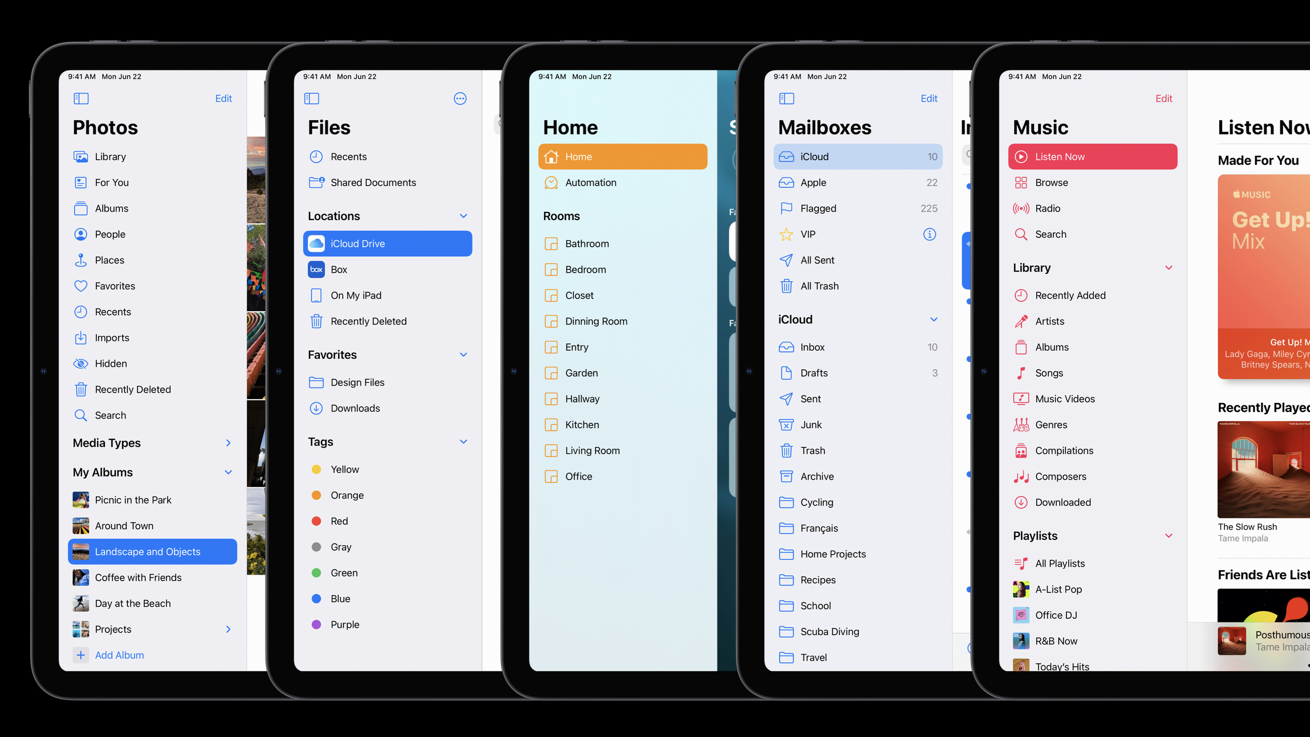
Apple has listed sidebar, overlay sidebar, three-column layout, top toolbar, and multi-input collaboration as core design patterns for iPad apps in iPadOS 14, helping apps reduce full-screen jumps and modal occlusions, and allowing drag-and-drop, keyboard, trackpad, and Apple Pencil to play their respective roles.
Core Content
A common problem with iPad apps is that they magnify the iPhone’s single-screen process. Photos When selecting the album in iPadOS 13, the entire screen will switch, leaving a lot of blank space on the right side; the room selection in Home is hidden behind tabs and popovers; the calendar selection in Calendar will also block the event list. Users hold a larger screen, but they have to go back and forth to enter and exit the page just like on a small screen.
The design direction of iPadOS 14 is to allow navigation, content, and context to appear at the same time. Photos uses a sidebar to place the album entrance on the left and photo content on the right; Home uses a sidebar to make the room easily accessible and can be sorted directly by dragging and dropping; Mail uses the new sidebar behavior to bring the three-column layout to all iPads, not just the largest iPad Pro.
This set of ideas also changes the way modal interfaces are used. Files puts the rename back into the list, so users can refer to other names in the same folder; Calendar raises the calendar switch to the same level as the event, and the result on the right changes instantly when the visibility is switched. The iPad’s large screen isn’t just for amplifying content, it’s also used to preserve the work that’s happening.
Input method is another watershed. Session requires that Multi-Touch be completed first, and then the keyboard, trackpad and Apple Pencil be added. Standard controls will automatically gain many system capabilities, and custom controls need to complete pointer and Scribble. More importantly, the iPad allows for combined input: Command plus click, Option plus drag, Pencil plus touch panel, and these interactions are difficult to copy to the iPhone or Mac.
Detailed Content
Use sidebar to reduce full-screen jumps
(02:46) The first suggestion for Session is flatten navigation. When the iPad screen is wide enough, full-screen push often wastes space and causes the user to lose their current location. After Photos switches from full-screen album to sidebar, the album entrance, photo content and drag-and-drop target can exist at the same time.
Old flow:
Select album -> full screen switches to album content -> go back and choose another location

iPadOS 14 flow:
Left sidebar keeps albums, media types, and groups -> right side shows photo content -> the target is already visible while dragging
Key points:
- The left navigation and right content appear at the same time, so users do not have to leave the current content first.
- The target of Drag and Drop is already visible when the drag is started, and the operation path is shorter.
- This type of layout is also suitable for Mac Catalyst, since macOS relies less on occlusion-based interfaces.
(15:42) The sidebar of iPadOS 14 is not a simple left-hand list. It supports edit mode, drag and drop, collapsible sections, overlay presentation and swipe gesture. The sidebar in Photos can be collapsed into an overlay. Portrait and Split View will automatically use overlay when there is insufficient space.
Sidebar structure:
Top: primary navigation, such as Photos, Albums, For You
Below: user-generated or frequently used content, such as albums, playlists, mailboxes
Groups: use collapsible sections to preserve hierarchy
Editing: supports show, hide, reorder, and drag-and-drop
Insufficient space: sidebar appears as an overlay, preserving the content area first
Key points:
- The top area plays the role of tab bar equivalent and is the most important entrance to the app. -User-generated content fits well under primary navigation and is organized with collapsible headers.
- The sidebar is not suitable for hosting a complete deep tree; deep browsing should be left to the content area.
- Compact width and iPhone should still use tab bar or standard table rows.
Put content density and context back on the screen
(05:05) Files’ example illustrates that big screens require more than just bigger icons. iPadOS 14 lets Files display nearly three times the number of items on the screen with smaller but still readable and clickable icons. The goal of this change is to reduce scrolling and lookup costs.
Check a list or grid:
Whether text is still readable
Whether touch targets are still easy to tap
Whether the number of onscreen items reduces scrolling
Whether users can compare, select, or drag content faster
Key points:
- Density adjustments must first meet readability and touch goals.
- Object collections such as files, photos, tasks, and project libraries often benefit from higher density.
- With increased density, drag-and-drop and batch selection will be smoother because more targets remain on the screen.
(06:15) Session has repeatedly emphasized reducing unnecessary occlusion. Files can be renamed in the list, and users can also see other file names in the same folder; Calendar moves the calendar switch to the same level as the event list, and users can immediately see the results on the right when switching calendars.
When encountering a modal sheet or popover:
First ask whether it provides source context
Then ask whether it blocks content the user needs to reference
If the answer leans toward obstruction, consider inline editing, a side panel, or same-level controls
Key points:
- A popover’s arrow is only valuable if it explains the source.
- Inline editing lets users retain reference information such as file name, date, and current list status.
- The compact screen of the iPhone is still suitable for modal focus; the regular width of the iPad is more suitable for same-level control.
Let multiple inputs have their own positions
(10:46) The iPad is still a touch-first device, but the keyboard, trackpad, and Pencil should all get first-class support. Standard text input controls automatically get Scribble; system controls already support a number of trackpad behaviors. Custom controls require additional checks because the system cannot understand their semantics in a vacuum.
Input support order:
Multi-Touch: primary path; every core operation must be completable by touch
Keyboard: add shortcuts for common operations
Trackpad: use default behavior from system controls first, then handle custom controls
Apple Pencil: standard text controls automatically support Scribble; custom text experiences need separate adaptation
Key points:
- Keyboard shortcuts won’t bother touch users, but will significantly improve the efficiency of heavy users.
- Mac Catalyst will inherit many keyboard shortcut benefits.
- Standard controls are a low-cost entry point to pointer and Scribble.
- Custom controls should be tested individually, especially custom input boxes and canvases.
(12:31) More iPad-like interactions come from combined input. Safari uses Command + click to open a new tab, and Option + click to download a file. Session also showed off Loom: the left hand uses the touch dial to switch animation frames, and the right hand uses Pencil to draw the current frame.
Combined input design:
Command + tap: open, expand, or enter an alternate path
Option + drag: duplicate an item
Shift + tap: batch select
Touch + Pencil: one hand controls tools or frames while the other completes precise drawing
Key points:
- Modifier keys should work with touch, trackpad, etc. inputs.
- Pencil does not have to be responsible for all UI operations, touch can be responsible for context switching and tool control.
- Combined input is suitable for animation, drawing, document editing, file management and professional creative apps.
Responsiveness comes from interruptible micro-interactions
(14:13) Session demonstrates responsiveness with iPadOS 14’s drop-down menu. While the menu is still appearing, the user can already slide to the target item; when scrolling starts outside the menu, the system will close the menu and scroll the underlying content at the same time. Animation should not lock the user out.
Responsiveness check:
Whether input can still be received during animation
Whether scrolling outside the menu can continue moving content
Whether users need to wait for a transition to finish before taking the next step
Whether cancel, select, and scroll can be merged into one gesture
Key points:
- The goal of microinteraction is to allow the app to keep up with user actions instead of waiting for the animation to finish.
- When occlusion controls appear, you still have to think about which gestures will not conflict with them.
- Animation can preserve the sense of direction, but cannot block subsequent operations.
The toolbar should change with the iPad size
(26:50) iPadOS 14 moves many toolbar items to the top. For toolbars with one to three buttons, the navigation bar at the top is often more suitable for use on large screens; when the width is compact, the buttons are returned to the bottom.
Toolbar layout:
Regular width: prefer placing primary actions at the top
One to three buttons: common candidates, try top placement
Compact width: when horizontal space is insufficient, return buttons to the bottom
Key points:
- The top button can reduce the screen occupied by the empty toolbar at the bottom.
- The same app needs to prepare two sets of placement methods: regular width and compact width.
- The position change of the toolbar should be bound to the size class, rather than just judged by the device model.
Core Takeaways
-
Change a library app into a sidebar entry: What to do: Put projects, photo albums, notebooks, playlists or room entries into a regular width sidebar. Why it’s worth doing: Photos, Home, Music, and Files in Session all use sidebar to shorten the navigation path. How to start: First put the top-level items of the original tab bar on top of the sidebar, and then put the user’s frequently used list into a collapsible group.
-
Add inline editing to file and content lists: What: Let renaming, toggle filtering, visibility adjustment, etc. stay next to the list or content. Why it’s worth doing: The Files and Calendar examples both reduce occlusion and allow the user to retain surrounding content for reference. How to get started: Take inventory of existing modal sheets and popovers, and prioritize replacing those interfaces that only contain simple forms or switches.
-
Design Pencil plus Touch two-hand process for creative apps: What to do: Use Pencil to draw, annotate or write, and use touch to switch frames, tools, layers or timelines. Why it’s worth doing: Loom’s demonstration shows that when two inputs are parallel, the creative process will have a lot less mode switching. How to start: List the two most frequent actions when creating, hand over the precise actions to Pencil, and put context switching within easy reach of your fingers.
-
Complete high-frequency actions on keyboard and trackpad: What: Add shortcut keys or modifier combinations for actions such as new, close, select, copy, download, open details, etc. Why it’s worth doing: Session clearly recommends that keyboard shortcuts should be provided for common operations. Command tap, Option drag, and Shift tap can all improve large-screen efficiency. How to get started: Start with menu commands and batch selections, making sure they work with touch, keyboard, and trackpad.
-
Build a layout check list for regular and compact: What to do: Create a set of size switching tests for sidebar, toolbar, three-column layout, overlay sidebar and tab bar. Why it’s worth doing: Repeated display of Portrait, Split View and compact width in Session will change the presentation of sidebar and toolbar. How to start: Every time you change the navigation structure, check whether the main entrance is consistent in regular width, Portrait, Split View and iPhone view.
Related Sessions
- Build for iPad — Apply local design principles to UIKit multi-column layout, sidebar, list and low-modal navigation implementation.
- Lists in UICollectionView — Explain how to use UICollectionView list appearance to build sidebar and modern lists.
- Build for the iPadOS pointer — Handles buttons, custom views, regions, and animation adaptations for the iPad pointer.
- Meet Scribble for iPad — An in-depth look at how Apple Pencil handwriting input adapts to standard text controls and custom text experiences.
- Support hardware keyboards in your app — Adds support for shortcut keys, modifier keys, and keyboard events to iPad and Mac Catalyst apps.
Comments
GitHub Issues · utterances