
Highlight
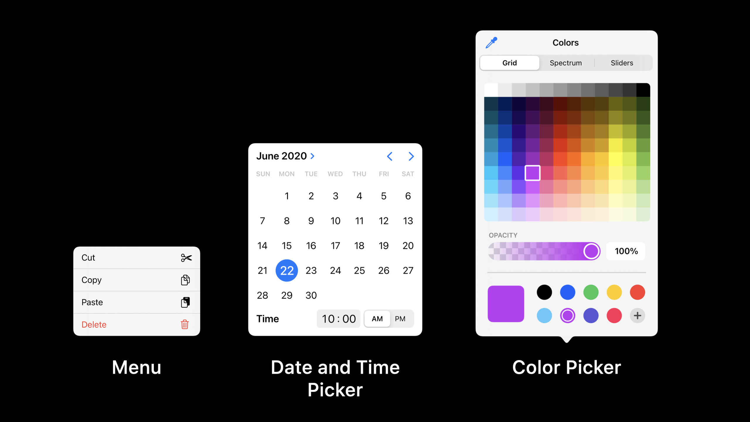
iOS 14 introduces lightweight menus triggered from buttons, new date/time pickers, and system color pickers, bringing common selections and secondary actions closer to context and reducing interruptions caused by action sheets, popovers, and wheel pickers.
Core Content
In iOS 13, many small operations will be taken over by action sheets or popovers. The user clicks a button, the interface dims, and a list appears from the other side of the screen. As the iPhone screen becomes larger, this distance becomes more obvious; as iPad apps become denser, the entire screen mask becomes heavier. The speech started from this problem: many operations are originally very light, but they are put into heavy containers. (00:47)
iOS 14’s menus bring actions closer to their trigger points. The menu appears from any button, the action is more compact, and the background is no longer strongly interrupted; it not only serves actions, but also handles selection, navigation, and secondary options. Sorting, adding photos, returning to history, and more operations, these originally scattered interactions can all be expressed with the same set of behaviors. (01:41)
Date and time pickers solve another old problem: wheel pickers have a weak representation of date structures, requiring the user to turn multiple wheels individually. The new design presents the date as a month, week, and date structure; the time can be entered directly. When it cannot be displayed inline, compact picker first displays a button and then expands it above the current view. The form row can also carry date input. (09:39)
The color picker complements the system-wide color selection experience. Users can select colors from four portals: grid, spectrum, RGB value, and screen color selection, and can also save colors into a palette accessible across apps. By leaving color selection to system components, developers can directly gain accessibility, localization, and iPad-to-Mac consistency. (12:54)
Detailed Content
The menu should start with a clear action
(03:44) The speech divides the main scenes of the menu into four categories: disambiguation, navigation, selection and secondary options. The commonality is that the user first sees a clear action, and then the menu fills in more specific choices.
Clear actions
  Photos: tap add
  Notes: tap add image
  Safari: long-press back
  Podcasts: tap Sort

Tasks handled by menus
  Ask what exactly should be added
  Show pages that can be returned to
  Mark the current sort option
  Collect low-frequency secondary operations
Key points:
- Menus are suitable for appearing after the user has expressed their intention to avoid spreading out all the options at the beginning.
- The selection menu will add a check mark to the current option so that the user can understand the current status.
- More buttons are suitable for hosting low-frequency operations, but high-frequency main operations should remain on the interface.
- The user can cancel by clicking outside the menu without placing an additional Cancel item.
Destructive operations continue to use the confirmation container
(07:09) The menu reduces the distance that the finger can move, which is good for normal operations, but too light for actions such as deletion. Lectures use Reminders to delete lists and Mail to discard drafts to indicate that destructive actions require confirmation, and that confirmation actions appear in different places.
Normal secondary operation
  Tap more
  The menu appears near the trigger point
  Selection executes immediately

Destructive operation
  Tap Delete
  An action sheet or popover appears
  The user moves to another location to confirm
  There is still a chance to cancel before confirmation
Key points:
- Actions such as deleting and discarding drafts will cause information loss and require a little artificial friction.
- The action sheet appears at the bottom of the iPhone, and the popover appears on the iPad, maintaining the position difference with the trigger point.
- Menus are suitable to advance tasks, and confirmation containers are suitable to prevent accidental touches.
- This rule preserves the value of old components and does not require replacing all action sheets with menus.
Date and time selectors should match layout density
(10:03) New date and time pickers provide a clearer date structure and also support touch, Pencil, keyboard and cursor. The Reminders example puts the date and time in the inline area; the Contacts example puts the birthday in the inline button, which expands the compact picker when clicked.
Enough space
  Show the date or time picker inline in the current view
  The user directly sees the month, weekday, date, or time input

Limited space
  Show a compact button first
  Expand above the current view after tapping
  The user taps outside to confirm the selection
Key points:
- inline is suitable for interfaces such as Reminders that regard date selection as the core step of the current task.
- compact is suitable for form rows such as the Contacts birthday field, which only occupies one row by default.
- New design makes date, time and date plus time use consistent expression.
- The same information is much closer on iPad and Mac, eliminating the need to reinterpret controls when moving to the larger screen.
The color picker should cover the complete color selection path
(12:54) The color picker of iOS 14 provides four color selection methods: grid, spectrum, RGB value and screen color picking. Users can also save colors to the palette and continue to access them in other apps.
The user wants to choose a color quickly
  Use grid

The user wants to fine-tune a color
  Use spectrum
  Or enter an RGB value

The user wants to match an existing interface
  Use pipet to pick a color from the screen

The user wants to reuse a color
  Save it to a cross-app palette
Key points:
- Color selection includes quick selection, fine adjustment, sampling and multiplexing.
- pipet uses a magnifying glass to pick up the colors on the screen, suitable for drawing and annotation apps.
- The palette can be used across apps, reducing the need for users to repeatedly record brand colors or commonly used colors.
- The official resources only provide Human Interface Guidelines: Designing for iOS, and the judgments in the text are all from the verbatim transcript of the speech.
Core Takeaways
-
What to do: Change the birthday, deadline, and reminder time in the form to compact picker. Why it’s worth doing: The talk clearly states that compact is suitable for inline scenarios where selectors cannot be displayed inline. How to start: First find the form field that currently pops up full-screen date selection, compress the default state into a row of buttons, and click to expand it above the current view.
-
What to do: Add a sorting menu to the list page. Why it’s worth doing: Sorting is an example of selection in the lecture, and the current option can be expressed through check mark. How to start: Keep a clear Sort button, put the sort items into the menu, and leave the cancellation operation to click the outer area.
-
What to do: Change the “Add” button of pictures, notes, and files to a disambiguation menu. Why it’s worth doing: The examples of Photos and Notes show that users click a specific action first and then select a specific source, which saves space than having all the entries spread out on the page for a long time. How to start: List the specific types of added actions, such as taking photos, photo albums, scanning, and file imports. They will only be displayed after the user clicks add.
-
What to do: Collect low-frequency commands hidden in the toolbar into the more menu. Why it’s worth doing: The Files example shows that after the secondary operations are centralized, the content area will be clearer. How to start: Keep main operations such as creating, sending, and editing, and put low-frequency items such as export, copy path, sorting details, etc. into the more menu; continue to use the confirmation container for deletion operations.
-
What to do: Access the system color picker in drawing, annotation or theme editing functions. Why it’s worth doing: The presentation demonstrates grid, spectrum, RGB, screen color selection and cross-App palette, covering common color selection paths. How to start: Stop maintaining the custom color palette status first, and leave common colors, screen color selection and precise input to the system components.
Related Sessions
- Build with iOS pickers, menus and actions — Continue looking at these design guidelines for UIKit controls and
UIActionHow to achieve it. - Designed for iPad — Continue to understand modal reduction, using sidebars, and adapting to multiple input devices from an iPad design perspective.
- Design for the iPadOS pointer — Learn why the iPadOS pointer is designed with indirect touch.
- Build for the iPadOS pointer — Get into implementation details of pointer effects, custom views, and pointer interaction.
- Design great widgets — Use design examples from iOS 14 from the same year to understand information density, context, and consistency of system components.
Comments
GitHub Issues · utterances