
Highlight
Apple reduced UI typesetting to a set of executable APIs at WWDC 2020: SF Pro migrated to variable fonts, and the system automatically synchronized optical size; UIKit, AppKit, and SwiftUI completed the entry of text style, leading, and system design, and UIKit and SwiftUI continued to improve Dynamic Type support for custom fonts.
Core Content
(00:37) The layout problems of many apps are often not exposed until they are used on real devices: the same paragraph of text becomes blurry when the font size is small, the button title is truncated within a few pixels, and after the user increases the Dynamic Type, the title and padding of the custom font do not change together. On the surface, developers are only choosing fonts and font sizes. In fact, they have to deal with the linkage between optical size, tracking, leading, text style, and accessibility settings.
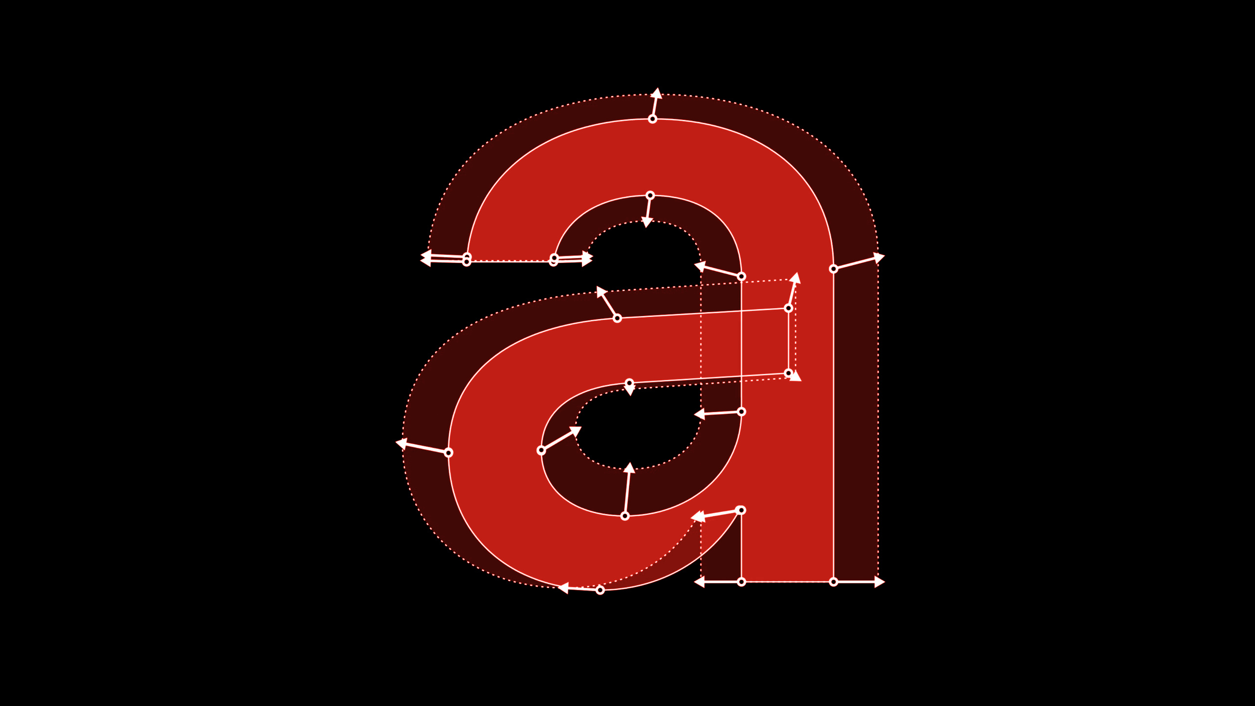
(01:47) Apple first explains why San Francisco (SF) has SF Text and SF Display. Small font sizes below 20 pt require wider font spacing and more stable details, while large font sizes above 20 pt can preserve more visuality. The change in 2020 is that SF Pro begins to shift to variable fonts (variable fonts). The optical size axis is used internally to express size changes in the font, and the system automatically aligns point size and optical size in the code. (06:31)
(09:22) This matter directly affects the UI layout. Tracking is not kerning; tracking is the kerning adjustment of the entire text, and kerning is the fine-tuning between kernings. When the title is about to be truncated, squeezing the text with the kerning API will leave the ligature intact and the rhythm will be broken. Using the tracking API or allowing the system to tighten automatically, the system can use the appropriate tracking table by font size and unpack the ligature if necessary.
(16:11) The second half connects these principles to UIKit, AppKit and SwiftUI. Text styles combine font size, font weight, and line height into system-level combinations; Dynamic Type lets these combinations scale with user preferences. Custom fonts don’t need to give up accessibility: UIKit usesUIFontMetrics, SwiftUI allows in iOS 14.customScale by body by default, and userelativeToSpecify the target text style. (25:10)
Detailed Content
Tracking: Handle kerning and truncation with the correct API
(12:19) If you want to manually adjust the kerning of the entire text, use the tracking attribute of Core Text on the UIKit side and the tracking attribute on the SwiftUI side..tracking(). session specifically reminds you not to mistake this requirement for kerning.
// UIKit
label.attributedText =
    NSAttributedString(string: "hamburgefonstiv",
        attributes: [kCTTrackingAttributeName as NSAttributedString.Key: -0.5])

// SwiftUI
Text("hamburgefonstiv").tracking(-0.5)
Key points:
kCTTrackingAttributeNameIt expresses the tracking of the entire text, not the kerning between two characters.-0.5The character spacing will be tightened; this value should be verified according to the font size, and small font size values cannot be directly applied to the large title.- SwiftUI
.tracking(-0.5)It is the same kind of semantics, suitable for a small amount of text that needs fine adjustment.
(12:45) The more common truncation scenarios should be left to the system.allowsDefaultTighteningForTruncationand.allowsTightening(true)The tight tracking table in the system font will be used to try to fit the string within the readable range.
// UIKit: UILabel
label.allowsDefaultTighteningForTruncation = true

// AppKit: NSTextField
textField.allowsDefaultTighteningForTruncation = true

// SwiftUI
Text("hamburgefonstiv").allowsTightening(true)
Key points:
- UIKit, AppKit and SwiftUI all have corresponding entrances, suitable for space-constrained text such as buttons, labels, and navigation titles.
- The system will control the range of tightening; when it exceeds a reasonable range, truncation is still a better result.
- This path will get size-specific tracking, and developers do not need to maintain the tracking table themselves.
Text styles: Get emphasis and line height variants from the system level
(17:45) Text style is more than just font size. To make emphasized title1, you can first getpreferredFontDescriptor(withTextStyle:), and then overlay the bold symbolic trait. The actual mapping to medium, semibold, bold or heavy is determined by the system according to text style.
// Getting emphasized text styles

let label = UILabel()
label.text = "Ready. Set. Code."

if let descriptor = UIFontDescriptor
    .preferredFontDescriptor(withTextStyle: .title1)
    .withSymbolicTraits(.traitBold) {
    // 28 pt Bold on iOS
    label.font = .init(descriptor: descriptor, size: 0)
}
Key points:
preferredFontDescriptor(withTextStyle: .title1)The system dimensions and Dynamic Type behavior of title1 are retained..withSymbolicTraits(.traitBold)Requesting emphasis variations does not mean specifying a fixed font weight value.size: 0Indicates using the system size in the descriptor and not manually overriding the font size.
(20:03) Line height can also be derived from text style. Tight leading is suitable for interfaces with higher information density, and loose leading is suitable for long paragraph reading; the example in the session shows that the body text changes from 22 pt line height to 20 pt or 24 pt.
// Getting tight/loose leading variant

// AppKit
let descriptor = NSFontDescriptor.preferredFontDescriptor(forTextStyle: .headline)
    .withSymbolicTraits(.tightLeading) // Use .looseLeading for loose leading font
let tightLeadingFont = NSFont(descriptor: descriptor, size: 0) // 14 pt line height

// UIKit/Catalyst
if let descriptor = UIFontDescriptor.preferredFontDescriptor(withTextStyle: .title1)
    .withSymbolicTraits(.traitTightLeading) { // Use .traitLooseLeading for loose leading
    let tightLeadingFont = UIFont(descriptor: descriptor, size: 0) // 36 pt line height
}

// SwiftUI
// Use .loose for loose leading font
let tightLeadingFootnoteFont = Font.footnote.leading(.tight) // 16 pt line height on iOS
Key points:
- AppKit usage
.tightLeadingor.looseLeading, UIKit/Catalyst uses.traitTightLeadingor.traitLooseLeading。 - SwiftUI use
.leading(.tight)or.leading(.loose)Receive system text style. - tight leading is not suitable for all long texts; session clearly shows at 19:43 that the reading experience will become worse when the body paragraph is too tight.
System designs: retain text style and only replace font style
(20:56) SF Pro Rounded, New York and SF Mono can work with text style. For UIKit, the approach is to start from the existing text style descriptor and then call.withDesign(.rounded); In this way, the font design has changed, but the font size, font weight and line height still use the system style.
// Access rounded system font design
import UIKit

let label = UILabel()
label.text = "Today"

if let descriptor = UIFontDescriptor
    .preferredFontDescriptor(withTextStyle: .largeTitle)
    .withSymbolicTraits(.traitBold)?
    .withDesign(.rounded) {
    // SF Pro Rounded Bold
    label.font = UIFont(descriptor: descriptor, size: 0)
}
Key points:
.preferredFontDescriptor(withTextStyle: .largeTitle)First determine the system level..withSymbolicTraits(.traitBold)Get emphasized large title..withDesign(.rounded)Switch the design to SF Pro Rounded, but retain the size, weight semantics, and line height of the large title.
(21:08) The same capability has entrances in AppKit, UIKit/Catalyst and SwiftUI. SwiftUI needs to pass in design when constructing the font instead of converting the existing font again.
// Access system font designs

// Use .serif for New York, .monospaced for SF Mono

// AppKit
let descriptor = NSFontDescriptor.preferredFontDescriptor(forTextStyle: .body)
    .withDesign(.rounded)
let roundedBodyFont = NSFont(descriptor: descriptor, size: 0) // SF Pro Rounded

// UIKit/Catalyst
if let descriptor = UIFontDescriptor.preferredFontDescriptor(withTextStyle: .body)
    .withDesign(.rounded) {
    let roundedBodyFont = UIFont(descriptor: descriptor, size: 0) // SF Pro Rounded
}

// SwiftUI
let roundedBodyFont = Font.system(.body, design: .rounded) // SF Pro Rounded
Key points:
.serifCorresponds to New York,.monospacedCorresponding to SF Mono,.roundedCorresponds to SF Pro Rounded.- Both UIKit/Catalyst and AppKit come in from the font descriptor.
- SwiftUI
Font.system(.body, design: .rounded)Declare both text style and design at the same time.
Dynamic Type: Let custom fonts and layouts scale together
(25:05) UIKit is available starting with iOS 11UIFontMetrics. It applies a certain text style’s Dynamic Type scaling curve to any custom font, and can also scale layout constants.
// Support Dynamic Type with custom font in UIKit

if let customFont = UIFont(name: "Charter-Roman", size: 17) {
    let bodyMetrics = UIFontMetrics(forTextStyle: .body)

    // Charter-Roman scaled relative to body text style
    // in different content size categories.
    let customFontScaledLikeBody = bodyMetrics.scaledFont(for: customFont)
    label.font = customFontScaledLikeBody
    label.adjustsFontForContentSizeCategory = true

    // Scaling constant 10 relative to body text style.
    let scaledValue = bodyMetrics.scaledValue(for: 10)
}
Key points:
UIFontMetrics(forTextStyle: .body)Choose the scaling behavior of the body, not just a fixed magnification.scaledFont(for:)letCharter-RomanFollow the user’s text size settings.adjustsFontForContentSizeCategory = trueMake the label continue to respond when settings change.scaledValue(for:)It is suitable for synchronously enlarging layout constants such as spacing and padding.
(26:25) SwiftUI improves custom font scaling in iOS 14..custom(_:size:relativeTo:)You can specify which text style to zoom by; omitrelativeToWhen , the default is to scale by body.@ScaledMetricThen connect the layout values to the same set of text size settings.
struct ContentView: View {
    let prose = "Apple provides two type families you can use in your iOS apps. San Francisco (SF). San Francisco is a sans serif type family that includes SF Pro, SF Pro Rounded, SF Mono, SF Compact, and SF Compact Rounded."
    @ScaledMetric(relativeTo: .body) var padding: CGFloat = 20

    var body: some View {
        VStack {
            Text("Typography")
                .font(.custom("Avenir-Medium", size: 34, relativeTo: .title))
            Text(prose)
                .font(.custom("Charter-Roman", size: 17))
                .padding(padding)
        }
    }
}
Key points:
- Title in Avenir-Medium, but via
relativeTo: .titleUse the scaling curve of title. - Use Charter-Roman for the text, omit
relativeToThen press body to zoom. @ScaledMetric(relativeTo: .body)Let the padding change with the text size to avoid text fringing when the font size is large.
Core Takeaways
-
Brand font reading page: Make an article or description page that supports Dynamic Type, so that the brand font changes with the user’s text size. Why it’s worth doing: Session explicitly connects custom font and accessibility. How to get started: Using UIKit
UIFontMetrics(forTextStyle:)Wrapping custom fonts for SwiftUI.custom(_:size:relativeTo:)and@ScaledMetricSynchronize fonts and padding. -
Truncate sensitive button and nav titles: Enable system tightening for short buttons, labels, and nav titles instead of handwritten kerning. Why it’s worth doing: The system uses a tight tracking table and adjusts it within a readable range. How to get started: UIKit/AppKit setup
allowsDefaultTighteningForTruncation,SwiftUI settings.allowsTightening(true), and then test with the longest localized copy. -
Small screen information density mode: Prepare a tight leading version for watchOS, widgets or compact cards. Why it’s worth doing: Session uses the examples of watchOS and Fitness to illustrate that tight leading can increase the amount of information per unit screen. How to start: Use the system text style first, and then try it in SwiftUI
.leading(.tight), keep the default or loose leading for long text. -
System font scheme that has a sense of brand but does not destroy the hierarchy: use rounded, serif or monospaced design to express different content temperaments in reminder, accounting, and reading apps. Why it’s worth doing:
.withDesignandFont.system(_:design:)The font size, font weight and line height of the text style will be preserved. How to get started: Title Try.rounded, text reading attempt.serif, amount or number try.monospaced。 -
Typography regression checklist: Put optical size, tracking, leading and Dynamic Type into UI QA. Why it’s worth doing: The core issues with sessions all happen in real sizes, real languages, and real user settings. How to start: Check at least small font sizes, large headlines, maximum accessibility font sizes, long localized strings, and tall line-height languages like Arabic for every key interface.
Related Sessions
- SF Symbols 2 — SF Symbols shares the visual system with the San Francisco font, which is suitable for continuing to see how symbols, text styles, and multi-frame APIs work together.
- Make your app visually accessible — Complete the check items for typography under real user settings from the perspectives of readable text, visual settings, and accessibility.
- Design great widgets — The widget information must be scanned quickly. The typography, size, and layout choices inside are directly adjacent to this session.
- Adopt the new look of macOS — macOS Big Sur’s visual hierarchy and AppKit updates provide desktop text style landing backgrounds.
- What’s new in watchOS design — The watchOS small-screen interface’s trade-offs between row height, information density, and direct operations are an extension of the tight leading scenario.
Comments
GitHub Issues · utterances