
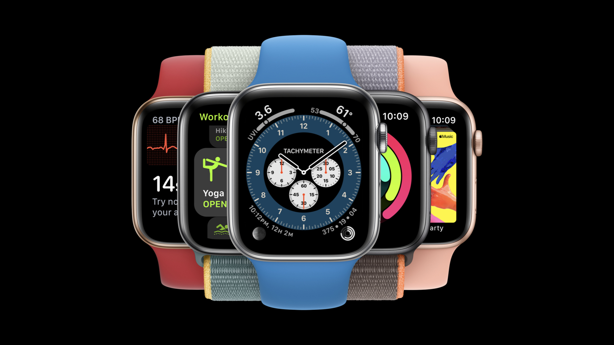
Highlight
watchOS 7 moves the secondary operations originally hidden in the gesture-based contextual menu to the visible interface, and provides Picker,
onDelete, More button, bottom operation, toolbar button and hierarchical navigation and other modes to retain functionality.
Core Content
It’s easy to make apps on your watch too heavy-duty. The screen is small, and the user’s wrist-raising time is short. Interactions such as long press, deep press, and hidden menus are easily missed. 10171 This session first gives three constraints: the Watch app must be lightweight; the functions must be operable at the moment; and key operations must be visible to the user. (00:37)
The change in watchOS 7 is to implement these constraints into system apps. Apple conducted an audit of the gesture-based contextual menu in watchOS and native apps, and moved the operations originally hidden in gestures back to the app interface. The goal is to make operations more intuitive, stable, and discoverable for all users while retaining functionality. (01:33)
This talk is mostly about secondary operations. The user may open Messages just to read the message, but still needs a new message entry; the user may open the map mainly to see the current location, but still needs to search the current area or switch the traffic view; when the user looks at the calendar details, he may need to send an email to the inviter or delete the event. The design task is to place these operations in the appropriate locations without taking away the main task of the current interface. (02:38)
The pattern given by Apple is very specific: use sort, filter or view switcher at the top of a long list; use swipe action to expose and delete list items; use the More button for non-scrolling full-screen content; place operations bound to the current content at the bottom of the details page; use the toolbar button to place necessary but non-main path entries in the scrolling list; only introduce hierarchical navigation when you need to remember the destination for a long time. (03:25)
Detailed Content
First divide the operation into main tasks and secondary tasks
(02:14) There are three design goals for watchOS 7: interactions must be discoverable and predictable; related operations must be visible in the app; and functionality cannot be removed when removing the gesture-based contextual menu. The key here is to first determine whether an operation is the main reason for the user to open this interface.
For example, the main task of Messages is usually to read new messages. Compose is an important function, but it is not the main reading path of this list. The main content of Calendar event is event information, and the email send or delete button at the bottom is the secondary operation bound to the current details. This classification will directly determine the control position.
Key points:
- The main task should appear in the most direct position of the interface, allowing users to complete it immediately after raising their wrist.
- Secondary tasks cannot be hidden in invisible gestures, especially entrances that would affect accessibility and discoverability.
- What can be put into the More menu can only be secondary operations related to the current content, and the main operation cannot be stuffed into it.
- If the operation requires the user to frequently switch destinations, hierarchical navigation is more appropriate than a button.
Use Picker to sort, filter and switch views at the top of long lists
(04:08) The examples of Activity Sharing and Stocks both deal with the same problem: the list is too long, and the current sorting or display dimensions may not meet the current needs of the user. watchOS 7 puts an entrance at the top of the list, allowing users to enter the modal view and switch sorting or views with one click.
List {
    Picker(selection: $viewing
           title: Text("Viewing")) {
       // Viewing options
    }
    // Stocks
}
Key points:
ListIt is an outer container, indicating that this mode serves a scrollable list. -Picker(selection:title:)Placed at the top of the list to host sorting, filtering or view switchers. -selection: $viewingLet the user choose to bind directly to the current display dimension. -title: Text("Viewing")Give the entrance clear semantics so that users know what they are switching to.- This code corresponds to the Stocks example: the user can switch between data views such as percentages and points.
Used to delete list itemsonDeleteExpose swipe action
(05:48) World Clock shows a secondary operation suitable for list rows: the user swipes left on a city and directly sees the deletion prompt. This operation is bound to the current row, and the visual feedback is clear. After deletion, it can also be added back through Add City at the bottom of the list.
List {
    ForEach(model.locations) {
        ClockCell(location: $0)
    }
    .onDelete { deleteClock(index: $0) }
}
Key points:
ForEach(model.locations)Responsible for generating each city row. -ClockCell(location: $0)Keep the main content of the list simple and the row itself still shows the city information first. -.onDeletehang onForEachabove, indicating that the deletion behavior belongs to this group of list items. -deleteClock(index: $0)Use the location passed in by the system to delete the corresponding city.- The speech clearly states that this swipe action API is called
onDeletemodifier and was already available in SwiftUI at the time.
Non-scrolling full-screen content uses the More button to carry contextual actions
(06:36) The map view of Maps itself is the main operating area, and the user needs to pan the map or return to the current location. Such an interface is not suitable for cramming many controls at the top. What watchOS 7 does is to put a More button in the lower right corner. After clicking it, it will display operations such as searching the current area, switching traffic and standard views.
Camera Remote is in the same mode. The user’s main task is to remotely control the iPhone to take photos; the More button contains flash, Live Photo and other camera settings. The talk describes it as a sheet API that can display simple actions or more complex lists of options. (07:46)
Key points:
- More button is suitable for glanceable full-screen views, especially interfaces that do not have enough space to display all operations.
- Buttons can use a circular container with a centered SF Symbol
ellipsisconstitute. - Apple recommends referring to the hit regions of different Watch sizes in the Human Interface Guidelines and adding transparent padding to the buttons if necessary.
- While both light and dark backgrounds are possible, the presentation example uses an 85% opaque white round container and a 50% opaque 1pt black outer glow to ensure readability.
- More menu only places secondary operations related to the currently visible content.
The button at the bottom of the details page must be bound to the content above
(11:10) Calendar’s detail view uses the buttons at the bottom to handle operations related to the current event: at the bottom of the event you received an invitation, you can send an email to the initiator, and at the bottom of the event you created, you can delete it. The button is positioned further back but is still a visible control that users naturally encounter when they scroll to the bottom.
Key points:
- Bottom operations are suitable for detail views because users first read the content and then decide whether to operate.
- Non-operational information is placed directly on the black background; only clickable operations are placed in the container to avoid misleading.
- Use red text for destructive operations.
- If the deleted content cannot be easily retrieved, add a confirmation alert.
Use toolbar button for necessary entries in the scrolling list
(12:22) toolbar button is a new API designed in watchOS 7 for the Compose button of Messages and Mail. The button is temporarily hidden under the navigation bar. Users can find it by scrolling when they need to create a new message, and they can put it away when they are not needed.
.toolbar {
    Button(action: newMessage) {
        Label("New Message",
              systemImage: "square.and.pencil")
    }
}
Key points:
.toolbarPlace the button in the toolbar area of SwiftUI. -Button(action: newMessage)Explicitly bind the new message action. -Label("New Message", systemImage: "square.and.pencil")Both text and system icons are provided.- The talk emphasizes that toolbar buttons should only be used in scrolling views, since the scrolling itself makes the button discoverable.
- It is suitable for operations that are necessary but not necessarily the main task of the current view and cannot be abused.
Use hierarchical navigation only when you need to remember the destination for a long time
(13:39) Mail and Home solve another problem: users need to switch between a set of destinations, and such choices will affect the entry point after the app is opened in the long term. When Mail is opened, you can directly enter All Inboxes; after clicking Return, the user can switch to Apple mailbox or personal mailbox. When Home is opened, it will directly enter the device list of the current house; after clicking Return, you can switch to another house or studio.
Key points:
- Hierarchical navigation is suitable for “destination” selection, not suitable for one-time filtering.
- The app can be opened at the last selected destination, allowing users to take one less step.
- The navigation bar title must show the current destination.
- back button To reliably return to the same set of destination lists.
- If the interaction does not require this persistence, the talk recommends not using this model.
Core Takeaways
-
Make an Apple Watch stock or fitness data view switcher: What it does: Provides “by percentage, points, activity, etc.” view switches at the top of a long list. Why it’s worth doing: Session explicitly places sort, filter, and view switcher at the top of long lists, reducing the time users spend looking for information on small screens. How to get started: In SwiftUI
Listtop embedPicker(selection:title:), bind the selection to a list sorting or display field. -
Add swipe action to deletable watchOS lists: What to do: Make lists such as world clock, favorite locations, and to-do items support left-swipe deletion. Why it’s worth doing: The World Clock example shows that deletion is a typical row-level secondary operation. Users can see clear prompts, and can be restored by adding an entry after accidental deletion. How to start: Use
ForEachRender rows of data, added on the same set of list items.onDelete, the delete function only processes the incoming index. -
Design a More button for full-screen content pages: What to do: Put a contextual operation entry in the lower right corner of non-scrolling interfaces such as maps, camera remote controls, and picture previews. Why it’s worth doing: The main content of these interfaces fills the screen, and the More button can carry secondary operations such as searching the current area, switching views, and adjusting settings. How to get started: Use a round container and add SF Symbol
ellipsis, press HIG to calibrate the touch area, and then use sheet to display simple actions or a list of options. -
Put the “New” type entry into the toolbar of the scrolling list: What to do: Provide a new button in the message, email, and note lists, but do not let it overwhelm the reading task. Why it’s worth doing: Session explains the design motivation of the toolbar button: most of the time, users read the content, and rarely, they need to create a new entry. How to get started: Using on SwiftUI scroll views
.toolbar, put with text and SF SymbolButton。 -
Change fixed destination switching to hierarchical navigation: What to do: Let the Watch app with multiple mailboxes, multiple families, and multiple workspaces enter frequently used destinations when opened, while retaining the return switching entrance. Why it’s worth doing: The Mail and Home examples show that persistent destinations are not suitable to be expressed by one-time filters. How to start: Record the last destination selected by the user, enter the corresponding list when opening the app, use the navigation title to display the current location, and use the back button to return to the destination list.
Related Sessions
- Design with iOS pickers, menus and actions — The design choices of pickers, menus and actions in iOS 14 are suitable for comparison with the secondary operation design of watchOS.
- Build with iOS pickers, menus and actions — Demonstrates the implementation of menu, picker, UIAction and other controls in UIKit.
- What’s new in SwiftUI — Introducing SwiftUI 2020’s new controls, toolbars, lists, and cross-platform capabilities.
- Create complications for Apple Watch — Explain the information presentation and timeline implementation of Apple Watch complications.
- Create quick interactions with Shortcuts on watchOS — Describes how to bring app intents and Shortcuts to Apple Watch, and understand intent routing and presentation interfaces.
Comments
GitHub Issues · utterances