
Highlight
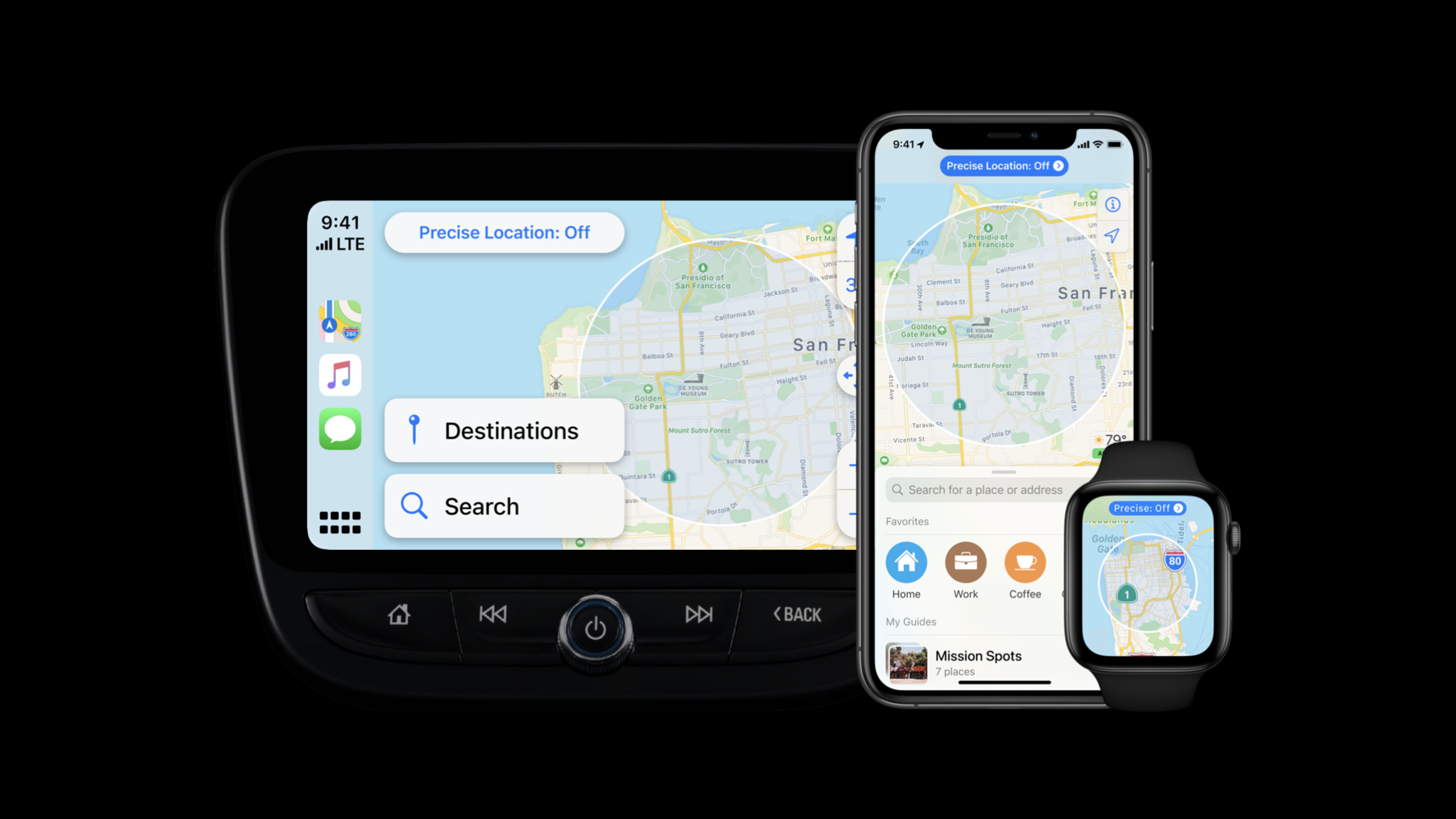
iOS 14’s approximate location allows users to share only approximate locations to apps; Apple Maps respects users’ location choices while retaining core map capabilities through new range annotations, precise data auditing, status bar controls, and requesting precise locations by action.
Core Content
Apple Maps was originally designed around precise locations. The blue anchor point is the organizing center of the map interface, and precise coordinates are used in search results, arrival times, distance calculations, and navigation. After iOS 14 allows users to share only approximate locations, this assumption is broken: users may still open maps, search for places, and view routes, but the app can no longer get the house-level location by default. (00:20)
The Maps team does not treat approximate location as a downgrade failure state. They first find out all the uses of precise locations in the interface, and then determine which information actually relies on precise coordinates. As a result, anchor points require new visual expressions, some arrival time and distance information in Favorites, Search, and place details can be removed, and navigation functionality requires higher precision when the user initiates an action. (02:07)
There are three design frameworks given in this session: Prioritize user control, transparently explain what data is being shared, and request precise location at a time commensurate with the functional value. It puts the discussion of permission changes back into the product experience: when the user selects the approximate location, the App should also allow the main functions to continue to be available. (01:50)
Detailed Content
Use range annotations to express approximate location
(02:15) Maps previously used pulsing blue dots to represent the user’s precise location. This point is eye-catching enough and naturally becomes the visual center of the map. You cannot continue to use the same symbol for approximate location because it would imply that the app knows the user’s precise coordinates.
The solution for Maps is to design a shaded circular area and use a range to express the approximate location. This element continues the visual language of the blue anchor point, and will fade out as the user zooms in on the map to avoid blocking map information.
Key points:
- Changes in location accuracy must be visible on the interface, not just hidden in the permission status.
- Approximate location should be expressed as an area rather than an exact point.
- Cartographic legibility must be protected when zooming the map, and privacy annotations cannot overwhelm the map itself.
Audit all interfaces that rely on precise coordinates
(02:53) The Maps team reviewed all places within the app that use precise location. Arrival time and distance calculations in Favorites rely on precise coordinates, and approximate locations cannot support these results. The team removed this unnecessary information and made similar adjustments to Search and place details.
This approach preserves core functionality. Users can still search for places, view maps, and enter routing flows, but they just won’t see the additional information that requires precise coordinates to be reliably calculated.
Key points:
- List all UIs that use precise locations first, then rank them by functional necessity.
- For unreliable approximate location information, it is better to directly remove it than to display wrong accuracy.
- As long as it does not affect the main flow, do not set precise location as a prerequisite for using the app.
Create transparency with writing and status bars
(03:37) The second principle is transparency. Maps invests in copywriting at key decision points like first launch to make it clear what data the app is requesting and what value that data will bring. When users make permission decisions, the copy needs to be accurate, specific, and close to the current scenario.
(04:12) For users who choose approximate location, Maps adds a status bar and control entry at the top of the map. When first launched, this status is larger and more prominent to remind users what kind of location data is being shared. As the user begins to interact with the app, the visual intensity decreases, preserving continued transparency while reducing distractions.
Key points:
- The permission description should clearly state the purpose of data and user benefits.
- The sharing choices made by users need to be continuously reminded within the product.
- The control portal should be close to the current experience, allowing users to change the sharing method at any time.
The precise location request should be close to the functional value
(05:09) The third principle is a sense of proportion. Maps acknowledges that turn-by-turn directions do require precise locations, but the timing of the requests is when the user is ready to get directions. Users can still see the Directions button in place details, and can also manually enter the start and end points.
(06:01) When the user needs to use the current location as a starting point, Maps adds My Location to the suggested location. Only after the user selects My Location does the app request one-time precise location access. This request follows the user action and is also directly connected to the upcoming route results.
Key points:
- Precise location requests should be triggered by user actions rather than preemptively appearing when the app is launched.
- Apps should retain alternative paths such as manual input so that users can continue operations without sharing their precise location.
- Both the request copy and the timing of the request indicate value: share the exact location to automatically populate the starting point and start navigation.
Core Takeaways
1. Local content homepage with approximate location priority
What to do: Let homepages such as weather, local news, and nearby events use approximate location to display city or regional content.
Why it’s worth doing: As mentioned at the beginning of the session, Weather, Wallet, and Photos will all be affected by changes in location accuracy. Many functions only require nearby context and do not require house-level coordinates.
How to start: Split the homepage into a regional default experience and a precise location enhanced experience. The default state displays city-level information, and users can only request higher accuracy when entering scenarios such as routes, check-ins, and precise reminders.
2. Accuracy degradation interface for map search
What to do: Continue to allow searching and browsing for places under approximate location, but hide distance, arrival time, or sorting details based on precise coordinates.
Why it’s worth doing: The Maps team made similar adjustments to Favorites, Search, and place details to prove that the core map process can continue to run at low accuracy.
How to start: Audit each location field and divide “must be precise”, “approximately available” and “removable” into three groups. For the third group, it was removed directly from the UI, and for the second group, it was changed to regional level expression.
3. One-time precise location entrance before navigation
What to do: Keep the Directions button and only request the precise location when the user selects My Location as the starting point.
Why it’s worth doing: turn-by-turn directions require precise location, but the request should be close to the moment the route is generated. Users can clearly understand what the precise location will bring.
How to start: Provide manual starting point input for the route page and add “My Location” to the suggested starting point. After the user selects this entry, the precise location request is displayed.
4. Location sharing status bar within the product
What it does: Shows the current sharing status at the top of the Maps, Explore, or Nearby service interface and provides access to settings or toggles the experience.
Why it’s worth doing: Maps uses a status bar to remind users that an approximate location is being shared, making it more prominent when it first appears, and then reducing its visual weight.
How to start: Design the status bar as a convergent component. After the first authorization, a complete description is displayed, and the short status and control entry are retained when the user continues browsing.
5. Scenario-based template for permission copywriting
What to do: Write separate permission descriptions for key nodes such as first startup, viewing nearby results, and starting navigation.
Why it’s worth doing: session clearly emphasizes clear writing. Users need to know what data the app uses, why it is used, and what value they will get from sharing it.
How to get started: Incorporate pre-permission request copy into the design review. Each piece of copy answers three questions: what type of location is requested, for which function, and what the user will get right away.
Related Sessions
- What’s new in location — Explain the approximate location and the latest location privacy control of iOS 14 Core Location, which is the technical basis for understanding the design suggestions of this site.
- Build trust through better privacy — Overview of iOS 14 privacy principles, transparency, and approximate location background, complementing the privacy framework mentioned in this session.
- Meet Nearby Interaction — Introducing Nearby Interaction that shares distance and direction with user consent, extending the privacy boundaries of location-related experiences.
- Build location-aware enterprise apps — Demonstrates how enterprise apps use iBeacon and Location Services, which is suitable for continuing to look at the combination of location capabilities and privacy design.
Comments
GitHub Issues · utterances