
Highlight
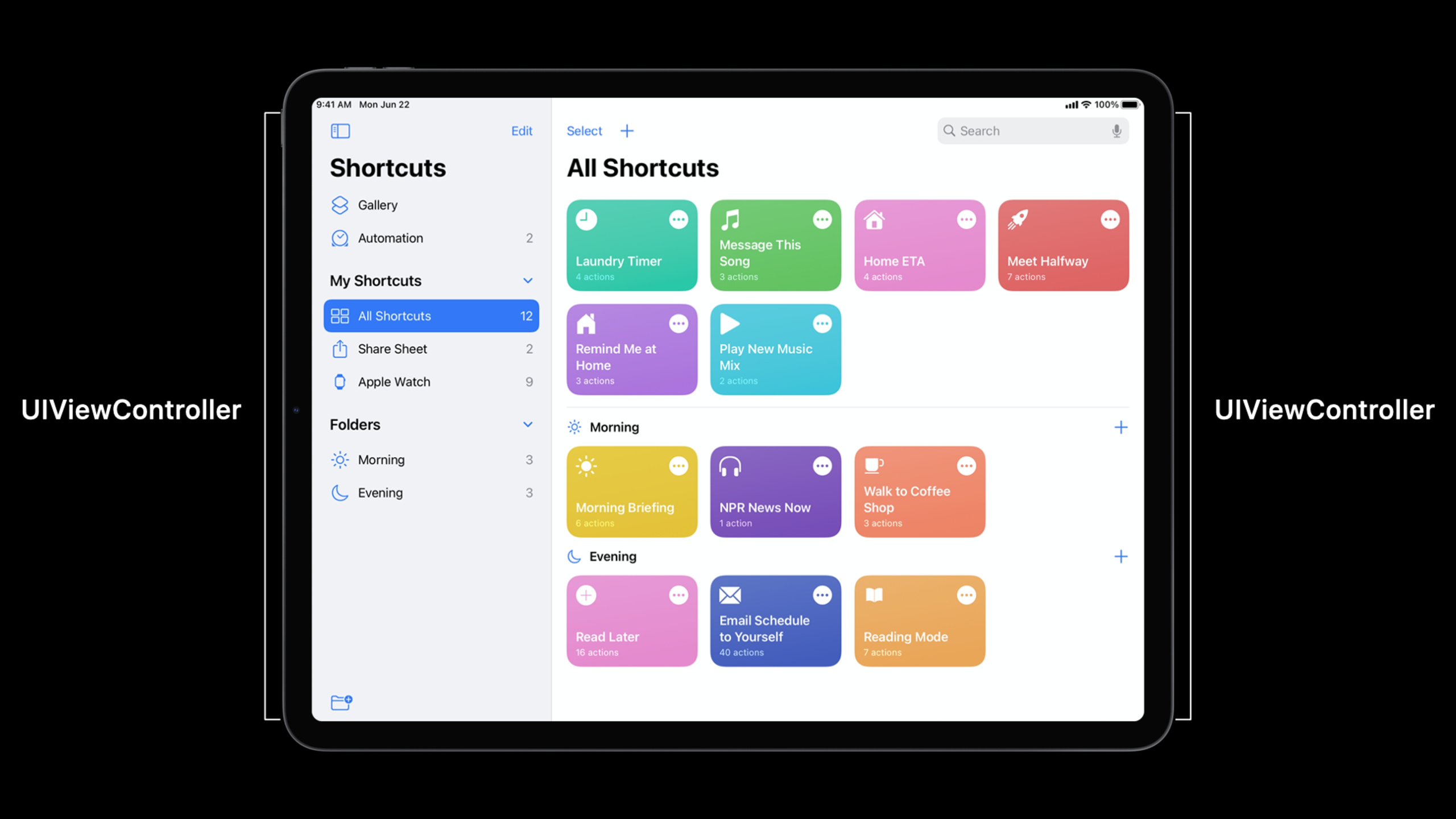
The design goal of iPadOS 14 is to bring a more desktop-class productivity experience to iPad while retaining the intuitiveness of touch-screen operations. Session introduces four core UI mode updates in iPadOS 14.
Core Content
The iPad screen is big enough, but many iPad apps still use the iPhone’s single-column navigation. Users want to check their mailbox and emails at the same time in Mail, want to continue writing while selecting tools in Notes, and want to quickly switch rooms and devices in Home; the old interface often requires them to jump back and forth between pages, or close a pop-up layer before continuing.
iPadOS 14 adds this path to UIKit.UISplitViewControllerA new initialization method for organizing the interface by columns is added. The app can directly declare a two-column or three-column layout, and then provide corresponding view controllers for primary, supplementary, secondary, compact and other columns. UIKit will display appropriate columns according to size class and automatically provide buttons and gestures to show and hide columns.
The lists in the column have also been replaced with modern practices. Recommended by AppleUICollectionViewCooperateUICollectionLayoutListConfigurationCreate sidebar appearance and useUICollectionView.CellRegistrationandUICollectionViewDiffableDataSourceReceive data to the cell. In this way, you can not only get the sidebar style of iPadOS 14, but also continue to use the collection view’s drag sorting, outline, swipe actions, and customizable cells.
The second half of the session uses Shortcuts as a case study. Shortcuts replaces the tab bar with a collapsible sidebar in regular width, and still uses tab bars and lists suitable for small screens in compact width. Instead of maintaining two completely separate apps, it puts the two navigation processes into the sameUISplitViewController, and then restore the detail state that the user is viewing when the size class is switched.
Detailed Content
Multi-column layout starts with UISplitViewController
(01:57) iOS 14UISplitViewControllerThe new initializer receives astyle, used to declare whether the app requires two columns or three columns. The double columns are called primary and secondary, and the three columns will add supplementary in the middle.
let splitViewController = UISplitViewController(style: .doubleColumn)Key points:
style: .doubleColumnIndicates that this split view is responsible for a navigation column and a content column.- This initializer will enable the new column management API exposed in the session.
- Apple recommends that apps structured into columns be directly
UISplitViewControllerAs the root view controller of the window.
(02:13) After creating the split view, put the specific view controller into the specified column. An example of Home is to put the sidebar on primary and the homepage content on secondary.
splitViewController.setViewController(sidebarViewController, for: .primary)
splitViewController.setViewController(myHomeViewController, for: .secondary)
Key points:
.primaryUsually hosts navigation portals, such as mailbox lists, room lists, or shortcut categories. -.secondaryCarrying the main content of the user’s current operation.- UIKit will determine how these columns appear based on regular width or compact width.
(02:28) If the app’s information level requires three columns, you can replace style with.tripleColumn, and then provide intermediate content for the supplementary column. Mail’s mailbox, message list, and message detail are this model.
let splitViewController = UISplitViewController(style: .tripleColumn)
splitViewController.setViewController(inboxViewController, for: .supplementary)
Key points:
.tripleColumnIt is suitable for productivity apps that coexist with navigation, lists, and details. -.supplementaryIs the middle column between primary and secondary.- This API is only responsible for the structure, and the specific interactions in the columns are still managed by the respective view controllers.
compact width can use different navigation flows
(04:02) Regular width can display multiple columns, but compact width does not have enough horizontal space. Session shows the approach of Shortcuts: using sidebar in regular width and providing a tab bar controller in compact width.
splitViewController.setViewController(tabBarController, for: .compact)Key points:
.compactColumns are used in narrow width environments such as iPhone portrait, iPad Slide Over, etc.- Compact flow can be different from regular width sidebar flow.
- switching logic by
UISplitViewControllerAccording to the trait collection process, the app is responsible for maintaining the user’s location.
(05:29) Multi-column interfaces are more than just a fixed layout.preferredSplitBehaviorDetermines how buttons and edge gestures move between different display modes.
splitViewController.preferredSplitBehavior = .tile
splitViewController.preferredSplitBehavior = .displace
splitViewController.preferredSplitBehavior = .overlay
Key points:
.tilePrefers placing columns side by side, suitable for apps that want content to be always visible. -.displaceWill push the secondary part away when three columns are displayed. -.overlayHave extra columns overlay the secondary, suitable for briefly viewing navigation information.
(05:56) The app can also actively request to hide or show a column. UIKit will perform smooth transitions and place automatically generated buttons into each column’s navigation bar or toolbar.
splitViewController.hideColumn(.primary)

splitViewController.showColumn(.supplementary)
Key points:
hideColumnIt is suitable for users to focus on the current content, such as only reading the document or the body of the email. -showColumnYou can bring back the navigation column or the middle list.- session also mentioned
presentsWithGestureandshowsSecondaryOnlyButton, they control edge gestures and display only secondary buttons.
Sidebar list is built with UICollectionView
(08:06) Columns are just containers, and the list in the sidebar needs to use collection view. Available on iOS 14UICollectionLayoutListConfiguration, you can directly specify the sidebar appearance.
let configuration = UICollectionLayoutListConfiguration(appearance: .sidebar)
let layout = UICollectionViewCompositionalLayout.list(using: configuration)
let collectionView = UICollectionView(frame: frame, collectionViewLayout: layout)
Key points:
.sidebarThe primary column will be provided with the iPadOS 14 sidebar visual style. -UICollectionViewCompositionalLayout.list(using:)Generate a vertical scrolling list layout. -UICollectionViewContinue to retain the flexibility of the collection view, and you can add accessories, drag reordering, outline and swipe actions later.
(09:36) cells no longer need to write subclasses for simple lists.CellRegistrationPut registration and configuration in one place and passdefaultContentConfiguration()Write text and pictures.
let cellRegistration = UICollectionView.CellRegistration<UICollectionViewListCell, MyItem>
{ cell, indexPath, item in

    var content = cell.defaultContentConfiguration()

    content.text = item.title
    content.image = item.image

    cell.contentConfiguration = content
}
Key points:
UICollectionViewListCellIs the standard cell type for list scenarios. -MyItemIt is the app’s own data type. The session example includes title and image. -defaultContentConfiguration()Will return the appropriate default style according to the current list/sidebar environment.- set up
cell.contentConfigurationFinally, the text, pictures and padding of the cell are managed uniformly by the system configuration.
(10:31) Finally, use diffable data source to connect the data source to the collection view. It is responsible for generating cells based on sections and items.
let dataSource = UICollectionViewDiffableDataSource<Section, MyItem>
   (collectionView: collectionView)
{ collectionView, indexPath, item in
   return collectionView.dequeueConfiguredReusableCell(using: cellRegistration,
                                                       for: indexPath,
                                                       item: item)
}
Key points:
SectionandMyItemA data structure that describes a list.- closure is called when the collection view requires a cell.
-
dequeueConfiguredReusableCellComplete reuse and configuration at the same time to avoid manual management of reuse identifiers. - Session emphasizes that most lists will follow the combination of layout, cell registration, and diffable data source.
(11:29) If the supplementary column displays a content list rather than a navigation entry, Human Interface Guidelines recommends usingsidebarPlain。
let configuration = UICollectionLayoutListConfiguration(appearance: .sidebarPlain)
let layout = UICollectionViewCompositionalLayout.list(using: configuration)
let collectionView = UICollectionView(frame: frame, collectionViewLayout: layout)
Key points:
.sidebarPlainSuitable for content lists such as folder items, collection items, and mailing lists.- The session mentioned that it will present a white background, dividers and a more content-oriented visual treatment.
- primary column commonly used
.sidebar, supplementary column common.sidebarPlain。
Shortcuts case strings structure and state together
(15:35) The regular width version of Shortcuts uses a double column split view. The sidebar on the left is responsible for navigation. After the user selects an item, detail is displayed on the right.
let splitViewController = UISplitViewController(style: .doubleColumn)

// Primary column

let sidebar = SidebarViewController()
splitViewController.setViewController(sidebar, for: .primary)


// Secondary column

func collectionView(_ collectionView: UICollectionView, didSelectItemAt indexPath: IndexPath) {
    splitViewController.showDetailViewController(DetailViewController(), sender: self)
}
Key points:
SidebarViewControllerPut it in the primary column.- sidebar select event from
UICollectionViewDelegateofdidSelectItemAt。 showDetailViewControllerPut the new detail into the secondary column.- transcript Description Shortcuts will rebuild the current detail when the size class changes to prevent the user from losing the current position after switching from split view to compact width.
(20:39) The sidebar of Shortcuts is also a collection view. It uses the section provider to read the current layout environment, changes the header to the first item of the section under compact width, and does not display the header under regular width.
let layout = UICollectionViewCompositionalLayout(sectionProvider: sectionProvider,
         configuration: UICollectionViewCompositionalLayoutConfiguration())

func sectionProvider(_ section: Int, environment: NSCollectionLayoutEnvironment)
-> NSCollectionLayoutSection {
    var configuration = UICollectionLayoutListConfiguration(appearance: .sidebar)

    if (environment.traitCollection.horizontalSizeClass == .compact) {
        configuration.headerMode = .firstItemInSection
    } else {
        configuration.headerMode = .none
    }

    return NSCollectionLayoutSection.list(using: configuration, layoutEnvironment: environment)
}
Key points:
sectionProviderAllow each section to generate different layouts based on the environment. -environment.traitCollection.horizontalSizeClassIt is the basis for judging compact/regular. -headerMode = .firstItemInSectionLet compact width still express grouping. -NSCollectionLayoutSection.listReturn the real list section.
Reducing modality is the goal at the interaction level
(12:27) The session also emphasized that iPad apps should reduce transient UI that blocks task flow. Notes’ color picker automatically disappears when the user starts drawing, and Contacts’ menu allows users to tap the outside of the menu and continue scrolling with the same touch. There is no fixed API recipe here. The criterion given by Apple is to observe whether the user has started the next action, such as scrolling, drawing, or responding to external events.
Key points:
- This is a system-level interaction improvement made by UIKit in iOS 14.
- The app itself should also observe signals such as scrolling, drawing, incoming events, etc.
- The goal is to allow the user to continue the current task rather than deal with closing the pop-up window first.
Core Takeaways
-
Add three-column reading mode to data-based apps What to do: Put “categories, lists, and details” in the iPad landscape interface at the same time. Why it’s worth doing: 10105 demonstrates
.tripleColumnand supplementary column, suitable for apps with clear information levels such as emails, notes, knowledge bases, and file management. How to start: UseUISplitViewController(style: .tripleColumn)Create a root container and put the category.primary, the item list is placed.supplementary, put the details.secondary。 -
Migrate old tab bar navigation to collapsible sidebar What to do: Replace the bottom tab bar with a collapsible sidebar in regular width, while keeping the tab bar for compact width. Why it’s worth doing: Shortcuts provides more navigation entries through sidebar, and uses
.compactColumn retains small screen process. How to start: Set up the primary sidebar view controller for the split view, then usesetViewController(tabBarController, for: .compact)Available in narrow width version. -
Use collection view to unify sidebar, content list and outline What to do: Gradually replace the table view list in the iPad app with a collection view list. Why it’s worth doing: session is clearly recommended
UICollectionViewAs a modern list solution, it continues to extend accessories, drag sorting, outline and swipe actions. How to get started: Use it firstUICollectionLayoutListConfiguration(appearance: .sidebar)Take the primary sidebar and then connect itCellRegistrationandUICollectionViewDiffableDataSource。 -
Choose sidebarPlain look and feel for content columns What to do: Distinguish the navigation list from the content list, making the supplementary column more like a file, mail, or project list. Why it’s worth doing: The rules given by the Human Interface Guidelines in the session are: use sidebar plain for items in content collections or folders. How to get started: Use when creating a collection view on supplementary columns
UICollectionLayoutListConfiguration(appearance: .sidebarPlain)。 -
Actively close the temporary interface that blocks the task flow What it does: Automatically close a popover, menu, or transient control that has completed its mission while the user continues to draw, scroll, or process input. Why it’s worth doing: Use Notes and Contacts for sessions, and redundant dismiss taps will interrupt continuous operations on the iPad. How to start: Start with the most common popover or menu in the app, find the user’s next action signal, close the temporary UI when the action occurs, and let the original action continue.
Related Sessions
- Designed for iPad — From a design perspective, sidebar, modal reduction, input methods and adaptive layout are the design-side supporting features of 10105.
- Lists in UICollectionView — Let’s talk about collection view list and sidebar in depth, which is suitable for continuing to dismantle the list implementation in 10105.
- Advances in UICollectionView — Talking about list layout, cell registration, and modern cell configuration, which are the basis of the code path of this article.
- Advances in diffable data sources — Talk about section snapshot, outline, reordering and sidebar data organization, and complete the sidebar data layer.
- Build with iOS pickers, menus and actions — Talking about iOS 14 menus, pickers and UIAction can extend this article about interactive transformation to reduce modality.
Comments
GitHub Issues · utterances