
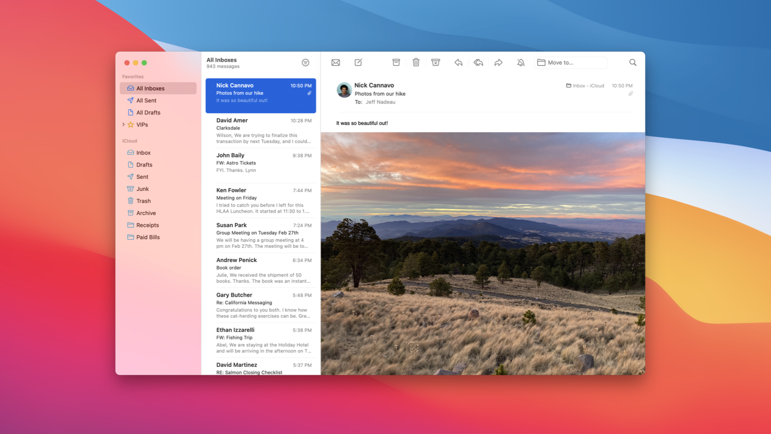
Highlight
macOS Big Sur’s AppKit automatically updates the appearance of Mac apps and provides full-height sidebar, toolbarStyle, NSSearchToolbarItem, NSTrackingSeparatorToolbarItem, large control, and SF Symbols APIs to allow developers to proactively adapt to new designs.
Core Content
Many Mac apps were used before Big SurNSSplitViewController、NSToolbar、NSOutlineViewand standard controls.After the system appearance is updated, this type of app can first get some automatic changes: the toolbar material disappears, the control border appears on hover, the sidebar icon starts to use accent color, and the list selection style will also be updated.
Automatic updates won’t solve every problem.The window structure still determines whether the app can truly fit into Big Sur: the sidebar must be able to extend below the title bar, the toolbar’s title and navigation items must find appropriate positions, the search box must remain available in a narrow window, and the split view’s divider must be aligned with the toolbar items.These require developers to examine existing structures and adopt Big Sur’s new or enhanced AppKit APIs.
The route of this session is very clear: first set the window into the structure expected by the system, and then process the controls, lists, text and icons.This path does not require developers to rewrite Mac apps; standard AppKit components take care of the appearance details, and developers focus on a few key adaptation points.
Detailed Content
1. Make sidebar part of the window structure
(02:05)
Big Sur’s full-height sidebar relies on existing structures: sidebar usageNSSplitViewController, corresponding toNSSplitViewItemConfigured as sidebar behavior, the window usesfullSizeContentViewmask, allowing content to be laid out in the area originally occupied by the title bar.macOS Big Sur is still hereNSViewTo expose the safe area, Interface Builder can also add a Safe Area Layout Guide.
The sidebar icon uses the system accent color by default.When you need to distinguish primary and secondary groups, you can passNSOutlineViewDelegatereturnNSTintConfiguration。
func outlineView(_ outlineView: NSOutlineView, tintConfigurationForItem item: Any) -> NSTintConfiguration? {
  if case let sectionItem as SectionItem = item {
    /*
       This outline view uses a type called "SectionItem" to populate its top-level sections.
       Here we choose a tint configuration based on a hypothetical `isSecondarySection` property on that type.
     */
    return sectionItem.isSecondarySection ? .monochrome : .default
  }
  // For all other cases, a return value of `nil` indicates that the item should inherit a tint from its parent.
  return nil
}
Key points:
outlineView(_:tintConfigurationForItem:)It is the new delegate method mentioned in session, used to control the tint of sidebar item..defaultUse accent color, suitable for main groupings..monochromeRemove the color accent and fit in the secondary section.- return
nilWhen , item inherits the parent tint to avoid repeated configuration for each node.
2. Use toolbarStyle, search items and tracking separator to adapt to the new toolbar
(05:47)
NSWindow.toolbarStyleControl the appearance of Big Sur’s new toolbar.session introduces unified, unified compact, preference, expanded and automatic.unified is the new standard for most windows; unified compact is more suitable for windows with content priority and toolbars that are not crowded; preference will be automatically used for adoptionNSTabViewControllerPreference window for toolbar tab style; expanded retains the old layout with the title above the toolbar, suitable for windows with long titles or many toolbar items.
The search box has a dedicatedNSSearchToolbarItem.When the window is wide enough, the complete search field is displayed. When the window becomes narrow, it is collapsed into a button and expanded after clicking.
var searchItem = NSSearchToolbarItem(itemIdentifier: searchIdentifier)
searchItem.searchField = searchField
Key points:
NSSearchToolbarItemReplaces the ordinary toolbar item and is responsible for Big Sur’s search folding behavior.- Continue to reuse existing
searchField, assign it tosearchFieldproperty. - session explicitly states that Interface Builder also provides search items, and older systems will fall back to the standard search field.
(13:30)
The toolbar items of apps like Mail will be aligned with the split view divider.For Big SurNSTrackingSeparatorToolbarItemDo this: Bind the item to a split view and divider index, and the toolbar will follow the divider’s position.
var trackingItem = NSTrackingSeparatorToolbarItem(itemIdentifier: identifier,
                                                  splitView: splitView,
                                                  dividerIndex: 1)
Key points:
splitViewPoints to the split view in the window.dividerIndexSpecify the dividing line to be traced.- This item can divide the toolbar into paragraphs consistent with the content area, helping users understand which pane the button acts on.
3. Controls, lists and text must also follow Big Sur metrics
(16:03)
Standard controls automatically get a new look in Big Sur.The session specifically reminds three types of changes that need to be checked: custom accent color, large controls, slider and table view layout metrics.
The custom accent color is defined in the asset catalog and named in the project editor.It only takes effect when multicolor is selected in System Preferences.Developers should still draw their interfaces using named system colors, as these colors will follow the accent preference chosen by the user.
(18:39)
large controls become standardcontrolSize.Large buttons in onboarding, large icon buttons in toolbar, and highlighting operations in alert can all use system sizes instead of self-drawn controls.
let button = NSButton(title: "Get Started",
                      target: self,
                      action: #selector(finishOnboarding(_:)))
button.controlSize = .large
Key points:
NSButton(title:target:action:)Create a standard AppKit button.targetandactionPreserve AppKit’s event dispatch model.button.controlSize = .largeUse Big Sur’s new large control sizes to make buttons match the system theme.
(20:21)
NSTableViewNewstyle, including automatic, fullWidth, inset, sourceList.automatic will be parsed according to the configuration: sourceList is used in sidebar, fullWidth is used in bordered scroll view, and inset is used by default in other scenes.When migrating, check the cell view’s horizontal padding, row height, multi-column spacing, and the old sourceList selection highlight style.
4. SF Symbols come to Mac and are processed together with text baselines
(23:10)
Big Sur brings SF Symbols to macOS.AppKit has access to over 2,500 built-in symbol images, and custom symbols can also be used.The toolbar control will automatically configure the size and style of the symbol. The size and style of the symbol in the sidebar will be automatically configured.NSOutlineViewBoth text and symbols will be scaled according to the system’s preferred sidebar size.
When creating a system symbol, the session requires an accessibility description.The symbol name describes the graphics, not the semantics.
/*
  Symbol image names are literal descriptions of the symbol glyph, so we must
  include an accessibility description to provide semantic meaning to the image.
 */
let newFolderImage = NSImage(systemSymbolName: "plus.rectangle.on.folder"
                             accessibilityDescription: "New Folder")
Key points:
NSImage(systemSymbolName:accessibilityDescription:)It is the entrance for AppKit to access system symbols."plus.rectangle.on.folder"Describes the glyph shape."New Folder"Provides semantics that allow accessibility to express the action of this icon.- session is recommended to be used first
NSImageViewDisplay symbol because it resolves symbol font, scale, display scale, and baseline alignment.
(25:13)
When you need to manually adjust the symbol,NSImageViewProvide symbol font and scale.When you need to write the configuration into image, you can usewithSymbolConfigurationCreate a new one with size, weight, scale or text styleNSImage.session also reminds you not to useNSImageStuff them directly into layer contents; symbols lose context, tend to become blurry, and are difficult to align correctly.
Core Takeaways
-
Change project-based apps to full-height sidebar: What to do: Migrate the main navigation of apps such as file management, notes, emails, and database clients to full-height sidebar.Why it’s worth doing: The session clearly states that Big Sur will make the sidebar and title bar form a unified window structure.How to start: Check if using
NSSplitViewControllerand sidebar behavior, then enablefullSizeContentView, and finally use safe area to correct the content layout. -
Keep the search box available in narrow windows: What to do: Replace the normal search field in the toolbar with
NSSearchToolbarItem.Why it’s worth doing: When the user shrinks the window, search collapses into a button instead of being squeezed out of the toolbar.How to start: Keep what you already haveNSSearchField,createNSSearchToolbarItem, assign search field tosearchFieldproperty. -
Use split view tracking to create a pane-level toolbar: What to do: Let the sidebar, list, and details area each have visually aligned toolbar sections.Why it’s worth doing:
NSTrackingSeparatorToolbarItemWill follow the split view divider, the user can determine the scope of the button.How to start: Create a tracking item for each divider, and put the toolbar item that needs to be placed above the sidebar before the separator. -
Replace onboarding and main action buttons with large controls: What to do: Replace self-drawn call-to-action with standard large buttons.Why it’s worth doing: large
controlSizeIt will match the Big Sur system theme to avoid distortion of self-drawn buttons in hover, disabled, and dark modes.How to start: Keep the existing target/action and change the key button’scontrolSizeset to.large, and then check the original min/max size constraints. -
Unify app symbol and text system: What to do: Replace toolbar, sidebar and empty status icons with SF Symbols.Why it’s worth doing: symbol will follow font size, weight, scale and sidebar size, which is more consistent with Big Sur’s text hierarchy.How to start: Use
NSImage(systemSymbolName:accessibilityDescription:)Create an icon usingNSImageViewDisplay, and add a semantic accessibility description for each symbol.
Related Sessions
- Optimize the interface of your Mac Catalyst app — Let Mac Catalyst apps adopt Mac idioms, Mac control skins, text sizes, and system spacing using Xcode’s Optimize Interface for Mac.
- What’s new in Mac Catalyst — Introducing the 2020 Mac Catalyst updates, including lifecycle, extensions, optimized for Mac mode, and macOS new look.
- SF Symbols 2 — An in-depth explanation of how SF Symbols 2 is used in AppKit, UIKit, and SwiftUI, alignment, color, and localization updates.
- The details of UI typography — Explain the details of the use of San Francisco font, system text style, Dynamic Type and custom fonts in the interface.
Comments
GitHub Issues · utterances