
Highlight
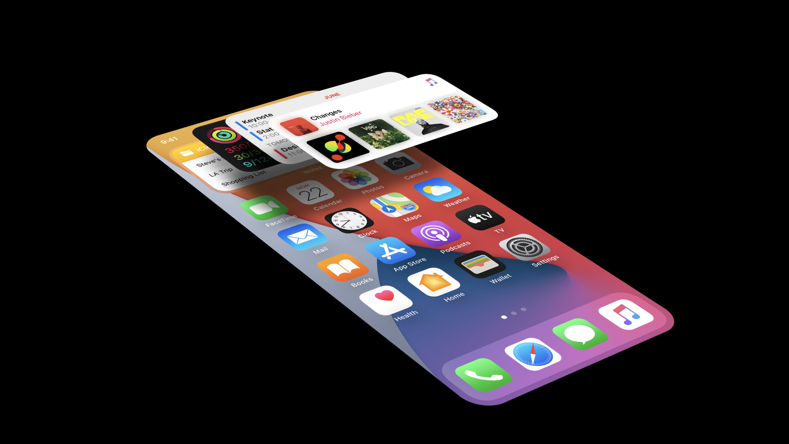
iOS 14 allows widgets to be placed directly on the home screen and Smart Stack. Apple uses system widgets such as calendar, photos, weather, maps, etc. as examples to illustrate how to select personal, informational and contextual content, and design it into an interface that is readable at a glance.
Core Content
Once the widget enters the home screen, the design issues become more acute.It is no longer just a supplementary entrance next to the app, but will appear together with icons, other widgets, and Smart Stack at a location that users scan repeatedly every day.Space on the home screen is limited, and users stay there for a short time. Cramming in more controls doesn’t automatically lead to a better experience.
The starting point of this session is content selection.Apple has repeatedly emphasized that the new widget system is content-centric.Developers need to answer a question first: When users open the app repeatedly, what do they want to know most immediately?The calendar gives the next event, the photos give selected memories, the weather gives the current location and upcoming weather changes, and the map gives the parking location, route or time to get home.
Smart Stack makes this question more concrete.The system will automatically switch the widget on the top of the stack based on user behavior and context, so the widget cannot only display static summaries.It needs to provide the most relevant information in different scenarios such as morning, commute, afternoon, and evening.Calendar shows tomorrow’s schedule when there are no more events for the day, and Weather improves the resolution of the one-hour forecast when it rains.
The creation phase focuses on size, interaction, and visual rules.Small widgets have only one tap target, which should point to the currently displayed content; medium and large can have multiple tap targets.The layout cannot simply enlarge small. Fonts, margins, colors, placeholders, and light and dark modes all need to be processed according to system rules.
Detailed Content
1. First use three principles to filter content
(02:29) The ideation principles given by Apple are personal, informational, and contextual.Personal allows the widget to connect with the user’s existing content; informational reduces the number of steps for users to repeatedly open the app; contextual allows information to appear at the right moment.
Key points:
- Calendar puts the time and location of your next meeting first, squeezing lower-priority information into busy schedules.
- Photos doesn’t just show recent photos, but a better selection of photos, memories, and content from the past.
- Weather displays the city, current temperature, high and low temperatures, the day’s forecast, and highlights special weather events in case of strong winds, thunderstorms, and rainfall.
- Maps first locates the user’s space, and then displays next-step information based on parking, schedule, and route home.
The design check in this section is straightforward: if a widget state doesn’t save the user from opening the app one more time, it needs to reselect content.
2. Leave configuration to the user, do not cram all entities into one layout
(06:03) iOS 14 supports user editing of widgets.In the Weather example, the user enters the editing state after long pressing, and changes the displayed location from the current location to Tokyo; then he can add another Weather widget and configure it to San Francisco.
Key points:
- The default configuration should be useful. Weather uses the current location by default, and users do not need to complete the settings first after adding.
- The configuration portal is suitable for entity selection such as cities, reminder lists, stocks, notes, and world clocks.
- Multi-instance capability reduces the pressure of complex layouts.Users can display the weather of two cities side by side without the need for a widget to cover all cities at the same time.
- The Stocks example illustrates the idea of multiple widgets available within the same app: one that displays a watchlist summary, and another that tracks individual stocks.
When designing a configurable widget, start by listing the entities that users are most likely to want to track separately, and then decide whether those entities should be split into multiple widgets.
3. Determine the interaction model according to size
(08:56) The new widget system supports three sizes: small, medium, and large.The small size carries the most useful piece of content in the app and supports only one tap target.medium and large display more content and support multiple tap targets.
Key points:
- Click small Calendar to enter Day View, and scroll to near the currently displayed event.
- small News Click to enter the currently displayed news story.
- In medium and large News, each news can point to its own story page.
- The system provides three tap styles: Fill is suitable for deep links of a single content, Cell is suitable for content that has its own container shape, and Content is suitable for content that does not have an independent container.
Interaction design should be consistent with content granularity.The click point of the small widget should be the current thing; medium and large are suitable for allowing different areas to enter different content.
4. Let content and personality come together
(10:44) Christian split the creation stage into content and personality.The content answers “What are users looking for when they open the App?” and the personality answers “How does this widget look like your App?”
Key points:
- Weather uses familiar weather backgrounds and icons, News uses news images, and Calendar uses a simple layout and red tint.
- Notes, Podcasts, and Tips extract illustration styles, gradients, or colors from the App icon, but do not put the App icon itself into the widget.
- Some layouts can be expanded from small to medium and large, such as Weather which gradually adds information.
- Some layouts need to be redesigned for each size, such as News showing a single piece of rich content in small and more news in medium.
- It is recommended to put up to four pieces of information in the small size; if there is no more valuable information in the larger size, only partial sizes can be supported.
The focus here is on the information hierarchy.Enlarging a small widget usually only creates gaps or repetitions. A true large widget needs to answer what information is added at a larger size.
5. Finish with system visual rules
(12:55) Apple shows a variety of common layout patterns and gives detail constraints for margins, rounded corners, fonts, placeholders, and brand exposure.
Key points:
- The default layout margin is 16pt; graphic layouts containing circles and inset platters can use 11pt.
- The shape corners close to the edge of the widget should maintain concentric rounded corners with the widget outer frame; the session mentioned that SwiftUI provides corresponding containers to avoid hand-written fixed corner radius.
- SF Pro is preferred for fonts, but SF Mono and SF Pro Rounded can also be used; custom fonts must be coordinated with the system widgets when placed together.
- The widget must provide a placeholder.Placeholder displays basic graphics and text placeholders so that the layout and colors do not jump when real data is replaced.
- Except for apps that aggregate content from multiple sources, it is not recommended to use logo; do not put wordmark, App icon or App name, because there is already an App label at the bottom of the home screen.
- Do not write description text to guide users, and do not use time descriptions such as “last updated” or “last checked” to display time information.
These rules address consistency.When users put widgets from multiple apps on the same page, the system margins, fonts, light and dark colors, and placeholder determine whether they can look like a whole.
Core Takeaways
1. Next event widget
What to do: Make a small widget for a calendar, course, meeting or appointment app that only displays the name, time and location of the next thing.
Why it’s worth doing: The Calendar example shows that the most common thing users repeatedly confirm is “what, what time, and where the next game is.”After this information appears on the home screen, you can save the step of opening the app to check the schedule.
How to start: First define a small size state: display the title, time, and location when there is the next event; display the first thing tomorrow when there is no event on the day.Click on the drop point to enter the corresponding date view, and scroll to near the event.
2. Rainfall or abnormal status reminder widget
What to do: Make a context-aware widget for apps such as weather, traffic, inventory, and service status to increase information density when exceptions occur.
Why it’s worth doing: The Weather sample highlights events when there are strong winds, thunderstorms, and rain, and shows a more granular forecast for the hour ahead when it’s raining.The value of a widget comes from timing, not just the data itself.
How to start: Split the normal state and abnormal state into different display templates.The normal state displays core values; the abnormal state displays the event type, start time, end trend, and changes that the user needs to know next.
3. Multi-city or multi-object tracking widget
What it does: Let users add multiple widgets to the same app, each instance tracking a city, stock, list, project, or note.
Why it’s worth doing: The Weather and Stocks examples illustrate that configuring multiple instances can replace complex large tables.The user decides himself which objects he wants to see side by side.
How to start: First make an entity into a clear small or medium widget, and then prepare the entity selection list for the editing interface.The default value should be able to display useful content immediately to prevent users from seeing an empty state after adding it.
4. Personal memories or selected content widget
What to do: Make a selected content widget for photo, reading, music, and note-taking apps, and regularly display content that users are more likely to want to return to.
Why it’s worth doing: Photos example choose better photos, Featured Photos and memories from past years instead of just filling the layout with the latest content.Personalization requires screening quality.
How to get started: First define “worthy of display” ranking signals, such as favorites, number of rewatches, time anniversaries, or editors’ picks.The placeholder only retains the layout skeleton and does not change the overall structure when the real content is loaded.
Related Sessions
- Meet WidgetKit — Understand WidgetKit’s definition, timeline, placeholder, refresh strategy and deep chain model.
- Build SwiftUI views for widgets — Learn to build widget views with SwiftUI, working with time text, placeholders, and different sizes.
- Add configuration and intelligence to your widgets — Dive into the configuration interface, Siri Suggestions, Smart Stack relevance, and timely information.
- Widgets Code-along, part 1: The adventure begins — Follow the starter project to create a widget extension, provider, and base timeline from scratch.
- Widgets Code-along, part 2: Alternate timelines — Continued implementation of timeline behaviors related to multiple sizes, configurations, and system intelligence.
Comments
GitHub Issues · utterances