
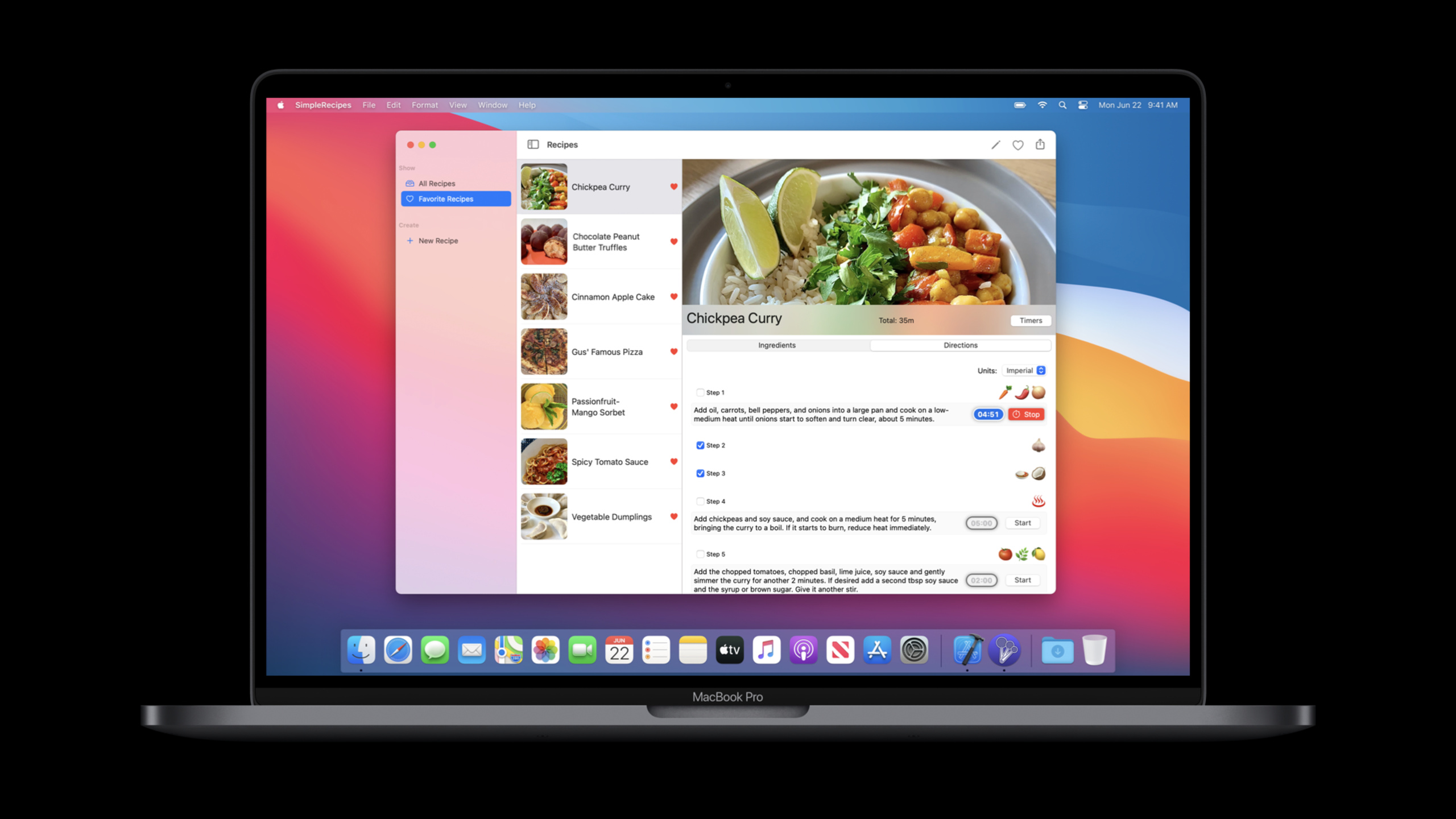
Highlight
Xcode 12’s “Optimize Interface for Mac” lets Mac Catalyst apps launch with Mac idiom, and UIKit and SwiftUI will adopt 1:1 point sizes, Mac control skins, Mac text sizes, and system spacing.
Core Content
When bringing iPad apps to Mac, the first step is often to select “Scale Interface to Match iPad”. This path has good compatibility, and UIKit will try to maintain the iPad layout. The cost is also clear: the interface is scaled by 77%, the code size of 100 points becomes 77 points on the screen, and the text and images are scaled.
“Optimize Interface for Mac” is the next step. It is a build setting in Xcode 12 that the app will enter the Mac idiom on startup. This choice has no compile-time impact, but the runtime interface metrics will change: content is rendered at 1:1 points, system buttons, sliders, switches, and activity indicators adopt a Mac appearance, body text changes from iPad’s 17 points to Mac’s 13 points, and Auto Layout’s system spacing is also changed to Mac spacing.
The workload this brings is focused on layout auditing. Hard-coded fonts will not automatically change to Mac text sizes; constraints that depend on the original size of the control will be affected by the new control measurement; when only Universal assets are provided, images will fall back to Mac Scaled, iPad, and then Universal. Session used the cookbook app to demonstrate this migration path: changing the cell height, providing Mac assets, hiding the navigation bar, and using the trait variation of Mac idiom to install the bottom Save and Cancel buttons.
SwiftUI migration costs are lower. GroupBox, Toggle, Button, and Picker will be changed to Mac style according to Mac idiom; customized ButtonStyle will not be replaced by the system. The session also showed how to use UIHostingController to put SwiftUI view into UIKit app. GroupBox, Toggle and Picker automatically obtain Mac performance after optimization.
Detailed Content
1. Use Mac idiom to differentiate between optimized Catalyst runtimes
(29:33)
“Optimize Interface for Mac” is not equivalent to the new build target. Session explicitly says this setting has no compile time implications. To determine the optimized runtime, you should use traitCollection.userInterfaceIdiom == .mac; to determine whether it is compiled in the Mac Catalyst environment, use targetEnvironment(macCatalyst).
// Idiom vs conditional compilation block

if traitCollection.userInterfaceIdiom == .mac {
    // "Optimize Interface for Mac" specific code
}


#if targetEnvironment(macCatalyst)
    // Mac Catalyst specific code
#endif


if traitCollection.userInterfaceIdiom == .mac {
    // "Optimize Interface for Mac" specific code
} else if traitCollection.userInterfaceIdiom == .pad {
    #if targetEnvironment(macCatalyst)
        // Mac Catalyst specific code
    #else
        // iPad specific code
    #endif
}
Key points:
traitCollection.userInterfaceIdiom == .maccorresponds to the optimized Mac idiom.#if targetEnvironment(macCatalyst)corresponds to the compilation environment and is not the same level of judgment as idiom.- The last paragraph separates the three paths of Mac idiom, iPad idiom under Catalyst, and ordinary iPad, which is suitable for handling differences during back deploy.
2. When migrating UIKit layout, first deal with navigation bar and hard-coded dimensions
(22:04)
In the New Recipe window of the cookbook app, an iPad-style navigation bar appears at the top of the Mac window. The way to handle Session is very straightforward: hide the navigation bar under Mac idiom, and then move Save and Cancel to the bottom view. It also fixes a label with a 17-point system font, because dynamic text styles will adjust with the platform, and hard-coded fonts will not.
if traitCollection.userInterfaceIdiom == .mac {
    navigationController?.setNavigationBarHidden(true, animated: false)
}
Key points:
traitCollection.userInterfaceIdiomis a runtime judgment and is suitable to be placed in the same set of Catalyst code.- The
.macbranch only handles interface differences under Mac idiom. setNavigationBarHidden(true, animated: false)corresponds to the step of removing the navigation bar in the session.
(24:47)
Interface Builder also has trait variations of the Mac idiom. In the Session, set the stack view containing Save and Cancel to only be installed on Mac idiom, and then lower the original bottom constraint priority from Required to High. This way the iPad still retains the original layout, while the Mac leaves room for the bottom buttons.
3. SwiftUI controls will change appearance according to Mac idiom
(31:26)
SwiftUI’s GroupBox renders Mac GroupBox when optimized for Mac. Session uses nested GroupBox to display structured content, and the system assigns background and padding to different levels.
// Nested GroupBoxes

struct ContentView: View {
    var body: some View {
        GroupBox {
            VStack {
                Text("High level information")
                GroupBox {
                    Text("Some elaborate details")
                }
            }
        }
    }
}
Key points:
- The outer
GroupBoxrepresents a set of structured content. VStackorganizes vertical content within a group.- The inner
GroupBoxdisplays deeper information. When optimized for Mac, it will use the visual hierarchy of Mac GroupBox.
(32:00)
The default appearance of Toggle will also change. The default on iPadOS is sliding switch, and the default on Mac idiom is checkbox. Session also explains that if the default style is not suitable, you can use ToggleStyle structs and ToggleStyle modifier to specify the style.
// DefaultToggleStyle

struct ContentView: View {
    @State var completed: Bool = false

    var body: some View {
        Toggle("Complete?", isOn: $completed)
    }
}
Key points:
@State var completedSaves the boolean state of Toggle.Toggle("Complete?", isOn: $completed)uses the default ToggleStyle.- Default style will appear as checkbox according to Mac idiom.
(33:14)
Picker will use Mac picker under Mac idiom. The example in Session uses an integer tag to bind three options: Small, Medium, and Large.
// DefaultPickerStyle

struct ContentView: View {
    @State var sizeIndex = 2

    var body: some View {
        Picker("Size:", selection: $sizeIndex) {
            Text("Small").tag(1)
            Text("Medium").tag(2)
            Text("Large").tag(3)
        }
    }
}
Key points:
@State var sizeIndex = 2makes Medium the initial choice.Picker("Size:", selection: $sizeIndex)binds the control to a state.- Each
Text(...).tag(...)provides an optional value, and Mac idiom will present a selection control familiar to Mac users.
4. Customized button styles will be retained
(33:55)
System buttons will have a Mac look. Custom ButtonStyle will not be overridden by Catalyst. Session is illustrated with a custom gradient button, and SwiftUI and Catalyst will leave the custom body intact.
// Custom gradient button

struct CustomNinetiesButtonStyle: ButtonStyle {
    var angle: Angle = .degrees(54.95)

    func gradient(shifted: Bool) -> AngularGradient {
        let lightTeal = Color(#colorLiteral(red: 0.2785285413, green: 0.9299042821, blue: 0.9448828101, alpha: 1))
        let yellow    = Color(#colorLiteral(red: 0.9300076365, green: 0.8226149678, blue: 0.59575665, alpha: 1))
        let pink      = Color(#colorLiteral(red: 0.9437599778, green: 0.3392140865, blue: 0.8994731307, alpha: 1))
        let purple    = Color(#colorLiteral(red: 0.5234025717, green: 0.3247769475, blue: 0.9921132922, alpha: 1))
        let softBlue  = Color(#colorLiteral(red: 0.137432307, green: 0.5998355746, blue: 0.9898411632, alpha: 1))

        let gradient = Gradient(stops:
                                    [.init(color:lightTeal, location: 0.2),
                                     .init(color: softBlue, location: 0.4),
                                     .init(color: purple, location: 0.6),
                                     .init(color: pink, location: 0.8),
                                     .init(color: yellow, location: 1.0)])

        return AngularGradient(gradient: gradient, center: .init(x: 0.25, y: 0.55), angle: shifted ? angle : .zero)
    }

    func makeBody(configuration: ButtonStyleConfiguration) -> some View {
        let background = NinetiesBackground(isPressed: configuration.isPressed,
                                            pressedGradient: gradient(shifted: false),
                                            unpressedGradient: gradient(shifted: true))
        return configuration.label
            .foregroundColor(configuration.isPressed ? Color.pink : Color.white)
            .modifier(background)
    }

    struct NinetiesBackground: ViewModifier {
        let isPressed: Bool
        let pressedGradient: AngularGradient
        let unpressedGradient: AngularGradient

        func body(content: Content) -> some View {
            let foreground = content
                    .padding(.horizontal, 24)
                    .padding(.vertical, 14)
                    .foregroundColor(.white)
            return foreground
                .background(Capsule().fill(isPressed ? pressedGradient : unpressedGradient))
        }
    }
}
struct ContentView: View {

    var body: some View {
      Button("Awesome", action: {})
          .buttonStyle(CustomNinetiesButtonStyle())
    }
}
Key points:
CustomNinetiesButtonStyleimplementsButtonStyle, and the style logic is controlled by the developer.configuration.isPressedswitches color and background based on pressed state..buttonStyle(CustomNinetiesButtonStyle())explicitly applies the custom style and Catalyst will not replace it with the system Mac button.
Core Takeaways
1. Make a Catalyst layout audit panel
- What to do: List views within the app that need to be checked under Mac idiom: hard-coded fonts, fixed-size images, constraints that depend on the original size of the control, system spacing changes.
- Why it’s worth doing: Session display optimized for Mac will use 1:1 points, Mac control measurement and Mac text size instead. Simple views may also have line breaks, pictures become larger, and sliders become narrower.
- How to start: First mark the key view controller in the Mac idiom branch, and then check the layout differences under
traitCollection.userInterfaceIdiom == .macone by one.
2. Complete Mac assets for commonly used pictures
- What to do: Add high-frequency images such as list icons, favorite icons, and map annotations to the Mac version.
- Why is it worth doing: It is explained in the Session that optimized for Mac will give priority to Mac assets; if it cannot be found, it will fall back to Mac Scaled, iPad, and Universal, and the size may not be appropriate.
- How to start: Check Mac in the Devices inspector of Asset Catalog, and start replacing the small icons of the list cells first.
3. Change iPad navigation actions to Mac window actions
- What to do: Move window-level actions such as new, save, and cancel from the iPad navigation bar to a more appropriate location on Mac.
- Why it’s worth doing: Hide the navigation bar in the New Recipe window in Session, and put Save and Cancel at the bottom, because these actions directly affect the form data in the current window.
- How to get started: Hide navigation bar under Mac idiom; install dedicated button area using Mac trait variation of Interface Builder.
4. Replace static description views with SwiftUI
- What to do: Change the plain text description page to a SwiftUI interactive view, such as GroupBox grouping, Toggle check step, and Picker switching unit.
- Why it’s worth doing: Session shows how to put SwiftUI view into UIKit app through UIHostingController, and GroupBox, Toggle, and Picker will automatically get Mac appearance.
- How to start: First make a partial
ContentView, reuse the GroupBox, Toggle, and Picker modes in the session, and then embed it into the existing UIKit page.
Related Sessions
- What’s new in Mac Catalyst — Supplements the overall update of Mac Catalyst in 2020, and mentions the upper background of optimized for Mac mode.
- Accessibility design for Mac Catalyst — Continuing work on the keyboard, mouse, and accessible navigation experience for Mac Catalyst apps.
- Handle trackpad and mouse input — Talk about the processing of indirect input, pointer movement, scroll input and gesture recognizer.
- Adopt the new look of macOS — Understand Mac controls, toolbars, and visual hierarchy from an AppKit and macOS Big Sur design perspective.
Comments
GitHub Issues · utterances