
Highlight
iOS 14 brings new system-level behaviors to UIKit’s Page Control, Color Picker, Date Picker, Menus, and UIAction, so developers can use ready-made controls to handle color selection, compact date input, asynchronous menus, and unified event callbacks.
Core Content
This session solves a very common interface problem: there are many small interactions in the App, and developers often work on it themselves. The paging indicator must support many pages, the color selection must support eyedroppers and favorite colors, the date input must be inserted into the form, and a set of contextual actions must be hung next to the button. When doing these functions yourself, it is easy to miss out on interaction details, accessibility, pointer input, and Catalyst appearance. (00:24)
Apple incorporated these interactions into UIKit controls in iOS 14. UIPageControl supports unlimited pages within a fixed width and custom indicator images. UIColorPickerViewController is responsible for color grid, spectrum, RGB, hex, collection colors and eyedroppers. UIDatePicker adds compact and inline styles, and both forms and large screens can use the same set of APIs. (03:20)
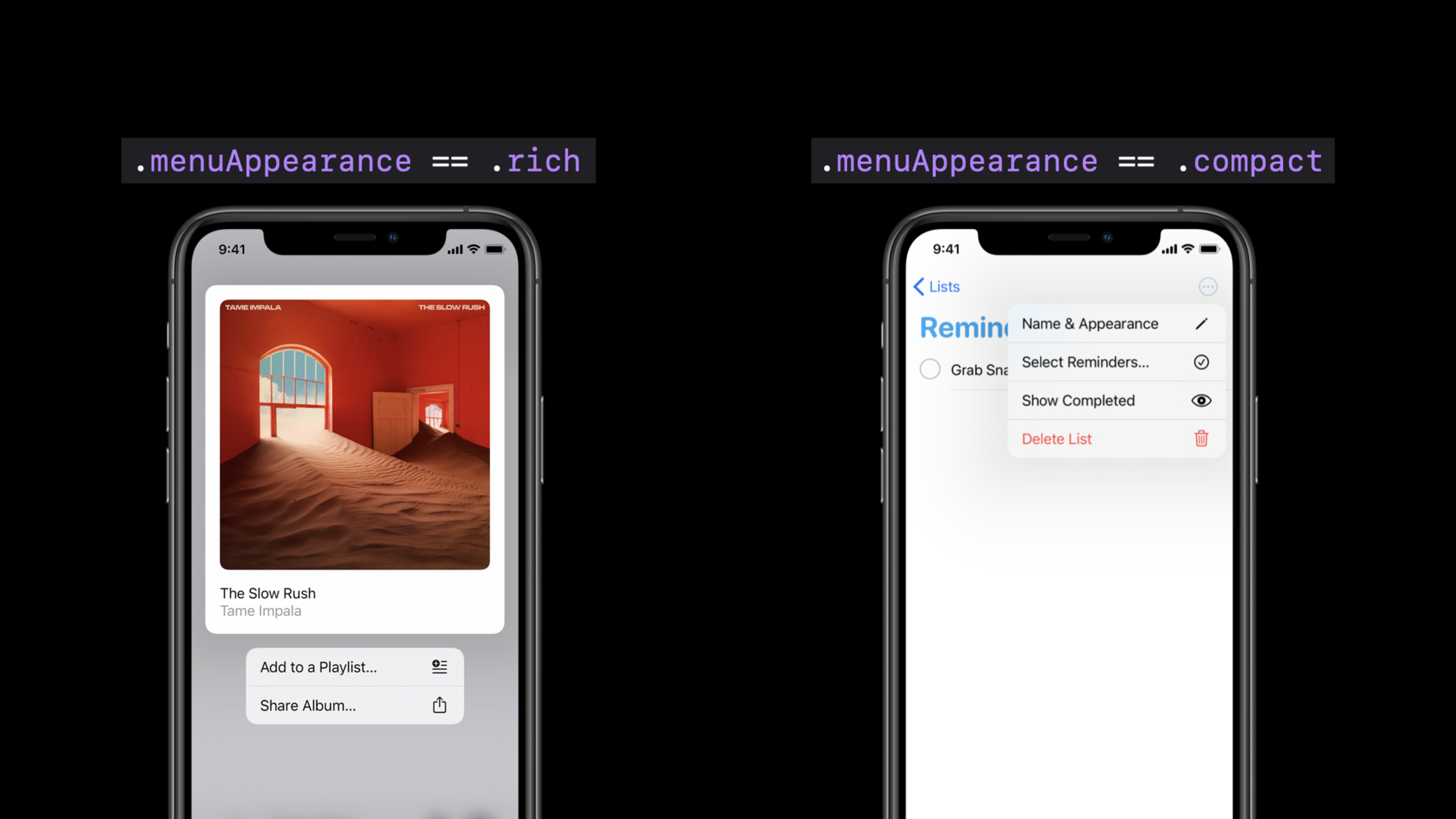
The focus in the second half turns to menus and actions. iOS 14 allows UIMenu to be directly attached to UIButton and UIBarButtonItem, which can be opened by long pressing or touching. UIDeferredMenuElement allows menu items to be generated asynchronously, and updateVisibleMenu allows the displayed menu to be updated. UIAction puts the event processing of buttons, Bar Button Item, and Segmented Control in the location where the control is created, reducing scattered target-action code. (11:15)
These capabilities also serve iPad and Mac Catalyst. It was mentioned many times in the speech that the standard controls will adopt a look closer to macOS in the optimized Catalyst App; the compact style of the Date Picker is also suitable for pointer input. Developers write less custom controls, and the app can more easily keep up with system platform differences. (01:38)
Detailed Content
Page Control can host more pages in a fixed space
(04:34) A new look for UIPageControl allows the control to support an arbitrary number of pages within a fixed size; users can scrub and scroll between page points when space is insufficient. It also adds indicator pictures and background style customization, which is suitable for pages with special meanings such as bookmark pages and collection pages.
let pageControl = UIPageControl()
pageControl.numberOfPages = 5

pageControl.backgroundStyle = .prominent

pageControl.preferredIndicatorImage =
    UIImage(systemName: "bookmark.fill")

pageControl.setIndicatorImage(
    UIImage(systemName: "heart.fill"), forPage: 0)
Key points:
numberOfPagesstill uses the original API, and the migration cost is low.backgroundStyle = .prominentallows the background area to be continuously displayed, which is suitable for interfaces that use Page Control as the main control.preferredIndicatorImagesets the default image for all pages.setIndicatorImage(_:forPage:)can set a separate icon for a certain page. The speech uses a heart shape on page 0 to indicate collection.
Color Picker is responsible for the complete color selection process
(06:56) UIColorPickerViewController is a view controller that can be presented as a sheet or popover. Users can select colors from grid, spectrum, RGB, hexadecimal values, or save frequently used colors. The eyedropper on iPadOS can pick colors from anywhere on the screen, and the standard macOS color panel will be used on Mac Catalyst.
var color = UIColor.blue
var colorPicker = UIColorPickerViewController()

func pickColor() {
    colorPicker.supportsAlpha = true
    colorPicker.selectedColor = color
    self.present(colorPicker,
        animated: true,
      completion: nil)
}

func colorPickerViewControllerDidSelectColor(_
  viewController: UIColorPickerViewController) {
    color = viewController.selectedColor
}

func colorPickerViewControllerDidFinish(_
  viewController: UIColorPickerViewController) {
    // Do nothing
}
Key points:
supportsAlphacontrols whether transparency is allowed.selectedColorwrites the current color before displaying, and the user can see the existing value after opening it.presentis responsible for displaying the system color picker. App does not need to implement eyedroppers or collection colors by itself.colorPickerViewControllerDidSelectColorreadsselectedColorafter the user selects a color.- User cancellation does not need to be handled. The
DidFinishexample in the lecture explicitly chose an empty implementation.
Date Picker uses the same API to switch compact and inline styles
(10:04) UIDatePicker in iOS 14 and iPadOS 14 adds compact style. It displays date and time as fields, click on the date to open the calendar, click on the time to open the keyboard input, suitable for compact layout in table view or form. The inline style is suitable for scenarios where date selection is the main task of the interface. The talk emphasizes that the new style does not change the underlying API of UIDatePicker.
let datePicker = UIDatePicker()
datePicker.date = Date(timeIntervalSinceReferenceDate:
                       timeInterval)

datePicker.preferredDatePickerStyle = .compact

datePicker.calendar = Calendar(identifier: .japanese)
datePicker.datePickerMode = .date

datePicker.addTarget(self,
             action: #selector(dateSet),
                for: .valueChanged)
Key points:
datecontinues to use the original method to set the initial value.preferredDatePickerStyle = .compactonly changes the display.calendarcan be changed to a calendar system such as Japanese calendar, and the new style will display the corresponding content.datePickerMode = .datelimits selection to dates, hiding irrelevant time inputs.addTarget(_:action:for:)still treats it as aUIControllistening for value changes.
Menus can be generated asynchronously, or the content being displayed can be updated.
(14:20) iOS 14 allows UIButton and UIBarButtonItem to support menu directly. The menu is displayed by long pressing by default; UIButton can be displayed immediately when touched through showsMenuAsPrimaryAction; UIBarButtonItem will also be displayed on touch when there is a menu and no primary action. Complex menus can be generated lazily using UIDeferredMenuElement.
button.menu = UIMenu(title: "", children: [
    UIMenu(title: "", options: .displayInline, children: (1...2).map { UIAction(title: "Static Item \($0)") { action in }}),
    UIDeferredMenuElement({ completion in
        DispatchQueue.main.asyncAfter(deadline: .now() + 2.0) {
            completion([UIMenu(title: "", options: .displayInline, children: (1...2).map { UIAction(title: "Dynamic Item \($0)") { action in }})])
        }
    }),
])
Key points:
button.menuhangs the menu directly on the button, and UIKit is responsible for displaying it.- The first
UIMenuholds static items,options: .displayInlinemakes them display inline. - The closure of
UIDeferredMenuElementcallscompletionasynchronously, which is suitable for waiting for the data to be ready before adding menu items. - UIKit will display the standard loading UI during the wait period and cache the generated items on subsequent displays.
(14:50) Menus that have been opened can also be updated. updateVisibleMenu of UIContextMenuInteraction will pass in a copy of the current menu and return a new menu to replace the current display content.
self.contextMenuInteraction.updateVisibleMenu { currentMenu -> UIMenu in
    currentMenu.children.forEach { element in
        guard let action = element as? UIAction else { return }

        action.state = Bool.random() ? .off : .on
        action.attributes = Bool.random() ? [.hidden] : []
    }
    return currentMenu
}
Key points:
updateVisibleMenuonly handles the menu being displayed to the user.currentMenu.childrencan traverse the current menu items.- The example only updates
UIAction, and other menu elements are skipped directly. statecan switch the selected state,attributescan hide the item.UIMenuin iOS 14 no longer forces children to be immutable, so you can update the incoming menu and return directly.
UIAction puts event handling back to the control creation site
(16:05) UIAction was introduced in iOS 13 and expanded to more controls in iOS 14. UIBarButtonItem adds a new initializer, which can create buttons that only execute actions, buttons that only display menu, or buttons that support both tap action and long-press menu.
let saveAction = UIAction(title: "") { action in }
let saveMenu = UIMenu(title: "", children: [
    UIAction(title: "Copy", image: UIImage(systemName: "doc.on.doc")) { action in },
    UIAction(title: "Rename", image: UIImage(systemName: "pencil")) { action in },
    UIAction(title: "Duplicate", image: UIImage(systemName: "plus.square.on.square")) { action in },
    UIAction(title: "Move", image: UIImage(systemName: "folder")) { action in },
])
let optionsImage = UIImage(systemName: "ellipsis.circle")
let optionsMenu = UIMenu(title: "", children: [
    UIAction(title: "Info", image: UIImage(systemName: "info.circle")) { action in },
    UIAction(title: "Share", image: UIImage(systemName: "square.and.arrow.up")) { action in },
    UIAction(title: "Collaborate", image: UIImage(systemName: "person.crop.circle.badge.plus")) { action in },
])
let revertAction = UIAction(title: "Revert") { action in }
self.toolbarItems = [
    UIBarButtonItem(systemItem: .save, primaryAction: saveAction, menu: saveMenu),
    .fixedSpace(width:20.0),
    UIBarButtonItem(image: optionsImage, menu: optionsMenu),
    .flexibleSpace(),
    UIBarButtonItem(primaryAction: revertAction),
]
Key points:
primaryActionhandles clicks,menuhandles more actions.UIActioncan be used both as a menu item and as the main action of a Bar Button Item.- A Bar Button Item with image and menu but no primary action will display the menu when touched.
.fixedSpace(width:)and.flexibleSpace()are the new toolbar item configuration methods shown in the speech.- The same toolbar can mix save, more options and undo operations.
(17:41) UISegmentedControl also supports segments created by UIAction. The handler of each segment is close to the configured position, and only the corresponding action is called when the user selects a segment. The speech suggested using enum to generate actions, so that when a case is added, the configuration and response logic will be updated together.
Core Takeaways
-
Make an editor settings page that supports brand colors: Use
UIColorPickerViewControllerto let users choose theme colors. It already handles grid, spectrum, RGB, hex, collection colors and eyedroppers; the implementation entry point is to display the picker, setselectedColor, and save the selection in the delegate callback. -
Rework the date field in the form: Change the space-consuming scroll wheel to
UIDatePickercompact style. It is suitable for table views or multi-field forms; the implementation entry is to setpreferredDatePickerStyle = .compact, and then usedatePickerModeto limit the selection of only date or time. -
Add long-press menu to toolbar buttons: Buttons such as save, more, and share can have primary actions and menus at the same time. The implementation entry is to use
UIBarButtonItem(systemItem:primaryAction:menu:)orUIBarButtonItem(image:menu:)to organize common actions and extended actions. -
Change menus that require network data to lazy loading: Menu items such as folders, project lists, and collaborators lists can be generated using
UIDeferredMenuElement. After the user opens the menu, he first sees the system loading UI. After the data is returned,completionis called to populate the menu. -
Bring Segmented Control options and processing logic together: Use
UIActionto create each segment and avoid usingselectedSegmentIndexto write a switch. The entry point is to use enum to generate a set of actions and then hand them over to the new initializer ofUISegmentedControl.
Related Sessions
- Design with iOS pickers, menus and actions — This design support session talks about the scenarios in which pickers, menus and actions should be used.
- Optimize the interface of your Mac Catalyst app — This session has mentioned the Catalyst appearance and menu many times. Let’s continue to see how it can handle Mac-side interface adaptation.
- Build for the iPadOS pointer — Date Picker and standard controls must take into account pointer input on the iPad. This session talks about the design and API of pointer interaction.
- Handle trackpad and mouse input — If the app is targeted at iPad or Mac Catalyst users, this session adds trackpad, mouse, scroll, and gesture handling.
Comments
GitHub Issues · utterances