
Highlight
watchOS 7 adds ClockKit templates that can host SwiftUI views for Graphic Corner, Circular, Rectangular, and Extra Large Complication, and provides support for Text automatic updates, ProgressView, Gauge, dial tint processing, and Xcode previews.
Core Content
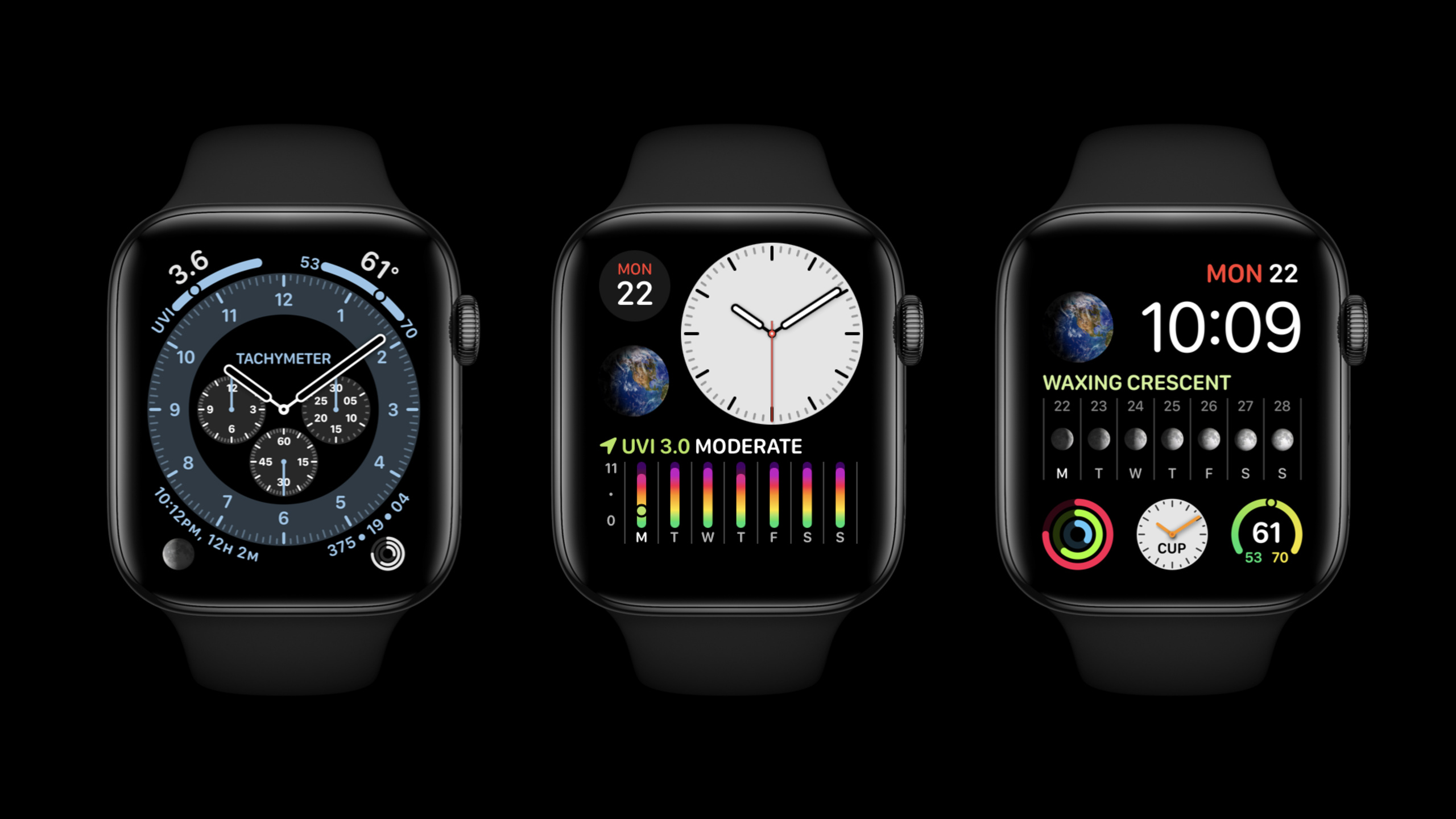
Complication in Apple Watch is responsible for displaying timely, relevant information on the watch face. An example of UVI complication is used at the beginning of the session: in a small area, a vertical gauge with color gradient can be used to tell the user whether sun protection is needed today (00:22).
The difficulty is that a good Complication should compress complex information into a form that can be understood at a glance. In the past, we mainly relied on ClockKit predefined templates and providers; watchOS 7 has added templates that can receive SwiftUI views, covering Graphic Corner, Circular, Rectangular and Extra Large families (01:29).
SwiftUI gives developers a freer canvas here. Session specifically mentioned that GraphicRectangularFullView is a new template that provides a larger drawing area for the Rectangular family. Dawn Patrol’s Tide Chart and Coffee Tracker The weekly coffee intake charts are examples of putting chart information on the dial (02:03, 13:48).
This degree of freedom also has boundaries. Complication is a static view in the timeline. Clicking anywhere will open the App; buttons, gestures, other interactive elements, and SwiftUI animation are not supported. The system also measures performance before the view is displayed. Complex or inappropriately sized views will trigger a runtime warning (19:12).
Detailed Content
Put SwiftUI view into ClockKit template
(01:29) ClockKit’s new Graphic templates can receive SwiftUI views. The official snippet below shows both a SwiftUI view, relative time text, and previewing complication in Xcode using previewContext().
import SwiftUI
import ClockKit

struct RelativeText: View {
    var body: some View {
        VStack(alignment: .leading) {
            Text("Count Down")
                .font(.headline)
                .foregroundColor(.accentColor)
            Label("Nap Time", systemImage: "moon.fill")
            Text(Date() + 100, style: .relative)
        }
        .frame(maxWidth: .infinity, alignment: .leading)
    }
}

struct RelativeText_Previews: PreviewProvider {
    static var previews: some View {
        CLKComplicationTemplateGraphicRectangularFullView(RelativeText())
            .previewContext()
    }
}
Key points:
import SwiftUIandimport ClockKitappear at the same time, sopreviewContext()can wrap the template into a view recognized by SwiftUI preview.RelativeTextis just a plain SwiftUIViewthat can organize content usingVStack,Text,Labeland modifiers.Text(Date() + 100, style: .relative)uses the relative date formatter named by session, and the dial will automatically keep the relative time accurate.CLKComplicationTemplateGraphicRectangularFullView(RelativeText())Hands the SwiftUI view to the Graphic Rectangular Full View template..previewContext()tells Xcode previews to put this template on the watch face suitable for this family.
Use Text, ProgressView and Gauge to express information that is readable at a glance
(02:38) SwiftUI’s Text will be aware of the complication family: the default font size will change with the family, and the default font will also be changed to SF Rounded. Session also names relative, offset, and timer styles, which are automatically updated by the watch face.
import SwiftUI
import ClockKit

struct TimerText: View {
    var body: some View {
        VStack(alignment: .leading) {
            Label("Sourdough Timer", systemImage: "timer")
                .foregroundColor(.orange)
            Text("Time remaining: \(Date() + 100, style: .timer)")
        }
        .frame(maxWidth: .infinity, alignment: .leading)
    }
}

struct TimerText_Previews: PreviewProvider {
    static var previews: some View {
        CLKComplicationTemplateGraphicRectangularFullView(TimerText())
            .previewContext()
    }
}
Key points:
Label("Sourdough Timer", systemImage: "timer")Use SF Symbol and short text to describe the purpose of this complication..foregroundColor(.orange)gives the title an explicit state color; subsequent tinting rules determine how it changes when the dial is tinted.Text("Time remaining: \(Date() + 100, style: .timer)")Put timer style into string interpolation, and the dial will display the remaining time..frame(maxWidth: .infinity, alignment: .leading)makes the content fill the available width of the Rectangular template and arrange it to the left.
(03:37) ProgressView is suitable for linearly advancing information, such as music progress; Gauge is suitable for values that change over time, such as temperature or pH.
import SwiftUI
import ClockKit

struct ProgressSample: View {
    var body: some View {
        VStack(alignment: .leading) {
            Text("Water Reminder")
                .foregroundColor(.blue)
            Text("32 oz. consumed")
            ProgressView(value: 0.7)
                .progressViewStyle(LinearProgressViewStyle(tint: .blue))
        }

    }
}

struct ProgressSample_Previews: PreviewProvider {
    static var previews: some View {
        CLKComplicationTemplateGraphicRectangularFullView(ProgressSample())
            .previewContext()
    }
}
Key points:
Text("Water Reminder")gives the user a title to avoid the lack of context when there is only a progress bar.Text("32 oz. consumed")writes the current state into a short sentence, suitable for the horizontal space of the Rectangular family.ProgressView(value: 0.7)represents a progress value from 0 to 1.LinearProgressViewStyle(tint: .blue)uses the linear style and tint displayed in the session.- Preview is still done via
CLKComplicationTemplateGraphicRectangularFullViewandpreviewContext().
import SwiftUI
import ClockKit

struct GaugeSample: View {
    @State var acidity = 5.8

    var body: some View {
        Gauge(value: acidity, in: 3...10) {
            Image(systemName: "drop.fill")
                .foregroundColor(.green)
        } currentValueLabel: {
            Text("\(acidity, specifier: "%.1f")")
        } minimumValueLabel: {
            Text("3")
        } maximumValueLabel: {
            Text("10")
        }
        .gaugeStyle(
            CircularGaugeStyle(
                tint: Gradient(colors: [.orange, .yellow, .green, .blue, .purple])
            )
        )
    }
}

struct GaugeSample_Previews: PreviewProvider {
    static var previews: some View {
        CLKComplicationTemplateGraphicCircularView(GaugeSample())
            .previewContext()
    }
}
Key points:
@State var acidity = 5.8gives Gauge a current value, for example the garden soil acidity scenario from the session.Gauge(value: acidity, in: 3...10)defines the value range, the range in session is 3 to 10.currentValueLabeldisplays the current value in the center of the Gauge to help users read quickly.minimumValueLabelandmaximumValueLabellabel the starting and ending values.CircularGaugeStyle(tint: Gradient(...))uses gradient tint to give different color hints to different intervals.CLKComplicationTemplateGraphicCircularViewcorresponds to the preview of Circular family.
Handle dial tint
(06:03) The dial supports multiple tint colors, and Complication will follow the dial color changes. Session divides tinting into two effects: desaturated tint and color opacity tint.
The default behavior is desaturated tint. When a watch face is tinted, the system creates a grayscale version of the view; some watch faces also overlay a single color on the grayscale view. Session uses a yellow apple and a blue circle to illustrate: If the brightness of the two colors is close, the apple may disappear after desaturated, so the grayscale state should be checked during design (07:03).
Color opacity tint requires developers to divide the view hierarchy into two layers. The key API named by Transcript is the complicationForeground modifier: the default content is in the background layer, and the content applying this modifier will enter the foreground layer. The dial then only looks at the opacity of each layer, and the specific dial decides which layer to color (08:32, 10:12).
Finer control comes from ComplicationRenderingMode. It has two values fullColor and tinted and can be read from environment. The Session example is to retain the blue fill in full-color mode, and change it to only change the linear gradient of opacity in tinted mode, because the color opacity tint ultimately only uses opacity (11:32).
Key points:
- The default tinting is desaturated tint, first check whether the view is still readable in grayscale.
complicationForegroundis used to lift part of the view to the foreground layer.- color opacity tint only uses opacity, the original color is not retained directly.
- Different watch faces may apply different colors to the foreground and background layers.
ComplicationRenderingModeallows the same view to adjust rendering forfullColorandtintedbranches.
Use Xcode previews to check complex complications
(13:42) The Coffee Tracker example puts the HistoryView in the App and the new ComplicationHistoryView in the preview to view them side by side. The purpose is to avoid accidentally damaging the pages in the App when changing the complication. Complex charts can be separated into complication-specific views, allowing dial size, font, and tinting adjustments to be concentrated in one place.
previewContext() is the entry point of this workflow. It is defined on CLKComplicationTemplate and requires importing both ClockKit and SwiftUI. It will wrap the template into a SwiftUI view and let previews put the complication on the watch face suitable for the family (15:11).
Session also showed PreviewFaceColors: you can enumerate different dial colors, and look at multicolor face and tinted face together. This allows you to observe how complication updates with tint in real time when modifying another file (18:16).
Key points:
- Simple views may require only a few attribute adjustments to enter complication.
- Complex charts are suitable for splitting into separate complication views.
previewContext()puts the template into SwiftUI previews.PreviewFaceColorsis used to check multiple watch face colors at the same time.- The preview should cover both full color and tinted states.
Check limits and layout bounds before publishing
(19:12) Complication is not a mini-App. Clicking on any area opens the app; Buttons, gestures, and other interactive elements are not supported. Session recommends using only text, images, and drawing primitives.
SwiftUI animation is also not supported because Complication is a timeline composed of static views. The system measures the performance of each SwiftUI view before displaying it. Session directly recommends: If Xcode gives a runtime warning about size or complexity, treat it as a build error and fix it before publishing (19:38).
In terms of layout, Circular and Rectangular families will mask content to corresponding shapes. Rectangular Full View has a safe area to prevent content from being cropped by the corners of the Apple Watch screen at certain watch face positions. If you really want to use the full area, you can use edgesIgnoringSafeArea, but make sure the content is not cropped (20:46).
Key points:
- Complication tap opens apps uniformly and cannot rely on local buttons or gestures.
- Timeline view is static content, SwiftUI animation will not work in complication.
- Drawing costs such as image size, blur, and formatted text will affect runtime performance.
- Runtime warning should be fixed before release.
- Circular and Rectangular families will mask content; Full View’s safe area protects all locations by default.
Core Takeaways
- Make a countdown type Complication: such as nap, baking, reminder before meeting. Session’s
Text(Date() + 100, style: .relative)and timer style will be automatically updated by the watch face. The starting method is to useCLKComplicationTemplateGraphicRectangularFullViewto carry a short title, SF Symbol and time text. - Make a progress type Complication: such as water consumption, music playback, and task completion. ProgressView’s circular and linear styles have been adapted to small-sized dials. The way to start is to use
ProgressView(value:)to represent the state from 0 to 1, and then press family to select circular or linear style. - Make an interval reading Complication: such as soil pH, UV, temperature. Gauge supports the current value, minimum value, maximum value and gradient tint. The starting method is to first determine the value range, and then use
Gauge(value:in:)pluscurrentValueLabelto let the user see the reading at a glance. - Split complex charts into complication-specific views: Coffee Tracker example extracts the weekly coffee intake chart into ComplicationHistoryView. The way to start is to reduce the large chart in the app to a SwiftUI view that only retains the title and key columns or gauges, and then use
previewContext()to view the App view and complication view at the same time. - Create tinting preview list: watch face tint will change color and level performance. The way to start is to mark the foreground layer with
complicationForeground, useComplicationRenderingModeto handlefullColorandtintedrespectively, and then usePreviewFaceColorsto check multiple watch face colors.
Related Sessions
- Create complications for Apple Watch — Starting from the basics of ClockKit timeline, family and template, it is the prerequisite knowledge for this session.
- Keep your complications up to date — Talk about timeline update, background refresh and push, so that SwiftUI complication keeps information timely.
- What’s new in SwiftUI — Overview of new controls, styles, widgets, and custom complications in SwiftUI in 2020.
- Meet Watch Face Sharing — Talk about how to share watch face containing App complications.
- Structure your app for SwiftUI previews — An in-depth look at the engineering organization of SwiftUI previews can complement the preview workflow of this session.
Comments
GitHub Issues · utterances