
Highlight
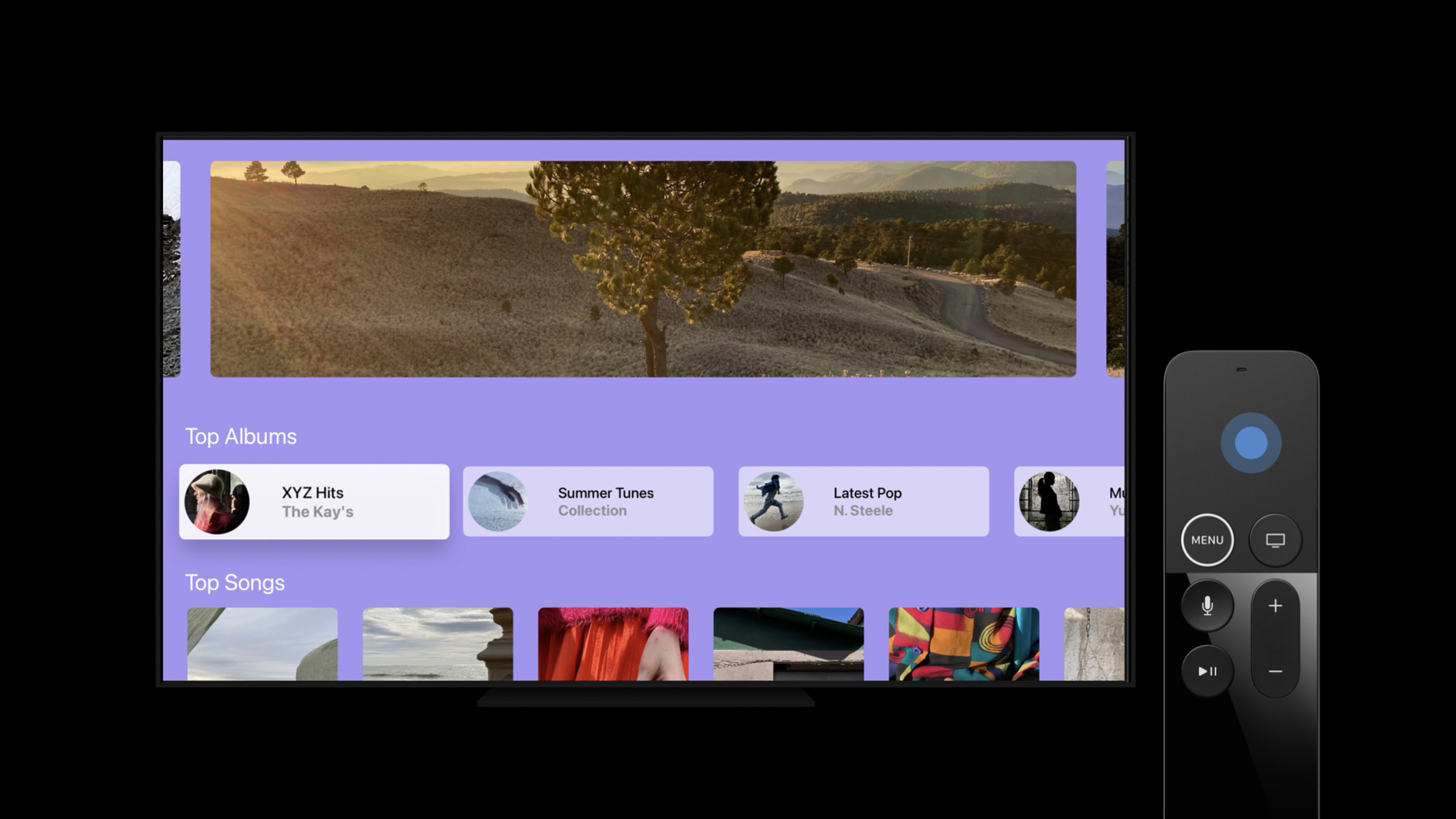
This session uses a music app example to demonstrate tvOS 14’s SwiftUI button styles, context menus, focus API, and Lazy Grid, allowing the Apple TV app to handle remote control focus, long press operations, and horizontal shelf layout.
Core Content
When moving the SwiftUI ideas of iPhone or iPad to TV, the first difference is the input method. Apple TV users use Siri Remote to move focus, press and hold buttons, and view large-screen interfaces from a distance. If the album button of a music app is only made into a normal button, it will lack focus highlighting and direction movement effects when the remote control is dragged.
This session uses a music app to connect three problems: the album card needs TV-style buttons and long-press menus; the Now Playing page needs to know which song is getting focus; and the login page needs to control the default focus between the username input box and the login button. All examples revolve around tvOS 14’s SwiftUI API.
The final issue is layout. The common homepage of the Apple TV app consists of multiple horizontal scrolling shelves. Session uses ScrollView, LazyHGrid and CardButtonStyle to combine this layout, and explains that Lazy Grid will load items when scrolling is needed.
Detailed Content
TV style buttons and long press menu
(01:19) CardButtonStyle creates a platter. When the button has focus, the platter lifts and highlights; when the user drags on the Siri Remote, the button moves in the direction.
Button(albumLabel, action: playAlbum)
    .buttonStyle(CardButtonStyle())
Key points:
Button(albumLabel, action: playAlbum)is the album entry, and the playback action will be executed after the user selects it..buttonStyle(CardButtonStyle())replaces the ordinary SwiftUI button with the tvOS card button style.- This style is responsible for focus highlighting and remote control drag feedback, without the need for handwritten animations outside the buttons.
(02:20) If the default highlight and focus effects are not suitable, you can customize ButtonStyle. The Session code only displays the structure, and the specific background style is completed by the app itself.
struct MyNewButtonStyle: ButtonStyle {
    func makeBody(configuration: Configuration) -> some View {
        configuration.label
           .background(configuration.isPressed ? … : …) // Custom styling
    }
}

Button(albumLabel, action: playAlbum)
    .buttonStyle(MyNewButtonStyle())
Key points:
MyNewButtonStyleconforms to theButtonStyleprotocol.makeBody(configuration:)returns the view of the button in different states.configuration.isPressedcomes from the button state and can be used to toggle the background when pressed..buttonStyle(MyNewButtonStyle())allows the same style to be reused for any button.
(03:04) Long press the album button to open the context menu. Menu items are still expressed as normal Button.
AlbumView()
    .contextMenu {
        Button("Add to Favorites", action: addAlbumToFavorites)
        Button("View Artist", action: viewArtistPage)
        Button("Discover Similar Albums", action: viewSimilarAlbums)
    }
Key points:
AlbumView()is the target view for menu mounting..contextMenudeclares the shortcut operation area that appears after long pressing.- Each
Buttonis a menu action, respectively connecting to collections, viewing artist pages and discovering similar albums.
Change content density with focus state
(05:19) tvOS 14 adds a new isFocused environment value. It returns true when the nearest focusable ancestor has focus. Description of the Session Now Playing page: The artist and album name are displayed for songs that have received focus, and only the artist name is displayed for songs that have not received focus.
struct SongView: View {
    var body: some View {
        Button(action: playSong) {
            VStack {
                Image(albumArt)
                DetailsView(...)
            }
        }.buttonStyle(MyCustomButtonStyle())
    }
}

struct DetailsView: View {
    ...
    @Environment(\.isFocused) var isFocused: Bool
    var body: some View {
        VStack {
            Text(songName)
            Text(isFocused ? artistAndAlbum : artistName)
        }
    }
}
Key points:
SongViewusesButton, the button itself is focusable.DetailsViewreads@Environment(\.isFocused)without making it a focusable view itself.Text(isFocused ? artistAndAlbum : artistName)switches the display information according to the focus state.- Session clearly reminds: buttons, lists, or views whose focus is managed by UIKit are not suitable for overlaying the
focusablemodifier.
Control default focus and reset after state change
(08:01) tvOS calculates the initial focus geometrically, usually falling on the top or frontmost focusable view of the screen. It is reasonable for the login page to focus on the username input box by default; if the username and password have been filled in, the default focus should fall on the login button.
@Namespace private var namespace
@State private var areCredentialsFilled: Bool

var body: some View {
    VStack {
        TextField("Username", text: $username)
            .prefersDefaultFocus(!areCredentialsFilled, in: namespace)
        SecureField("Password", text: $password)

        Button("Log In", action: logIn)
           .prefersDefaultFocus(areCredentialsFilled, in: namespace)
    }
    .focusScope(namespace)
}
Key points:
@Namespace private var namespacecreates a unique ID used to identify the focus scope.areCredentialsFilleddetermines whether the username input box or the login button is more suitable as the default focus..prefersDefaultFocus(..., in: namespace)only expresses preferences and does not directly operate the global focus tree..focusScope(namespace)limits these preferences to the currentVStack.
(10:35) After clearing the login form, you need to return the focus to the default position. The resetFocus environment action will reset focus by the same namespace.
@Namespace private var namespace
@State private var areCredentialsFilled: Bool
@Environment(\.resetFocus) var resetFocus

var body: some View {
    VStack {
        TextField("Username", text: $username)
            .prefersDefaultFocus(!areCredentialsFilled, in: namespace)
        SecureField("Password", text: $password)

        Button("Log In", action: logIn)
           .prefersDefaultFocus(areCredentialsFilled, in: namespace)

        Button("Clear", action: {
            username = ""; password = ""
            areCredentialsFilled = false
            resetFocus(in: namespace)
        })
    }
    .focusScope(namespace)
}
Key points:
@Environment(\.resetFocus)takes out the reset focus action provided by the system.- The Clear button clears
usernameandpasswordfirst. areCredentialsFilled = falsemakes the username input box re-state the default focus preference.resetFocus(in: namespace)only performs a reset within the current focus scope.
Organize TV homepage shelf with Lazy Grid
(12:08) The common horizontal shelf layout of Apple TV app can be implemented with Lazy Grid. Lazy Grid initializes items on demand and is suitable for placing a large number of covers in a horizontal scrolling area.
struct ShelfView: View {
    var body: some View {
        ScrollView([.horizontal]) {
            LazyHGrid(rows: [GridItem()]) {
                ForEach(playlists, id: \.self) { playlist in
                    Button(action: goToPlaylist) {
                        Image(playlist.coverImage)
                            .resizable()
                            .frame(…)
                    }
                    .buttonStyle(CardButtonStyle())
                }
            }
        }
    }
}
Key points:
ScrollView([.horizontal])creates a horizontal scrolling area.LazyHGrid(rows: [GridItem()])organizes the horizontal shelf with a grid row.ForEach(playlists, id: \.self)maps playlists to cover buttons one by one.Image(playlist.coverImage).resizable().frame(…)means that the cover is resizable and the size is specified by the app..buttonStyle(CardButtonStyle())gives each cover button the tvOS card focus effect.
Core Takeaways
- Make an album shelf homepage
What to do: Organize music, videos, or course content into multiple horizontal shelves organized into playlists.
Why it’s worth doing: ScrollView([.horizontal]) and LazyHGrid displayed by Session are common layouts for Apple TV apps; Lazy Grid will load items when scrolling is needed.
How to start: First use LazyHGrid(rows: [GridItem()]) to render a shelf, then wrap each cover into Button, and add CardButtonStyle().
- Add long press shortcut operation to the content card
What to do: Provide quick actions such as collecting, viewing author pages, and discovering similar content on album, video or playlist cards.
Why it’s worth doing: Session explicitly opens the context menu by long-pressing the album button, and the menu items can directly use ordinary Button.
How to start: Add .contextMenu after the card view and write each action as Button("Action", action: handler).
- Let Now Playing list expand details by focus
What to do: The currently focused song displays the artist and album name, and other songs only display the artist name, reducing information noise on the TV interface.
Why it’s worth doing: isFocused allows subviews to read the focus state of the most recent focusable ancestor, without adding a separate focus wrapper to each detail view.
How to start: Split the text area into DetailsView, read @Environment(\.isFocused) in it, and then switch the Text content according to the Boolean value.
- Set state-driven default focus for the login page
What to do: When the credentials are not filled in, the user name input box is focused by default, and when the credentials are filled in, the login button is focused by default.
Why it’s worth doing: tvOS selects the initial focus based on geometric position by default; the login process is more suitable for determining the focus entrance based on the form status.
How to start: Create @Namespace, add .prefersDefaultFocus to the username input box and login button respectively, and then use .focusScope(namespace) to limit the scope.
- Add focus reset to clear form action
What to do: After the user clicks Clear, clear the username and password, and return focus to the username input box.
Why it’s worth doing: Session exposes resetFocus(in:), which recalculates focus according to the default preferences of the current namespace.
How to start: Read @Environment(\.resetFocus), update the form status in the Clear button action, and then call resetFocus(in: namespace).
Related Sessions
- What’s new in SwiftUI — Learn about annual updates to SwiftUI on iPhone, iPad, Mac, Apple Watch, and Apple TV.
- Stacks, Grids, and Outlines in SwiftUI — Added Lazy Grid, list and outline related layout capabilities, directly adjacent to the shelf layout of this session.
- App essentials in SwiftUI — Explain how app, scene and view form a complete SwiftUI app, which is suitable as a structural front-end for tvOS SwiftUI app.
- Master Picture in Picture on tvOS — It belongs to the same tvOS experience theme, talking about switching between full-screen content and picture-in-picture.
- Discover search suggestions for Apple TV — It also belongs to the Apple TV app experience theme, talking about the integration of tvOS search interface and
UISearchController.
Comments
GitHub Issues · utterances