
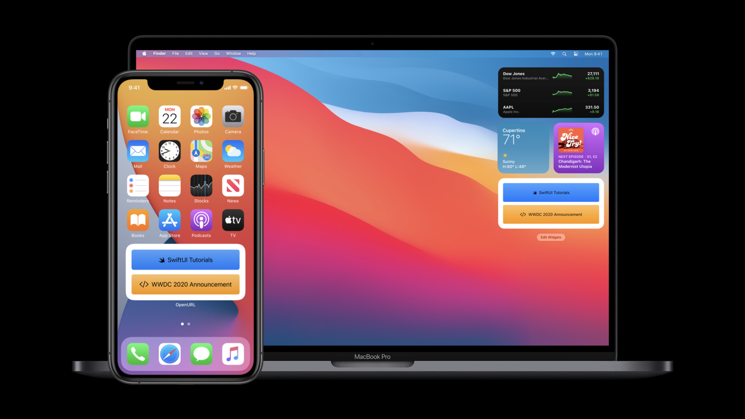
Highlight
SwiftUI 2020 adds
App,Scene,DocumentGroup,Widget,List(children:),LazyVGrid,ToolbarItem,matchedGeometryEffect,Link,openURL,UTTypeandSignInWithAppleButtonBy connecting to the same set of declarative models, application portals, windows, documents, widgets, complex lists, toolbars, animations, and system services can all be implemented directly using SwiftUI.
Core Content
The focus of SwiftUI in its first year was View. Developers can write declarative interfaces, but the complete app also handles portals, windows, menus, documents, list capabilities, toolbars, accessibility, and system services. The task of this session is to take these daily tasks back into SwiftUI’s declarative model.
(01:14) At the beginning, a complete App is given: @main marks the entrance, the body of App returns Scene, and WindowGroup hosts the View. The system will map this statement to iOS’s full-screen window, iPadOS’s multi-window, macOS’s multi-window and menu commands according to platform rules.
(09:18) The second problem is content scale. Ordinary lists and handwritten navigation will soon encounter hierarchical data, grid content, and scrolling performance. SwiftUI 2020 adds outline, lazy grid and lazy stack, so that galleries, sidebars and recursive lists can continue to be expressed in data-driven writing.
(12:19) The last part returns to the platform experience. There are SwiftUI entries for toolbars, labels, help tips, keyboard shortcuts, progress controls, Gauge, matched geometry, dynamic font scaling, Links, openURL, Uniform Type Identifiers, and Sign in with Apple. Developers can access these system capabilities without leaving SwiftUI.
Detailed Content
1. App and Scene become the entrance to SwiftUI
(01:26) The first clip officially displayed is a complete App. The App protocol and WindowGroup write the application entry into a declarative structure similar to View.
@main
struct HelloWorld: App {
    var body: some Scene {
        WindowGroup {
            Text("Hello, world!").padding()
        }
    }
}
Key points:
@mainmarks the application entry, replacing the manual life cycle entry in traditional templates.HelloWorldcomplies withApp, andbodyreturnsScene.WindowGroupis the Scene here; the transcript indicates that it will provide corresponding window behavior on different platforms.Text("Hello, world!").padding()is the SwiftUI View in the window.
(04:46) It is also possible to combine Settings Scenes on macOS. The system sets up the standard preference menu and gives the window the correct style.
@main
struct BookClubApp: App {
    @StateObject private var store = ReadingListStore()

    @SceneBuilder var body: some Scene {
        WindowGroup {
            ReadingListViewer(store: store)
        }

    #if os(macOS)
        Settings {
            BookClubSettingsView()
        }
    #endif
    }
}

struct BookClubSettingsView: View {
    var body: some View {
        Text("Add your settings UI here.")
            .padding()
    }
}
Key points:
@StateObjectstores the reading list in the App layer and is observed by the View in the window.@SceneBuilderallows an App to declare multiple Scenes.WindowGroupis responsible for the main window.Settingsis only compiled on macOS and is responsible for the preferences window.
2. DocumentGroup takes over document opening, editing and saving
(05:10) Document-based apps use DocumentGroup. transcript explains that it automatically manages document opening, editing, and saving scenarios and is available on iOS, iPadOS, and macOS.
import SwiftUI
import UniformTypeIdentifiers

@main
struct ShapeEditApp: App {
    var body: some Scene {
        DocumentGroup(newDocument: ShapeDocument()) { file in
            DocumentView(document: file.$document)
        }
    }
}

struct DocumentView: View {
    @Binding var document: ShapeDocument

    var body: some View {
        Text(document.title)
            .frame(width: 300, height: 200)
    }
}

struct ShapeDocument: Codable {
    var title: String = "Untitled"
}

extension UTType {
    static let shapeEditDocument =
        UTType(exportedAs: "com.example.ShapeEdit.shapes")
}

extension ShapeDocument: FileDocument {
    static var readableContentTypes: [UTType] { [.shapeEditDocument] }

    init(fileWrapper: FileWrapper, contentType: UTType) throws {
        let data = fileWrapper.regularFileContents!
        self = try JSONDecoder().decode(Self.self, from: data)
    }

    func write(to fileWrapper: inout FileWrapper, contentType: UTType) throws {
        let data = try JSONEncoder().encode(self)
        fileWrapper = FileWrapper(regularFileWithContents: data)
    }
}
Key points:
DocumentGroup(newDocument:)defines new document defaults.file.$documentpasses the document content as binding toDocumentView.UTType(exportedAs:)declares the application’s own file type.initandwriteofFileDocumentare responsible for reading and writing document data.
(05:49) Document App can also add menu commands. commands will place the custom menu in the appropriate location for the platform, and keyboardShortcut will display the shortcut keys.
DocumentGroup(newDocument: ShapeDocument()) { file in
    DocumentView(document: file.$document)
}
.commands {
    CommandMenu("Shapes") {
        Button("Add Shape...", action: addShape)
            .keyboardShortcut("N")
        Button("Add Text", action: addText)
            .keyboardShortcut("T")
    }
}
Key points:
commandsare hung on the Scene, not on a single View.CommandMenu("Shapes")creates a custom menu.- Two
Buttonare bound to actions respectively. keyboardShortcutdeclares a keyboard shortcut for a menu item.
3. Lists, grids and lazy stacks handle large amounts of content
(09:22) List adds a new children key path, which can directly display recursive hierarchical data. This capability reduces frequent push-and-pop navigation in content-based apps.
struct OutlineContentView: View {
    var graphics: [Graphic]

    var body: some View {
        List(graphics, children: \.children) { graphic in
            GraphicRow(graphic)
        }
        .listStyle(SidebarListStyle())
    }
}

struct Graphic: Identifiable {
    var id: String
    var name: String
    var icon: Image
    var children: [Graphic]?
}
Key points:
List(graphics, children: \.children)reads the children of each node.childrenofGraphicis an optional array, corresponding to expandable or leaf nodes.SidebarListStyle()uses sidebar styles.- Each node is still rendered with a normal SwiftUI View.
(10:09) The grid uses lazy-loading layout. GridItem(.adaptive(minimum: 176)) will adjust the number of columns to the available width.
struct ContentView: View {
    var items: [Item]

    var body: some View {
        ScrollView {
            LazyVGrid(columns: [GridItem(.adaptive(minimum: 176))]) {
                ForEach(items) { item in
                    ItemView(item: item)
                }
            }
            .padding()
        }
    }
}
Key points:
ScrollViewprovides a scrolling container.LazyVGridonly loads grid content on demand.GridItem(.adaptive(minimum: 176))makes the number of columns follow the spatial changes.ForEach(items)maps data arrays into cells.
(10:58) Custom long lists can be used with LazyVStack. The official gallery example also shows that the view builder supports switch, which can switch multiple layouts in the same stack.
struct WildlifeList: View {
    var rows: [ImageRow]

    var body: some View {
        ScrollView {
            LazyVStack(spacing: 2) {
                ForEach(rows) { row in
                    switch row.content {
                    case let .singleImage(image):
                        SingleImageLayout(image: image)
                    case let .imageGroup(images):
                        ImageGroupLayout(images: images)
                    case let .imageRow(images):
                        ImageRowLayout(images: images)
                    }
                }
            }
        }
    }
}
Key points:
LazyVStacksuitable for custom scroll layout.switch row.contentselects different Views by data type.SingleImageLayout,ImageGroupLayoutandImageRowLayouttogether form an irregular gallery.- The transcript clearly states that these contents are combined to form a seamless gallery.
4. Toolbar, Label, help prompts and new controls unify platform interaction
(12:24) SwiftUI adds a new toolbar modifier. Toolbar items can be ordinary Views, which are placed in the platform’s preferred location by default.
struct ContentView: View {
    var body: some View {
        List {
            Text("Book List")
        }
        .toolbar {
            Button(action: recordProgress) {
                Label("Record Progress", systemImage: "book.circle")
            }
        }
    }

    private func recordProgress() {}
}
Key points:
toolbaris hung on the View, and the toolbar content is placed inside.Buttonis a normal SwiftUI control.Labelprovides both title and icon.- The transcript description toolbar will be displayed in the default location of the platform.
(12:40) Use ToolbarItem when you need to control the position. It can declare semantic placements such as primary operations, confirm operations, cancel operations, and principal positions.
struct ContentView: View {
    var body: some View {
        List {
            Text("Book List")
        }
        .toolbar {
            ToolbarItem(placement: .primaryAction) {
                Button(action: recordProgress) {
                    Label("Record Progress", systemImage: "book.circle")
                }
            }
        }
    }

    private func recordProgress() {}
}
Key points:
ToolbarItemwraps a toolbar control..primaryActiondescribes the control role.- SwiftUI determines the specific location based on the platform.
Labeldisplays the icon in the toolbar by default, and the title is used for accessibility.
(15:28) The help modifier becomes a tooltip on macOS and also provides an accessibility hint.
struct ContentView: View {
    var body: some View {
        Button(action: recordProgress) {
            Label("Progress", systemImage: "book.circle")
        }
        .help("Record new progress entry")
    }

    private func recordProgress() {}
}
Key points:
helpdescribes control effects.- macOS will render this as Tool Tips.
- transcript Description It also provides VoiceOver hint on all platforms.
(17:08) New controls cover progress and capacity expressions. ProgressView represents definite or uncertain progress, Gauge represents the position of a certain value relative to capacity.
struct ContentView: View {
    var percentComplete: Double

    var body: some View {
        ProgressView("Downloading Photo", value: percentComplete)
    }
}
Key points:
percentCompleteis the determined progress value.ProgressViewreceives both title and progress.- transcript explains that it has two styles: linear and circular.
5. Animation, responsive visuals and system services have direct SwiftUI API
(19:17) matchedGeometryEffect connects the same element in two areas. In the example, when the album moves from the grid to the selected row, SwiftUI interpolates the frame to form a continuous transition.
struct ContentView: View {
    @Namespace private var namespace
    @State private var selectedAlbumIDs: Set<Album.ID> = []

    var body: some View {
        VStack(spacing: 0) {
            ScrollView {
                albumGrid.padding(.horizontal)
            }

            Divider().zIndex(-1)

            selectedAlbumRow
                .frame(height: AlbumCell.albumSize)
                .padding(.top, 8)
        }
        .buttonStyle(PlainButtonStyle())
    }

    private var albumGrid: some View {
        LazyVGrid(columns: [GridItem(.adaptive(minimum: AlbumCell.albumSize))], spacing: 8) {
           ForEach(unselectedAlbums) { album in
              Button(action: { select(album) }) {
                 AlbumCell(album)
              }
              .matchedGeometryEffect(id: album.id, in: namespace)
           }
        }
    }

    private var selectedAlbumRow: some View {
        HStack {
            ForEach(selectedAlbums) { album in
                AlbumCell(album)
                .matchedGeometryEffect(id: album.id, in: namespace)
            }
        }
    }
}
Key points:
@Namespaceprovides a namespace for geometric matching.- Two
matchedGeometryEffectuses the samealbum.id. - Grid and selected row share the same set of identifiers.
withAnimation(.spring(response: 0.5))appears in the official complete fragment and is used to trigger the selection animation.
(20:34) Responsive typography has also been enhanced. Custom fonts will scale with Dynamic Type, and non-text metrics can use @ScaledMetric.
struct ContentView: View {
    var album: Album
    @ScaledMetric private var padding: CGFloat = 10

    var body: some View {
        VStack {
            Text(album.name)
                .font(.custom("AvenirNext-Bold", size: 30))

            Text("\(Image(systemName: "music.mic")) \(album.artist)")
                .font(.custom("AvenirNext-Bold", size: 17))

        }
        .padding(padding)
        .background(RoundedRectangle(cornerRadius: 16, style: .continuous).fill(Color.purple))
    }
}
Key points:
@ScaledMetricmakespaddingfollow Dynamic Type.- Custom fonts continue to use
.font(.custom(...)). Image(systemName:)can be embedded inTextand respond to font size changes as part of the text.
(23:15) The system integration part will first talk about Link and openURL. Link will open a URL or universal link, openURL is used to trigger the opening from code in the View environment.
let customPublisher = NotificationCenter.default.publisher(for: .init("CustomURLRequestNotification"))
let apple = URL(string: "https://developer.apple.com/tutorials/swiftui/")!

struct ContentView: View {
    @Environment(\.openURL) private var openURL

    var body: some View {
        Text("OpenURL Environment Action")
            .onReceive(customPublisher) { output in
                if output.userInfo!["shouldOpenURL"] as! Bool {
                    openURL(apple)
                }
            }
    }
}
Key points:
@Environment(\.openURL)reads the open URL action in the environment.onReceivelistens for publisher.- Call
openURL(apple)after the condition is met. - transcript Description SwiftUI opens a URL relative to the window that contains it.
(25:16) Sign in with Apple also has SwiftUI controls. Just import both AuthenticationServices and SwiftUI to use it.
import AuthenticationServices
import SwiftUI

struct ContentView: View {
    var body: some View {
        SignInWithAppleButton(
            .signUp,
            onRequest: handleRequest,
            onCompletion: handleCompletion
        )
        .signInWithAppleButtonStyle(.black)
    }

    private func handleRequest(request: ASAuthorizationAppleIDRequest) {}
    private func handleCompletion(result: Result<ASAuthorization, Error>) {}
}
Key points:
SignInWithAppleButtonfrom the combination of AuthenticationServices and SwiftUI..signUpspecifies the button purpose.onRequestandonCompletionhandle authorization requests and results..signInWithAppleButtonStyle(.black)sets the official style.
Core Takeaways
- Make a multi-window reading or data management App: Use
App,WindowGroupand@StateObjectto place shared models, so that the same set of SwiftUI entrances can cover iPhone, iPad, Mac, Apple Watch and Apple TV. At the beginning, build the entry according to the BookClub structure, and then addSettingsScene to macOS. - Make a simple document editor: use
DocumentGroupto manage opening, editing and saving, useFileDocumentto read and write models, and useUTType(exportedAs:)to declare file types. The first version only requires a title field and aDocumentView, and then usescommandsto add menu actions. - Make a gallery that can carry a large amount of content: Use
LazyVGridto make adaptive grids, useLazyVStackto handle irregular long lists, and usematchedGeometryEffectto add continuous animation to item movement. To start, you can reuse the official album selector structure and replace the data with image or video thumbnails. - Complete platform interaction details for production apps: Use
toolbar,ToolbarItem,Label,helpandkeyboardShortcutto place common operations in appropriate locations on the platform. Start with a details page and map save, cancel, share and main operations to the corresponding placements. - Integrate system capabilities into SwiftUI pages: use
Linkto handle tutorials, news or universal links in the app, useopenURLto respond to asynchronous events, and useSignInWithAppleButtonto put in the login process. The first step is to make the external links and login buttons into independent SwiftUI Views, and then embed them into the existing page.
Related Sessions
- App essentials in SwiftUI — Continue to talk about the structure of App, Scene, View, WindowGroup, Settings and application entry.
- Build document-based apps in SwiftUI — Deep dive into
DocumentGroup,FileDocument, and document-based App management. - Stacks, Grids, and Outlines in SwiftUI — Expand outline, lazy grid and lazy stack mentioned in this session.
- Build SwiftUI views for widgets — Supplement the way SwiftUI widget views are built in WidgetKit.
- Build complications in SwiftUI — Continue working with SwiftUI custom views for Apple Watch complication.
Comments
GitHub Issues · utterances