
Highlight
This code-along uses the Emoji Rangers sample app to reuse
AvatarViewto create a Widget Extension, and connect the character data toTimelineProvider, then limit the size throughsupportedFamilies, and use placeholder to preview the display state while waiting for the timeline.
Core Content
Emoji Rangers is a game that tracks the status of characters. Power Panda is recovering, and Spouty and Egghead are in their respective states. There is already a status box in the upper left corner of the main app, which is just right to put on the home screen, so that players can know when the character can continue to act without opening the app.
In this code-along, Apple did not talk about the complete architecture diagram first, but started directly from this block. The core of a Widget is condensed into one sentence: it is a SwiftUI view that updates over time. The existing AvatarView can continue to be used. What developers have to do is to put it into the Widget Extension and let WidgetKit get the correct content in Gallery, home screen and when waiting for timeline.
The goal of the first episode is small: get a small widget running. The process starts with creating a new widget target in Xcode, then adding AvatarView to the target, using WidgetPreviewContext to preview the real size, and then connecting the same character state to the WidgetKit life cycle through entry, snapshot, timeline and placeholder.
This is also the value of this session. It breaks “making a widget” into several small steps that can be verified immediately: first reuse a SwiftUI view, then add the display name and description, then put the data into the entry, and finally open only one size that can be made currently.
Detailed Content
(00:48) Widget is defined here as a SwiftUI view and will be updated over time. The demo starts with the existing AvatarView, since this view can already express the character’s avatar and status.
Since there are no official code snippets for this session, the code block below only retains the call points where the transcript clearly appears; the complete project is subject to the Building Widgets Using WidgetKit and SwiftUI download project in the resources.
AvatarView(character: panda)Key points:
AvatarViewis a SwiftUI view that already exists in the main App.charactercorresponds to the Emoji Rangers character data such as Power Panda in the demo.- The first step is to reuse existing views to avoid redesigning a UI in the widget target.
(02:39) The first step in turning a view into a widget is to create a new Widget Extension target in Xcode. After the new target is activated, add the required view files to the target, and then use the widget size to check the effect in SwiftUI Preview.
AvatarView(character: panda)
    .previewContext(WidgetPreviewContext(family: .systemSmall))
Key points:
WidgetPreviewContextlets SwiftUI Preview render according to the widget context.familycorresponds to the small, medium and large sizes seen in Add sheet.- Demo selection first verifies that the status box fits the display space of the small widget.
(04:23) DisplayName and Description need to be added to the Widget template, and then enter the main EntryView. EmojiRangerWidgetEntryView already has entry, character data can be placed in the entry and then passed to AvatarView.
EmojiRangerWidgetEntryView(entry: entry)

AvatarView(character: entry.character)
Key points:
DisplayNameandDescriptiondetermine the name and description that users see in the Widget Gallery.entryis the entry point for widget view to read data.AvatarViewdoes not directly go to the main App to check data, but receives the role object from the entry.
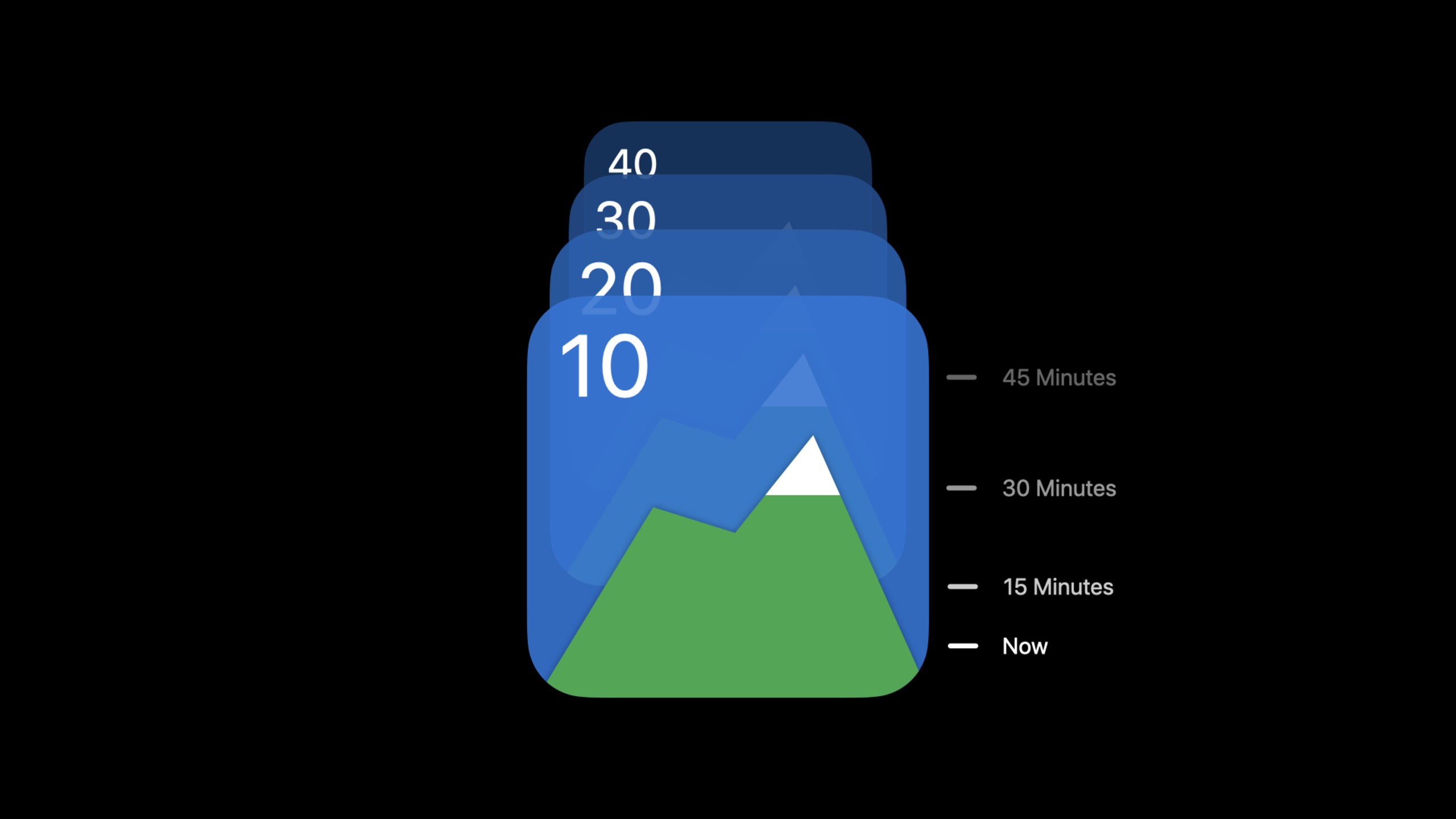
(05:17) Entry comes from timeline provider. Session refers to the provider as the core engine of widgets: WidgetKit takes a snapshot when it needs a single piece of content; after the user has added the widget to the device, the system takes the complete timeline.
TimelineProvider
  .getSnapshot -> one entry for Widget Gallery
  .getTimeline -> entries for the added widget
Key points:
getSnapshotservice Widget Gallery and other scenarios that only require one piece of content.- The
getTimelineservice has been added to the Home Screen or Today View widget. - Only one entry will be included in the first episode, and the display link will be run through first, and then the subsequent timeline design will be entered.
(06:22) After running for the first time, the Add sheet displays small, medium, and large at the same time. The presenter believes that it is not ready to support all sizes at this time, so it only opens one size that it can currently do well.
EmojiRangerWidget()
    .supportedFamilies([.systemSmall])
Key points:
supportedFamiliesis an additional modifier on the widget configuration.- Limiting the size allows the first version of the widget to avoid wasting space in medium and large.
- On final inspection, the Widget Gallery only shows one supported size and can be added directly to the Home Screen.
(06:55) There is also PlaceholderView in the template. It appears while WidgetKit is waiting for timeline. The demonstration also changes the placeholder to AvatarView, and then uses isPlaceholder to automatically turn the text and pictures into gray rounded placeholders.
AvatarView(character: panda)
    .isPlaceholder(true)
Key points:
- The placeholder does not require a real entry. Panda will continue to be passed in during the demonstration.
isPlaceholderwill replace the text with a gray rounded rectangle, and the image will be automatically replaced.- SwiftUI Preview can place real widgets and placeholders at the same time, making it easy to compare waiting status and completion status.
Core Takeaways
1. Make a small widget for the character status
What to do: Put a single status block from a game, fitness, or learning app on your home screen.
Why it’s worth doing: The reason why I chose Emoji Rangers’ state box for session is that it’s already a SwiftUI view that can be read at a glance.
How to start: First find a small view similar to AvatarView in the App, add it to the Widget Extension target, and then use WidgetPreviewContext to check the small size.
2. Prepare a real snapshot for Widget Gallery
What: Make the preview in the Gallery show a representative character or quest instead of an empty state.
Why it’s worth doing: The transcript clearly states that snapshot is the content used when WidgetKit only needs one entry, such as Widget Gallery.
How to start: Put a recent or most representative object in the provider’s snapshot path, and first verify that it can be passed to EntryView completely.
3. Use placeholder to preview the waiting state
What: Make a readable loading appearance for the widget waiting for the timeline.
Why it’s worth doing: The session demonstrates that isPlaceholder will automatically replace text and images with system placeholder effects.
How to start: Put the real widget view and placeholder view into the same preview group, and add isPlaceholder to the placeholder version.
4. The first version is only available in one size
What to do: Publish the small widget first, and then expand it after medium and large have clear content levels.
Why it’s worth doing: In the demo, small, medium, and large all appear by default, but the space of the current character status box is not well utilized in other sizes.
How to start: Add supportedFamilies to the widget configuration and only retain verified families.
Related Sessions
- Meet WidgetKit — Let’s look at the overall model of WidgetKit first, and then return to this game to run code-along for the first step.
- Build SwiftUI views for widgets — Go deep into the widget view itself and fill in the SwiftUI layout details that have only been briefly covered in this session.
- Widgets Code-along, part 2: Alternate timelines — Continue the same project and advance an entry from the first episode to the real timeline.
- Widgets Code-along, part 3: Advancing timelines — Next, handle advanced timelines, URLs, deep links, and multiple widgets.
- Design great widgets — transcript The recommended design session at the end is suitable for judging which information should enter the widget.
Comments
GitHub Issues · utterances