
Highlight
iOS 14 introduces background/content configurations and configuration state for collection view and table view cells. Developers use lightweight value-type configurations to describe content, background, and state appearance; UIKit applies the new configuration to views in one shot.
Core Content
In iOS 13, the most common table cell pattern was setting the built-in imageView and textLabel on UITableViewCell. The model is simple, but it ties content, styling, and view hierarchy to the cell class. Moving to collection view cells, headers, or footers, the code cannot be reused as-is.
iOS 14 splits this into configuration objects. Content configuration describes images, text, and text styles; background configuration describes background fill, blur, stroke, and corner radius. Configurations are lightweight Swift value types with low creation cost—rendering happens when you set them back on the cell.
This enables a key change: the same configuration code works for table view cells, collection view cells, and headers/footers that support content configuration. Developers get a fresh configuration, fill in content, assign contentConfiguration, and UIKit updates internal views.
The harder part is state. List cells highlight, select, disable, focus, and may enter editing, swipe, expansion, or drag and drop states. iOS 14 uses configuration state to combine traits, system states, and custom states, then lets configurations generate new appearance from state.
The API goal is not another wrapper layer. It centralizes configuration so the cell regenerates appearance from current state on every state change. The talk’s practice is direct: don’t read old configuration and patch—always start from a fresh configuration, set needed properties, then apply once.
Detailed Content
From direct subview setup to content configuration
(01:31) The old pattern touches built-in subviews on UITableViewCell.
cell.imageView?.image = UIImage(systemName: "star")
cell.textLabel?.text = "Hello WWDC!"
Key points:
cell.imageViewsets the cell image.cell.textLabelsets the cell primary text.- This code depends on
UITableViewCellbuilt-in views.
(01:59) The new pattern asks the cell for a default content configuration, sets content, then assigns it back.
var content = cell.defaultContentConfiguration()

content.image = UIImage(systemName: "star")
content.text = "Hello WWDC!"

cell.contentConfiguration = content
Key points:
defaultContentConfiguration()returns a fresh configuration with default styles for the current cell and table view style.content.imageandcontent.textmodify local configuration values—the cell hasn’t updated yet.cell.contentConfiguration = contentmakes the cell render image and text.- This configuration code also works for collection view cells and headers/footers that support content configuration.
Update appearance with configuration state
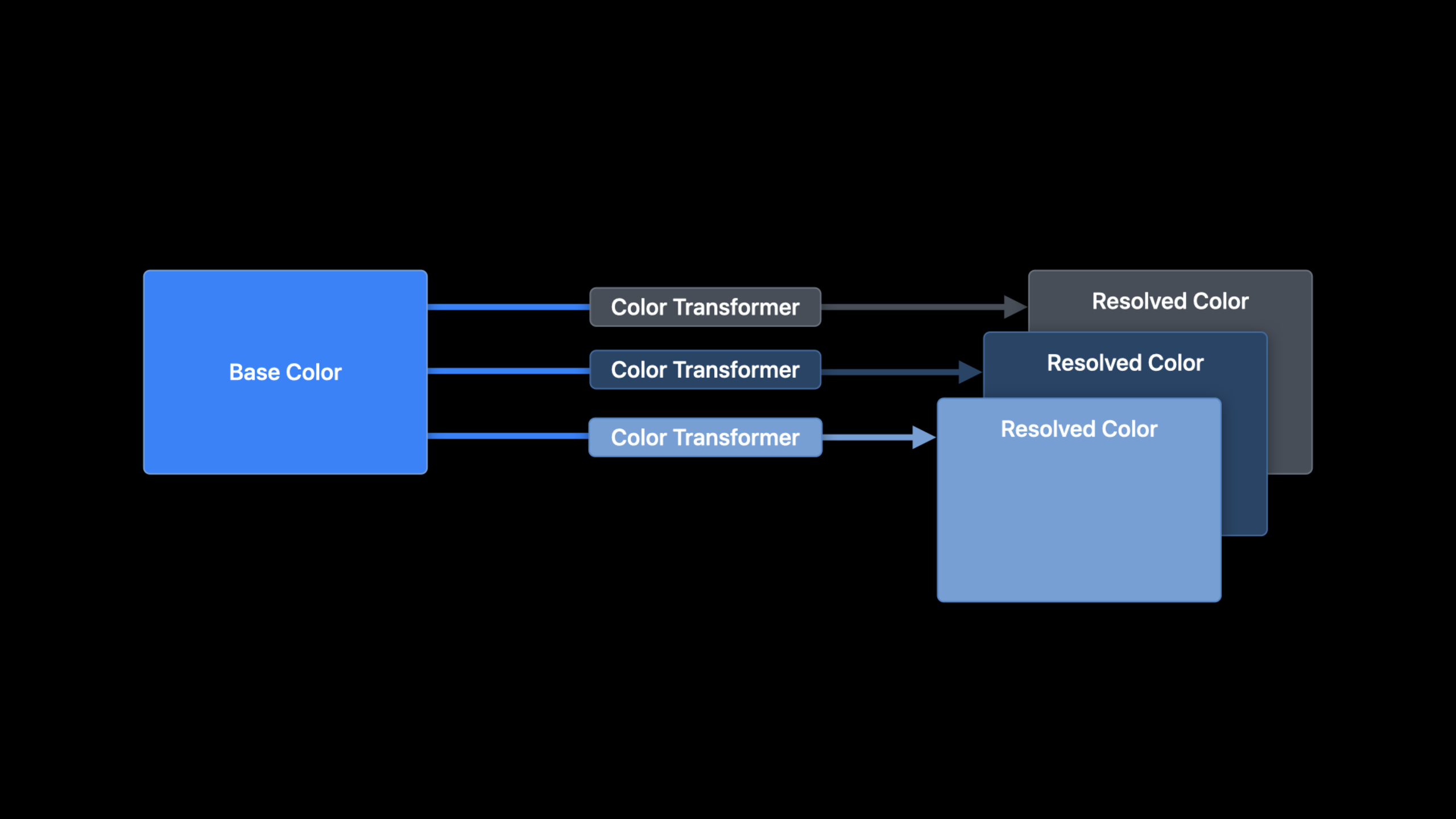
(13:10) Background and content configurations can return updated copies based on state.
let updatedConfiguration = configuration.updated(for: state)Key points:
updated(for:)receives the current configuration state.- Returns a new configuration; the original is not modified.
- Properties you already set are preserved in the updated configuration.
- By default, when the cell’s configuration state changes, the system automatically requests updated configuration and reapplies it.
(16:33) For custom state appearance, centralize logic in updateConfiguration(using:).
override func updateConfiguration(using state: UICellConfigurationState) {
    var content = self.defaultContentConfiguration().updated(for: state)

    content.image = self.item.icon
    content.text = self.item.title

    if state.isHighlighted || state.isSelected {
        content.imageProperties.tintColor = .white
        content.textProperties.color = .white
    }

    self.contentConfiguration = content
}
Key points:
updateConfiguration(using:)is called before the cell first appears and when configuration state may change.defaultContentConfiguration().updated(for: state)gets system default styles for the current state first.content.imageandcontent.textfill in current item content.state.isHighlighted || state.isSelectedhandles only highlight and selection states.self.contentConfiguration = contentapplies configuration for this state round.- Call
setNeedsUpdateConfigurationto actively request reconfiguration.
Choose default background and content styles
(19:45) Collection view list cells, table view cells, and table view headers/footers automatically get default background configuration from container style. Content configuration can come from the cell or directly from the type.
var background = UIBackgroundConfiguration.listSidebarCell()

var content = UIListContentConfiguration.sidebarCell()
Key points:
UIBackgroundConfiguration.listSidebarCell()creates default background configuration for sidebar cells.UIListContentConfiguration.sidebarCell()creates default content configuration for sidebar cells.- Visual differences among grouped, inset grouped, plain, sidebar plain, and sidebar list appearances come from default background and content configurations.
- Content configuration supports Dynamic Type. At largest Accessibility text sizes, text wraps around images, giving content more space.
(22:32) List content configuration works with self-sizing cells. Affect intrinsic height through layout margins and padding so cells auto-adjust height for device size, Dynamic Type, and content volume.
(23:44) If multi-line cells have images of different widths, text loses alignment. The talk’s approach specifies the same reserved layout width for images, centers images in a fixed region, then lays out text relative to the same area. SF Symbols automatically get standard reserved layout size; non-symbol images need developer requests as needed.
Don’t mix old properties when migrating
(24:52) When migrating old cells, avoid two styling approaches on the same appearance. Setting background configuration resets backgroundColor and backgroundView to nil; setting those old properties in reverse also affects background configuration.
Content configuration also replaces built-in content subviews like imageView, textLabel, and detailTextLabel. The talk explicitly recommends content configurations because these old content properties will be deprecated in future releases.
Reuse system content rendering in custom views
(26:23) For more complex cells, create UIListContentView directly and place it alongside your custom views.
var content = UIListContentConfiguration.cell()

// Set up the content configuration as desired...

let contentView = UIListContentView(configuration: content)
Key points:
UIListContentConfiguration.cell()creates standard cell content configuration.- The comment location is where you set images, text, styles, and layout properties.
UIListContentView(configuration:)creates the rendering view from this configuration.- This view can go in a custom cell or alone in a plain
UIStackView.
If the cell is fully custom, system configuration still helps. Use it as a source for default fonts, colors, and margins. Advanced scenarios can create custom content configuration with a matching content view so cells use it like list content configuration.
Core Takeaways
1. iPad sidebar with automatic state adaptation
What to do: Build a project, tag, or folder sidebar where selected and highlighted items automatically switch text and icon colors.
Why it’s worth doing: The talk shows sidebar list cells get different default appearance in highlighted, selected, and other states, and demonstrates overriding colors in updateConfiguration(using:).
How to start: Create sidebar appearance with collection view list; inside the cell start from defaultContentConfiguration().updated(for: state), set item icon and title, override tint and text color only when selected/highlighted.
2. Dynamic Type-friendly settings page
What to do: Build a settings or preferences page where each row has icon, title, and description text that auto-grows at large sizes.
Why it’s worth doing: Content configuration supports self-sizing cells, layout margins, padding, and special layout modes at Accessibility text sizes.
How to start: Use defaultContentConfiguration() to set image, text, and optional secondary text; don’t fix cell height—control layout through margins and padding on the configuration so height follows content.
3. Message list with business state
What to do: Build a message or transaction list where business states like archived, flagged, or processed directly affect cell appearance.
Why it’s worth doing: Configuration state supports custom states. The talk uses messaging app archived/flagged and payment app processed as examples of states participating in cell configuration.
How to start: Pass business state as configuration input; in updateConfiguration(using:) read state, first get system state appearance with updated(for:), then set business icons, titles, and colors.
4. Standard content plus custom badge cell
What to do: Build a list cell with system image/text/secondary text layout on the left and your own progress, badge, or status label on the right.
Why it’s worth doing: UIListContentView can sit alongside custom views, keeping system content configuration’s Dynamic Type, default styles, and state updates.
How to start: Create UIListContentConfiguration.cell(), set content, generate UIListContentView(configuration:), place it with a custom badge view in the cell view hierarchy.
Related Sessions
- Advances in UICollectionView — Start here to see how iOS 14 collection view capabilities cover data, layout, and content presentation.
- Lists in UICollectionView — Continue with how lists and sidebars replace table appearance using compositional layout.
- Advances in diffable data sources — Add data-side capabilities: section snapshots and reordering for list and outline changes.
Comments
GitHub Issues · utterances